One of the most important—but least understood—aspects of branding is the role color plays in a customer’s impression of your brand. In marketing, we call this brand color psychology. While this may sound like buzzy marketing speak, it’s actually rooted in science.
The nature of color isn’t limited to just logos and a color palette on your website. In fact, color schemes have long played an important role in everything from home decor to diplomacy. After all, there’s a reason Jacqueline Kennedy picked blue as the dominant color for Air Force One (but we’ll get to that in good time). First, a story…
Many years back, in my first “real” house, I wanted to create an elegant dining space. I spent time researching the “proper” color for a dining room. Time and time again, the same notion popped up. The best color for a dining room, it seems, is red. Why? Color psychology. Red triggers emotions in guests that encourage liveliness, excitement, and conversation. Want a lively table for the holidays? Paint your dining room red. Which is exactly what I did.
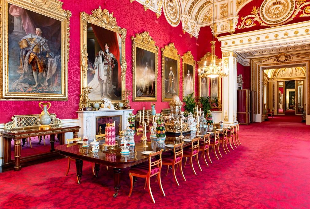
The State Dining Room at Buckingham Palace features bold reds to stimulate lively conversation. (Source: Royal Conservancy Trust)
The photo above shows the State Dining Room at Buckingham Palace. This room has hosted visitors at the highest levels of government for more than 150 years. It’s also a study in red, from the carpet to the ceiling. Even the chairs are upholstered in red. Just think of the lively conversations this room has seen—and the luminaries who’ve had them. Everyone from Queen Victoria to President Reagan has sat at that table to discuss world matters.
When it comes to using red, many brands have done so quite effectively. (We’ll discuss Coca-Cola later.) But the application of color psychology to branding is a potentially perilous activity, especially when you consider how vital the use of color is to building a strong brand presence. Understanding the important role of brand color psychology in marketing can mean the difference between success and failure.
What Is Color & Why Is It So Important?
To understand color psychology, you first need to know a little bit about color itself. Color theory is the artistic and scientific study of how colors interact. We all remember from elementary school the color wheel with the primary colors—red, yellow, and blue. There are secondary colors, such as green, purple, and orange. There are even tertiary colors that combine varying amounts of primary and secondary colors to form new colors.
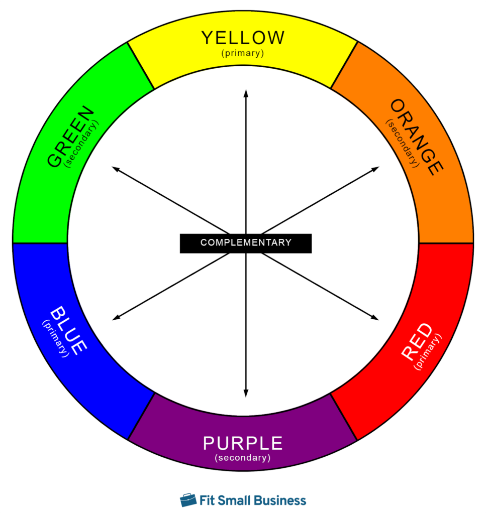
The color wheel showing primary, secondary, and complementary colors.
The color wheel is a means of organizing colors in a way that can be used to help drive color decisions. Essentially, it shows how primary, secondary, and tertiary colors relate to one another as either complementary colors or analogous colors.
Knowing color theory lingo will be helpful as you dive into color psychology. To help you navigate the nuances of color, here’s a brief glossary of relevant terms:
Primary colors: The three most basic colors—red, yellow, and blue–are not reducible to other colors, and all hues consist of some mixture of these colors plus black and white, which controls saturation.
Secondary colors: Secondary colors are created by mixing equal parts of primary colors—half yellow + half blue = green. Red and blue make purple. Red and yellow yield orange.
Tertiary colors: Also known as intermediate colors, these are created when you mix half of a primary color with half of a secondary color. Think chartreuse green or violet purple.
Complementary colors: Colors that sit on opposite sides of the color wheel are said to complement one another. Almost always, the opposition is between a primary color and a secondary color—or between secondary and tertiary colors. That’s why red and green go so well together at Christmas.
Analogous colors: Colors that sit beside one another on the color wheel are said to be analogous or adjacent. These colors share similar properties—and psychological effects.
Hue: Primary colors and combinations of those colors with no added black, white, or gray can be grouped in categories based on primary and secondary colors. There are various temperatures and saturations of red—rose red, candy apple red, etc.—but all are recognized as “red.”
Temperature: Variations in the amount of reflected light a color emits affect the “temperature” of that light. Measured in kelvin, color temperature is what leaves us with “warm” and “cool” light.
Saturation: The intensity and purity of a color is known as the saturation. Primary red would be 100% saturation of red, with no other colors. A 50% saturation of red with 50% white yields a cool pink, while a 50% saturation of red with a 50% saturation of black gives you maroon.
Shade: The amount of pure black added to each hue affects how muted the hue appears. Shade is one value of color, and you’ll frequently see it measured in degrees-Kelvin.
Tint: The amount of pure white added to each hue affects how washed out a hue appears. Like shade, tint is a value of color, and it, too, is measured in degrees-Kelvin.
Tone: The amount of pure gray (50% black, 50% white) is added to a hue deepens the color, neither washing it out or muting it.
Now that you have a basic understanding of the theory and terminology used to discuss color, you’re ready to continue your journey. There’s just one last thing before you dive into the psychology of color and how it can help your brand.
How Many Colors Are There?
As it turns out, the answer to determining the total number of colors is kind of complicated.
Using mathematical formulas, scientists estimate there are about 16.5 million possible colors in the visible light spectrum. That’s not to say humans are equipped to differentiate each of those colors. The human eye, it seems, is equipped to view about 10 million colors. Don’t panic, though—when it comes to brand color psychology, those colors get grouped into nine to 12 categories.
Understanding Color Psychology & Its Use in Branding
Color psychology is the scientific study of how color affects individual viewers. Many factors can impact how someone views a particular color, from biology to the cultural background of the viewer. Context can also play a role in the effects of color: how and where color is used can greatly impact how the viewer reacts.
Writing for the journal Genetic, Social, and General Psychology Monographs, T. W. White and T. J. Wilsthire outlined six basic principles of color psychology. Click on each heading to learn more about what they suggest:
Think about how you talk about emotions. You might say a friend is feeling blue over a bad breakup. Maybe your coworker is green with envy because you got a promotion they didn’t. A coward is called yellow. Color meanings go beyond just metaphorical use in language, though.
Purple is said to be the color of royalty. Red is used almost universally to indicate danger, while its complementary color, green, represents safety. For whatever reason, these colors seem to be universally understood, despite the cultural background of the viewer.
In the western world, we all know pink is for girls and blue is for boys. “It’s a girl!” usually shows up pink, while “We’re having a boy!” is printed in blue. Baby girls are typically dressed in pink, while boys’ outfits are almost universally blue. But this is because we have learned this through cultural exposure.
Prior to about 1910, the rule was exactly the opposite. The color pink was most closely associated with boys, while blue was more related to girls. The reason was simple: when boys are engaged in a strenuous activity, their cheeks go flush. Pink was biologically associated with arduous activity. Boys’ cheeks turn pink with heavy activity. Conversely, because young ladies’ faces and lips would turn a very cool tint of blue when they fainted, blue was viewed as the weaker color. What society perceived as biological roles drove color assignment.
Of course, as society evolved, that changed. What drove that change may be something as simple as a pair of paintings. According to fashion expert Valerie Steele, the genders got swapped when an industrialist purchased a pair of British paintings (shown below) known as “The Blue Boy,” by Thomas Gainsborough, and “Pinkie,” by Thomas Lawrence. The paintings were very popular and, as Steele sees it, drove the societal change in color assignment.
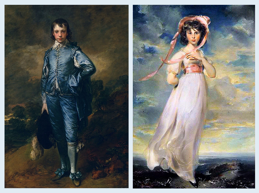
“The Blue Boy” by Gainsborough and “Pinkie” by Lawrence (Source: Wikipedia)
The viewer’s reaction to color is almost instantaneous. It is reflexive and automatic. The viewer sees a color and immediately asks themselves how that color makes them feel.
For example, when you view an image filled with analogous colors, you will feel an instant sense of calm. Artists seeking to create tranquil emotions in the viewer will use analogous colors. Think: that lovely, warm image of fall with all the oranges, yellows, and reds; or the calm tranquility of a cool winter scene with dozens of shades of blue.
Conversely, if an artist seeks to trigger conflicted or powerful emotions, they’ll rely on complementary colors. Red and green conspire together at Christmas to underscore the excitement of the season, while orange and blue will trigger a sense of conflict. Pairing colors that are neither directly adjacent nor complementary will produce a sense of chaos—which is why Jackson Pollock paintings are so powerful.
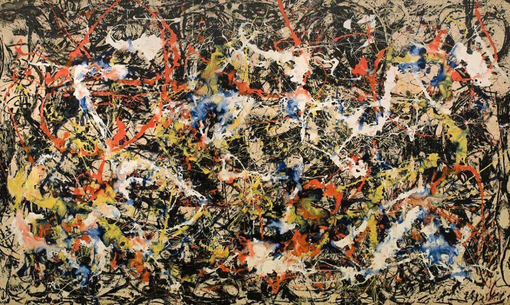
“Convergence” by Jackson Pollock is a sea of conflicting colors that creates a sense of uneasiness for the viewer. (Source: Jackson-Pollock.org)
Put in the simplest of terms: color drives people’s actions—whether they want them to or not. This is because the reaction to color is automatic and deeply emotional. Viewers tend to react based on emotion, and that’s true of customers, as well.
Depending on your situation, color will help determine your course of action. Think about the last time you were in a medical situation.
You were stressed and nervous, you probably didn’t have full possession of your faculties, and maybe you didn’t know what the next steps were going to be. The signage, instructional placards, and posters are all designed with adjacent hues of blue because blue conveys a reassuring authority and prompts you to follow instructions.

Few things are more stressful than a dental visit, which is why this poster employs lots of blues. (Source: Venngage)
In the medical situation I just described above, note one key factor is missing: conscious thought. Do you stand in the waiting room of the ER and think, “How does that blue poster make me feel?” You simply see it and begin following the instructions.
Were the poster printed in bold red with orange accents, you would recoil from it, as red means “Stop! Danger!” To follow those printed instructions, you’d have to overcome the sense of warning the color red imbues.
In either color case, your reaction—and the actions that follow—directly result from the automatic influence the designer’s color choice has on your psychology.
Finally, color responses are not 100% clear-cut. After all, in addition to warning you not to cross the street without checking first, red is a Christmas color and a color that fosters lively conversation around the dinner table in the State Dining Room at Buckingham Palace. The context in which a color is used is just as important to psychology as any other factor.
Another key example of how context drives color meaning can be found in the varied uses of green. In the context of driving your car, green means “Go!” But if you’re driving to the bank and walk into a lobby with green walls, the color green has another meaning altogether. In your car it meant it was safe to move forward, but in the bank lobby, green means money. In particular, in the context of a bank lobby, we associate green with more money.

The lobby of Bank of the West is a vibrant green, which tells visitors, “Your money grows here.” (Source: Yelp)
Each of these principles is simple to understand. We’ll examine each one in order to better understand how to use these concepts in building the brand for your small business.
The Psychological Effects of Each Color
By now, you’re probably beginning to associate each color with the psychological impact it has on the viewer. Blue conveys strength and authority while red represents a warning or energy. Scientists studying color psychology have broken colors down into categories to help artists, designers, and—yes—branding experts better exploit the emotional impacts of color.
One thing that should be jumping out at you is each color we’ve discussed can have both positive and negative effects. Blue is calming, reassuring, and conveys strength. It also is the color of sadness and depression. Red is vibrant, exciting, and energetic. But it also carries with it warnings of danger or orders to stop.
While there are many, many colors (and associated effects of those colors), usually researchers, branding experts, and designers break them down into nine categories: black, white, red, orange, yellow, green, blue, and purple. For each color, certain emotional or psychological responses can be ascribed. This breakdown of color responses from jobs site Indeed.com provides the following breakdown:
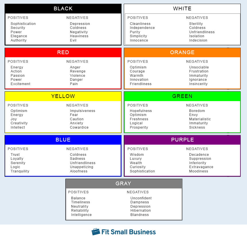
A selection of colors and associated emotions. (Source: Indeed.com, Fit Small Business)
Remember Jackie O and her redesign of Air Force One? Prior to the 1962 livery redesign, the president’s plane had been orange, white, and silver. Mrs. Kennedy disliked this scheme, as she felt it was garish. That makes sense if you consider orange can trigger emotions of frustration, unsociableness, and insincerity. For her redesign, Mrs. Kennedy chose various saturations blue, which suggests trustworthiness, logic, and stability.
Be careful, though, because these color impressions aren’t hard and fast rules. A lot goes into the application and interpretation of color psychology, as Art Therapy Blog explains.
“The psychology of color is based on the mental and emotional effects colors have on sighted people in all facets of life,” Art Therapy writes. “There are some very subjective pieces to color psychology as well as some more accepted and proven elements. Keep in mind there will also be variations in interpretation, meaning, and perception between different cultures.”
How to Use Brand Color Psychology in Your Small Business
The writers at Indeed.com provide some valuable advice: “Most colors represent specific feelings, so it’s best to choose brand colors that evoke the emotions you’d like customers to feel when they see your brand.”
To put color psychology in marketing to work, you need to ask yourself a few questions about your brand and about your customers. These questions will help you choose the right colors to produce the effects you need in order to convert potential customers to paying customers. Here are the two key questions to consider:
Are There Colors Closely Associated With My Industry? If So, Why?
Many industries are associated with specific colors. We’ve already talked about banking’s use of green to signify prosperity. But green is also closely associated with both landscaping and health foods due to green’s relationship to impressions of freshness. Put another way, we view the outdoors as healthy, and using green puts both Tony’s Landscaping and Whole Foods closer to nature.
A similar situation occurs with blue, which shares relationships with both healthcare and beverages. Blue isn’t just reassuring and trustworthy in a healthcare setting. It also conveys emotions of tranquility and logic. If you’re thirsty, soothe your thirst with a cold bottle of Dasani or Aquafina.

Coca-Cola uses blue branding for its Dasani line of purified water. (Source: Coca-Cola)
There are dozens of associations between colors and industries. Chances are, if you just look at your immediate competitors, you’ll start to see some common colors between them.
What Emotions Will Most Likely Drive My Customers to Buy?
Put yourself in your customer’s shoes for a moment and ask yourself what emotions would drive you to buy your product. Maybe you’re running a family restaurant focused on serving up delicious comfort foods. Perhaps you’re a retail boutique specializing in happy, vibrant fashions. Or you could be a law office seeking to impart authority and wisdom.
Look at the Emotions of Color chart above and try to associate those emotional goals with the psychological effects of each color. For the restaurant serving comfort foods, shades of orange give a sense of warmth and friendliness. The retail boutique could combine yellow and purple to signify optimism, energy, and luxury. Or the law office might utilize blacks and yellows to impart a sense of authority and intellect. (Note that bolded words correspond to the chart.)
In each case, emotion ultimately drives purchase intent. Customers looking for a good, home-cooked meal will respond to the warmth of my restaurant’s logo and branding. A woman seeking a peppy, fun, new look for summer will lean into the yellows and purples of my boutique’s sign and window decor. That father seeking an estate plan to provide for his family will rely on my skill and knowledge of the law.

Marrone Law Firm uses blacks and yellows to drive client conversions. (Source: Maronne Law Firm)
If you’re just starting your new business, you can immediately begin to apply these theories and principles to every aspect of your branding. For businesses that are already up and running, you’ll need to assess how your brand’s use of color is influencing potential customers—both positively and negatively.
A logo that is black and gray can impart a sense of power and reliability. But change the context, and suddenly it triggers thoughts of hibernation and coldness. Black and gray are great colors to use if you’re a real estate agency, where achievement and predictability are valued. But if you’re a landscaper, they’re horrible colors because we naturally associate them with decay and death.
4 Examples of Brand Color Psychology in Marketing & Why They Work
There are some brands that just seem to knock it out of the park when it comes to their use of brand color psychology. We recognize these brands and have an almost overwhelming sense of confidence each brand will deliver what it promises. This visceral, automatic response is just one of the ways color psychology can shape brand identity. Here are four examples of brand color at work:
Color scheme: Orange and white
Psychological impact: Optimism, courage, independence, and simplicity

Orange Theory’s website uses orange and white to create a sense of optimism, courage, independence, and simplicity.
Orange Theory is a fitness franchise specializing in circuit training to promote general health, weight loss, and athleticism. The company’s value proposition is straightforward: they help busy members maximize the impact of limited workout schedules. To do so, the workouts must be simple, straightforward, and achievable.
Through the use of an orange and white color scheme, Orange Theory reinforces this value proposition: independent workouts that lead to achievable results for driven individuals. Orange provides hopeful courage, while white lends itself to thoughts of independent workouts that are simple enough to achieve. When combined, the viewer sees Orange Fitness’ workouts as built around their availability and simple enough that they can do them without a lot of intervention. Also, they believe the most critical thing: an Orange Theory workout works.
Color scheme: Green and white
Psychological impact: Prosperity, freshness, cleanliness, and purity
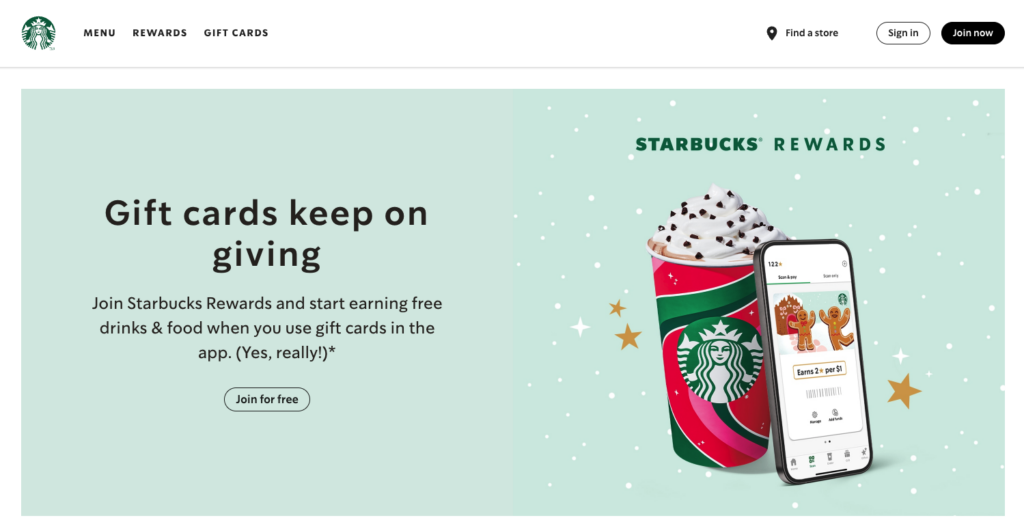
With its green and white, Starbucks suggests its products are fresh, clean, and pure for a prosperous customer base.
Starbucks’ business model is simple: come to our cafes for a great cup of fresh premium coffee. To achieve this, the company employs a color scheme almost exclusively green and white.
With green, the company simultaneously signifies the fresh-brewed nature of its coffees and the relative luxury of purchasing a custom-brewed beverage. After all, don’t we feel especially rich when we buy that $6 mocha? White provides a sense of cleanliness and purity, two important traits we look for when it comes to the foods and beverages we consume.
Color scheme: Black and white
Psychological impact: Independence and power
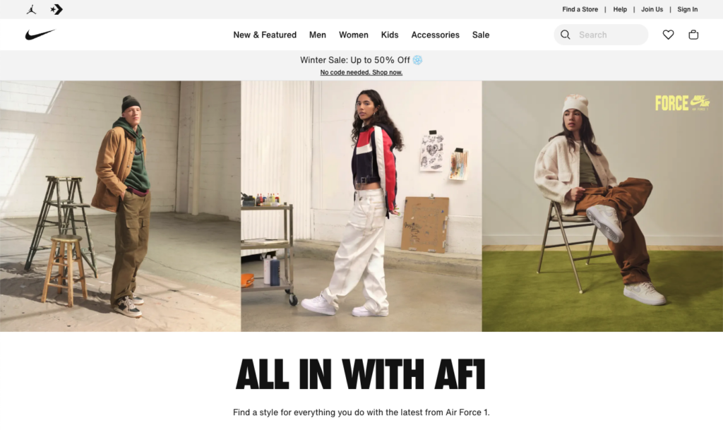
Nike’s website proclaims the power and independence of people wearing its products.
When it comes to athletic wear, you might think the best choices would be bold reds and yellows to symbolize energy and passion. Nike would disagree. For its color scheme, it chose the simplest of the simple: black and white.
The black logo and large, bold, black text say these shoes give people wearing them the power to achieve their goals, while the ample use of white feeds an independent spirit. That combination provides motivation that every athlete understands: individual achievement. The simplicity (again, leaning into the white) is best summed up in its motto: Just Do It.
Or, put another way, it’s right there in black and white.
Color scheme: Red and white
Psychological impact: Energy, excitement, purity, and innocence
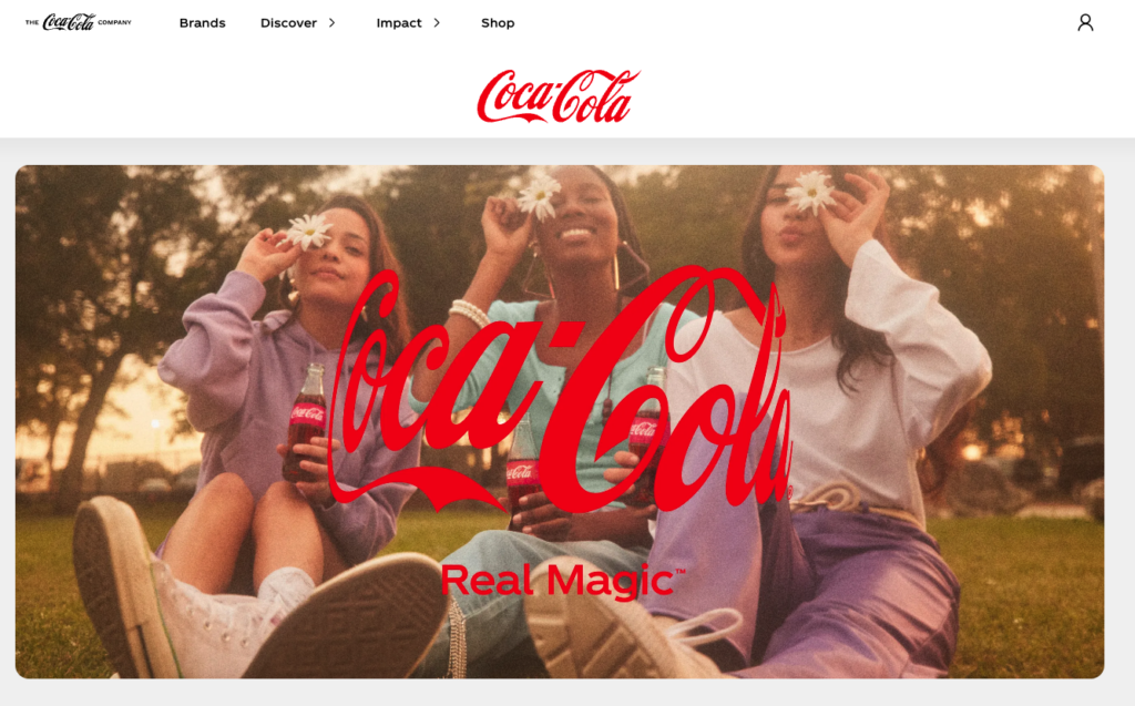
Coca-Cola’s website gives viewers a sense of excitement and innocence.
When it comes to brands, nobody does color psychology better than Coca-Cola, the soda maker that’s conquered the globe. Every day, customers consume 1.9 billion servings of Coke products. Even after more than 100 years, the flagship product continues to be Coca-Cola, lining shelves and coolers in every convenience store with its bright red-and-white can or bottle. To say Coke takes color very seriously would be an understatement.
Every can of Coke, every Coca-Cola sign, every T-shirt ever printed uses precisely the same hue of red, which is unique to Coca-Cola. There isn’t even a Pantone color code for the red they use, and Pantone is the authority on all things color. So why red and white?
Red delivers feelings of energy, action, excitement, and passion. White symbolizes the purity and simplicity of the product, connecting customers to the innocence of enjoying an ice-cold Coke.
As you can see, a lot of our perception of a brand is driven by the colors the designers chose to represent that brand. From bold, courageous oranges to pure, innocent whites, color is quite literally the very first impression your customers will ever have of your brand.
Brand Color Mistakes to Avoid
Remember that dining room in my first house? Things didn’t go exactly as planned. In fact, my first attempt at a lively, stimulating conversational space ended in abject disaster. You see, the paint specialist mixing my bold, spicy red got butterfingers. What was supposed to be somewhere between candy apple and crimson (two shades of red) came out a very loud shade of magenta known as Royal Fuchsia.
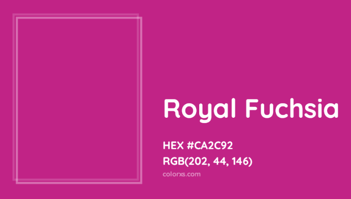
Royal Fuchsia is a loud, vibrant color that probably isn’t best for a dining room. (Source: ColorXS)
Instead of proclaiming “This is a space for spirited, engaged conversation and camaraderie,” the walls screamed, “A crazy eccentric lives here!” (The deeper you dive into color psychology, the more nuanced it becomes. Fuchsia is a color commonly associated with creativity, free-spiritedness, and a uniquely independent streak.)
We didn’t use the dining room for a week until I had time to repaint it with the appropriate shade of red. Through no fault of my own, I had made a color psychology mistake. You can avoid the travails of a fuchsia dining room by avoiding these common faux pas:
- Avoid colors that might trigger negative reactions in your industry: Just as a landscaper might want to avoid using black because of its association with decay and death, a daycare center might avoid certain cool shades of blue because these colors can give viewers a sense of coldness or unfriendliness.
- Don’t combine colors that create a negative meaning: It’s not just about how an individual color affects viewers. You also have to pay attention to how combinations of colors can lead to negative reactions, as well. Green and red may be great for Christmas products because they’re associated with excitement and optimism. But using green and red for a doctor’s office might give your patients feelings of sickness and pain.
- Refrain from playing fast and loose with your brand colors: Avoid frequent changes to the color schemes you use. Your brand identity needs to be consistent. Coca-Cola red has been exactly the same for more than 100 years for a reason. Consistency is important when you’re trying to cement your brand in the minds of potential customers.
- Don’t be a slave to color psychology: While color consistency is very (very) important, at the same time don’t be so nailed down that you can’t have a little fun. There are plenty of brands that take an iconoclastic approach to color theory—throwing out the rules and creating logos with clashing colors that pay absolutely zero attention to brand color psychology.
Just look at Google. I mean, what’s with that random, green L? Google was completely unafraid to step outside of “good” color theory—and with excellent results.

Google’s iconoclastic logo blends competing primary colors and, almost inexplicably, one secondary color in the green L, sandwiched in between blue and red. (Source: Wikipedia)
Frequently Asked Questions (FAQs)
Color is an important part of branding because individual colors can induce automatic psychological responses in potential customers. By paying attention to how both individual colors and color combinations can affect viewers, you can either improve the odds a customer will buy your product or service or guarantee they’ll go with someone else.
Color defines your brand in two key ways: through color psychology and learned association. When a potential customer first encounters your logo, flier, or website, the colors you chose will trigger an immediate and automatic psychological response that can either be positive or negative. This is color psychology. As time goes on and the viewer repeatedly encounters your brand, they’ll associate those colors with it. This is learned association.
The best colors to utilize in your branding will depend on two questions: what industry are you serving, and what effect do you need to create in your customer’s mind? The answers to these two questions will vary by industry, as certain colors are closely associated with specific activities. The answers will also be affected by the specific goals of your individual business. Ultimately, only you can develop the right combination of colors to achieve your goals.
Bottom Line
Any time I start a new branding project, one of the first factors I consider is the combination of colors I’ll need to use to land the message with consumers. By paying close attention to the way colors affect viewers and interact with one another, it’s possible to create a positive emotional experience for each customer. In turn, this can help guide them along their buying process, ultimately encouraging them to become your customer.