When you decide to start a small business, you’ll most likely think at least a little about where you’ll advertise your new venture. What you might not consider is how you’ll convey to graphic designers, advertising copywriters, and website designers how to talk about your brand, the colors you want to use, and the dimensions of your logo. That’s all information included in a brand style guide.
A brand style guide is a written document outlining how the various elements of your brand should be used in various types of media. Also known as brand guidelines, this document controls colors, logo usage, and the tone of advertising copy. It is critical to establishing brand standards.
Taking the time to create a brand style guide will help you while building initial brand presence and down the road, when you start advertising your business to potential customers. Keep reading to learn how to build your brand guidelines and to download our free brand style guide template.
Why Brand Guidelines Are Important
Brand style guides are important because they’re the primary method you will use to convey your brand identity to marketing professionals outside of your company. At the same time, these brand guides will govern how your own team members use your brand elements internally.
Brand style guides aren’t just for giving to advertising media. It’s for your own use, as well. You can refer to your own guide to help inspire and shape the advertising you run.
Download the Brand Guidelines Template
To get started, download the template below and then work through your guide as you move through the steps. You can select a Google Doc, a Microsoft Word DOCX, or a PDF.
Armed with the style guide template, work through each of the sections below. If you haven’t created some of these elements yet, don’t panic, because we can show you how to do that too.
Compile the Elements of Your Brand Style Guide
In the simplest terms, building brand guidelines requires little more than gathering elements you’ve already created. You’ve got a logo, picked brand colors, and maybe even written a brand story. But in case you haven’t completed any of these materials, you can click on each of the headings below to learn a little bit more about each branding element you’ll include in your style guide.
A brand story is a straightforward narrative telling the story of your company. It includes details about why you chose to start your business, your unique value proposition, and the development of your brand. It’s also the first place you’d demonstrate your brand voice.
Many business owners neglect to write a brand story, and this is a mistake. You may not enjoy writing, but taking the time now to create your brand story will help guide you through marketing and advertising your business for decades to come.
The second element you’ll include in your brand style guide will be the basic identity materials that define your company and its goals. These materials include:
- Mission statement: A short statement explaining the “why” of your business. Nike’s mission statement is “To bring inspiration and innovation to every athlete in the world.” (And to Nike, everyone with a body is an athlete.) Learn how to write a mission statement.
- Vision statement: A high-level view of what you want your company to become. Sticking with Nike, their vision statement is “to remain the most connected, authentic, and distinctive brand.” Learn how to create a vision statement.
- Core values: The principles that guide how you do business, usually expressed as a list of words. Nike’s core values are: Community, Sustainability, Diversity, and Social Responsibility. Read more about building your core values.
- Brand positioning statement: A detailed description of factors such as your company’s place in the industry you serve, your core customers, and your unique selling proposition with the goal of explaining your value in the market. Learn how to create your brand positioning statement.
Add each of these statements to your brand style guide in the space provided. Once that’s done, it’s time to move on to the next part of the process.
A logo is usually the first impression potential customers have of your business. Consistently using your logo will help cement your brand identity in the minds of your customers. At the same time, the kinds of graphics you use should also be a significant part of your brand guidelines. We’ll look at each in turn below:
Logo Guidelines
You might think “I have a logo, so what else is there to say?” But think about this: Your logo has at least two features you need to use consistently—width and height.
The most important aspect of your logo is its proportional scale (also known as its relative dimensions): the ratio of its width to height. You’ve probably seen a logo that looks “squished” to squeeze it into a place it otherwise would not fit. This is a bad idea because it not only changes the look of your logo, it can also make your designs look cheap or low quality.
Calculating a logo’s proportional scale requires you to know how wide and how tall your logo is in some scale. You can check the dimensions of the image, measured in pixels, or you can print it out and put a ruler to it.
Armed with those measurements, go to this proportional scale calculator from ScriptyGoddess.com. In the first box, enter the width you measured and in the second the height you measured. Then, in either the third or fourth box, set the lowest measurement to one and click “Resize.” The proportional scale are the New Width and New Height.
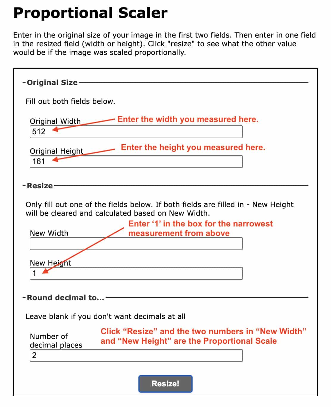
A screenshot of ScriptyGoddess’ Proportional Scale Calculator
Now that you have your logo’s proportional scale, put a copy of that logo into your brand style guide and record the relative dimensions there.
Other Graphics
You’ll most likely use other graphics on your website, in advertisements, and on social media. Take a moment to gather several of these graphics and include them in your style guide to demonstrate the general look you’re shooting for. Describe briefly why you chose these images.
Brand colors can say a lot about your business. That’s in no small part due to brand color psychology—the emotional effects a color can have on the viewer. Take a look at Fit Small Business’ brand color palette.
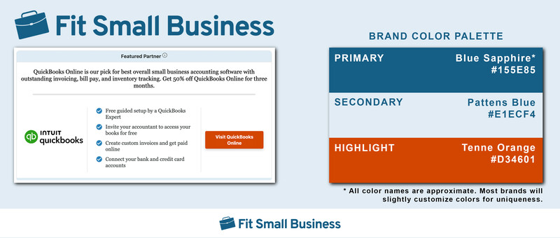
Fit Small Business utilizes a three-color palette, plus black and white.
Blue is frequently associated with trustworthiness and logic. The orange highlight color stands out while suggesting optimism and innovation. If you need help or inspiration, read our guide to choosing the right brand colors.
Take a few minutes to think about the colors you want to use for your brand. Then, record those colors in your brand style guide. In particular, you’ll want to include:
- Color swatches: A small patch of the color in question. In some cases, you’ll need the hex code described below to create the swatch.
- Hex code: A combination of six digits or letters computers use to recreate a color. Example: Pure white’s hex code is #FFFFFF, while Primary Red is #FF0000. You can find hex codes using many graphics programs or by looking up color palettes on Google.
- Color name: Either the name of a color, such as ruby red, or the general color family, “red.” You can look up color names at the Official Registry of Color Names.
Finding and recording brand colors in your style guide may be the most technically challenging aspect of creating your guide. But it’s worth it because, without it, designers may alter the colors, which can corrupt your logo and your brand identity.
The final component you’ll record in your copy of our brand guidelines template will be the fonts you use and how you use them—known collectively as typography. You can get really detailed in your typography description, but you don’t have to.
Most businesses can get by simply entering the primary font and any accent fonts they use. Most brands will include at least two fonts: a headlines font for headings and bold text, and a body font for general text. Some brands even keep things simple and choose a single font and use bold, italics, and font sizes to call attention to various places.
Now that you’ve listed your fonts, you’ve completed a working draft of your business style guidelines. Take the document you just created and remove any of the examples and instructions. What you’ll be left with is your brand style guide.
3 Brand Style Guide Examples (+ Why They Work)
Even though you’ve worked through your brand guidelines template, you may still wonder if you’ve included the information you needed to. Take a look at these three examples for inspiration, guidance, and maybe a little bit of fun.
1. Starbucks: Strict Rules & Plenty of Freedom
Fit Small Business’ marketing team spends a lot of time thinking and writing about Starbucks. That’s because the company gets its marketing so right so consistently. One part of its track record is the detailed Starbucks style guide, which outlines virtually every aspect of the company’s marketing and branding.
Its guide includes extensive examples of color use, fonts, and typography, and even a timeline of its logo over the years. This information is gold for marketers helping promote the company.
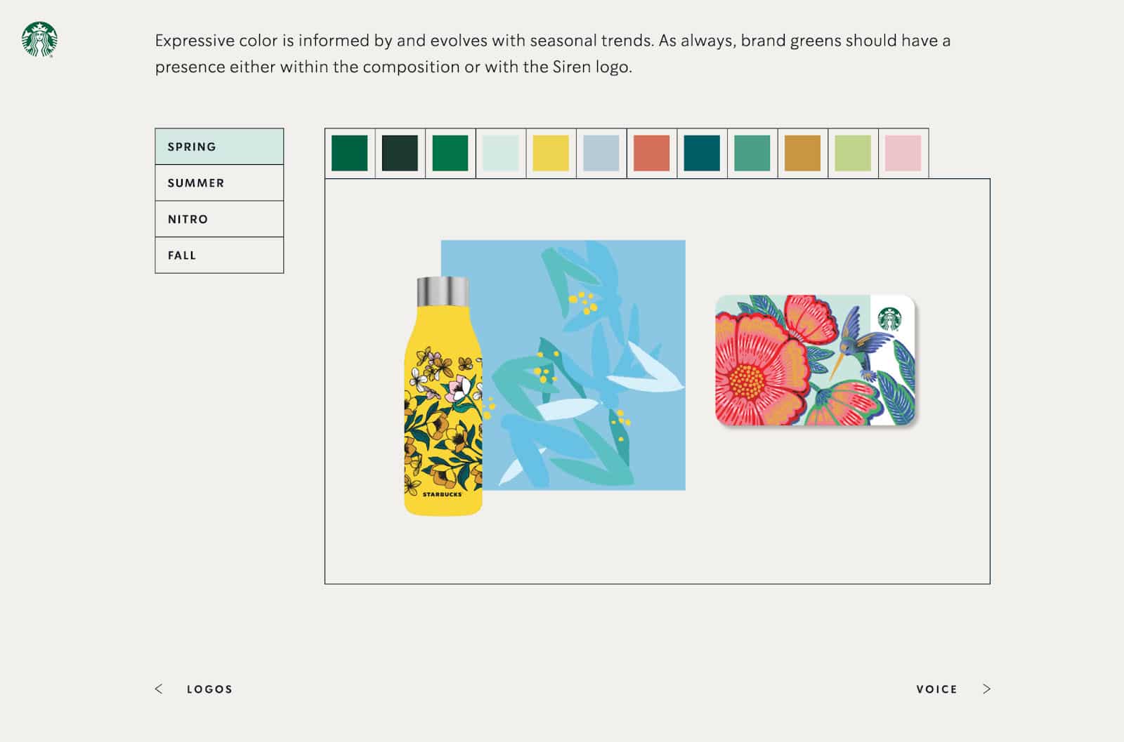
The Starbucks style guidelines include detailed descriptions of each element, including seasonal colors as seen above.
Why It Works
Starbucks has invested heavily in its branding, and it shows. Each element of its style guide provides strict instructions for how its logo, colors, and branding should look. But, it also allows for a tremendous amount of design creativity, which results in a vibrant brand that engages customer imaginations.
2. Burger King: Bold Fonts & Bold Graphics
When Burger King says “Have it Your Way” (and we know you sang that, because it’s an integral part of their brand style), they help you envision your way by showing you the ideal way. To accomplish this, the Burger King style guide includes extensive details on fonts and typography and instructions on how to photograph its food for maximum effect.
Take a look at just a single page from Burger King’s brand guidelines, and a few things should jump out. First, it uses Burger King’s own guidelines throughout the document. That heading font is the same typeface as in its advertising. The photo meets Burger King’s recommended technique. Even the colors are Burger King colors.
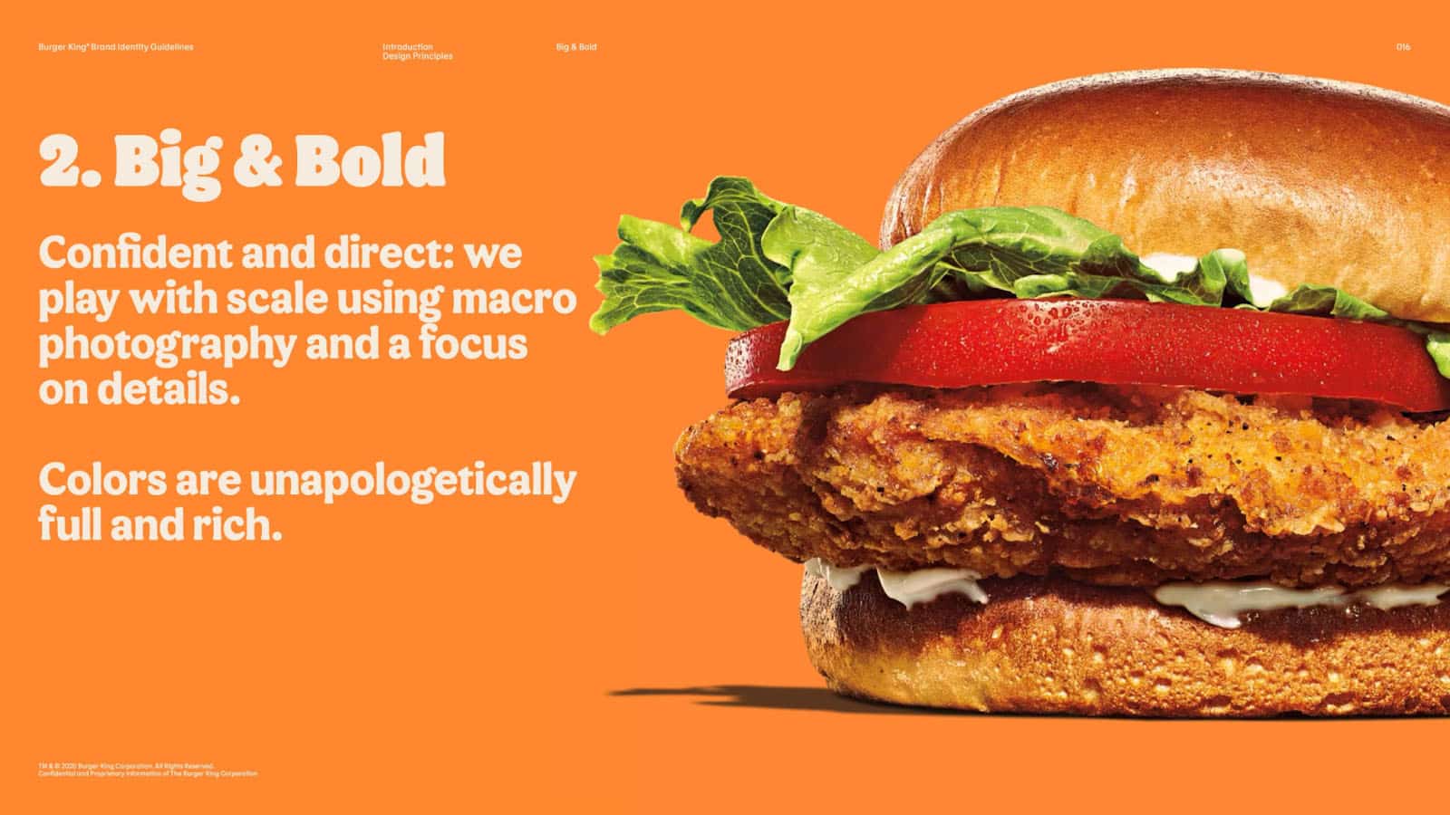
Burger King’s style guide includes extensive guidance on images—including how to photograph its food and beverages.
Why It Works
Burger King’s style guide works for two reasons. It is incredibly detailed and specific, going so far as to explain each of its branding goals in a series of do’s and don’ts. At the same time, it’s visually rich, using Burger King’s own style, which provides both examples and inspiration to designers and marketers.
3. NASA: Inspiring & Aspirational
Bill Nye the Science Guy regularly calls NASA “the best brand the United States has.” He’s not wrong, either. When it comes to creating an instantly recognizable brand, few organizations have done better than NASA.
Its brand style guidelines include an overwhelming amount of detail on how the various elements of the NASA brand are to be used. It also includes extensive breakdowns of the imagery and symbolism of its logos, graphics, and typography.
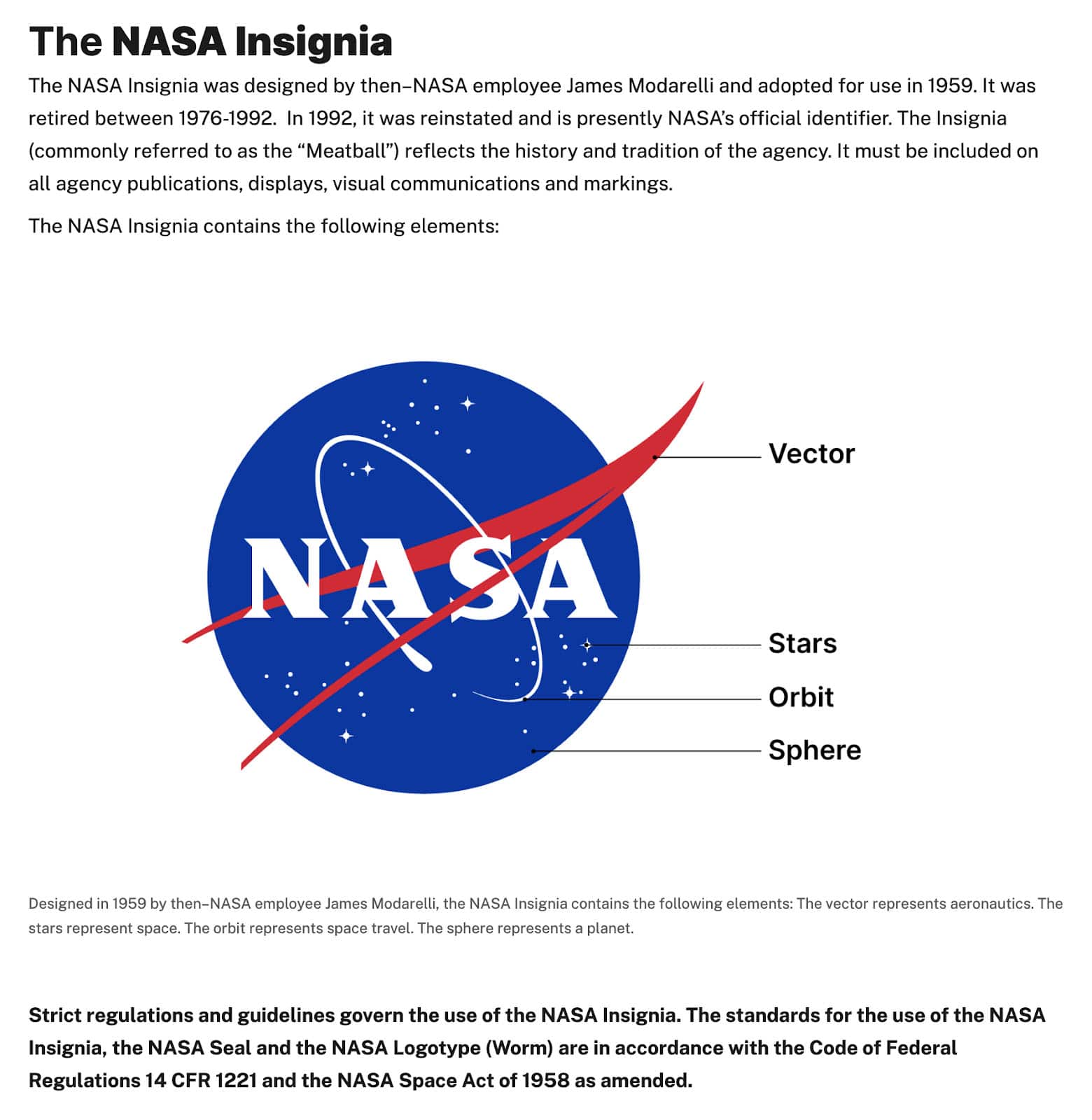
NASA’s guidelines include a lot of detail about the why of the brand—including the symbolism of its iconic logo.
Why It Works
Here’s the thing about NASA’s branding: Absent strict guidelines and detailed explanations of the symbolism behind its logos and imagery, the brand really wouldn’t be very good. Sure, the NASA logo landed the #10 spot on our list of most iconic logos, but even that logo was called “the Meatball” when it was first introduced.
NASA’s brand works because of the symbolism and the consistency—a consistency that happens to be backed up by federal law. (Not kidding. Look up U.S. 14 CFR 1221 and the NASA Space Act of 1958.)
Frequently Asked Questions (FAQs)
How do you write a brand style guide?
First, gather the materials you’ll need to include. Those materials are your brand story; your vision, mission, core values, and brand identity statements; your logo and graphics; a detailed inventory of your brand colors; and the fonts your brand uses in its logo, on websites, and in print materials. Compile those materials in a single document and include specific instructions and examples of how each element is used.
What should a brand style guide include?
A brand style guide should include the following: your brand story; your company’s mission and vision statements, a list of its core values, and an explanation of the company’s brand identity; any logos and graphics; the brand’s colors; and the various fonts and typography your company uses. Additionally, you might include examples of each usage, comments about the tone your ads should set, and examples of your brand personality.
Why are brand guidelines important?
A well-drafted brand style guide serves as a foundational, governing document over your advertising and marketing. Brand guidelines explain to advertisers and marketing professionals the ins and outs of your brand, the colors they should employ, and the manner in which each element of your brand can be used. Ultimately, an effective brand style guide will help preserve your brand identity and shape how customers perceive your business.
Bottom Line
Now that you’ve compiled your first brand style guide, you’re ready to hit the ground running with advertising and marketing. Your brand identity will appear consistent, well-considered, and stronger. As a result, it’ll be easier for customers to recognize your brand when they see it and remember your business when they decide to make a purchase.
