First, a question: What is the very first impression the vast majority of potential customers will have of your business? Chances are you said, “My logo.” And it’s true. The best brand logos make powerful first impressions and cement those brands in the minds of the people who might eventually buy whatever the business is selling.
But is your logo making the right first impression? An effective logo is one of the core parts of building a strong brand presence. Think about the companies you frequent and those companies’ logos. Those logos are as varied as the products and services the companies offer.
To help inspire you, we’ve compiled a list of the best brand logo examples to highlight everything a logo can be. Before you dive in, take a quick moment to familiarize yourself with the kinds of logos you can choose from. Then, keep reading for inspiration.
6 Common Kinds of Brand Logos
Before settling on a logo design, a business first needs to determine what type of logo best serves its needs. While you can choose from dozens of logo variations, most logos fall into six common categories of design.
- Wordmarks: When a logo contains a word, such as the business name. Examples include Google, Ford, and Facebook.
- Monograms: Similar to wordmarks, but featuring abbreviations or initials. Examples of monograms are IBM, Louis Vuitton’s LV, and General Electric’s GE.
- Emblems: Combines writing inside of some other symbol, such as a badge or coat of arms. Famous emblem logos include Harley-Davidson, Porsche, and Levi’s.
- Mascots: Using illustrated characters to represent the brand. The Kool-Aid Man, Planter’s Peanut Man, and the Pillsbury Doughboy are great examples.
- Pictorial logos: Graphic logos or icons used to represent a brand. Target, Shell, and Domino’s Pizza all use pictorial logos.
- Abstract logos: Similar to pictorial logos, but the icon isn’t something recognizable. Chase Bank, Mastercard, and the Olympics are represented by abstract logos.
Now that you’re armed with a bit of logo know-how, it’s time to dive into business logo design.
1. Coca-Cola

First introduced: 1887
Designer: Frank Mason Robinson
Like so many great American brands, the Coca-Cola Company began in humble circumstances when a pharmacist in Columbus, GA, created a new medicinal tonic to treat headaches. John Stith Pemberton sold his recipe in 1892, but not before his bookkeeper drew the first version of the logo that would become the most valuable and recognizable logo in the world. For more than 130 years, Frank Mason Robinson’s creation has remained relatively unchanged.
While the Coca-Cola logo has become slightly more refined over the decades, it still retains the core elements of Robinson’s original design. The wordmark logo is drawn in Spencerian script, a common form of business cursive in the late 1800s.
What Works
The first thing you’ll notice about Coca-Cola’s logo is the distinct way it flows, with the wavy script carrying the reader through the line of text. At the same time, there is just enough variation throughout the design to keep the viewer stimulated. While Coca-Cola is alliterative, the two Cs are completely different, sharing no common traits. Meanwhile, the hyphen between the two words is placed at the top of the A, rather than centered between the two words.
While both Cs are of relatively equal height, “Cola” descends by a third, resulting in a natural flow that’s echoed in each of the Cs. A distinctive, custom shade of red is the final factor underpinning the iconic status of the Coca-Cola logo. In fact, there is no Pantone code for Coca-Cola red, which is a blend of three different reds—and the formula for Coca-Cola red is almost as protected as the formula for Coke itself.
2. Nike
First introduced: 1971
Designer: Carolyn Davidson
The history of the Nike logo ranks among the most famous branding stories in all of advertising. In 1971, Phil Knight went in search of a designer to create a look for his athleticwear company, Blue Ribbon Sports, which he was rechristening as Nike. At the time, Knight was a professor of Accounting at Portland State University, so it made sense to find someone in the graphic design department who could complete the work. It turns out that person was a student, Carolyn Davidson.
Knight paid only $35 for the logo—a pretty sweet deal considering today it’s valued at more than $26 billion. That’s a 74 billion percent return on investment. Not bad for a college student’s work.
What Works
On first impression, the Nike logo just looks like a fat checkmark. But it’s so much more than that. Here is the first clue to interpreting this iconic logo: if you’re wearing a pair of tennis shoes, look down at the profile. See the fat heel, the tapered toe? Now think about the act of running—heel-toe, heel-toe. The Nike logo is an abstract recreation of their primary product. But there is more.
By weighting the bottom left corner of the logo and tilting the remainder, not only does Davidson call attention to the shoe-esque shape, she also imbues a sense of motion, starting at the tiny peak in the top left of the swoosh, building through the trough, and exploding forward into another, tiny little peak. That’s a lot of thought and meaning crammed into a college student’s $35 side project.
3. Apple
First introduced: 1977
Designer: Rob Janoff
Apple’s logo hasn’t always been an apple. Its first logo, in use from 1976 through 1977, featured a complicated, photo-realistic etching of Sir Isaac Newton seated under an apple tree. But when Steve Jobs was preparing to introduce the Apple II, he knew the company needed a simpler logo—and one that was easy to reproduce on its formed plastic cases. To create this new, simple logo, Jobs turned to famed logo designer Rob Janoff.
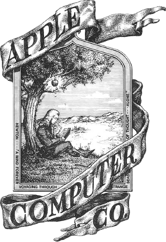
The original Apple logo was cluttered, busy, and almost impossible to reproduce. (Source: Wikipedia)
Of course, Janoff leaned into the company’s name and created a silhouetted apple. Because the Apple II featured the first color display, Janoff overlaid the silhouette with a spectrum of colors. Then, Janoff removed a bite from the apple.
Over the years, many legends have risen up about the choice of an apple missing a bite. The logo’s lore includes theories based in religion (Eve in the Garden of Eden), mythology (golden apples of the Hesperides), even history (Alan Turing famously committed suicide by eating a poisoned apple). However, the reality is much simpler: Steve Jobs liked apples, and absent a missing bite, the silhouette of an apple looks just like a cherry.
What Works
This pictorial logo is almost too simple to interpret. It works because the image is literally the company’s name. Even in its original rainbow form, the Apple logo is sleek and modern. It exudes “now.” But, at the very core (see what we did there? Core?), the Apple logo works because it is, simply, an apple.
4. I (Heart) New York
First introduced: 1977
Designer: Milton Glaser
If you’ve ever visited New York City, you’ll have seen this logo everywhere—and we do mean everywhere. It’s on bus stops, subway cars, signs in bodega windows, and stickers on hot dog carts. This logo is quintessential New York City, right? Ironically, the logo was created as part of a 1976 tourism campaign led by the New York State Department of Commerce.
As part of the campaign, the phrase “I love New York” became the official state slogan and the title of the state anthem. In 1977, Deputy Commissioner of Commerce William Doyle realized the campaign needed a logo and reached out to brand designer Milton Glaser. Glaser took on the work pro bono, figuring it would be good exposure for his growing business.
There was just one hiccup: At first, Glaser struggled with finding a design that worked. That was until inspiration struck in the middle of a Manhattan traffic jam. Glaser scribbled the original design—a single line of text that read I (heart) NY on a single line. Very quickly, Glaser stacked the logo in the design we know and love today. The original crayon sketch is on display in New York’s Museum of Modern Art.
What Works
The final version of the logo text is in American Typewriter font—which was still a ubiquitous typeface in the 1970s. The typeface was popular because it was easy to read, but it also lends a sense of commercial, business, and industry to the logo, all of which are core parts of New York’s identity. The bold red of the heart draws the viewer’s attention and adds a touch of whimsy, breaking up the somewhat sterile American Typewriter text.
Though it’s still the official logo for New York State, over the years it’s become synonymous with New York City. While the logo had fallen out of use by the 1990s, that all changed with the terrorist attacks of September 11, 2001. When people started searching for a way to show their support, this iconic logo experienced a massive resurgence.
5. Burger King
First introduced: 1969
Designer: Jones Knowles Ritchie (2021)
Burger King first introduced its burger emblem logo in 1969. This logo has remained in use within the company since then, undergoing minor modifications over the years to keep up with changing design styles. The most recent version was created in 2021 by London design firm Jones Knowles Ritchie. Designers made the burger buns a little taller and replaced a dated font with a more contemporary one.
However, the world’s second-largest burger brand has remained relatively loyal to this blend of pictorial and wordmark logo, only partially departing from this design in 1999 with the introduction of the equally iconic, round logo. Even during this rebrand, though, the burger emblem remained.
What Works
Like Apple, the first trait that makes this logo so iconic is the fact that it is a burger. Add the wording to it, Burger King, and the restaurant’s primary product is transparent to potential customers. The brand color psychology is equally meaningful, with the orange suggesting friendliness and warmth, and the red conveying a sense of energy and excitement.
6. BMW
First introduced: 1917
Designer: Müller Agency, Switzerland
The story of the BMW logo is well-known. It’s a propeller, spinning against a blue sky, a graphical ode to BMW’s famous plane engines. Unfortunately, the well-known story is just that—a story. The actual meaning of the BMW logo is much less romantic, and its design has its roots in the earliest days of company history, when it was Rapp Motorenwerken, an airplane engine manufacturer.
The Rapp logo was a round chevron surrounding the silhouette of a knight chess piece. When the company rebranded to Bayerische Motoren Werke in 1917, it needed a new logo. For this, the company turned to Müller, a Swiss design firm. Müller truncated the company name to its initials and replaced the knight with a four-quadrant blue-and-white field suggesting images of the flag of Bavaria—the company’s home state.
Simplicity aside, the propeller myth endures to this day, repeated by unsuspecting ad agencies, car aficionados, and even finding its way into “Finding Forrester,” starring Sean Connery.
What Works
The BMW logo is strong and instantly recognizable. At the time the company was founded, it leaned into its geographic roots, lending a sense of nationalism to the logo at a time when Bavaria was struggling to establish itself as a free state. But that history aside, today it endures because of the abstract logo’s simplicity and balance.
It is bold enough to be recognized at a distance and quite quickly—both traits important to advertising a moving vehicle. It’s also unique among logos, thanks to those pretty blue and white quadrants.
Of course, the plane story helps too.
7. Starbucks
First introduced: 1971
Designer: Terry Heckler
When Seattle-based coffee titan Starbucks was starting to rise, the company asked Terry Heckler to create a logo. At the time, Heckler was the art director for Seattle Magazine. For the Starbucks logo, he crafted a brown emblem comprising the company name (then Starbucks Coffee and Tea) surrounding an intricate, bare-breasted siren mascot. Heckler’s original logo endured until 1987, when a merger necessitated the first redesign.
Since then, the company’s logo has evolved. That first redesign saw the elimination of “coffee and tea” as well as a shift from brown to green. A second redesign followed in 1992, when the logo zoomed in slightly to focus solely on the siren’s face. In 2011, Starbucks updated the famed siren once more, this time modernizing the logo with crisp, linocut lines and the elimination of the company name, transforming the original logo into the mascot mark we see today.
As Starbucks’ website puts it, “Starbucks global reach extends beyond the bounds of coffee, and our Siren, now so familiar, can surely stand on her own.”
What Works
One peculiar trait of mascot logos is psychological. Customers tend to form a peculiar bond with a corporate mascot. (Flo from Progressive is one of television’s most recognizable and loved characters.) If a company can combine that mascot with its logo, that relationship grows deeper. All a customer need see is the siren, and they think, “I’d like a cup of coffee.”
The green and white linocut lines are sharp, timeless, and infinitely reproducible. It’s on shirts, caps, coffee mugs, stickers—you name it. You can find a Starbucks logo on just about anything.
8. CBS

First introduced: 1951
Designer: Bill Golden
Like both NBC and ABC, CBS got its start in broadcasting with a network of radio stations strewn across the U.S. When it shifted into television, in the late 1940s, it began to slowly turn away from radio. By 1951, the transformation was nearly complete. To create a new logo, CBS president Bill Paley turned to graphic designer Bill Golden.
Since you watch television, it just made sense to create a pictorial logo of an eye. The idea for the eye struck Golden while he was on a road trip through rural Pennsylvania. He noticed the various hex designs on barns, all of which looked something like an eye, and the rest is logo history. Today, CBS uses the eye logo on its evening news, entertainment programming, sports brands and yes—even its radio properties.
What Works
The CBS eye is simple, powerful, and recognizable. It’s also symbolic of the act of watching. Your eyes are the way you experience the world, and television is a medium primarily focused on bringing that world to you. Typically rendered in black, the CBS logo conveys strength and dependability. (A translucent white version appears on the screen nearly constantly.)
At the same time, the CBS logo is frequently combined with wordmarks, such as CBS News, CBS Sports, and CBS Radio, with each brand utilizing a unique typeface. Those typefaces are always modern, always clean, and always authoritative.
9. FedEx

Designer: Lindon Leader, Landor Associates
International shipping company FedEx’s logo is instantly recognizable for its bold colors, crisp font, and that hidden arrow between the E and the X that suggests forward motion. The logo says, quietly, “You can depend on us to move from here to there.” Crafted in 1994 by Lindon Leader, a designer with Landor Associates, the FedEx logo overnight became one of the most recognizable wordmarks on the planet. But it’s much more than just a simple wordmark.
To create the logo’s famous embedded arrow, Leader needed the perfect typeface. Frequently, educated viewers assume the logo is simply Futura. But it’s not. Futura doesn’t quite embed the arrow perfectly. Nor does the other popular guess for typeface—Univers 67 Bold Condensed. Both are very close, but not quite there.
Accomplishing the perfectly embedded arrow required Leader to create a proprietary typeface that borrowed “the best parts,” as Leader put it, of Futura and Univers 67 into a single, unified font. The result—that perfectly embedded arrow in FedEx.
What Works
We’ve already talked about the meaning behind that little, hidden arrow. But the FedEx logo accomplishes much more. A truncation of the company’s original name—Federal Express—the logo captures the colloquial name that customers used to refer to it. Federal Express was a mouthful. But FedEx rolls off the tongue.
In addition to its authoritative, proprietary typeface, the wordmark also features a powerful color choice. The rich purple conjures a sense of sophistication, while the orange lends tones of innovation. When combined, the elements suggest FedEx is a modern, sophisticated, innovative brand—much better than the musty old post office with its stamps.
10. NASA
First introduced: 1959
Designer: James Modarelli
In 1959, the National Aeronautics and Space Administration was still in its infancy. Employees had only just stumbled upon calling it NASA for short, and as NASA, the agency was capturing the public’s imagination. But it needed a brand, and for that, it turned to employee James Modarelli.
For the logo, Modarelli chose a design combining a wordmark and emblem with pictorial representation of space. NASA spreads boldly across the logo in a proprietary font. A flying delta soars across the logo, while an incomplete white circle swirls around the name and the delta. All of this is set against a blue field of stars.
What Works
At first, the logo was considered cluttered and clunky, earning itself the moniker “the meatball.” To be fair, the logo is a bit overloaded. But in toto, it just works. This is especially true, given NASA was born from the nationalistic fears of communism in the 1950s.
The meatball logo embraces this nationalism through the use of the United States’ colors red, white, and blue—in that order on the logo. The typeface is strong, authoritative, and unique. The delta conveys motion and the white circle, the agency’s goal—orbiting the earth—all over a field of blue where this motion and orbiting will eventually happen, in the stars.
11. New York Yankees
First introduced: 1877
Designer: Tiffany & Co.
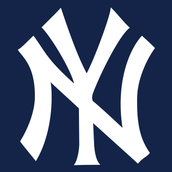
Of course the logo of America’s most expensive baseball team was designed by America’s most expensive jewelry designer. But, ironically, Tiffany & Co. didn’t create the interlocking NY monogram for the baseball team. It was created, instead, as a medal presented to New York police officer John McDowell, who had been shot in the line of duty. The Yankees adopted the monogram as an official emblem in 1909.
Today, the Tiffany & Co. design is one of two official logos for the team—which has won 27 World Series championships wearing the NY logo. (That’s more than a quarter of all championships held in the last hundred years, Red Sox fans.) The team’s success has led to the ever-increasing popularity of the interlocking NY logo. Today it is so popular you’ll even catch glimpses of it in Dodger Stadium way out in Los Angeles.
What Works
Using the initials of their home city, the New York Yankees foster a sense of community pride. The logo says, in no uncertain terms, “We are New York.” This may be why cross-town rivals the New York Mets adopted a similar logo in 1963.
At the same time, the logo is clean and easy to both read and recognize, which is ironic given that there are three distinct versions of the interlocking NY. With three typefaces, three placements of the NY, and three distinct sizes of lettering, the Yankees are breaking pretty much every rule of brand consistency. Yet, somehow, every version is immediately identifiable as the New York Yankees.
Also ironic? Only the New York Mets’ logo still uses the Tiffany & Co. lettering from that 1877 design.
12. Disney

First introduced: 1937
Designer: Walt Disney
Disney’s friendly, loopy wordmark has been the symbol of the company since 1937, when founder Walt Disney replaced the company’s original, cluttered, and vastly overly designed “Mickey Mouse” logo. For the new logo, Disney adopted his own friendly and loopy autograph. From that moment forward, the Walt Disney Company not only bore his name but also his signature.
In 1956, the company introduced a cleaner, more refined version of the logo, sometimes dropping “Walt” and leaving just Disney and, at other times, incorporating both its founder’s first and last names. Regardless of which version you see, the Disney logo has been inspiring joy for almost 100 years.
What Works
Walt Disney’s signature was nothing short of whimsical. Though the wordmark was refined in 1956, it remains true to Disney’s signature, with its playfully positioned loop floating above the lower-case I and all those uplifted tails on each capital letter. And today’s logo preserves the blend of capital and lowercase letters.
The logo isn’t just a signature, though. It is a study in proportion. The D extends above the line of the text precisely the same distance as the Y descends below it. The letters are almost uniformly proportioned, as well, with the thickest part of the writing the downstroke of the Y, which buttons up the logo with a neat, strong finish. And about that D … it uses the Golden Ratio no fewer than three times.
This ratio appears throughout architecture, design, and nature and corresponds closely to the Fibonacci Sequence. Because the Golden Ratio appears in mathematics, design, and nature, it’s frequently called the Divine Ratio. It can be applied to logos, photographs, the Mona Lisa—even business cards, which with a ratio of 1.7 very nearly conform perfectly to the Divine Ratio.

The Fibonacci Spiral is a graphical representation of the Golden Ratio. (Source: Wikipedia)
13. Michelin
First introduced: 1894
Designer: Marius Rossillon
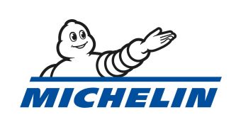
The Michelin Man is the friendly, smiling representative of the Michelin Tire Company. This mascot was first introduced on a poster in 1898, a jovial, corpulent being raising a glass to smaller, thinner dinner companions and offering a toast: Nunc est bibendum. “Now is the time for drinking!” The irony of a tire company mascot extolling drinking aside, the toast gave the fluffy white mascot his name: Bibendum.
The initial idea for Bibendum came in 1894, when company founders noticed a stack of tires suggested the outline of a plump man. But why is Bibendum white? That’s because tires at the time were crafted from natural rubber—which is white. So for those early customers, Bibendum was clearly a stack of tires. That changed in 1917, when chemists learned adding carbon black to rubber made it more durable and resistant to ultraviolet light.
Ever since that first toast, Bibendum has been an ambassador for Michelin Tires. While he’s evolved a bit over the years, his friendly smile and puffy corpulence remain.
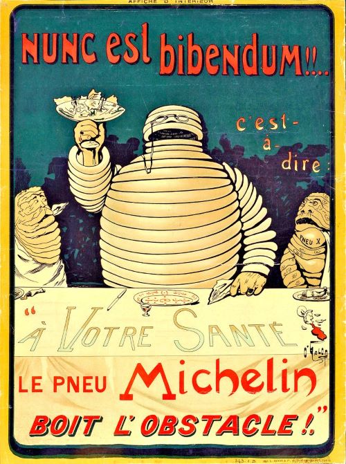
The original design of the Michelin Man, introduced in 1898 (Source: Wikipedia)
What Works
For the original poster, Rossillon made Bibendum much larger and fatter than the other beings to symbolize Michelin tires were more robust than those of the competitors. As the mascot evolved, he looked more and more like the stack of tires he is supposed to represent. That being said, much of Bibendum’s meaning has been lost with the transition to black tires.
Today, the Michelin Man works simply by association. Like the Starbucks Siren, he’s a familiar reminder of a dependable brand. Even if you don’t know the history, you probably still recognize his resemblance to a stack of tires.
Frequently Asked Questions (FAQs)
Logos are an important part of your business’ brand identity. Your logo conveys the image you want your customers to have of your business. Often, it is the first impression many of your customers will see, and a good logo is memorable and will remind them of your company.
A good logo has several traits. It is easily readable, recognizable, and memorable. That means your logo should be well-designed and unique. You should also consider the colors you choose, as colors can have a psychological impact on viewers, impacting how they view your brand before they’ve ever spoken to you.
Generally speaking, there are six types of logos. They are:
- Wordmarks: Logos containing a recognizable word, usually a business name
- Monograms: Logos featuring the initials of the business
- Emblems: Chevrons, badges, and coats of arms, frequently combined with wordmarks
- Mascots: Animal, human, or mythical creatures used to represent a business
- Pictorial: Graphical representations of the business name
- Abstract: An icon associated with the business
Each type of logo can work for your business, and which you choose ultimately depends on the image you want to create for your company.
Bottom Line
The most iconic logos all have one thing in common: they rely on effective, unique design and convey vital information about each brand’s philosophy, identity, or product. Creating the perfect logo for your business can make attracting and keeping customers easier, and that perfect logo also becomes a recognizable symbol of your business in the minds of potential customers.