Your website is your brand’s primary representation in the online world. It’s likely the first stop potential customers will visit when researching your business, which is why it’s essential that it leaves the right impression. And part of that is choosing the colors for your website. To get started with some inspiration, I rounded up the 15 best color palettes for websites, why they work, and what you can take away from them.
Color plays a larger role in building your online brand presence than you might think. This is due to factors like color psychology and design principles, which affect how audiences see and ultimately think of your brand. The website color palettes on this list, from classic white to pastel colors, are all good examples. Ultimately, the colors you choose will come down to your brand identity and the overall impression you want to leave on your visitors.
If you want a custom design from a professional website designer who takes all these into account, I recommend hiring a freelance professional from Fiverr Pro. Fiverr Pro has plenty of freelance web designers for hire who can build you a custom website without needing to partner with a design agency.
1. Brown & White Tones for a Warm, Earthy Feel
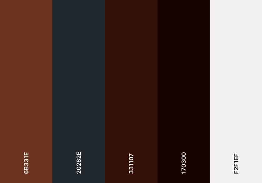
Have you heard that Pantone’s 2025 Color of the Year is a warm, earthy shade of Mocha Mousse? It’s a surprisingly familiar color, and with good reason. Warm tones always give a good look and are one of the most reliable website color schemes, especially if you have an “earthy” business, like an organic cafe or ceramics and pottery.
With a warm tone, you want to balance your website colors with a light secondary color, like white, and another warm color as an accent, like burnt orange.
2. A Classic White Background to Convey Professionalism
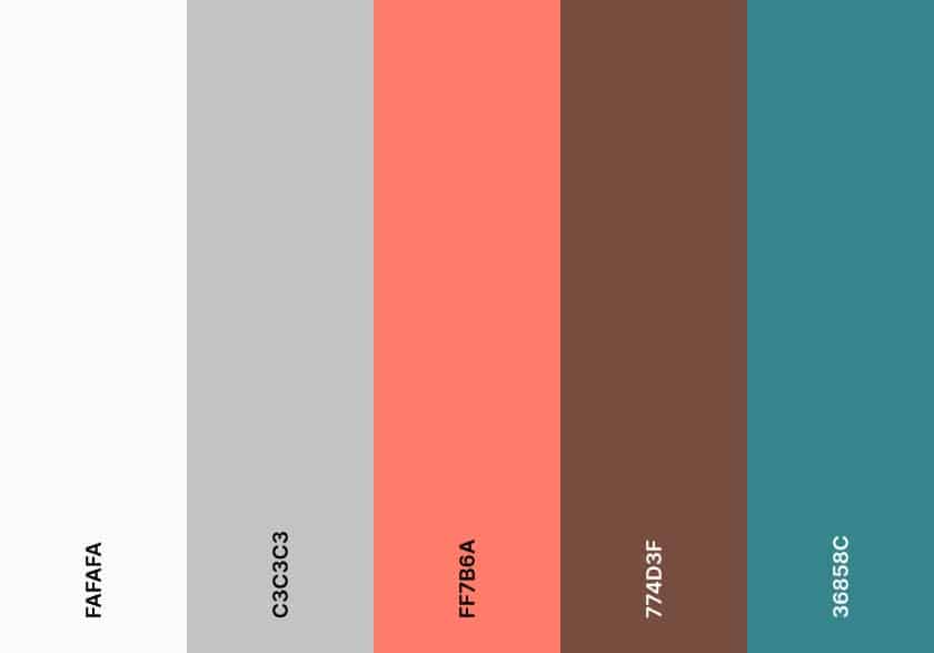
Some may call white boring, but I’d argue it’s timeless and professional. There’s a reason it’s one of the most-used colors for web design. A white background keeps your website clean and focuses your audience’s attention on your content. You can also highlight your most important information with a bright accent color, like orange.
White backgrounds work for any industry and target audience, but they particularly convey a more professional and trustworthy feel, ideal if you’re in the business-to-business (B2B) or services industry.
3. Sky Blue & Sandy Beige for a Relaxing Experience
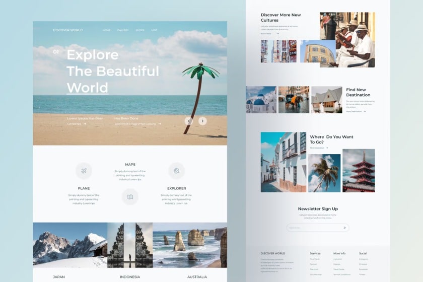
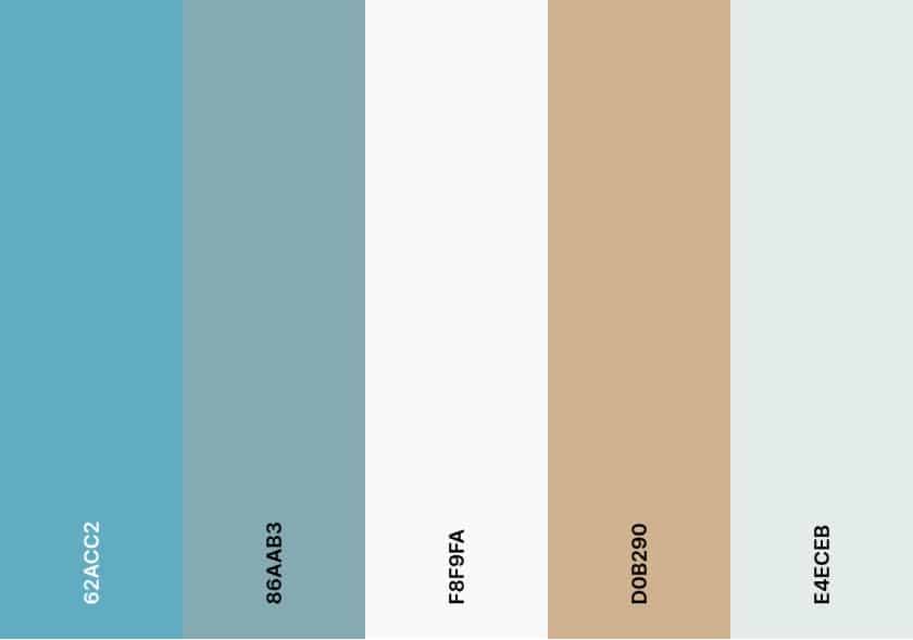
When you think of sky blues and sandy beiges, I wouldn’t be surprised if images of beaches and islands instantly came to mind. But one thing about website colors is you aren’t limited exclusively to blocks of color in your design. You can use real images to form your website design while still sticking to your main color scheme.
For example, you can use real images of beaches to form your blue and beige home page, and then add other images with a similar color scheme. To help them really stand out, keep the rest of your site clean and simple with a white background. It altogether makes for a very calming website design that’s a good fit for travel websites or blogs.
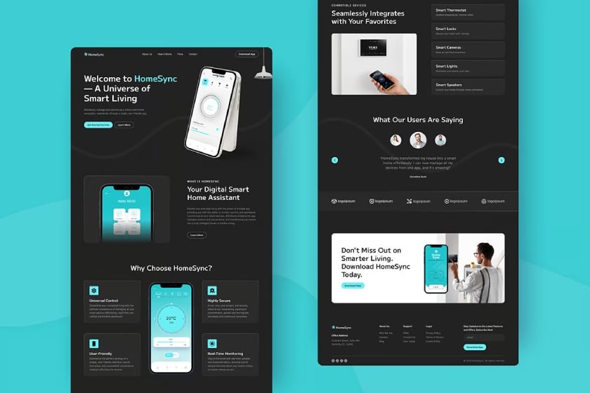
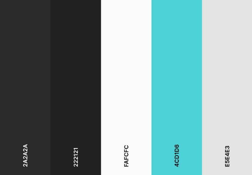
4. Electric Blue on a Black Background for Modern Sophistication
Black backgrounds aren’t often in the most popular color palettes because they initially feel dark and mysterious. But black can also convey modern sophistication, elegance, and professionalism. It’s also like the “dark mode” on devices. Because a black background often makes a bold statement, use lighter and brighter tones as your secondary and accent colors.
To avoid the feeling of a pure dark abyss, add some texture and design elements to your background and use a bright accent color, like electric blue.
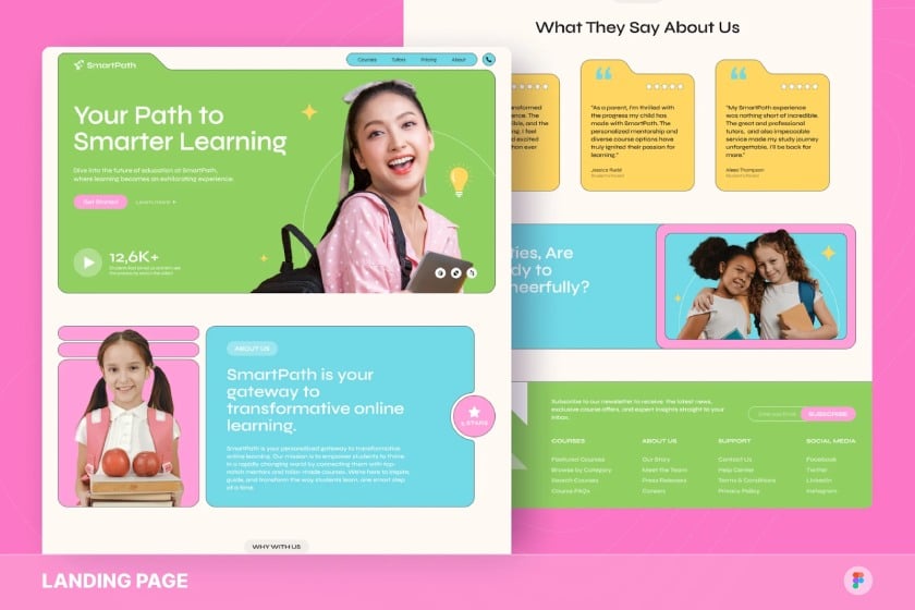
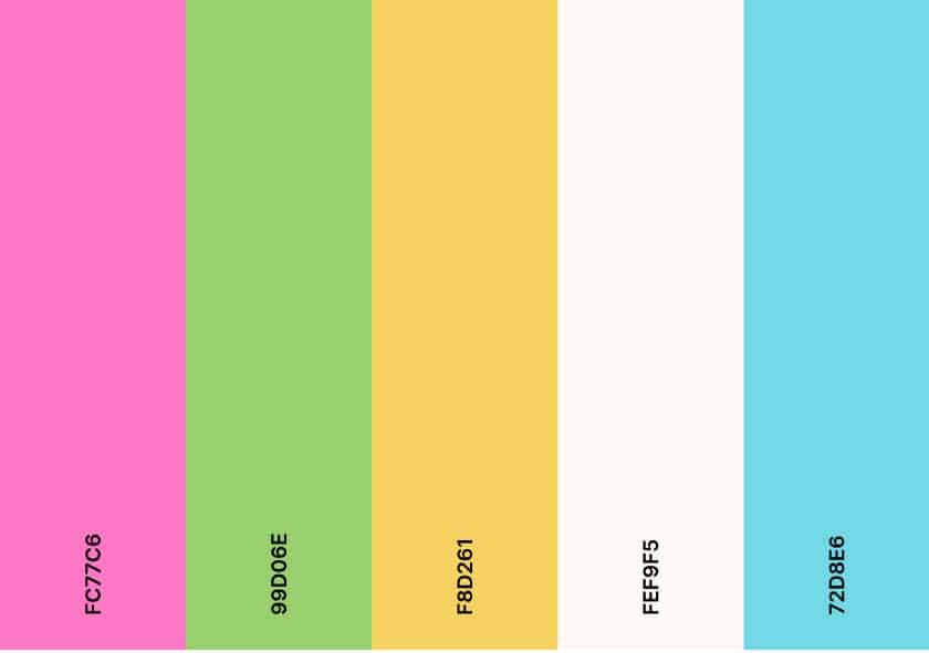
5. Bright Green, Pink & Blue for Youthful Vibrance
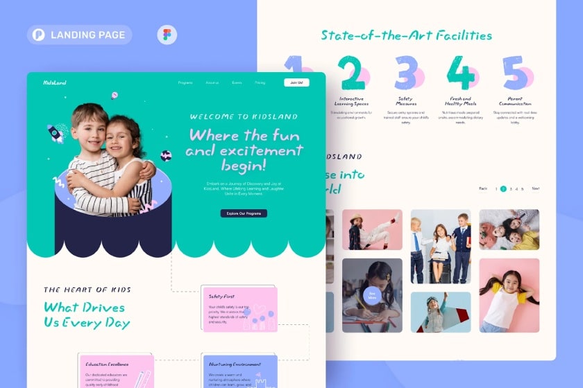
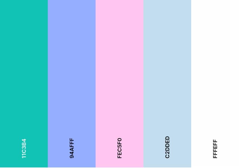
Nothing says youthful fun quite like three bright colors in one website—particularly, green, pink, and blue. While it may sound a little too overwhelming, it all comes down to how you lay them out on your site. A good direction is to place each color in separate sections or “blocks” on your site so they don’t mix. That way, each color stands on its own and doesn’t overwhelm audiences’ senses.
6. Cream & Beige for an Elegant Neutral Look
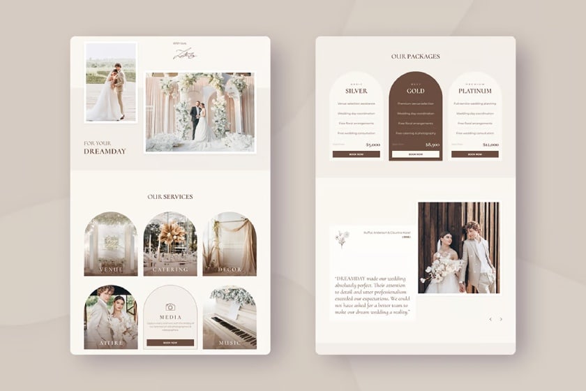
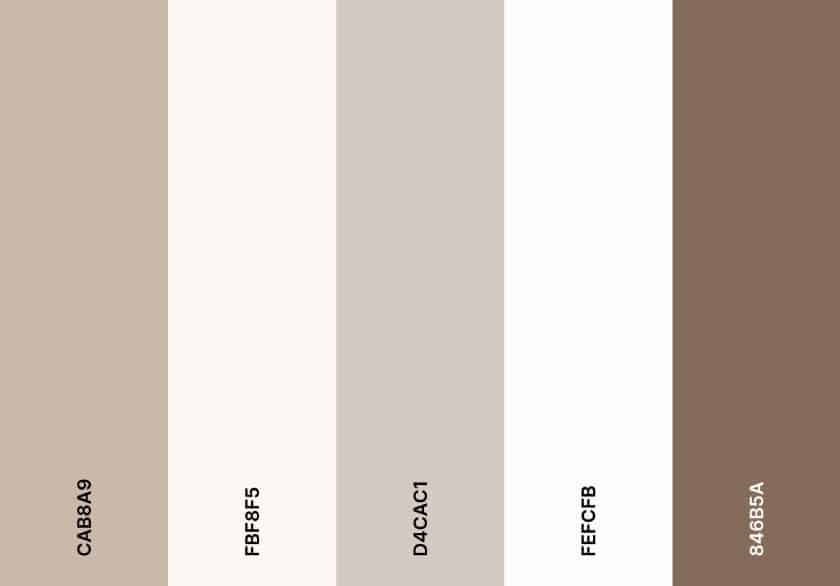
When it comes to good color themes for websites, sometimes the classics are classics for a reason. Case in point: cream and beige for a rustic and elegant monochromatic color scheme, perfect for wedding websites or brands that want to convey a sense of elegance and class. Accent colors aren’t normally required for this color scheme, as they work together harmoniously. But if you do use one, choose similarly muted tones like brown or white.
7. Soft Green, Purple & Pink to Convey Friendliness
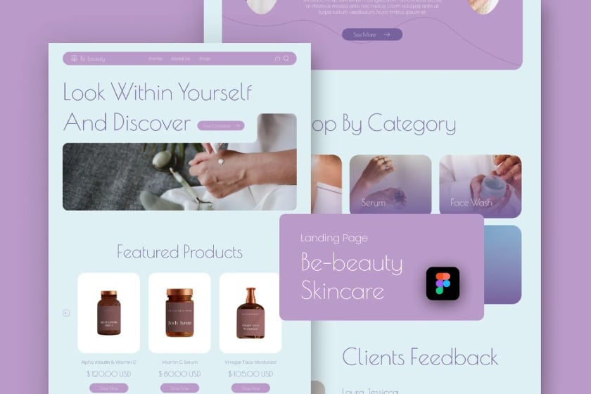
Soft colors are always reliable for leaving a friendly, welcoming impression; for instance, soft green, pink, and purple for a family-oriented website. What makes this particular color combination stand out is the specific shades and tones used for each color. For example, instead of the usual bright green, use a softer, more muted shade—the same goes for the purples and pinks.
The key takeaway here is when thinking up good color combinations for websites, don’t be afraid to experiment with different shades and tones of colors you have your eye on. Colors are a spectrum—don’t be afraid to try every combination you see.
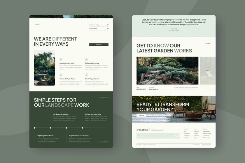
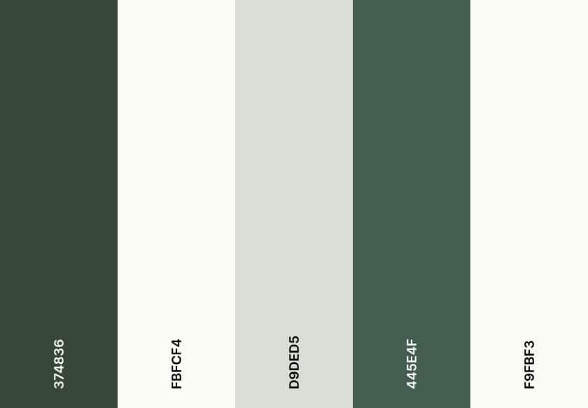
8. White & Forest Green to Convey Wellness
Green is always associated with wellness and nature, so it’s a no-brainer that it’s often used for earth-related websites, like environmental organizations or landscaping services. On its own, green is already such a strong color, so it’s a good idea to balance it out with something neutral, like white or cream.
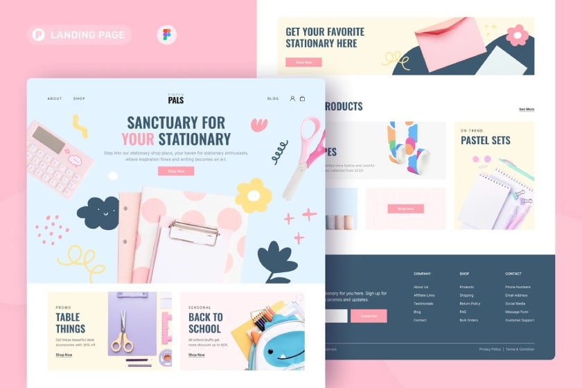
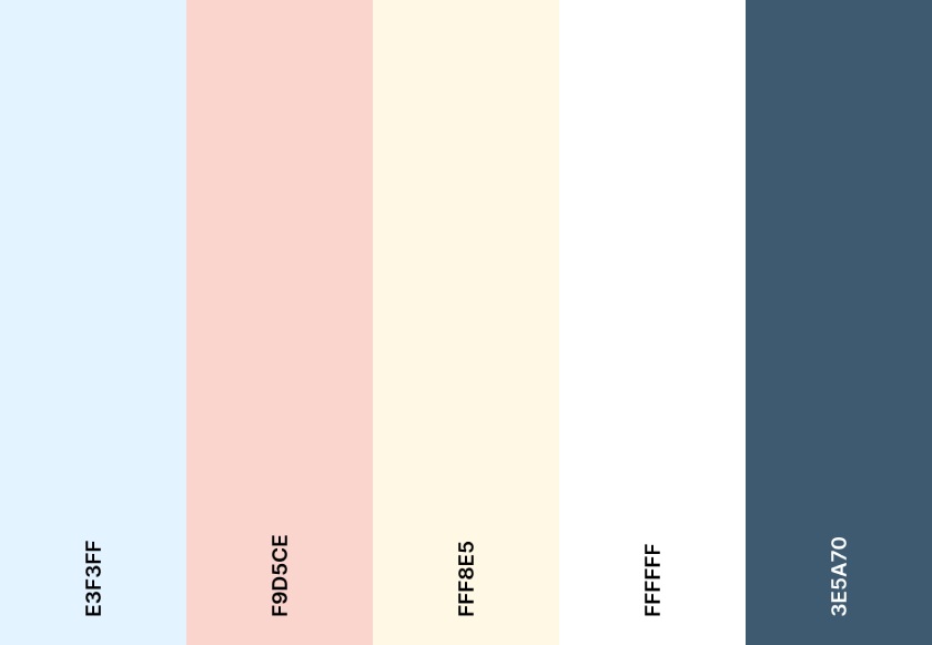
9. Pastel Palettes for a Touch of Whimsy
Pastels are always one of the most reliable color palettes for websites because they’re so familiar and reliable. Whatever pastel color combination you choose, they’ll always turn out well. Pastels always convey a sense of whimsy, playfulness, and gentleness, which is why you’ll often find them on websites for kids or dessert brands.
10. Color Gradients to Make an Instant Impression
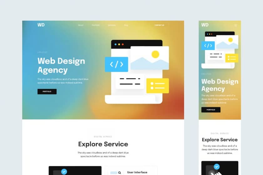
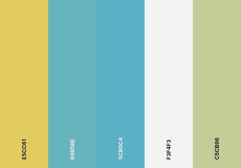
One of the best things about designing websites is they can be a blank canvas for your creativity and to express your brand identity. And if your brand wants to leave an instant impression, what better way than through a gradient background? Gradients always make great color combinations for websites because of their versatility—pick any two complementary colors, and they’ll usually blend well into a gradient.
Case in point: blue and orange, complementary colors on the color wheel, make for a pleasant and friendly website color palette that’ll fit anything from a tech to a home repair service business. Some other good gradient colors are red and green and yellow and purple. Don’t be afraid to experiment with various shades of each.
11. Sandy Brown, Teal & Purple for a Retro Vibe
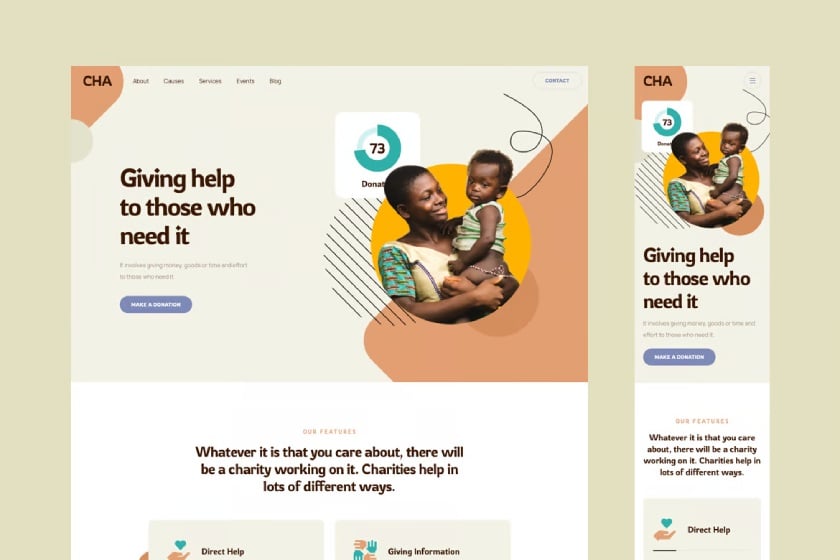
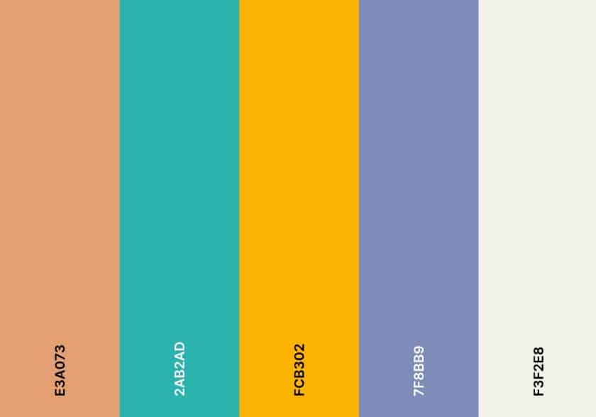
Meanwhile, if you’re aiming for a more retro, throwback impression, sandy brown and teal make for a good website color palette, especially with a cool color like purple or blue as an accent. This palette recalls ads and posters from the 1960s and 1970s, evoking a distinctly nostalgic, retro feeling. It’s a good choice for sites that need to appeal to audiences’ emotions, like nonprofits and foundations—or if your brand simply has retro elements.
12. Black & Off-white for Monochrome Minimalism
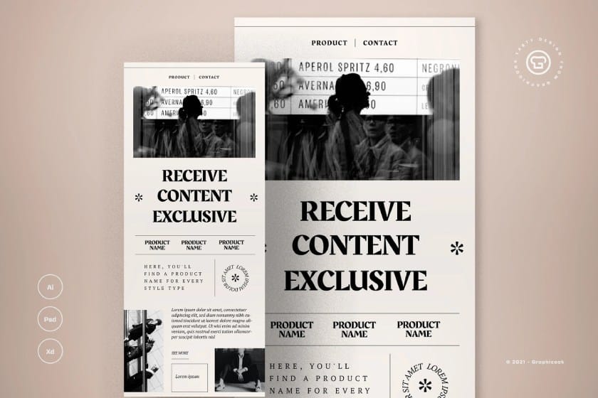
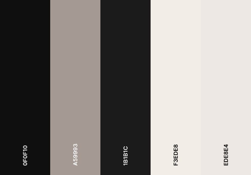
Black and white is one of the most classic color palettes for websites, and it’s still a good way to make an understated yet impactful impression. One way to put a modern twist to it is by opting for an off-white shade instead of a pure white one. It retains the clean, sophisticated look of a black-and-white monochrome but updates it for more modern tastes.
Monochromatic looks are often very striking, so they’re best fit for modern, cutting-edge brands—or information-heavy websites like blogs and news sites. If you’re adding images, make sure they’re also in monochrome to keep with the theme.
13. Neon Elements on a Black Background for a Galactic Look
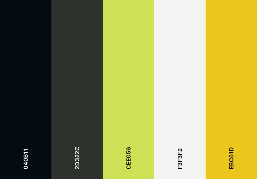
A fully black background can seem intimidating—but not if you accentuate it with bright neon elements. As previous examples have shown, black can be anything but boring as a website background. It can even be like the night sky or outer space. And with neon colors like lime green and yellow-orange as elements, it can even give your website a galactic, celestial look.
With black backgrounds, always make sure to use a very light color (preferably white) for your text to make sure it’s readable.
14. Cool Analogous Colors for a Calming Effect
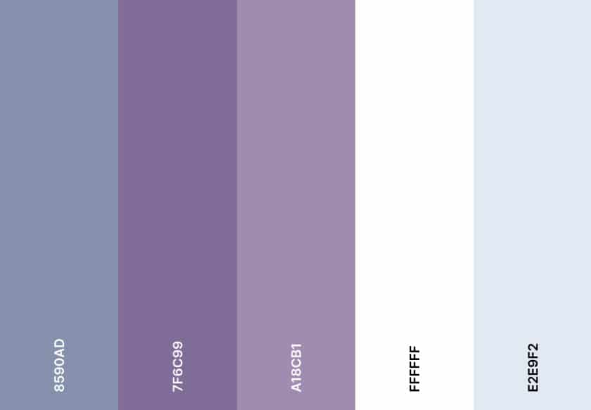
Anytime I’m stuck thinking up good color palettes for websites—or any design project, I always consult the color wheel. It’s an ever-reliable way to see the different relationships between colors. One particular relationship that always works is analogous colors, which are colors next to each other on the wheel like blue and purple or yellow and orange. I think of these colors as “sibling” colors because they’re close to each other and work harmoniously.
Cool analogous colors, in particular, tend to have a calming, peaceful effect. However, when taken to an extreme, analogous colors can risk being overwhelming, so space them out with a neutral color, like white.
15. Complementary Colors for an Eye-catching Effect
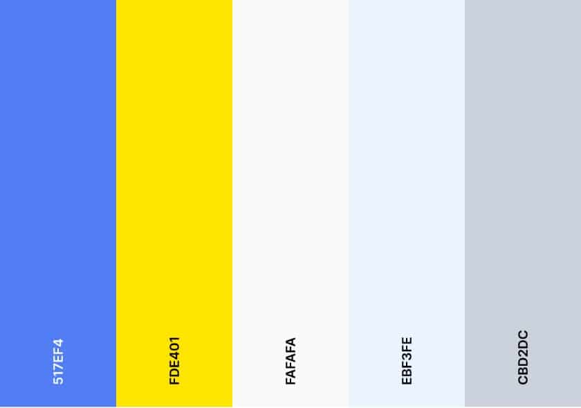
I mentioned analogous colors just now, so I also need to mention complementary colors. Complementary colors are the exact opposite of analogous colors. They’re across each other on the color wheel, so they’re often more surprising and eye-popping. Some examples are blue and yellow and green and purple.
Like analogous colors, complementary colors can easily become overwhelming, so space them out with a neutral tone to let your design breathe.
Choosing the Best Color Palettes for Websites (5 Tips)
You may have noticed by now that the website color palettes you choose can significantly affect your brand presence and how audiences perceive your business. Different colors give off different emotions. We know that instinctively. Therefore, the colors you choose will instinctively affect how your brand will be remembered by your audiences.
The first thing to consider when choosing your website colors is your brand identity. This is because your website is your business’ main representation in the online world, so it still needs to express your brand in some way. Here are some other tips for choosing the right colors for your website:
- Know the basic color theories. I touched briefly above on some basic principles of color theory and the color wheel. That’s because they’re still relevant guides for using color effectively in design. If you’re feeling stuck choosing your site’s colors, the color wheel is always a handy resource.
- Know basic brand color psychology. Have you noticed that most food establishments use red and orange in their branding, and many social media apps are blue? Another fascinating thing about colors is how they can be associated with specific thoughts, feelings, and ideas, some of which you’ll want to associate with your brand—and some you’ll want to avoid.
- Choose a primary, secondary, and accent color. As you may have also noticed, most websites use three distinct colors: a primary and secondary color for the main theme and a third color as an accent to highlight important details and headings. Choose these three colors first, and then evaluate if you need any more, as too many colors can feel overwhelming.
- Research your competitors and target audience. You don’t want your website to get lost in a sea of similar-looking websites. That’s why, as with any marketing strategy, it’s important to research your competitors and your target audience during the process. See what your competitors are doing that you could do better and get a feel of your target audience’s likes and characteristics.
- Use available color tools. If you still need help deciding which colors go well together, there are tools available that can help. One I particularly like is VistaPrint’s Color Palette Generator, which lets you design marketing materials using various color palettes—or generate your own palette and build your designs from there.
Visit VistaPrint’s Color Palette Generator
Frequently Asked Questions (FAQs)
First, take inspiration from your brand identity and choose colors that represent elements of it. For example, in brand color psychology, red represents passion and energy, and blue represents trust and logic. If you have a brand logo, also take some colors from it. Research your competitors’ brands to see how you can stand out, as well as your audiences’ interests. You can also use color palette generators to see what colors go well together.
A monochromatic color palette leaves a visually cohesive impression on audiences. It gives the impression of a very put-together brand, and it’s not garish or overwhelming, which can help you stand out even more in a sea of bright colors. A monochromatic color palette gives structure and harmony to any design and can be strongly associated with a specific brand over time.
The best way to test your color palette’s accessibility is through accessibility checker tools like WebAIM and AccessibilityChecker.org, which check the contrast levels of your color palette on screens. The general rule of thumb is to avoid high-contrast colors as backgrounds and foregrounds (especially for text and backgrounds) and solely use color to convey information and calls to action.
Bottom Line
There are thousands of colors and color combinations to design your website. Ultimately, choosing the best color palettes for your website will come down to your unique brand identity and the specific thoughts, emotions, and ideas you want to convey to audiences. Once you have a good grasp of how colors work together and what they represent, you’ll have all the tools you need to make the right color decisions.
