Good billboards are all about good design. When you think of the best billboards, it’s often their design that catches your attention and stops you in your tracks. Even in a digitally driven world, a good billboard design can help you get new fans, especially if you have a physical store locally. If you’re looking for some billboard design ideas as inspiration, I’ve rounded up the best ones below and why they’re effective.
1. Tell a Story With Your Billboard
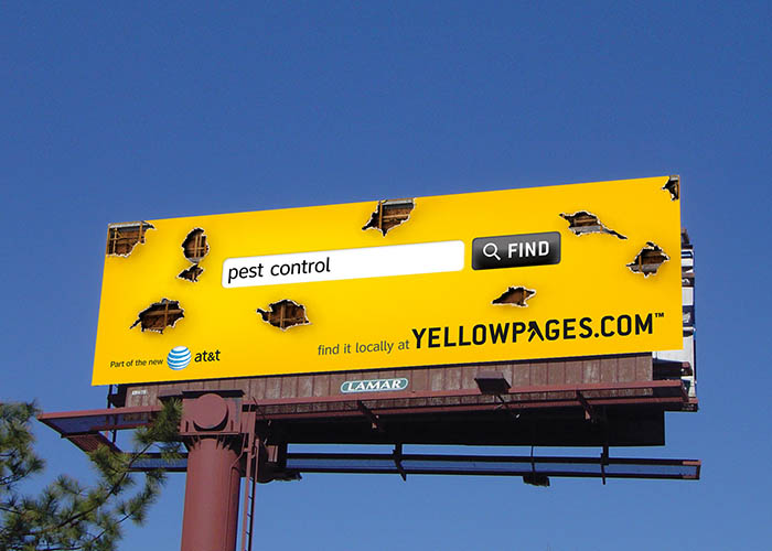
An eye-catching billboard design for Yellow Pages (Source: Ads of the World)
Billboards get a lot of fleeting glances, but a good story can captivate people’s attention long enough to leave a real impression. Take for example this billboard design by Yellow Pages. It’s nothing complicated—pests have damaged the billboard, which warranted a search for pest control services. The solution is presented on the Yellow Pages website.
Even a brief narrative like this can help engage your viewers’ emotions and keep them intrigued. Although a billboard has a limited space compared with video ads or other advertising ideas, find a way to put your product in a narrative to make your ad a memorable experience rather than just another ad on the road.
2. Send a Clear Message in Your Billboard Design
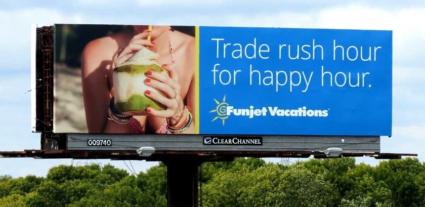
Use easy-to-read fonts to convey a clear message and followable CTA. (Source: Clear Channel)
Billboard ads are large, but they’re usually viewed by people driving by at 60 miles per hour or even faster. You have mere seconds to attract attention and convey your message. As simple as it sounds, you need to make sure that your billboard design consists of a clear message—both literally and figuratively.
Clear Channel’s billboard example is both aspirational and emotional while targeting the right audience (i.e., rush-hour travelers). It has a big, easily readable main message that doubles as a clear call to action followed by an easy-to-remember brand name.
3. Advertise Affordably With Digital Billboards
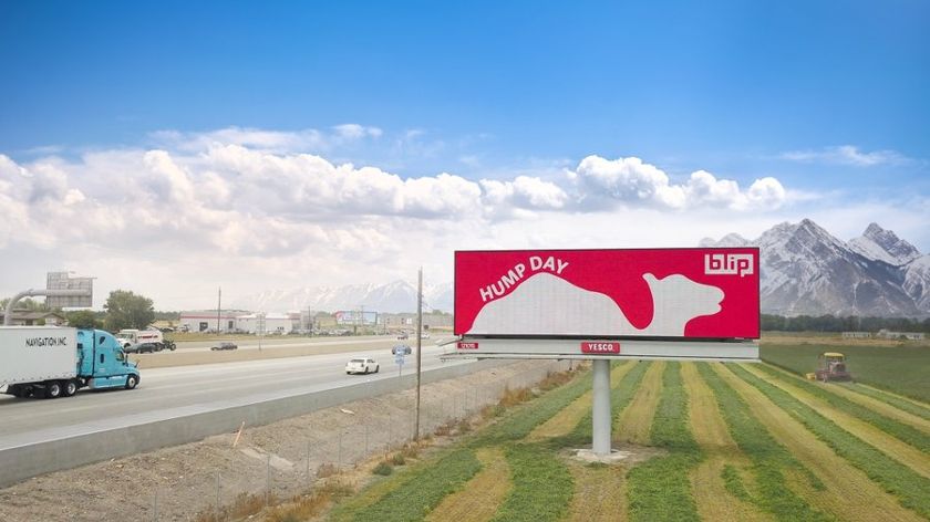
Choose your location, when, and how often your ad will appear with affordable digital billboards. (Source: Blip Billboards)
Digital billboards are not only a modern way to build brand awareness, but they’re also far more affordable since you don’t need to worry about printing costs. Because they’re digital, they’re also easier to edit and replace, keeping your ads fresh and engaging. Plus, they can support video.
Some of the biggest digital billboard design tips are to keep your message short and simple, use contrasting colors for better visibility, and choose the best time for your ad to be shown.
Digital billboards are an affordable alternative to physical billboards and are a good way for small businesses to get started with OOH (out-of-home) advertising. The best place to get started is Blip Billboards, which plays a 10-second “blip” of your digital billboard ad for as low as $10 per day or whatever your budget allows.
4. Show Instead of Tell
-
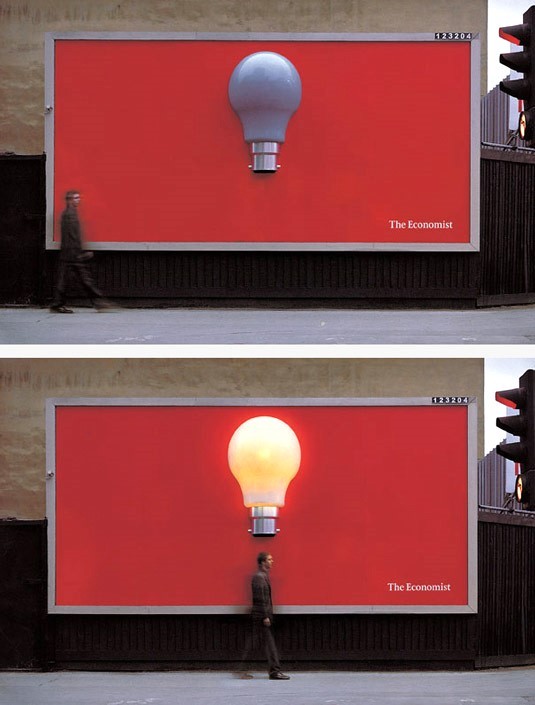
The Economist billboard conveys a clear message without words. (Source: Brandsynario)
A picture is worth a thousand words, so don’t be afraid to let your billboard speak for itself. This billboard ad example from The Economist draws attention through the use of motion-detecting equipment that causes the lightbulb to turn on when someone walks nearby. It’s a great example of a billboard ad that is unique and memorable without saying a word. Talk about a bright idea.
5. Be Inspired by Current Events
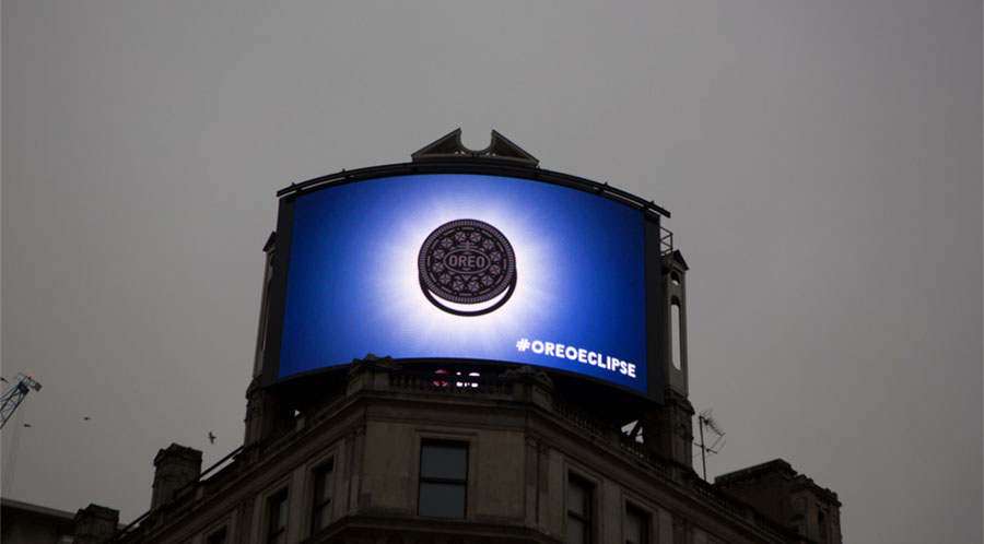
The #OreoEclipse campaign was a memorable step toward real-time advertising. (Source: Grand Visual)
Take inspiration from current events and create timely, conversation-starter messaging. This digital billboard from Oreo caught people’s attention with real-time movement that coincided with a real solar eclipse, turning a nationwide phenomenon into a brilliant and branded marketing opportunity. Aside from eclipses, other big events you can tap into are big sporting events, cultural milestones, or global holidays.
6. Show You Have Your Audience’s Best Interests in Mind
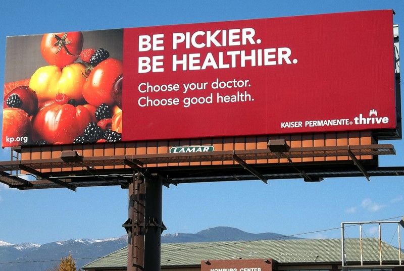
An example of billboard ad design that shows customers you have their interests at heart (Source: Lamar)
Many small business owners are driven by a passion for their customers, creating products and services to meet their needs. Make sure your outdoor ads showcase how you put your customers’ best interests at the top of the list. Kaiser Permanente’s “Be pickier” billboard is a great example of this as it encourages audiences to prioritize their health. It’s almost like a sponsored public advisory.
7. Feature Customer Testimonials
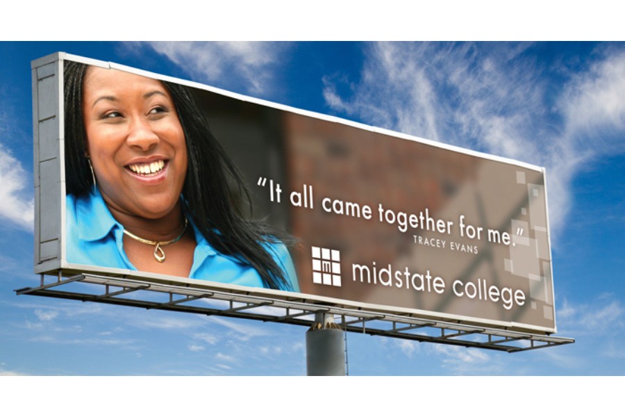
Sometimes, it’s best to let your customers do the talking for you. Testimonials are a growingly effective marketing strategy because customers tend to trust fellow customers more than brands. Having a bevy of positive customer testimonials can substantially increase your brand credibility.
Best of all, they’re one of the simplest (yet effective) billboard design ideas. You can go the standard route of incorporating your customers’ photograph with a quote (with their permission) or simply post a five-star review.
8. Add a Live Data Feed to Billboard Ads
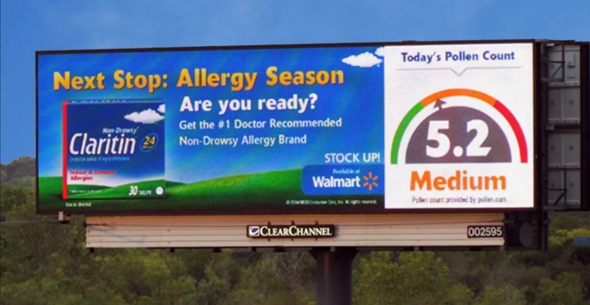
Live data like this example makes your billboard ad more credible and valuable. (Source: ClearChannel)
Real-time data can make your billboard ad design interesting and helpful, like in Claritin’s example showing the daily pollen count. You can also incorporate other info like current temperatures, time, air quality ratings, or storm trackers—as long as they’re relevant to your brand.
Otherwise, the overall effect would be jarring. Billboards like these with helpful information are effective because they give your customers value in exchange for their attention.
9. Extend Design Beyond Billboard Dimensions
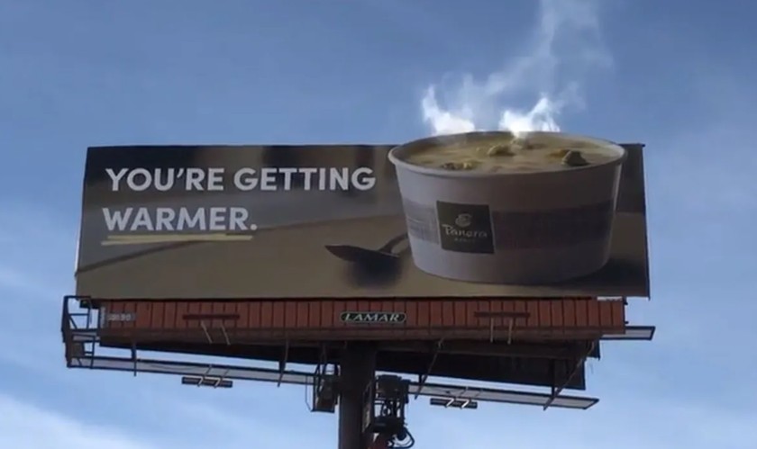
Go beyond the confines of billboard dimensions with design and effects. (Source: OOH Today)
When it comes to billboard design ideas, don’t be limited by your canvas’s dimensions. Think outside the box—literally. Don’t be afraid to think up eye-catching designs that pop, like in the example from Panera Bread, which cleverly uses surrounding clouds to evoke steam from hot soup. It’s only a small adjustment but goes a long way.
10. Incorporate Strong Visual Metaphors to Capture Attention
-
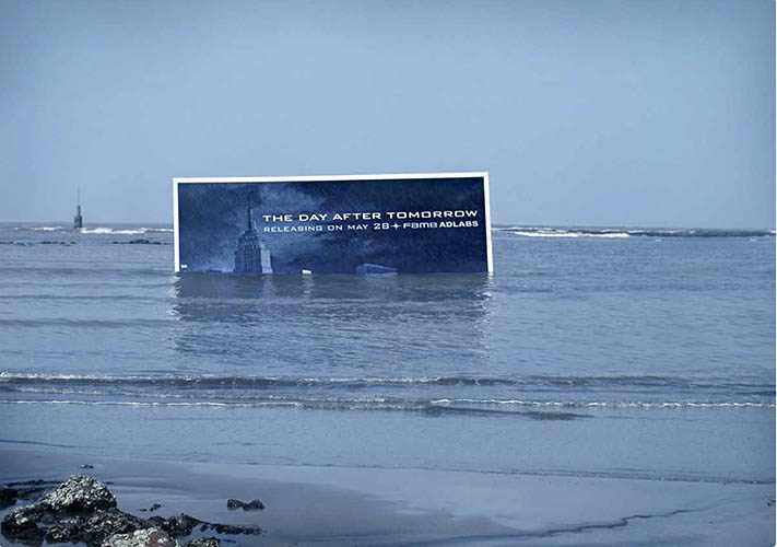
This “drowning” billboard is part of an advertising campaign for a disaster-themed movie. (Source: Trend Hunter)
One of the best examples of movie billboard advertising is the campaign for the disaster movie “The Day After Tomorrow,” which features a partially submerged billboard in the ocean. Not only does it immediately grab the attention of any nearby beachgoer, but it also creates a striking visual metaphor. It’s a great example of billboard advertising crossing into guerilla marketing territory.
The key takeaway is that if you incorporate the surroundings into your billboard, go the extra mile and see how you can use it to tell your entire story. The film’s marketing team could’ve just created any regular advertising movie campaign, but they saw an opportunity and leveraged it.
11. Get Engagement With Interactive Billboards
-
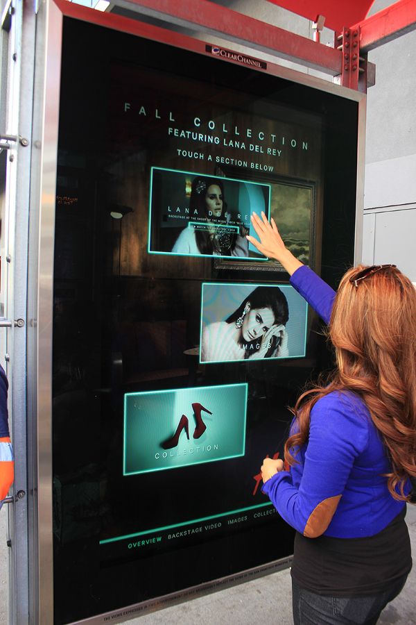
Interactive billboards let customers engage with your brand on the go. (Source: ClearChannel)
Not all billboards need to be by roadsides. Outdoor advertising appears in many places, from bus stops and subway stations to malls, airports, the sides of walls, and even street lamps.
Technology not only makes it possible for people to view ads from many different locations, but to interact with them as well. Interactive customers transform your ad into an opportunity to interact with customers in real time, increasing your chances of being remembered.
12. Feature Your Customer Community
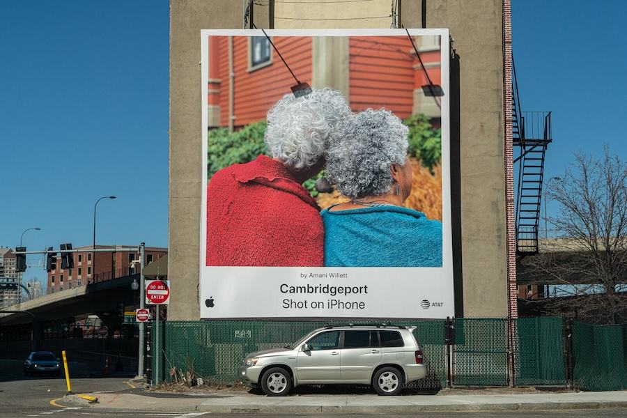
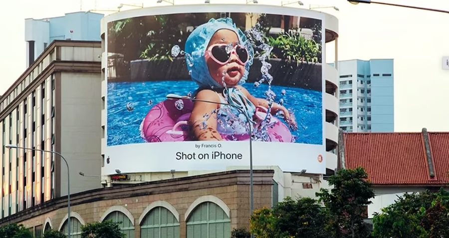
Apple has long been one of the most cutting-edge brands in advertising. One of the primary reasons for this is how it embraces and highlights its customer community, even in its paid ads. Case in point: its “Shot on iPhone” billboard campaign featured real photographs taken by its users on their iPhones. It’s a stark contrast from the usual billboard examples you’d expect from most tech brands, and that’s exactly why it stands out.
Apple’s message is clear: it cares about its customer community. If anything, this campaign is a surefire way to get that community to love them right back, strengthening their brand loyalty. These types of campaigns leverage user-generated content, a good source of billboard design inspiration that highlights your community.
13. Design a Billboard That’s Interesting and On-brand
-
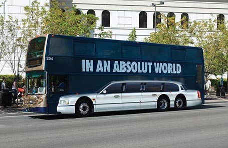
Showcase your brand positioning through juxtaposition like the “In an Absolut World” bus ad. (Source: Design + Magazine)
As with any form of advertising, showing what differentiates your brand is essential. Think of fresh billboard ideas that can promote your brand without compromising your brand positioning. One of the best billboard examples showcasing this design tip is for the Swedish vodka brand Absolut.
The creative ad transforms something often thought of as less-than-luxe (public transportation) into a high-end marketing message, which illustrates Absolut effectively. Using juxtaposition and a short play on words, the mobile billboard makes the statement that with Absolut, you’re taking a limo, not a bus.
14. Know What Your Audience Likes
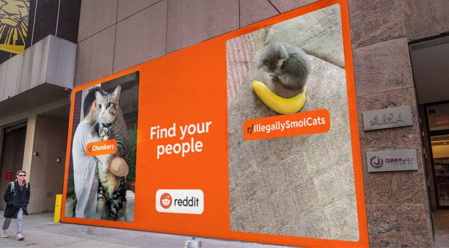
Reddit showcases its popular communities to encourage people to join. (Source: Ad Age)
In 2022, Reddit rolled out its first TV and billboard campaigns with the tagline “Find Your People.” Their billboards were met with positive responses because they highlighted niche communities that Reddit offers. Aside from the catchy tagline, this is a good billboard design example because it goes deep into niche communities and reflects them in their ads.
15. Incorporate the Natural Environment
-
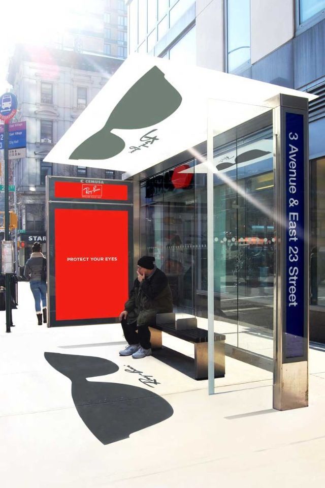
Ray-Ban’s “Protect your eyes” bus shelter ad conveys an unmistakable brand identity. (Source: growndblogday.com)
Good billboard designs aren’t just about the message they convey, but also how they convey it. A good idea worth exploring for billboard designs is ads on public transportation centers like bus stops and train stations because they’re often places where people gather and pause for a moment before going about their day.
One of my favorite examples that leverages this well is Ray-Ban’s “Protect Your Eyes” campaign, which cleverly uses shadows to project their signature sunglasses shape onto the ground, directly in front of commuters’ line of eyesight. It works so well because the concept directly relates to the brand and perfectly leverages its immediate surroundings.
16. Design for Different Perspectives
-
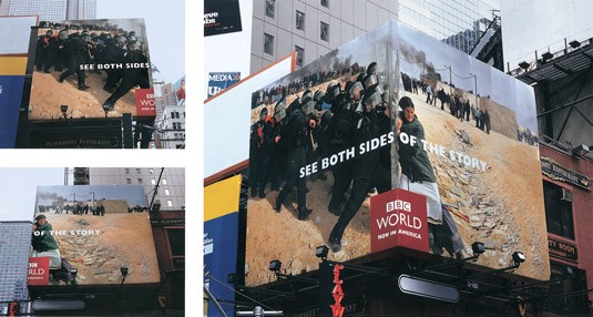
Billboard designs that wrap a corner offer the ability to show two sides of a message. (Source: Creative Criminals)
No matter which type of billboard or outdoor ad you choose, people will see it from varying angles and, thus, different perspectives. This allows you to craft different stories from each vantage point. The billboard from BBC World does a great job of showcasing different perspectives to communicate that the news they share conveys both sides of the story.
17. Double Down on Useful Information
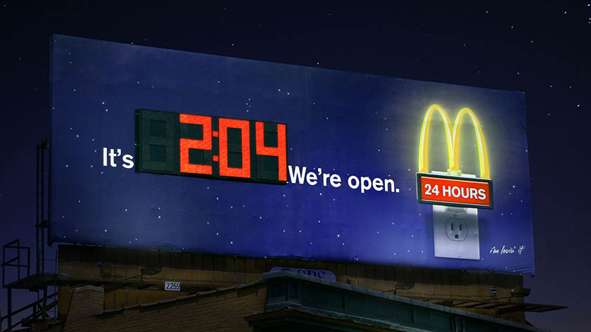
McDonald’s billboard is a unique take on the “Open 24 Hours” ad. (Source: Effortless Outdoor Media)
With the countless “Open 24/7” ads on practically every street corner, standing out can be a challenge. However, McDonald’s still managed to do just that with its out-of-the-box approach to the same message: showing a live clock on their billboard to convey that no matter the time, they’re open. Repeating your value proposition like this in any type of advertisement can help people easily remember what you offer and strengthen your brand presence.
18. Add Form to Function
-
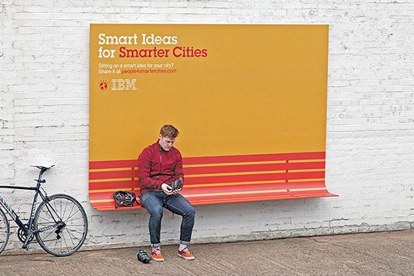
IBM’s Smart Ideas for Smarter Cities featured multifunction ads. (Source: The Cool Hunter)
The best billboards feature both form and function. For example, IBM demonstrated how billboards could serve a practical purpose—turning a billboard into a bench—while conveying a strong marketing message.
Offering something of use breaks through the noise of two-dimensional billboards, demonstrating that your brand isn’t just about the message but wants to be of service. For example, IBM created multifunctional billboard benches to put its marketing message to work.
19. Make Your Billboard Design Fun
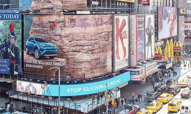
Toyota’s Rav4 billboard included a rock wall you could actually climb. (Source: AdWeek)
Taking form and function a step further (quite literally), Toyota designed a billboard that didn’t just look like a rock wall but was actually a functional rock climbing wall. Climbers were invited to scale the New York City building wall, drawing attention to it and creating a newsworthy billboard that captured the attention of people passing by.
20. Emphasize What You Do
-
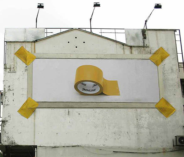
Penline Stationery focuses on a single visual element, its product. (Source: Brandsynario)
One strategy that always holds up well is putting your selling point front and center. For example, if you see this billboard by Penline Stationery anywhere, you’d understand what it’s selling—despite it not having any words on the ad. A wordless ad can be impactful, but don’t sacrifice the quality of your message.
21. Use Negative Space to Your Advantage
-
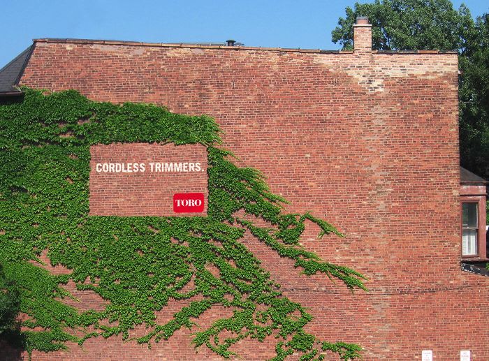
TORO illustrates the use of cordless trimmers with this billboard-like ad of ivy trimmed on a brick wall. (Source: Ads of the World)
It’s not always about what you say but what you don’t say. In some cases, billboard ad designs that are most effective are those using the power of abstraction. In this example, outdoor equipment company Toro deploys negative space to promote its products. It appears as though its product was used to trim what would otherwise be a difficult area to reach if it weren’t for cordless trimmers.
22. Create Appeal by Getting Artsy
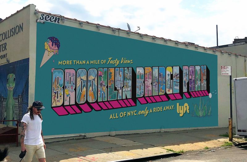
Create Insta-worthy stopping points with mural billboards. (Source: Musebycl.io)
Murals as an advertising medium have become increasingly popular. Not only do they brighten up an otherwise plain wall, but they can also bring additional exposure through user-generated content, such as when people stop to pose for an Instagram post. Ridesharing app Lyft did just that in New York with a series of murals promoting staycations that are “only a ride away.”
23. Transform Your Billboard With Shadows
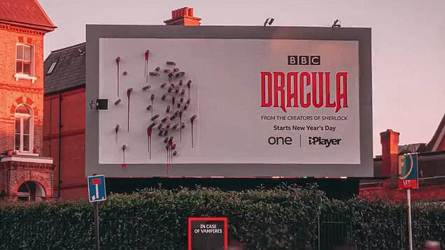
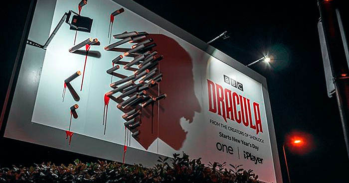
Billboards can instantly be brought to life just by adding a unique element. BBC’s billboard promoting its TV show “Dracula” does this by using shadows to paint a picture that comes alive at night. The effect is twofold: one, it raises visual intrigue. It makes an impression on people and leaves them thinking about it moving forward. And once it transforms, it makes an impact. The billboard immediately went viral, exponentially increasing the ad’s reach.
If you’re interested in exploring light and shadows for your billboard design, try to think of shadows as a way to add a new dimension to your design. Finally, enhance the contrast to put the transformation on full display.
24. Skip the Sales Pitch
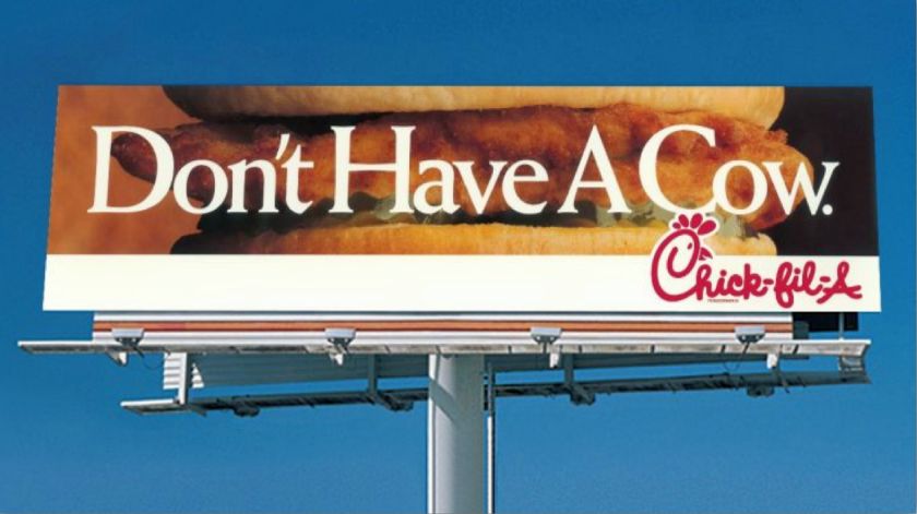
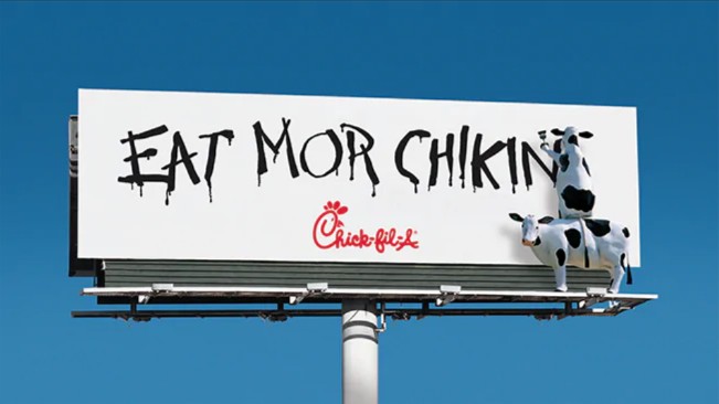
The best marketing messages don’t just tell people what they want but make them want what they offer. This strategy helps people see your billboard in a more positive light. For example, the fast food chain Chick-fil-A is well known for employing humor in its outdoor ads with slogans like “Don’t have a cow.”
25. Appeal to Local Demographics
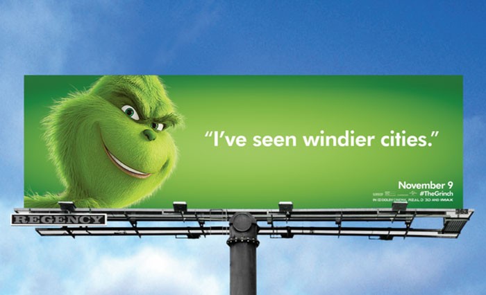
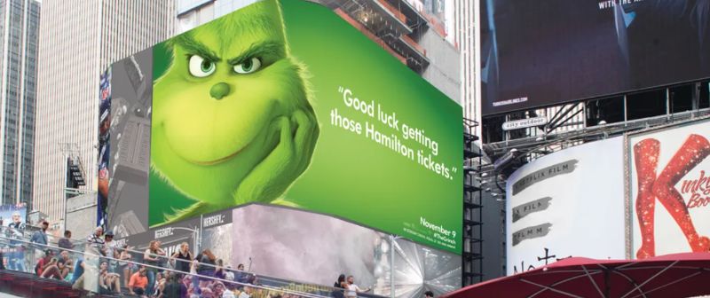
A great billboard idea to keep in mind is to customize your ad messages based on your billboard’s location, like the billboard examples for the movie “The Grinch,” which tailors its copy to appeal to specific local audiences, creating greater impact. Localizing your messages shows you have an understanding of your audience and are therefore more likely to be remembered in a positive light.
26. Create Urgency With Your Call to Action
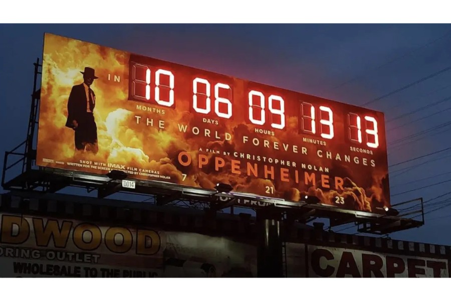
Countdown timer billboards like this one advertising the film “Oppenheimer” create a sense of urgency. (Source: Midnight Oil)
Who could forget the 2023 film “Oppenheimer” and all the hype surrounding its release? The movie’s marketing team knew exactly the buzz it created and found a way to increase it even further through a fully functional countdown timer to the film’s release. This not only fits the film’s content and branding but also gives people a sense of urgency to mark the film’s release in their calendars and purchase a ticket.
Even if you aren’t promoting a big-budgeted film, having a countdown timer is a creative advertising idea that creates a sense of urgency. Use it to promote time-bound campaigns like seasonal sales, limited-time offers, or new product launches.
27. Use a Vanity Number
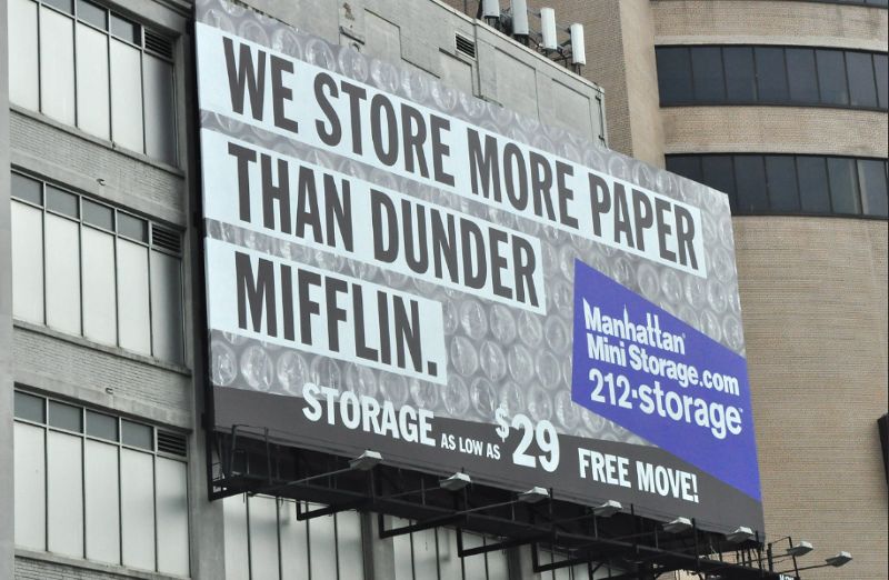
Adding a vanity number to your billboard ad campaign makes your info much easier to remember. (Source: Flickr)
Don’t make people try to work to remember your number. Instead, make it easy by using a vanity phone number (e.g., 212-storage or something like 1-800-NYPLUMBER). Even if your business already has a phone number, you can still get a vanity number that directs to your standard business line.
28. Incorporate Humor
-
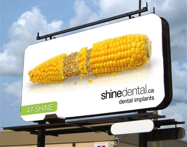
Use humor to draw attention to your brand’s products or services. (Source: Medialease)
Billboard designs that incorporate humor are often the most memorable. They trigger an emotional response while sending a clear message about your brand’s products or services and the problems they solve. When designing a billboard, think beyond your business’ products and use your design by reflecting the characteristics of your ideal customer personas, as this dental implant billboard design does.
29. Play With the Billboard Structure
-
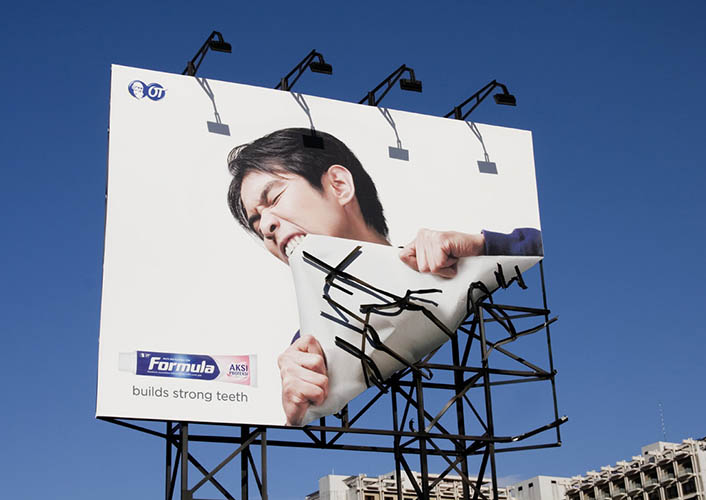
The Formula toothpaste billboard uses the material of the billboard to convey its message. (Source: Quality Design)
Most billboards are designed to be two-dimensional, so using the structure to add more depth to your design is sure to set your billboard apart. The Formula toothpaste billboard mimicked the movement of stripping away the billboard itself from its frame. It’s a simple but impactful design that can get people to stop and look at the ad instead of just letting it be part of the background.
30. Don’t Be Afraid to Compete
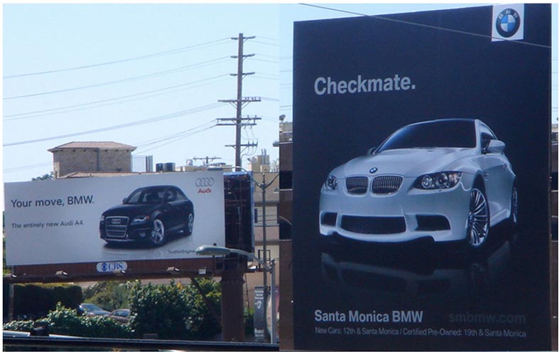
BMW responded to Audi with a billboard of its own. (Source: What a World Again)
People love a good fight, whether a sports game or a billboard war between brands. BMW took up Audi’s challenge with a competing billboard that showcases their new vehicle. If your business encounters strong competition with billboards of their own, don’t be afraid to address this competition in your own design.
31. Address a (Very) Specific Demographic
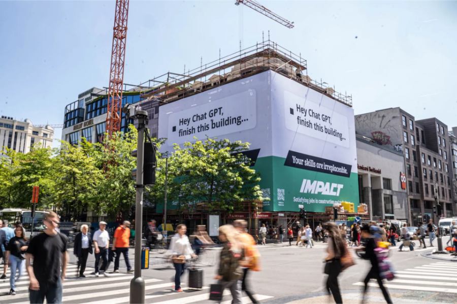
Impact Jobs’ tongue-in-cheek billboard is one of the best recent billboard ideas and examples. (Source: Impact Jobs)
The best billboard design ideas often address a specific demographic. Even if they’re placed in the busiest of intersections, if you angle your billboard messaging well enough to a specific audience, it can even be doubly effective. That’s what makes Impact Jobs’ 2023 billboard so effective.
Impact Jobs is a job listening platform specifically for construction workers. But its unique and tongue-in-cheek ad drew fans from around the world not from any particularly groundbreaking design but for its clever callout to one of the biggest hot topics: AI and its effects on job security. Its message to its target audience is clever, clear, and razor-sharp. It even leverages its surroundings (i.e., the unfinished building) to clarify its message.
32. Use Billboards to Strengthen Your Brand Voice
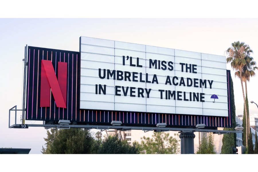
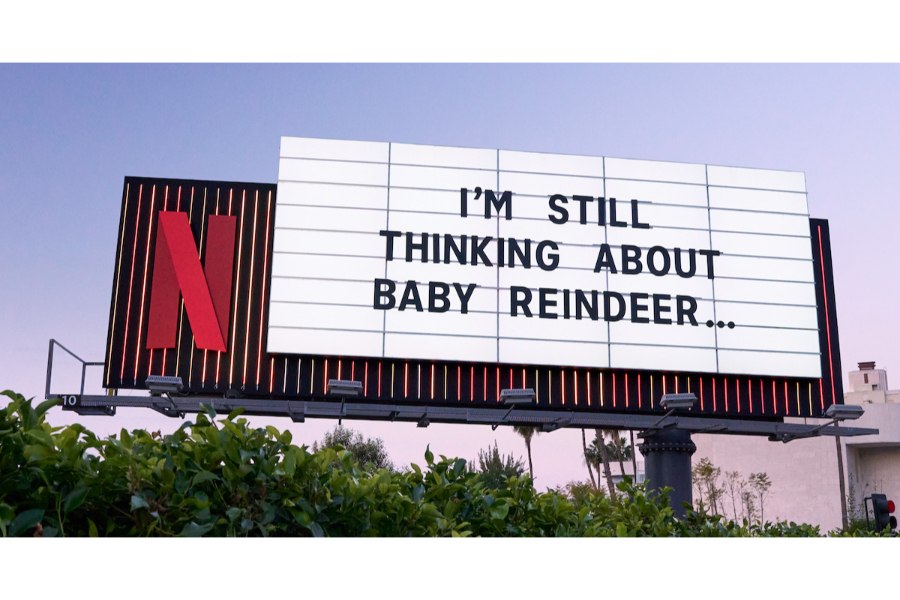
Billboards don’t have to be a one-off, solitary marketing campaign. They’re more effective as part of a multichannel approach with a larger end goal. A good example of this is Netflix’s text-only billboard series. While it’s stylistically one of the simplest billboard ideas, what makes it effective is that it’s part of a wider content marketing strategy that also includes its social media content.
Netflix continually posts messages like these on its social media accounts with the same tone and structure. And the reason it doesn’t need anything extra or fancy in its billboard design is that it has perfected its brand voice so well after using it on multiple fronts. Its messages seamlessly feed into each other.
These types of strategies work best once your brand identity has already matured a little—not when you’re still introducing it to audiences. But if you already have a steady customer base, it can help strengthen your brand even further.
33. Add a QR Code to Go Digital
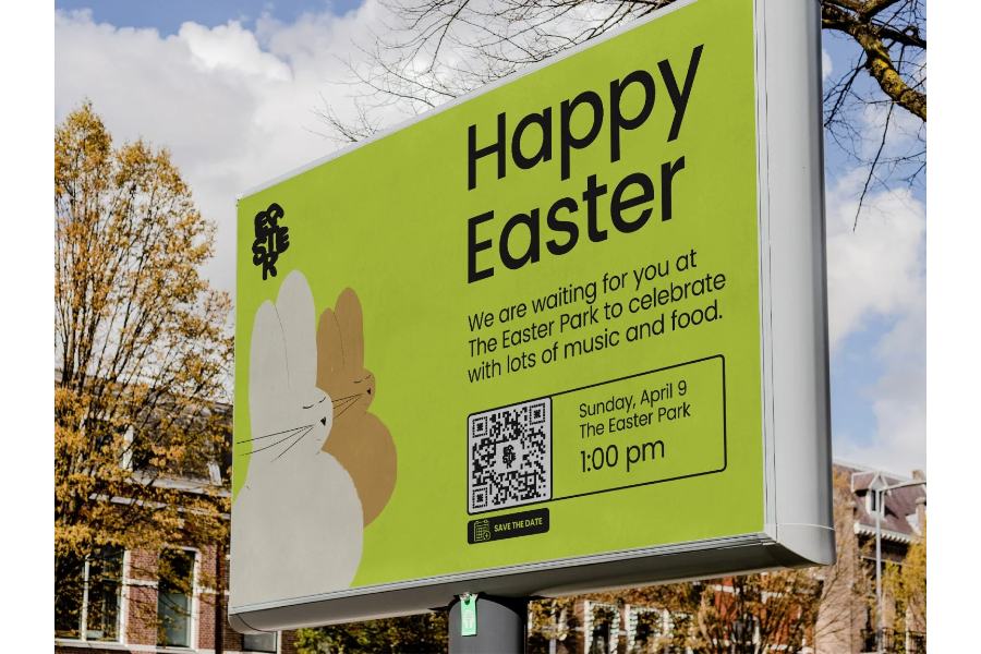
QR codes like these transform your billboard into an interactive experience. (Source: Trueqrcode)
Billboards today don’t have to be simple and one-directional. They can also be interactive and incorporate digital experiences, like leading audiences to your website, social media page, or even a special landing page specifically for your billboard campaign. The best way to do this is via a QR code, which can instantly take people to a specific online destination in one click.
QR codes are specifically helpful if you want to increase traffic to a website or conversions on a certain campaign, say a seasonal sale. They’re also helpful if you want people to watch a video or save an event date.
34. Encourage Conversions With a Promo Code
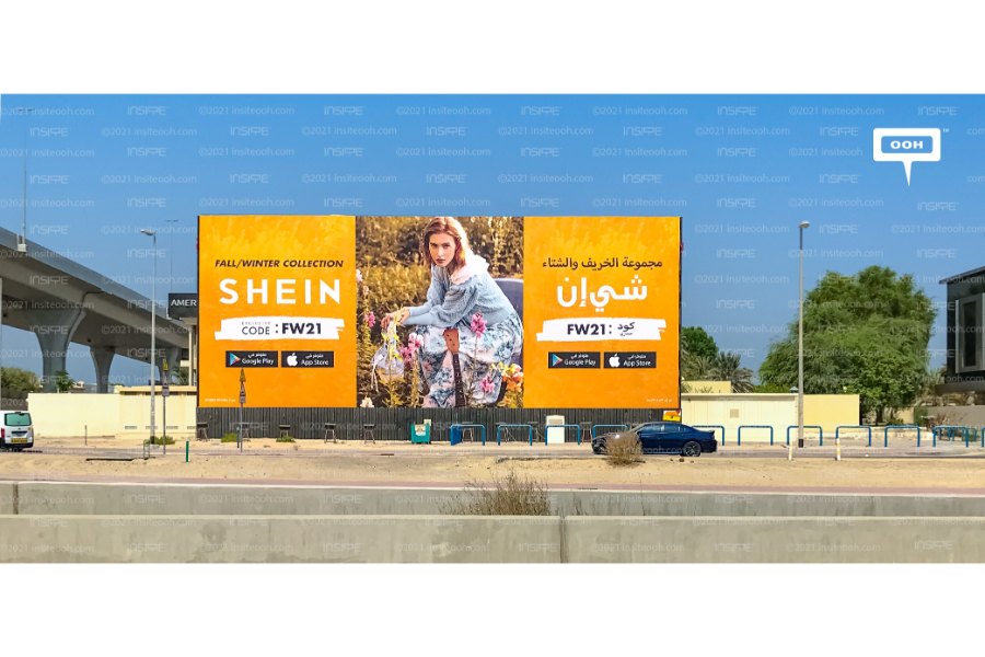
Promo codes like these on your billboard can help encourage conversions. (Source: SHEIN)
Billboards aren’t only for brand awareness. In today’s digitally driven world, they’re also effective at driving audiences to take immediate action using their mobile phones. In fact, studies say more than three-quarters of audiences say billboards have encouraged them to take some kind of action. That includes directly purchasing from your online store. And one way to encourage that even further is by offering a promo code.
Picture this: your audience is stuck in traffic and probably feeling a little frustrated when they spot a coupon code on your billboard to try your new product at a discounted price. It feels like discovering a little treat and associating positive feelings with your brand. They snap a photo of your billboard and maybe even share your coupon code with friends.
35. Leverage What Makes Your Brand Unique
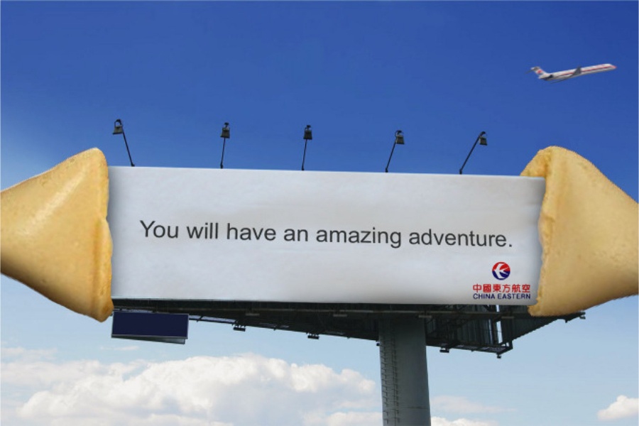
Leverage what makes your brand unique. (Source: China Eastern Airlines)
This applies to just about any marketing strategy, but even more so with billboards, where you have to communicate your message as well as your brand identity in a matter of seconds. What makes your brand unique differs for every business, but one of the best examples of good billboard design that exemplifies this is China Eastern Airlines’ fortune cookie-inspired billboard design.
It’s an excellent idea because fortune cookies are inherently connected with Chinese culture, something China Eastern leveraged to make their billboard stand out and be truly memorable.
36. Be Resourceful
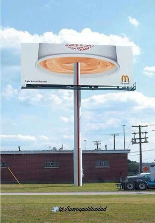
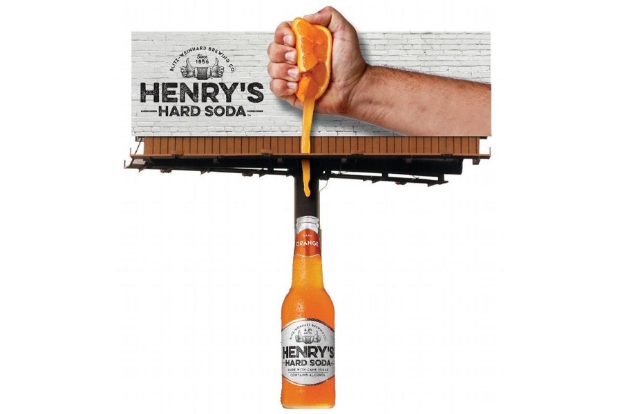
When it comes to ads that really catch passersby’s attention, sometimes the best billboard design ideas are simply borne out of resourcefulness. A good example is the McDonald’s billboard that turns its billboard pole into a giant straw for an upside-down drink, as well as Henry’s Hard Soda’s orange dripping into a bottle.
Both are examples of great billboard designs that expand beyond their four borders but don’t need much extra work—just some extra imagination and resourcefulness.
Billboard Design Do’s and Don’ts
Billboard advertising hinges on two main things: creating good designs and targeting the right audience. But ultimately, no one formula guarantees your billboard’s success. Like anything else in marketing, it’s a constant trial-and-error process. However, some billboard advertising best practices have remained through the years. Here are some of them:
- Remember the three-second rule: Make sure your message is concise, straightforward, and can be understood in three seconds—because that’s likely how long your ad will be viewed.
- Use legible fonts: Lean into clear and bold fonts that are readable from a distance to maximize the time a person sees your billboard. Steer clear of small fonts that can make it difficult to read.
- Create a color strategy: Choose colors that align with your brand, get viewers’ attention, and evoke the emotions you want for your message.
- Incorporate your brand logo and identity: Integrate your brand identity elements seamlessly into your billboard design to strengthen your brand recognition.
- Don’t make it all about your brand: Conversely, your logo shouldn’t take up half your billboard space. Instead, make your message and call to action the focal point.
- Proofread thoroughly: Take the time to check for any errors on your billboard. Even small grammatical mistakes can make you look unprofessional and damage your brand’s reputation.
- Don’t clutter your design: An overly-cluttered design with too many clashing elements can turn off viewers and hurt memorability versus having a simple, strong ad design.
- Don’t rely on generic visuals: Avoid stock imagery and other generic visuals. Original visuals capture attention more effectively, are more memorable, and are much more likely to make a lasting impact on the people who see your ad.
- Don’t use a design you’re not confident about: If you’re unsure about a particular design, refine and finalize it first as it takes time and money to completely redo a billboard. If you are not confident in your design skills, hire a professional to create one for you.
- Choose strategic locations: Finally, locations play a fundamental role in your billboards’ success and cost. Choosing a high-visibility location with lots of traffic may get you many impressions, but may not reach your target audience effectively. On the other hand, choosing a less popular location might help you stand out even more.
If you don’t have the budget to hire full billboard design services, you can hire a designer through platforms like Fiverr to design and mockup your billboard for you for less than $100. It’s an affordable way to get a fully custom and professionally designed billboard ad.
Statistics on the Benefits of Billboard Advertising
Contrary to popular opinion, traditional advertising methods like billboards aren’t dead. In fact, in the digitally saturated world we live in today, they’re potentially even more effective than ever, especially for getting your brand known in your local community. Check out the stats below on how effective billboard advertising can be for your business.
49% of Americans notice billboard ads more now than before the pandemic
The pandemic upended plenty of things we knew about marketing, and one significant area is OOH advertising. Interestingly, nearly half of Americans notice billboard ads more now than before the pandemic, a 2023 study found. When you’re stuck in a lockdown long enough, you notice things more meaningfully—good news for your billboard campaigns.
In fact, physical billboard ads had the #1 brand recall among other advertising forms
In 2023, billboard ads (both physical and digital) had an average recall rate of 85%—higher than print, TV, audio, and even digital ads. In contrast, podcast ads only had a 77% recall rate, while mobile digital ads only had 57%.
76% of audiences say billboards prompted them to take action
Billboards aren’t just effective at growing your brand awareness, they can also lead people to take action and drive conversions. In a 2023 study, 76% of respondents said digital billboard ads directly prompted them to take action, such as watching a video, visiting a restaurant, and making an in-store purchase.
Nearly 80% of audiences engaged with an OOH ad in the last 60 days
Engagement with OOH ads like billboards may not be as straightforward as clicking and sharing like with digital ads. It often involves scanning a QR code or researching the brand behind it. And in 2023, nearly 80% of audiences said they engaged with OOH ads in some way in the last 60 days.
51% of people who notice a billboard ad with directions visit its location
Here’s one reason billboards remain effective for local advertising: over half (51%) of people who notice a billboard with directions visit its location. This is especially valuable if you have a physical location. A simple, clear billboard can lead people in your area right to your doorstep.
93% of people who visit a store advertised on a billboard complete a purchase
Finally, not only are billboards driving in-store visits, but 93% of people who visit a store after seeing it on a billboard actually complete a purchase. This demonstrates that billboards can directly boost revenue.
Frequently Asked Questions (FAQs)
The first thing you need to do to make a catchy billboard is identify the right message for your billboard campaign. This will depend on your campaign’s overall objective. Also, make sure you have a fully formed brand identity to create a billboard message and design that fits your brand. Come up with a billboard concept and message draft, then revise it until it’s exactly right. Make sure your billboard is instantly understandable from just one read.
Laying out a billboard depends on your overall ad concept. If it’s just a simple design that fits in one rectangle, you can use any design tool like Adobe Illustrator or Canva to lay out your billboard design. You can also request a template from your billboard provider to lay out your design. Meanwhile, if your design is more outside the box, you may need to hire a professional mockup designer to properly conceptualize your billboard ad.
The main elements that make a billboard stand out are a memorable message and a unique concept. If there’s anything all the best billboard ideas have in common, it’s those two: an effective, on-brand message and a creative, eye-catching design.
Together, they help your billboard stand out even among other billboards in your area. Other things that help your billboard stand out are interactive elements with its environment and a prime location.
Bottom Line
There is no single formula for creating a billboard design that stands out and catches audiences’ attention. But that also means there are no limitations to the billboard design ideas and concepts you can come up with. As long as you have a clear message, a thorough understanding of your target audience and brand identity, and a creative design, you’re on the right track to making a memorable billboard.
