Professional letterhead conveys your branding and gives valuable information to recipients. The key elements to include are your logo, company name, physical or mailing address (or both), phone number, email address, and website URL. There are many creative ways to display this essential information. We rounded up 25 business letterhead examples from a variety of industries to inspire you, including a free template you can customize to design your own.
Free Business Letterhead Template & Design Tips
Business letterhead refers to content that appears on every page used for business correspondence. Traditionally, this content is placed at the top of a page, or top and bottom, leaving room for messaging to be added. But in practice, your letterhead’s design and text elements could be placed anywhere, and using these elements creatively can help your brand stand out.
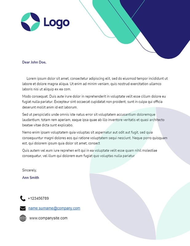
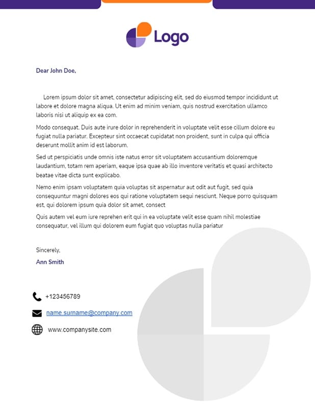
To help you create a stationery design for your small business, download the free business letterhead template below.
Thank you for downloading!
💡 Quick Tip:
When you’re ready to print your stationery, use VistaPrint. With fast turn times and low minimums, it’s the best place to print all your marketing materials.
Thank you for downloading!
💡 Quick Tip:
When you’re ready to print your stationery, use VistaPrint. With fast turn times and low minimums, it’s the best place to print all your marketing materials.
Check out the 25 business letterhead examples below and learn about the strategy behind the design:
1. Retail
Splash of color on retail business letterhead (Source: Graphic Delta)
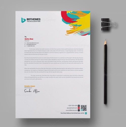
Adding a bold splash of color (which this example takes literally) is an excellent way to catch your reader’s attention. Up to three contrasting colors can create a sense of vibrancy that makes a letter stand out from the rest of the designs in the industry. Including at least one of the colors from the logo also ensures a cohesive look.
2. Furniture
Modern furniture business letterhead example (Source: Stock Layouts)
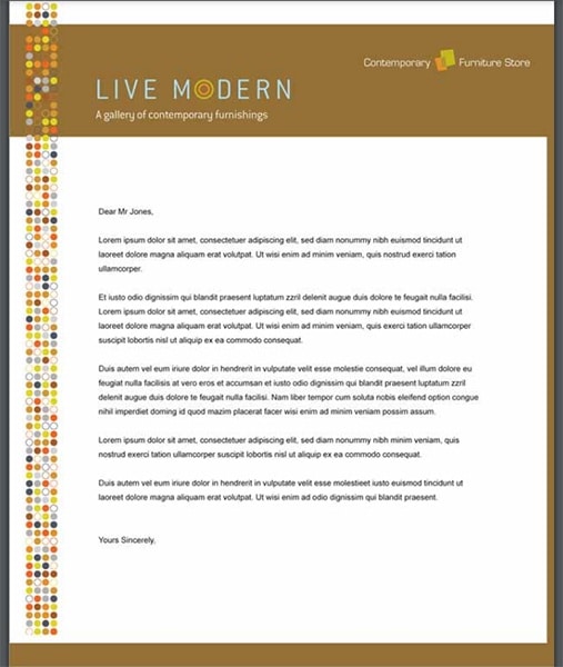
Using any amount or number of colors in your company letterhead is perfectly fine—as long as it doesn’t overpower your company branding. As far as business letterhead examples go, this furniture company’s stationery uses a range of colors that complement the logo. The horizontal color block at the top of this stationery ensures that the readers’ eyes go directly to the top, and they are guided by the sidebar for a smoother flow.
3. Construction
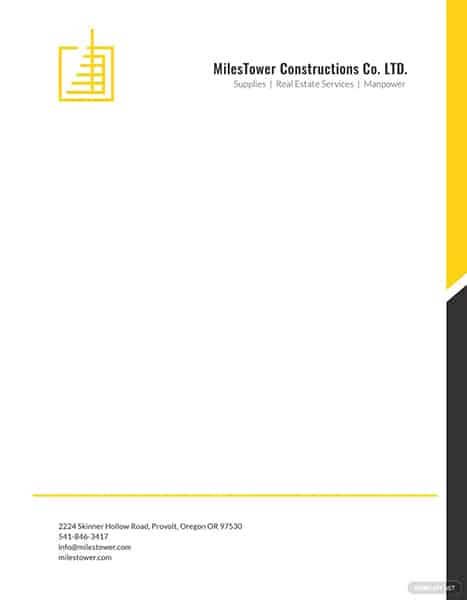
Black and yellow construction business letterhead (Source: template.net)
This construction company stationery supports the brand using colors common to the industry and a clean but still architectural design. The logo stands apart, bringing extra attention to the brand, while the yellow and black post at the far right anchors the design of this business letterhead example.
4. Charity
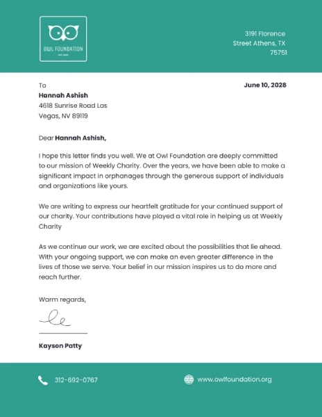
Simple green charity letterhead example (Source: Venngage)
Organizations that need to build up their presence should incorporate as many of their branding elements as possible into their collateral. This charity business letterhead example uses only a single color throughout the letterhead. Rely on your brand color and logo to catch viewers’ attention while keeping who you are top of mind.
5. Security Systems
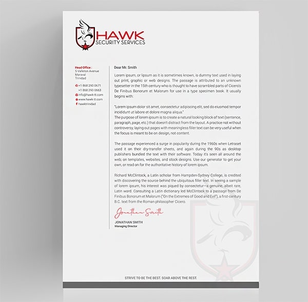
Column type business letterhead layout (Source: DesignCrowd)
A creative way to make a letterhead is by incorporating columns into your design to separate areas of text. Instead of putting contact information at the top or bottom of the page, the business letterhead example above uses a column on the left to clearly include all the relevant company information. An additional element that can elevate your design is a watermark of your logo in the body of the letter.
6. Hotel
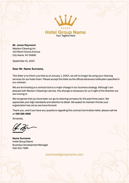
Luxury hotel business letterhead (Source: Poster My Wall)
This hotel letterhead sample uses a subtle yet intricate design that dramatically frames the body of the text. Using designs like this while keeping the body of the letter simple evokes a sense of luxury, which benefits hotel marketing. Even though the company information is found at the bottom with minimal design, the logo’s position still makes the company branding recognizable.
If you are promoting a luxury brand, product, or high-end service, make sure your letterhead and other marketing materials give the same impression. For example, products from MOO are best known for their sleek designs and expensive-looking finishes. For more information and options about MOO, check out our list of the best direct mail providers for small businesses.
7. Law Firm
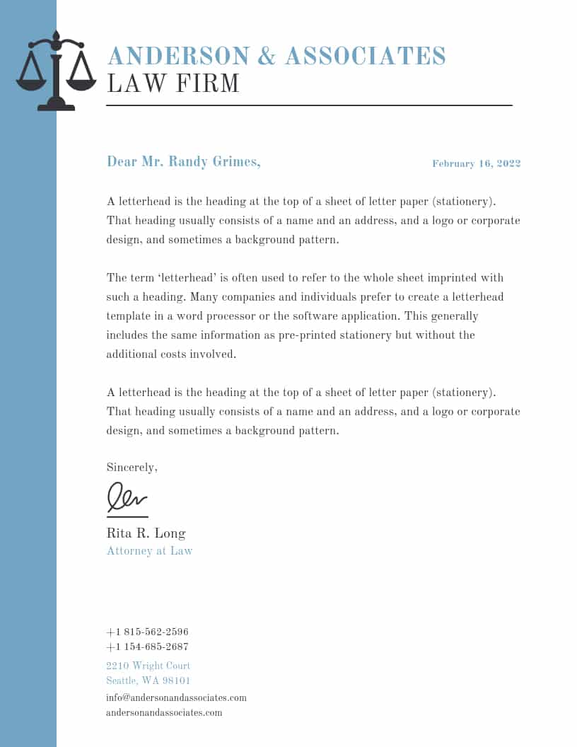
Professional law firm letterhead (Source: Venngage)
To set this firm’s correspondence apart from its competitors, it uses the company’s colors and displays a large logo at the top left corner. As a law firm, your marketing collateral needs to look professional. In terms of business letterhead examples, this does that while also creating visual interest with color.
8. Medical Practice
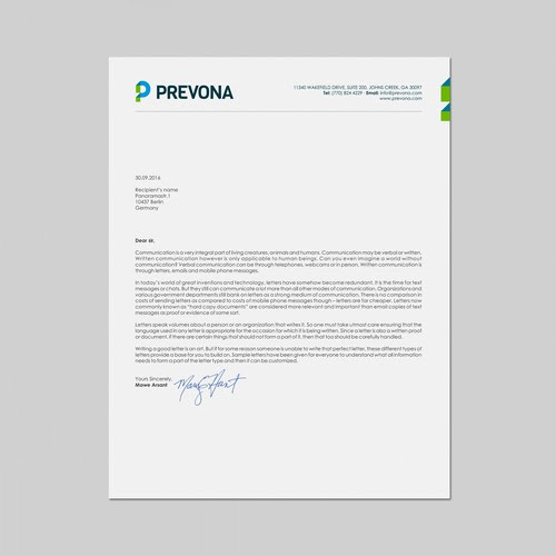
Simple company letterhead for a medical provider (Source: 99designs)
A medical provider or practice doesn’t only have to look professional but also reliable and modern as well. This sample letterhead strikes the right balance between simplicity and modernity by keeping the layout clean with all the company information up top while adding a few pops of color that match the company’s logo and branding.
9. Consultancy
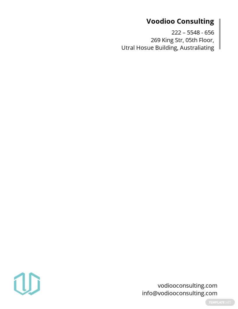
Minimalist consultancy business letterhead (Source: Template.net)
Less can be more when it comes to giving off a professional vibe in your marketing materials, but less doesn’t mean limited. This is an example of how to make more visually interesting use of your letterhead’s design by placing your company’s information and business logo outside the usual spot at the top of the page. The result is minimalistic and easy to read because of the more unusual positioning.
10. Investment Firm
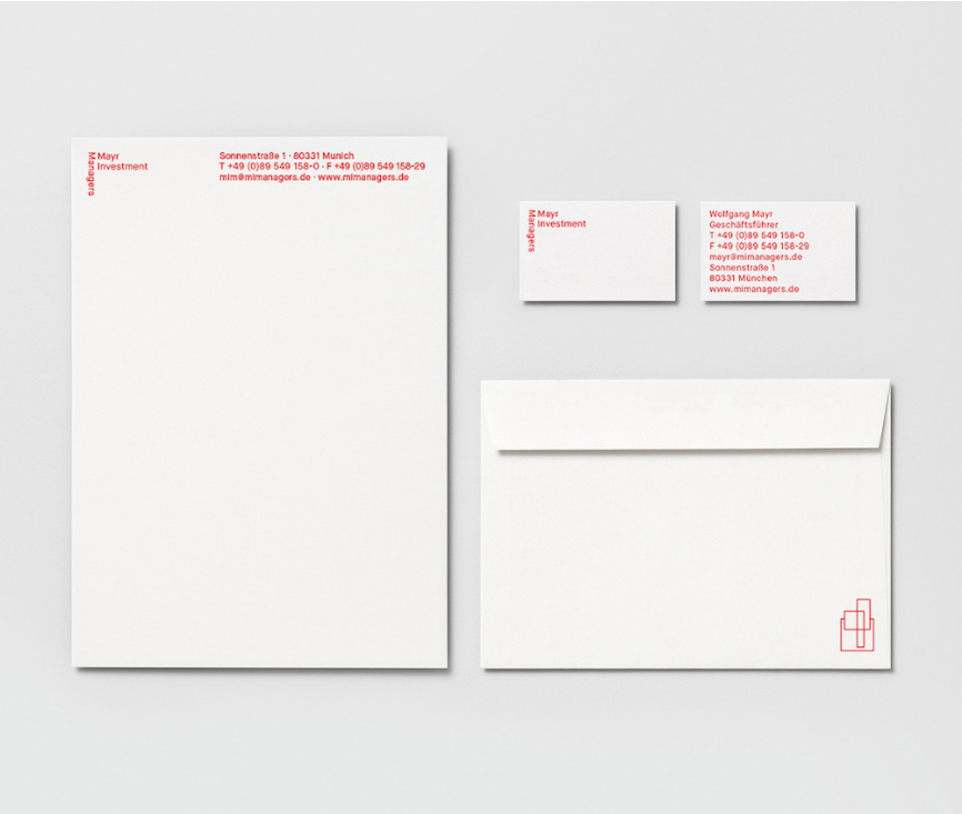
Red monochrome letterhead template (Source: Aiga Eye on Design)
Alternatively, you can keep things clean and minimal yet still interesting through a monochromatic color that isn’t black. With all the crucial information at the top of the page, your audience will get a strong brand impression, and your contact details will be easy to find.
While this letterhead example shows a great use of eye-catching color, it’s also economical. The cheapest stationery to print is black and white, but using a single color is usually only slightly more expensive and still much cheaper than full-color business letterhead. As a bonus, a letterhead like this is easy to create on do-it-yourself (DIY) graphic design sites like VistaCreate.
11. School or University
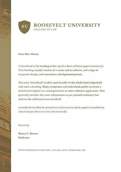
University letterhead with photo sliver (Source: Canva)
Set your institution apart and further your branding by using your school’s primary color as the basis for your business stationery. The letterhead example above shows how easy it is to add imagery without taking away from the overall simplicity. Use just a sliver of a photo with an overlay color consistent with the rest of your letterhead to keep it elegant and professional.
12. Restaurant
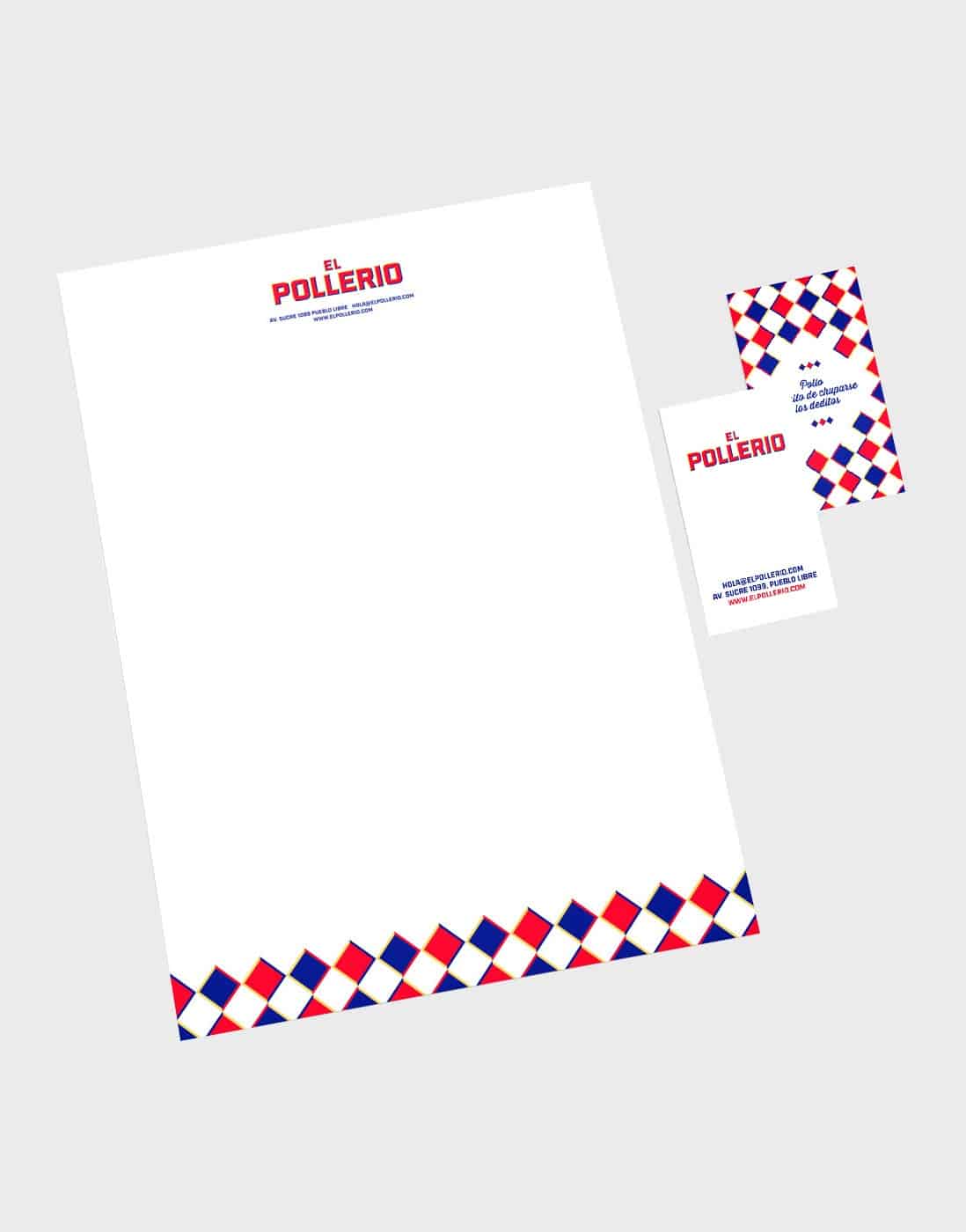
Creative restaurant letterhead with vibrant colors (Source: IS Creative Studio)
A food business can have a little more fun and take creative freedom with its letterhead. Take inspiration from this letterhead example, and create your letterhead in vivid, vibrant colors. To keep it modern and fresh, isolate the graphic design and use it as a border at the edge of your letterhead.
13. Bookshop
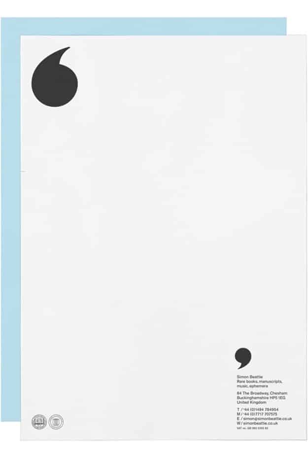
Graphic symbol letterhead for bookshop
(Source: purpose.co.uk via Pinterest)
Black and white letterhead design can be visually attractive by incorporating evocative or whimsical graphic symbols, like in this example. Instead of a company logo, use a visual that fits with the industry or type of work your business is in. The quotation marks shown here are apt for a bookshop’s stationery but would also work for a literary agent, publishing company, or writer.
14. Real Estate Agency
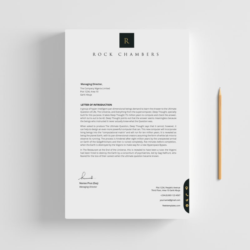
Letterhead for company sample in real estate (Source: Fleek Templates)
Plain letterhead with a sizable initial logo and your business name up top looks elegant and professional, especially in classic colors like black and gold. While it may not be the most colorful real estate letterhead example, going with a classic font and minimalist color scheme gives the impression of exclusivity and luxury—making it perfect for a real estate agency.
15. Architectural Firm
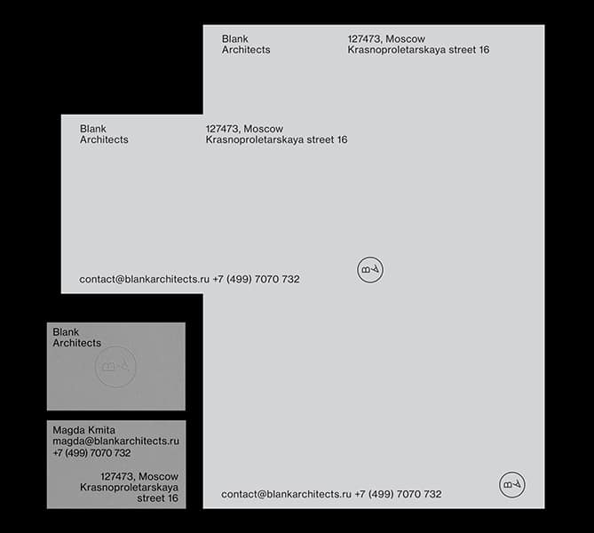
Modern blocked company letterhead example (Source: Bleed Design Studio)
Create a more modern letterhead design by not using graphics or colors, as seen in this letterhead example. Use spacing and text blocks to separate the content areas of your correspondence to make everything easy to digest. This type of design is also very structural by nature, fitting for an architectural firm, art gallery, builder, or even an interior designer.
16. Digital Marketing
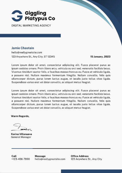
Digital marketing agency professional letterhead examples (Source: Canva)
Digital marketing agencies face the challenge of having to walk the line between unique, creative branding and refined with a strong sense of professionalism. This business letterhead may seem simple, but the harmony of colors and sprinkle of design elements throughout the page are good ways to showcase a digital marketing agency’s creative capabilities.
For agencies who tend to lean toward simpler designs, a more unique paper stock or texture can make all the difference to positively imprint your brand to the reader.
17. Nonprofit Organizations
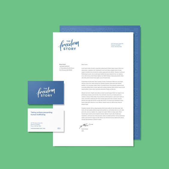
Modern nonprofit organization letterhead example (Source: Brave Factor)
A nonprofit’s letterhead has to do an excellent job of disseminating information while still being modern, appealing, and on-brand. The business stationery example shown here is beautifully designed yet still very simple. Aside from the pops of color in the logo and company information, the rest of the professional letterhead is further delineated by the visually interesting use of spacing, including a left-side column for the organization’s contact information.
18. Graphic Designer or Artist
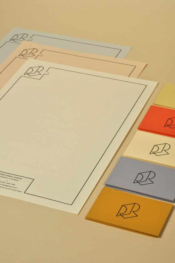
Unique letterhead sample for graphic artist
(Source: Tim Jarvis)
Being in a creative field of work allows more leeway in terms of letterhead design. While modern-looking letterheads are often simpler as to graphics and colors, don’t let that stifle your creativity. If you have the budget for it, print your letterhead design on different paper colors. This enables you to stay on-brand while keeping it more interesting for your clients and audience.
19. Health & Wellness
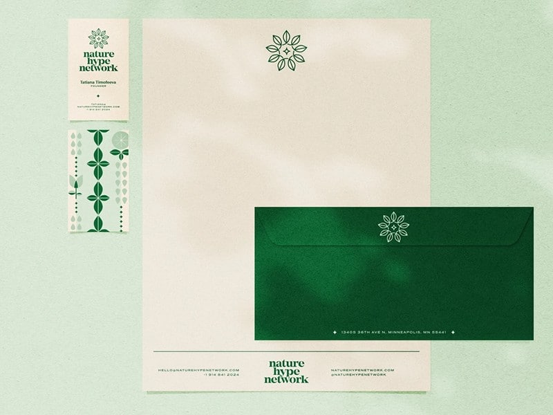
An example of esthetic business letterhead for a wellness brand (Source: Dribble)
A relaxing and elegant take on business letterhead, this health and wellness letterhead example is sure to set your brand apart. Choose appealing yet eye-relaxing colors to add visual interest and keep the correspondence side simple. Adding the logo in the same color will tie everything together on your custom letterhead.
20. Skincare
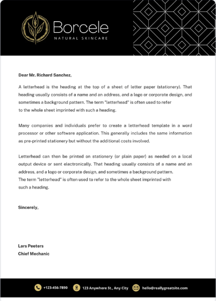
Unique letterhead sample for skincare agencies (Source: Canva)
This business letterhead is undeniably luxe, from the sleek color blocking to the intricate accentuating pattern. For businesses in skincare, cosmetics, or similar industries, it’s important to not only make an impact with your business letterhead design but also speak to the quality of your products.
Pair this with a heavier stock from premium printing providers like MOO, and this business letterhead style can leave your audience feeling impressed and interested in purchasing.
21. Gardening & Landscaping
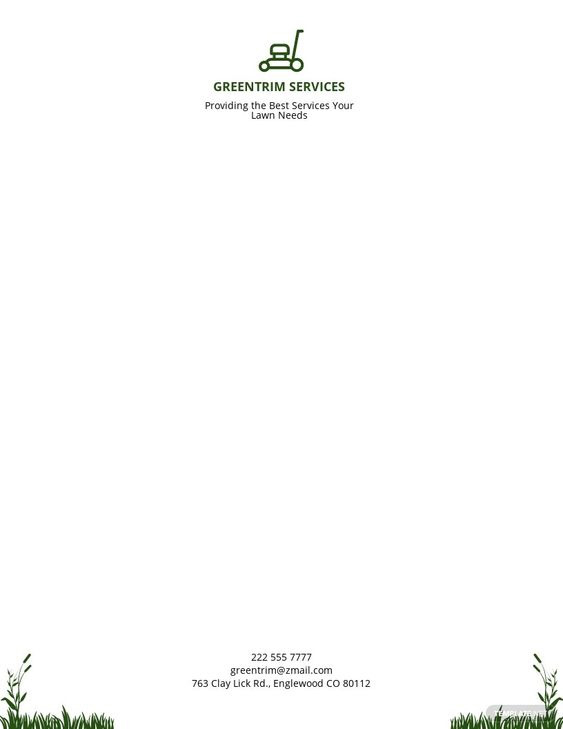
Grass graphics business letterhead sample
(Source: Template.net)
Don’t shy away from on-brand graphics. Take this landscaping letterhead design, for example, where patches of grass frame the page’s content. To keep it modern without being overly kitschy, the graphics are limited to the corners of the paper. You can do something similar for your business on Canva. In addition to editable stationery templates, they have a library filled with free graphics and images.
22. IT Services
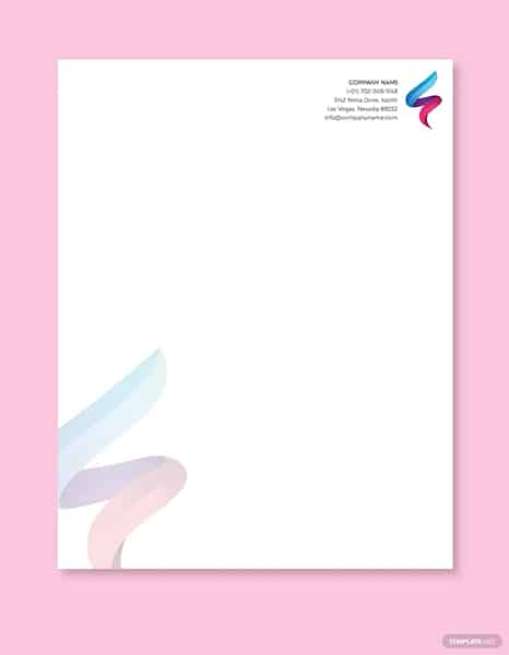
Contemporary and colorful IT company stationery design (Source: Template.net)
This business letterhead example’s contemporary design stays on-brand while still being modern enough for an IT company. Since the logo design is already extremely colorful, instead of overwhelming the design with more colors, it repeats the logo at the bottom corner as a larger but muted watermark. This adds a more subtle burst of color to the template and ensures your clients recognize your logo instantly.
If you still need to design a logo or it’s time to refresh your brand’s visual identity, check out our list of the best sites for logo design. They include free and small business budget-friendly options for do-it-yourself logo design as well as professional services.
23. Accountant
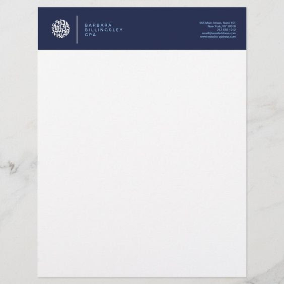
Elegant accounting firm examples of letterhead (Source: Zazzle)
An accounting firm’s correspondence should inspire trust and look professional. This is a great company letterhead example that uses color to convey an air of seriousness. Its fonts fit the bill too, as they’re not too stylistic to detract from the overall tone of the letterhead. This look is great for accountancy and financial firms, but it can also work well for other corporate businesses, like investment firms, banks, and insurance agencies.
Reinforce this sense of elegance by printing your stationery on a heavier stock. Lighter-weight papers may be cheaper, but often look cheaper as well and may not hold up to a color-saturated block as seen in the example above.
Since it’s a relatively simple design to reproduce, you can make it yourself through Canva instead of hiring a professional graphic designer and printing it yourself on demand. Alternatively, to get edge-to-edge graphics or images as part of your design, have it printed professionally by VistaPrint.
24. Hospital
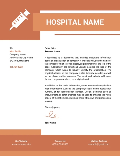
Orange monochrome hospital template (Source: Venngage)
Color has always been used as a way to attract interest and catch people’s eye. This letterhead is a unique take, especially for businesses in the medical industry. Design-wise, it is impactful and much bolder than traditional options. Functionality-wise, we see how the business contact information is much more upfront and laid out.
This is particularly useful for businesses that communicate pertinent business information since the color ideally keeps their eyes on the page. The layout of business information, which is centered in its own column, helps encourage further communication with the business as opposed to smaller text positioned on the corner of the page.
25. Fashion Designer
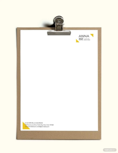
Minimalist designer letterhead template
(Source: Template.net)
Complicated letterhead designs aren’t necessary in the design industry. For some brands, it’s more effective to stick to a single design element and focus on giving a sense of luxury instead of trying to showcase everything they can do.
This minimalist letterhead template for fashion designers is a testament to how simplicity alone can be enough to elevate your design. For a more seamless feel to your letterhead, use your logo as a reference for how to design your letterhead.
Creating a Letterhead: Best Practices
The “perfect” business letterhead will ultimately depend on your business industry, brand identity or style, and personal preferences. However, to keep your letterhead up to standards and prevent a negative impression on your reader, follow these best practices:
- Prioritize clarity: A flashy letterhead, if designed correctly, can make your business stand out. However, your main priority in designing a letterhead should be that it can clearly communicate your brand from other businesses in the industry. When in doubt, use a simple letterhead to give a sense of professionalism and clarity.
- Showcase your logo: To achieve a highly recognizable letterhead, position your company logo at the top. You can incorporate your letterhead logo seamlessly into your design by using the same or accent colors throughout the letter.
- Use brand-consistent colors: Your letterhead can have different colors in its borders, header, and selected parts of the letter’s body. You can explore vibrant and contrasting colors to make your letterhead memorable and pleasing to the eye. Just remember that, above all else, your company letterhead should convey your brand.
- Add a creative footer: Adding a footer to your letterhead can create balance, emphasis, or even a sense of hierarchy. A well-designed footer can show your business information clearly as long as there is good use of space. To do this, make sure that your footer isn’t squeezed into the design and incorporate some color to draw attention to it.
- Frame the page: To add more personality to your letterhead design, use illustrations or a customized border to frame the body of your letter. This adds a pop of color and gives a sense of creativity that most readers appreciate.
Best Letterhead Design Resources for Small Businesses
Creating a successful letterhead design requires some level of skill and creativity. You can choose to design your own letterhead, hire a professional graphic designer to do it for you, or customize a template to suit your business.
Here are some of our most trusted and affordable letterhead design resources to help you start:
- Canva: Modern and creative letterhead templates (4,500-plus options), as well as free graphic design and editing tools to create a design and download it for printing.
- VistaPrint: Start with one of its hundreds of business letterhead templates, use intuitive design tools to customize it for your brand, and order affordable print copies in a matter of minutes.
- VistaCreate: Get access to tens of thousands of free images and graphics and use its powerful design tools to create custom stationery for your company.
- MOO: Best templates for luxury brands and high-end printing and finishes.
- Fiverr: Businesses on a budget that want to outsource for a more professional look can get a custom letterhead design for as little as $5.
- 99designs: Hold a contest, and multiple graphic designers will submit letterhead designs so you can choose the one that best suits your brand, or explore examples on the platform to find a designer you want to work with.
For more ideas, check out our comprehensive list of the best logo design sites for businesses. Many have free tools for designing not only your logo, but your stationery and other marketing materials as well.
Frequently Asked Questions (FAQs)
Creating corporate letterhead yourself can be done easily by modifying a Microsoft Word template or in Google Docs by clicking the template gallery at the top right of an open page. But for a more professional look, use graphic design software such as Canva or premade templates from sites like VistaPrint. Alternatively, you can hire a professional through Fiverr for as little as $5 and get a unique, custom design to showcase your brand.
Aside from your branding, your letterhead should include the information clients and prospects generally need to know. This includes your address, phone number, fax number, office hours, email address, and the URL of your small business website. You can get creative with placing all the details, but be sure you leave enough space on the page for your message to be added.
Many businesses print their letterhead on demand, limiting their costs to any design fees incurred plus the cost of printing (e.g., paper and ink costs). The cost for pre-printed letterhead starts at under 80 cents per sheet with VistaPrint, and the cost per sheet goes down with higher quantities. However, it could be $2 per page and up with luxe printers like MOO, depending on the paper stock, finishes, and extras you might want, like embossing or foil.
Bottom Line
Business stationery is an essential marketing and branding tool. Because it represents your business, it needs to look professional yet be creative enough to stand out. To get fantastic designs, convenient printing, and affordable pricing, take the next step after going through our top business letterhead examples. Explore the professionally designed letterhead templates in VistaPrint and have them printed immediately for as low as 13 cents per page.
VistaPrint is the best one-stop solution for company letterhead design and printing. Upload your own design or use VistaPrint’s templates and online editing tools to create a custom letterhead design for your small business. Then, when you’re ready, order in quantities as low as 100.