Brochures are one of the most affordable marketing tools at your disposal. They’re reliable, effective (even in the digital age), and are a creative way to showcase your brand. Brochures are also versatile—they’re suitable for almost any type of content or promotion. We’ve rounded up 25 of the best business brochure examples to take inspiration from, why they work, plus tips on creating yours.
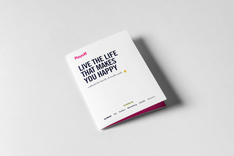
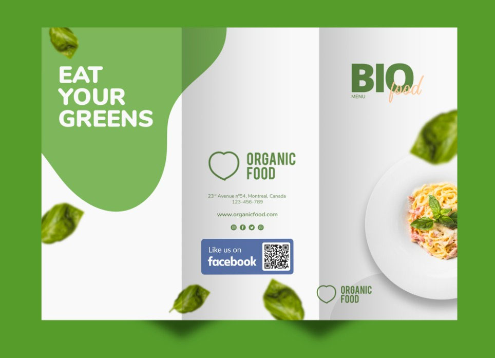
1. Use Hero Images to Draw Attention
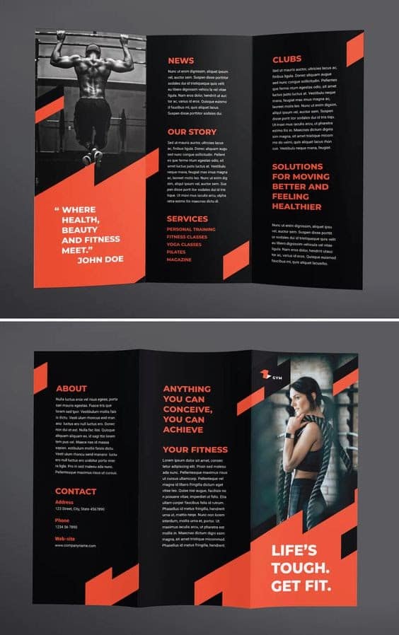
Z-fold brochures are the most standard version of a brochure, so they can sometimes be a little basic and easily overlooked. But there are ways to help them stand out, and one of the most tried-and-true is by using hero images as the focal point of your content. Hero images work because humans are inherently visual—our brains process visuals up to 60,000 faster than text—so it’s true that a good picture on your brochure is worth thousands of words.
Choose a few best images of your product or service and use them as the centerpiece of your content, then design your brochure around it. These make for some of the best business brochure examples because they work well with any type of business, whether you own a cafe or a travel agency.
2. Stick to One Color Palette for Better Brand Recall
While many eye-popping colors on your brochure are sure to catch attention, a little too many might just overwhelm your readers. If you still want to go for a vibrant effect but in a more muted way, stick to one color palette for your entire brochure instead, like in the company brochure examples above. They maintain a sense of creativity and energy without being too overpowering.
Sticking to one color palette is also a great way to showcase your branding in your brochure. Since brochures are widely regarded as a source of in-depth information about your business (vs posters that usually advertise a specific product or event), they’re a prime asset for promoting your brand presence.
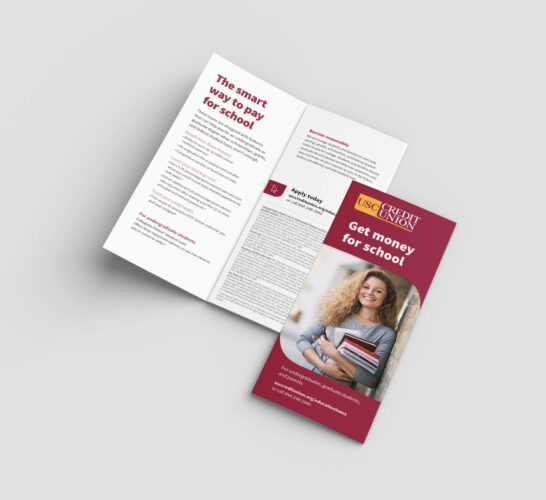
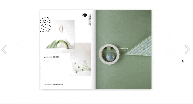
3. Use White Space to Highlight Images
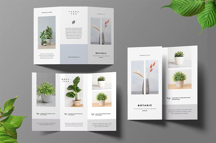
Use white space to draw attention to images. (Source: Envato)
If you have several images in your brochure, use them as its center point. This goes especially if you have photos of your product—you don’t want readers to be distracted by many other copies or design elements. This is where white space comes in handy, like in the examples of brochures above.
You’ll notice that they don’t feel too overwhelming, despite having multiple images, sometimes even on the same page. That’s because they keep the rest of the brochure simple, using lots of white space and short lines of copy.
Staring at a blank sheet can be intimidating. Short-cut the process by using Canva’s free templates and online design tools—it’s one of the best places to get free images for brochures, websites, business cards, and most other marketing materials.
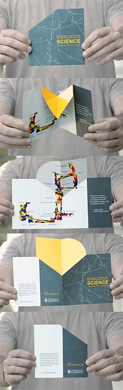
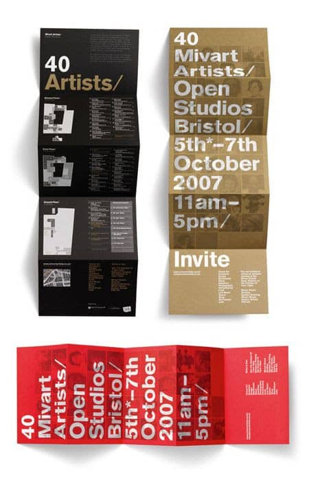
4. Illustrate Processes Through Accordions
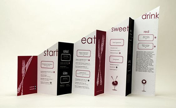
Stand out from the rest with a uniquely shaped brochure (Source: Theo Kleinschnittger)
Brochures are versatile marketing materials for small business. If you want your brochure to hold more information than your standard business name and contact info, your best bet is to use longer accordion brochures. Accordion brochures are especially helpful if you have a process you want to illustrate or a longer story to tell, like in the example above that uses an accordion to illustrate different courses in a menu.
Since you have much more space in an accordion brochure, another good tip is to alternate using images and text in each panel so you don’t cause information overload.
5. Use Hand-drawn Elements for an Authentic Feel
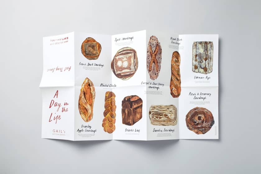
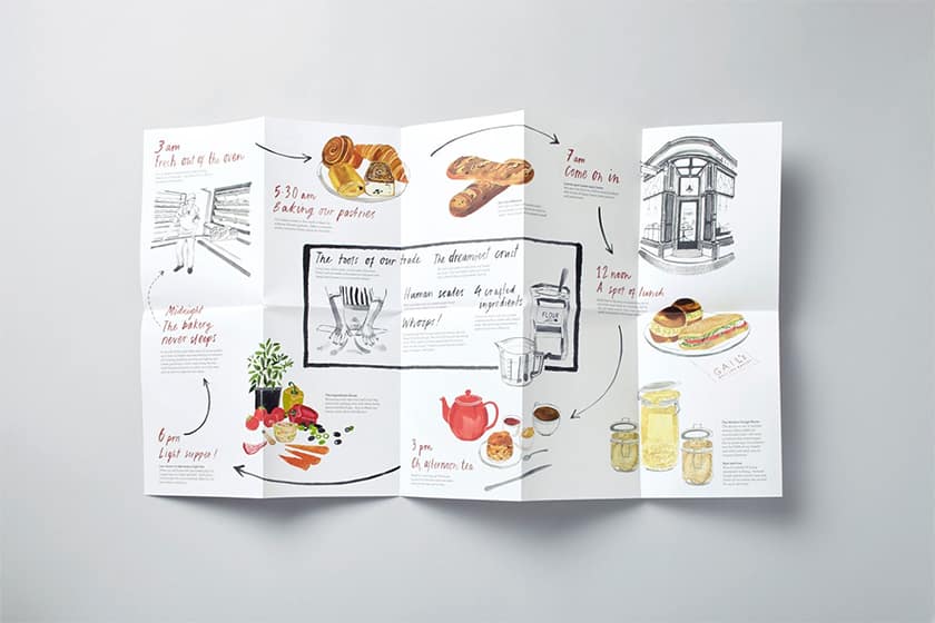
The brochure examples above from an artisan bakery do a wonderful job of being informative to customers while feeling unique from most other marketing brochures. This is thanks to the creative approach to its design: It’s composed entirely of hand-drawn elements, from its watercolor illustrations to its calligraphy font. Altogether, they immediately give users an authentic, artisanal feel.
Overall, the brochure is an excellent example of fully integrating your brand identity into your design. If you have a business in the crafts or artisan industry, hand-drawn elements are great design elements to help your brochure stand out.
6. Create an Immersive Experience With Pop-up Brochures
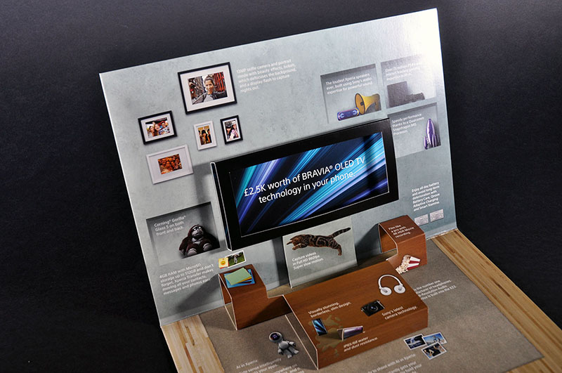
If you’ve ever opened a children’s pop-up book, you’ll know how much fun of an experience it can be. But what if you took that immersive experience and transposed it onto your brochures? Pop-up brochures do exactly that, and they’re some of the best examples of advertising brochures that go beyond sharing information to create a memorable user experience.
Use pop-ups to show maps (say for a museum or exhibit) or to create a mini diorama of your products in action, like the above example of gadgets in a living room. These types of brochures are possible with die-cutting—which can cost you extra, but will definitely make your brand more memorable.
7. Use Graphic Elements to Direct Attention
Graphic designs aren’t just decoration on your brochure. You can also utilize them to provide a better reader experience, like in the examples above that use graphics to guide users’ attention around the information in the brochure. This is especially helpful if you have lots of information on your brochure—use graphic design to guide your users’ journey. Arrows are a simple and effective design element. Or, leading lines make for a similar but more subtle effect.
8. Give People a Reason to Pick Up Your Brochure
When it comes to writing your brochure headings, your immediate instinct might be to just go for a generic title. But with so many other competitors (especially if you send your brochure via direct mail marketing), yours will need a little edge to get picked up and read. That’s why when it comes to the best business brochures, don’t discount the importance of effective copy.
It’s the same as with any call to action: Use your heading to give people a reason to pick up your brochure. Persuasive headings make your brochure more intriguing and interesting and motivate readers to find out more.
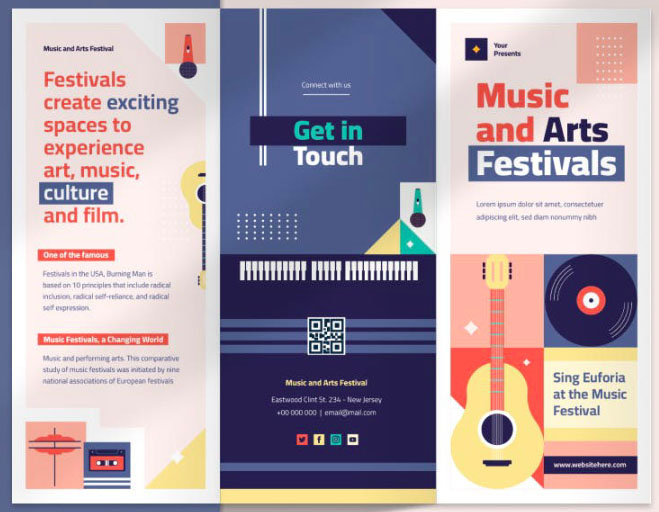
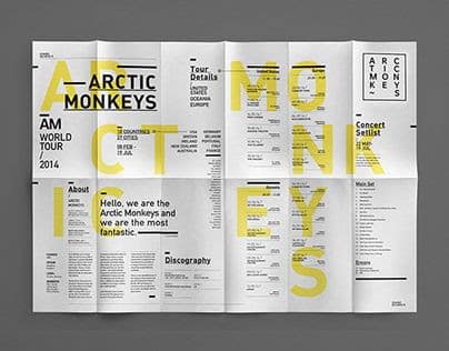
9. Use Bold Typography for Event Details
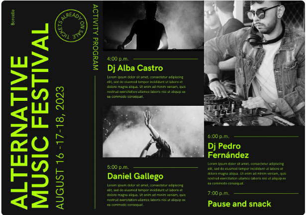
Bold typography attracts attention no matter where they’re used. But for brochures, it’s especially useful for event invitations, like in the examples above. Event invitations need to be fun and eye-catching while showcasing the most important details of the event, both of which bold typography is perfectly suited for.
But that doesn’t mean that the rest of your brochure needs to be any less creative. Take cues from the sample brochures above—play around with different fonts and layouts and use contrasting colors for your text and background.
10. Play Around With Color Gradients
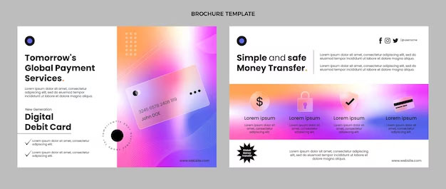
When it comes to your brochure’s design, one of the simplest but most eye-catching ways to stand out is by being creative with your colors and images. For instance, use color gradients to highlight key details in your content, or you can even go bold and use a full-color gradient background. Just be sure to keep the rest of your layout simple, and use a contrasting color for your text.
11. Highlight Information With Minimalist Typography
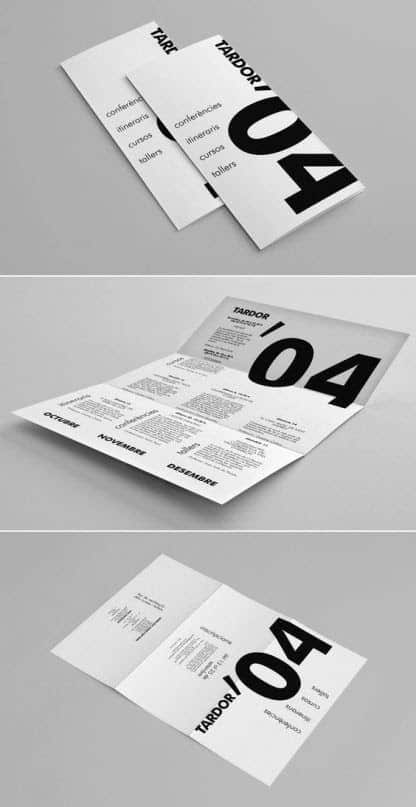
Keep everything sleek with blocky typography (Source: Print Peppermint)
Conference itinerary brochures don’t have to be boring, as shown by the brochure samples above. Because these types of brochures are primarily informational (rather than promotional), keep your designs to a minimum to focus readers’ attention.
The brochure above uses a minimalist black and white color scheme for a more modern look, then plays up the sleekness with font hierarchy. It’s a great example of how a brochure can be visually striking even without any images.
12. Use Colors to Highlight Headings
Brochures can sometimes be filled to the brim with so much information for one reader to take in all at once. Aside from using font hierarchy to organize your text, use bright colors to highlight the most important headings of your brochure so they immediately catch viewers’ attention.
Above are some of the best examples of a brochure that follow these principles. Despite having lots of other information on the page, your attention is immediately drawn to the main headings first and foremost. To best leverage this, keep the rest of your brochure to a simple, monochromatic color scheme.
Check out our list of branding statistics for more guidance. Branding stats show that consistency is key, and our roundup also offers a summary of color psychology to help you know which to choose.
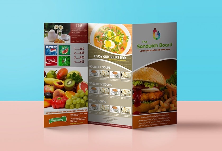
13. Section Your Brochure to Create a Product Catalog
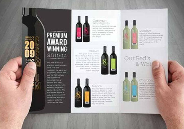
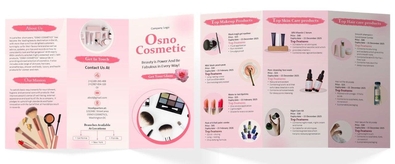
Product catalogs are traditionally reserved for longer, booklet-type marketing assets, but they’re also perfectly suitable for brochures—the business brochure examples above are proof of that. The key to making them work is to divide your brochure into sections, then list your product details along with some high-quality images of your product. To maximize your space, you can even add other info like contact details and your store address on the opposite side.
14. Use Full-panel Lifestyle Photos
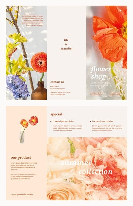
Go colorful, but keep it in one color scheme (Source: Raw Pixel)
Alternatively, if there’s one product you want to highlight in particular, you might opt for full-panel images on your brochure instead. These work particularly well for lifestyle-oriented brands, like florists or beauty brands where high-quality visuals are key. To keep your images from being too overwhelming, you can add a filter over them or overlay them with short text, as in the example above.
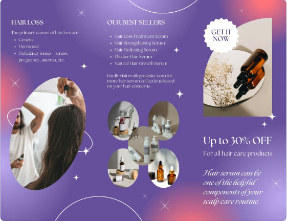
15. Offer a Discount Coupon
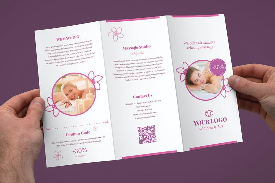
Include a discount coupon your clients can use for future visits (Source: Design Template Place)
Discount coupons are a proven-and-tested effective marketing method, especially for marketing brochures. In fact, coupons are the primary source of product inspiration for about two in 10 people, which means your brochures have a much higher chance of leading directly to a sale if they include a discount coupon.
There are two ways to incorporate coupon marketing in your brochure: You can go the traditional way and have audiences cut off a portion as a coupon, or you can use a digital coupon via a QR code.
16. Use Images as a Brochure Cover
Include a strong call to action (CTA) to motivate people to work out (Source: Design Template Place)
One of the most classic and effective business brochure examples is to use a full photo on the first panel of your brochure, turning it into a kind of “cover.” Then, on the inside, fill the remaining pages with all the essential information and copies about your business, from your brand story to your contact details. Since this type of layout can hold lots of information, it works best if you’re creating a squarely informative brochure.
17. Highlight Your Product With Die-cuts
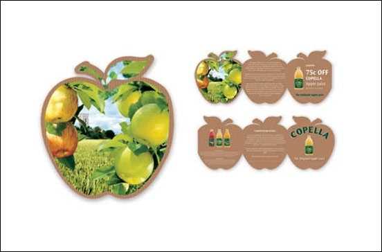
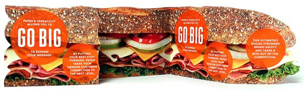
If you have a product to highlight, here’s an example of a brochure that’s sure to stand out: Cut your brochure into the shape of your product. These types of brochure examples go beyond eye-catching—they immediately give customers an idea about your business and product before they’re even picked up.
Die-cutting is one of the best ways to create custom brochures. Utilize them to create a brochure that’s truly unique and eye-catching.
18. Use Infographics to Share Information
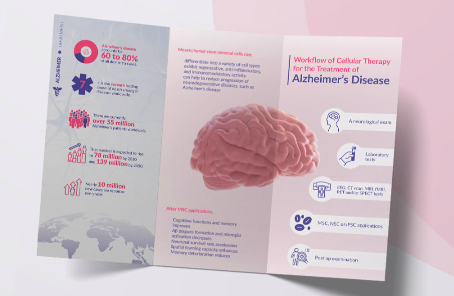
Use infographics to convey complicated information like statistics. (Source: Gizen Silahc on Behance)
Good brochure examples don’t always have to feature products. They’re also useful for sharing information, especially through infographics. A good example of an information brochure is the one above—it uses infographics to share data and statistics that would otherwise be cumbersome to read in a regular text format.
When using infographics, use simple, easy-to-understand icons and short copies. These are easy to design with online tools like Canva or VistaPrint, both of which have ready-made infographic templates you’ll only need to customize.
19. Make Testimonials the Focal Point
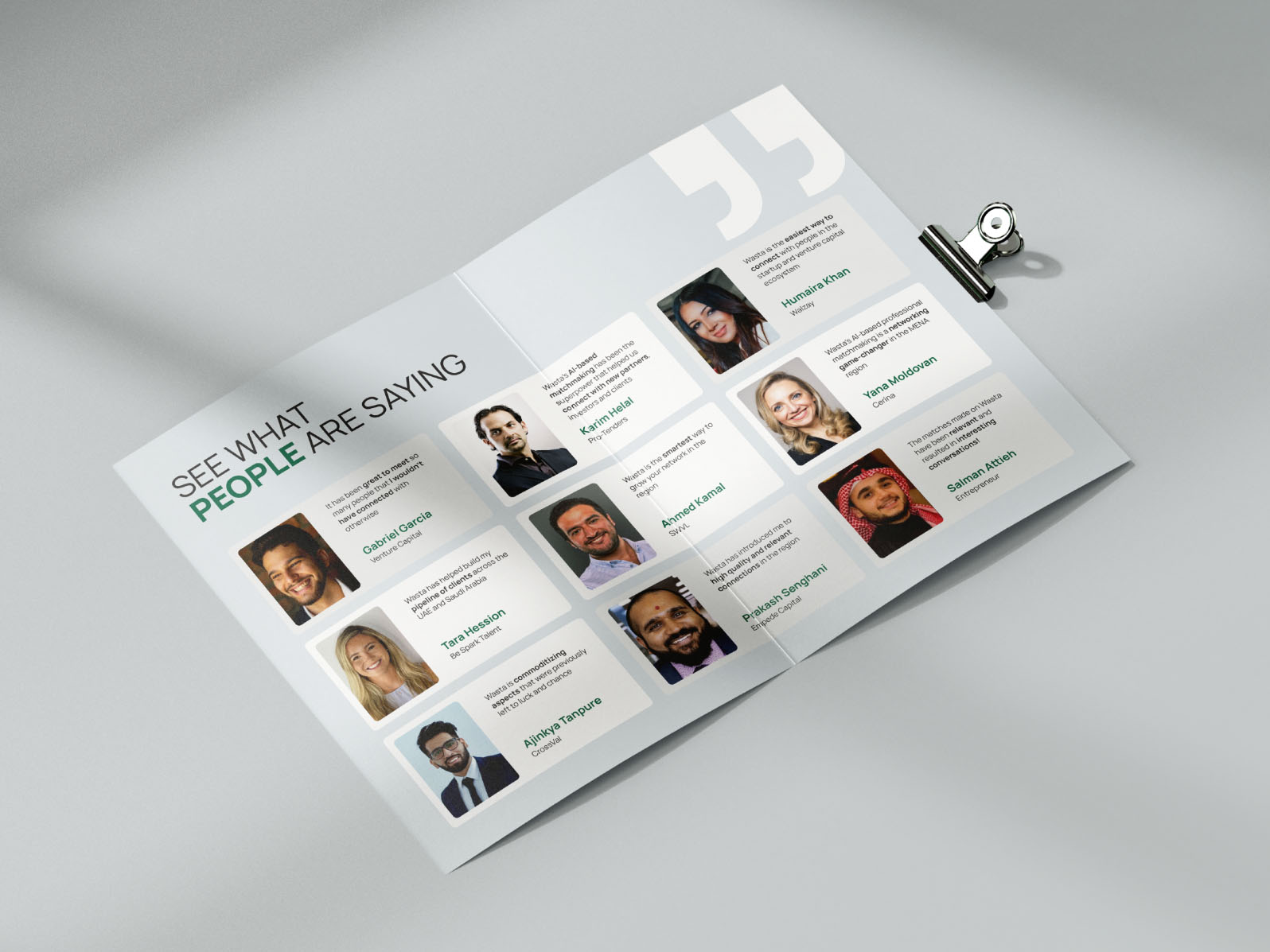
Testimonials can often be more effective at converting visitors to leads. (Source: Dribble)
Testimonials are a powerful marketing asset. Did you know that 58% of consumers are willing to pay more for a product with good reviews? When it comes to the content to include in your marketing brochures, consider putting customer testimonials front and center. They can often be far more effective at converting casual visitors into leads than any amount of marketing copy or special offer.
Most customers are happy to leave small businesses with a review if they have a positive experience, but be sure to get consent to use their testimonials before printing them.
20. Use Door Hangers for Home Services
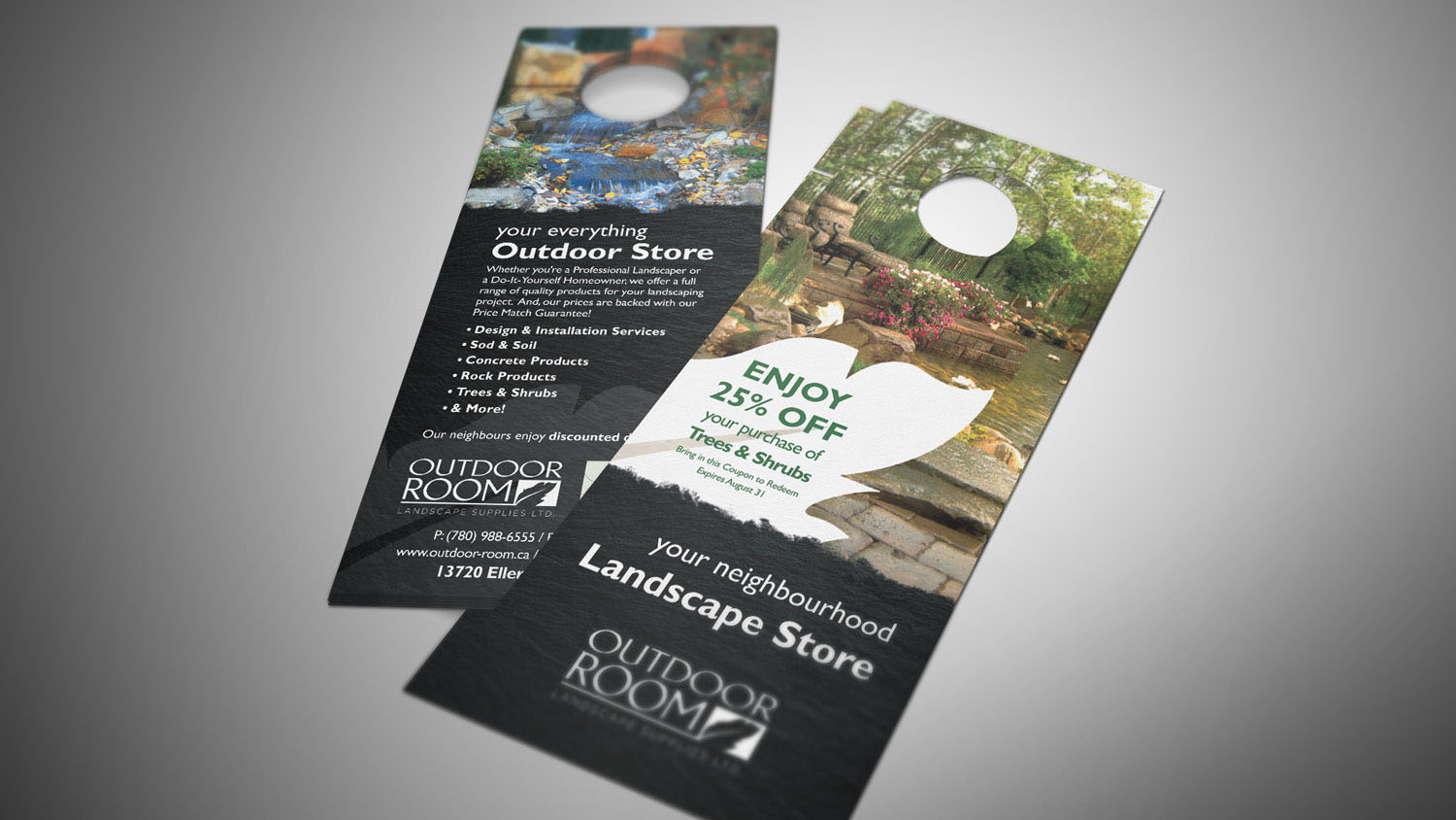
Door hanger brochures are an excellent fit for landscaping or home repair service businesses. (Source: Brochure Design Service)
Here’s one of the more creative brochure examples for businesses. If you have a home-related business—for instance, if you own a furniture brand or offer landscaping services—turn your brochure into a door hanger. Door hangers are fairly easy to create, and make for a more interesting type of brochure that people are more likely to keep.
To make the best of door hanger brochures, keep them within one or two panels—any more, and they’ll be too troublesome to hang.
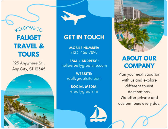
21. Layer Images for Depth
These layered polaroid images give immediate depth to an otherwise simple brochure. (Source: Canva)
Who says you can’t simulate depth in your brochure? While full-panel images and modern visual elements are in the spotlight for brochure design, layered images are a great way to give the illusion of depth to your brochure and create an overall visually interesting design. These types of brochures work well for showcasing locations or scenery, so they’re a great match for travel and tourism businesses.
22. Make QR Codes the Center of Your Design
This brochure uses a different color to highlight and draw attention to its QR code. (Source: QR Code Chimp)
If you’re starting out with QR code marketing, brochures are one of the best places to use them. Take this example: Not only does this brochure include QR codes to easily integrate with digital assets, but it also uses them as the focal point of the brochure’s design. This eliminates any other potentially distracting design elements and makes users more likely to scan them.
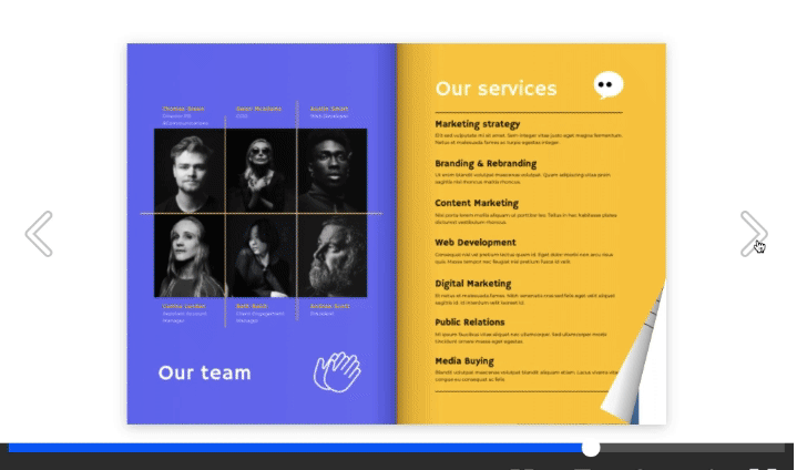
23. Use Digital Brochures as Portfolios
Digital brochures are a great way to showcase creative work. (Source: Flipsnack)
If you’re an artist or creative looking to showcase your work, consider digital brochures as an alternative to printed portfolios or a regular artist website. A digital brochure combines the look and feel of a classic portfolio you can flip through while having the convenience of a digital asset—i.e., you won’t need to worry about printing costs, and it’s easily accessible to anyone with an internet connection.
With digital brochures, you can also be as creative as you like. Add as many pages as you need, and experiment with videos and different image layouts.
24. Add Interactive Maps to Digital Brochures
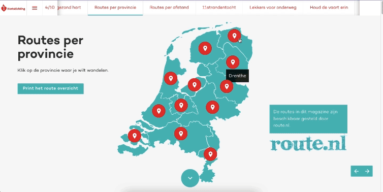
Interactive maps on digital brochures create a more memorable experience for your audience. (Source: Foleon)
The best thing about digital brochures is that they’re interactive, which immediately opens up many more functions from your brochure. The example above is a great example—it features a fully interactive map to showcase its businesses’ many locations. Interactive elements make for far more interesting ways to showcase information and it creates an experience that’s more likely to stick in your audience’s minds.
25. Replace Images With GIFs on Digital Brochures
Using GIFs instead of images makes for an understated but memorable impact on digital brochures. (Source: Flipsnack)
Here’s another example you can adapt when creating your digital brochure: Replace your images with GIFs for a fun and lively effect that won’t distract from your main content. It’s an especially great example if you already have a regular print brochure that you just want to upgrade to digital. Replace most or all of your static images with moving GIFs: It’s a simple adjustment, but it makes a memorable impact.
Pro tip: Need more inspiration before creating your brochure? Check out our list of the best brochure design ideas.
Best Places to Design & Order Business Brochures
In addition to the brochure examples above, there are several places you can get brochure design ideas and templates to customize for your brand and business, and some are completely free. Here are some places to get premade brochure templates:
Best for an all-in-one brochure printing and mailing solution | Best for designing a brochure to download for printing or online use | Best for those who need ongoing access to high-quality templates and images or marketing |
|
|
|
Alternatively, if you don’t have design skills or the time to invest in making brochures, you can outsource brochure design to a freelancer on Fiverr. They’ll create brochure templates you can customize and repurpose for your business or ready-to-print marketing brochures for as little as $5 per project.
Frequently Asked Questions (FAQs)
Some examples of brochures are Z-fold brochures, tri-fold brochures, accordion brochures, half-fold brochures, and die-cut brochures. In terms of content, the most common brochure types are company information brochures, sales promotion brochures, event announcements and guides, product catalogs, and portfolios.
The five main parts of a brochure are branding, content, design and layout, a call to action, and contact information. While there are no set guidelines for the elements of a brochure, these five are almost always present in any type of brochure, whether it’s a simple company info brochure or a sales promotion.
You can create a brochure by first deciding on the purpose of your brochure (e.g., brand awareness, sales, and so on), then creating your content around it. After finalizing your brochure’s content, use an online design tool like Canva or VistaPrint to design your brochure—both have many templates to start with. Or, hire a graphic designer via sites like Fiverr for a more custom design. Once you have your design, your brochure is ready to print.
Bottom Line
Brochures are a cheap, effective way to promote your brand regardless of what industry you’re in. Their versatility also makes them suitable for nearly any purpose or type of content, and they’re a great opportunity to show off your creativity. Take the business brochure examples above as inspiration and use them as guides to create effective marketing brochures.
Millions of small business owners and marketers use (and love) Canva’s online design tools. Check out the free version, and then upgrade to get access to premium images, graphics, and templates you can use to fuel your small business marketing ideas.