Choosing brand colors is an essential step in creating your brand’s identity. Think about this: Hospitals and banks often employ blue, but beauty shops use pinks and pastels. To select the right brand colors, you’ll need to express your brand’s personality. Once you can do that, take a moment to consider the meanings behind the various colors. Only then can you choose which colors best express your brand’s identity.
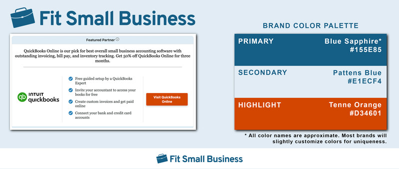
Fit Small Business utilizes a three-color palette, plus black and white.
Understanding how to choose brand colors will play a huge role in how customers view your brand—and how you stand out in the marketplace. These colors make up a big part of your brand presence. Whether your colors are a good fit for your brand or a bad fit, branding colors can profoundly impact both a customer’s perception of your business and your bottom line.
Consider this: I once led rebranding efforts for a building contractor. The rebranding maintained the logo, focus on affordability, advertising themes, and even pricing. The brand color palette was the only aspect of branding we altered. And here’s the thing: That single change almost killed the company. We’ll talk more about how once you’ve learned to choose branding colors of your own.
What Makes Up Your Brand Color Palette
When you’re considering colors for your brand, you’ll want to select between three and five colors. For most small businesses, four colors will be ideal. You’ll need to choose one of each of the following:
- Primary color: This is the main color that says the most about your brand. It will usually be the strongest, boldest color you choose. You’ll use this color in the most prominent places in your marketing and advertising materials.
- Secondary color: The secondary color is just that—the second boldest color you choose. Your secondary color can either match your primary color or clash with it, depending on the message you want to send with your branding colors.
- Accent color: Your accent color is the third-most common color, and it’ll be used to accentuate your marketing and promotional materials. This color will frequently be the background color of features boxes on your small business website or in brochures.
- Highlight color: The final color you choose will be a highlight color. You’ll use this color to call attention to specific, important features of marketing—think links on websites or special pricing. It should in some way stand out from the other colors you’ve chosen.
One company that really knows how to do brand color is Starbucks. While the company changes its color palette seasonally, it stays true to its two primary colors—both shades of green. Take a look at a recent iteration of their site.
The Starbucks website features four colors, each with a specific use.
Something should jump out at you at once. Starbucks uses only a few specific colors, and they work very well together. Here’s the palette on that website:
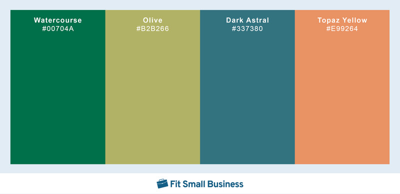
Starbucks’ color palette is a study in contrasting and adjacent colors.
Right now, it’s not important to unpack the meaning of Starbucks’ color scheme. It’s worth pointing out that Starbucks’ two non-standard product lines—iced drinks and breakfast sandwiches—are nested in accent colors, while its hot coffee products feel right at home in the company’s two shades of green.
Also, while these colors are named and coded above, Starbucks likes to play with the colors it chooses, adding touches of black (shading) and white (tinting) to provide a touch of uniqueness.
Choosing Colors for Your Brand in 5 Steps
With more than 16 million colors identified so far, your choice may seem overwhelming. But it’s really not as complicated as all that. In fact, most colors can be broken down into nine broad categories of color:
- Black
- White
- Red
- Yellow
- Blue
- Orange
- Green
- Purple
- Gray
Step 1: Take Note of Colors Specific to Your Industry
Before you even begin considering the colors you’ll use in your brand, first look at other businesses operating in the same space. Chances are you’ll begin to see similar tints and shades of the same colors from business to business. That’s because certain colors have become strongly associated with those industries because of the psychology behind brand color.
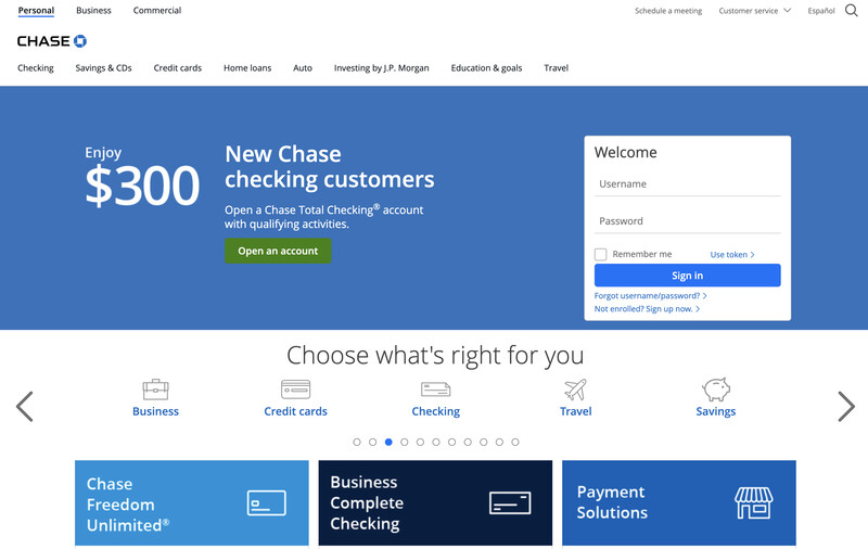
For example, financial institutions and healthcare providers frequently choose shades and tints of blue. That’s because blue triggers intense emotions of trustworthiness, loyalty, logic, and tranquility—definitely the qualities we want in the people who handle our money and our health. Here are three examples of blue in action:
Blue isn’t the only color with deep industry associations. Blacks and golds frequently appear on legal and professional services firms. Landscapers, architects, and builders employ a lot of greens and yellows. Hair salons use pastels, particularly shades and tints of pink, which suggest fun, upbeat experiences, primarily for women.
Make a list of any common colors you see used in competitor brands. If multiple brands share common colors, that’s probably a great place to start looking for your own brand colors—as well as for different colors that might help your brand stand out.
Step 2: Get to Know Your Brand Identity, Personality & Industry
Take a moment to think about your company, really think about it. What is your brand identity? What image do you want to project to your customers? Is your business fun and vibrant? Do you need to show your more serious side? Depending on the kinds of goods and services you sell, these answers will vary. Answer these three questions about your brand:
| What is the primary color commonly used by my competitors? |
|
| How would I describe my brand in a single word? |
|
| How do I want customers to feel about my company? |
|
Armed with the answers to these questions, take a look at the chart below and see how the answers to your questions line up. Compare the answers to these questions to the chart below:
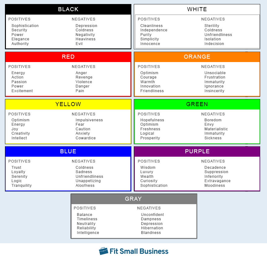
This color chart highlights common emotions associated with various colors.
Step 3: Select 4 Main Colors for Your Brand Color Palette
Armed with the answers from the first two steps, you can now pick the four colors you want for your branding. Using the color wheel below, hone in on the color families you want to use and fill that out on the chart below.
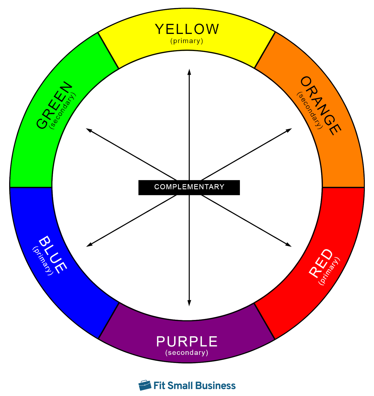
The color wheel showing primary, secondary, and complementary colors.
| Primary color: |
|
| Secondary color: |
|
| Accent color: |
|
| Highlight color: |
|
Don’t worry. You won’t be stuck with a screaming red, a shrieking yellow, or a garish blue. We’re going to customize them in the next step.
Before we go any further, take this quick lesson in color terminology:
- Hues are pure color—red, yellow, blue—or combinations of pure color without black, white, or gray.
- Tints are hues with some amount of white added to lighten them.
- Shades are hues with some amount of black added to darken them.
- Tone is accomplished by adding “neutral gray”—equal parts black and white to “wash out” a color or make it muted.
Step 4: Specialize Your Colors
All those loud, vibrant hues from the previous step are about to get the personal touch. You’re going to experiment with selecting tints, shades, and tones. Graphics software provider Adobe offers a free color wheel to help individuals choose a color palette.
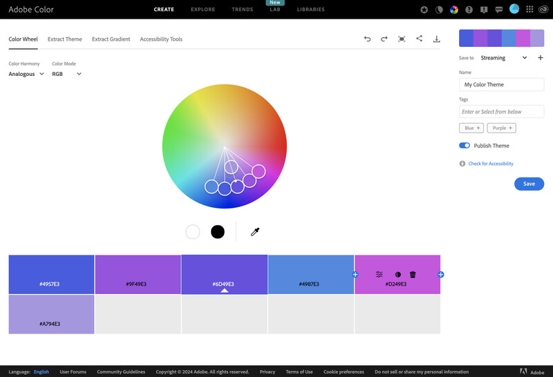
Adobe’s Color Palette Generator offers all of the 16 million available colors.
Each of the swatches you select will include a hex code (#4957E3 is the code for the primary blue, above). Write the code for each of your colors below:
| Primary color: # |
|
| Secondary color: # |
|
| Accent color: # |
|
| Highlight color: # |
|
These hex codes will tell your graphic artist or website designer what colors to use in your brand. But before you hand everything off—or dive into building your brand identity yourself, check out the next step.
Step 5: Verify Your Colors Conform to Your Brand Personality
Congratulations! You have successfully selected a color palette. The final step is to confirm your colors will make the impression you want. So take just a quick moment and compare your colors to the psychological impact chart from the second step. Pay close attention to the positive columns under each color, but don’t neglect to check the negatives. This will help ensure you don’t accidentally associate a color with your brand that offends viewer psychology.
3 Examples of Brand Color Palettes & Why They Work
Large companies spend millions of dollars on developing effective brand colors and more still maintaining the consistency of those colors. They invest in focus groups, studies, and analyses to determine how even the slightest variation might impact customer perceptions or sales. These brands do color “right” because they focus on it.
That’s not to say they don’t change things up from time to time. Particularly on websites, brands will play fast and loose with their color palettes. (For a bit more on web colors, check out our look at the best color palettes for websites.) Click on each drop-down below to take a look at these three iconic brands and see what they’re doing with color and why it works.
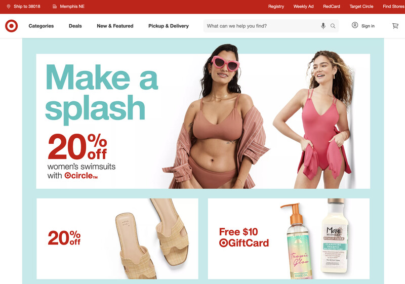
Primary color: Ruby Star
Hex: #BC261A
Secondary color: Pastel Teal
Hex: #C7E9EA
Target is a company that likes to keep things simple. Its signature red is Ruby Star, slightly shaded with just enough black to make it bold without being loud. The secondary color around the swimwear section is a bright tint of Pastel Teal, with plenty of white to soften the hue and help it fade into the background.
The bold red lends a sense of energy and passion, two emotions mirrored in Target’s advertising. The Pastel Teal offers hints of the tranquility of a day lounging in the sun by the pool. One quick note about Target: its marketing team is renowned for effectively using color to connect products to color psychology. Scroll the Target website, and you’ll see dozens of colors, all chosen because they perfectly align viewer emotions with product categories.
Primary color: Black
Hex: #000000
Secondary color: Cerulean Blue
Hex: ##326DB2
Accent color: Pastel Yellow
Hex: #F8F4D9
Mercedes-Benz is no stranger to the power of color, as their website demonstrates. The two main colors are pure black—sophisticated, assertive, elegant, and a heavily shaded Cerulean Blue, which draws the eye. The black underscores quality and luxury, while the blue beckons, “It is logical to click here.” But Mercedes does something else with its colors, which you may have already noticed.
These colors—black and blue—are echoed in the featured photograph. The deepest blue in the sky is almost a perfect match for the calls to action. The car, the floor, the tires—they’re all black. But what about the part of that sky the car is facing? It’s all tints of Pastel Yellow, invoking optimism and energy, as if to call out to the driver to floor it and enjoy the ride.
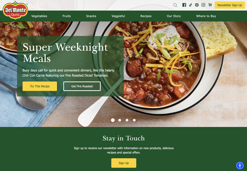
Primary color: Bolivia Green
Hex: #24532C
Secondary color: Energy Yellow
Hex: #F9D448
Accent color: Bolivia Red
Hex: #C83A36
Canned food manufacturer Del Monte chose three colors that work well together to spread its message: green, red, and yellow. Combined, Del Monte’s color choices might best be summed up in a statement:
Del Monte provides fresh foods to make creative and exciting dishes.
This is a message echoed in the feature image, which not only captures those three colors, but also looks like a delicious meal. Choose Del Monte because they know what good, wholesome food looks like.
By now you have your color palette and you’re starting to understand just how powerful color can be. But don’t jet away just yet. Remember that client whose business we tanked? It’s definitely a story worth finishing.
The Perils of (Bad) Branding Colors Revisited
My client was a regional leader of outdoor spaces—decks, porches, and pergolas, to name a few products it sold. Over a decade, it had established itself as more affordable than any other builder in the space, and part of establishing that identity had been the conscious choice to use two complementary colors to represent its brand: a vibrant, Trypan Blue coupled with a loud, Bright Yellow.
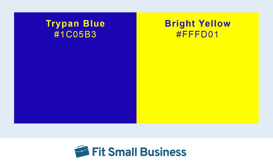
Trypan Blue and Bright Yellow are complementary colors—roughly opposites on the color wheel, which makes for a bold contrast.
Those were the only two untinted and unshaded colors the brand used. One thing you have to say about the color choice: it certainly stands out! While these colors may not have anything to do with the great outdoors, they conveyed something else: the brand was cheap. And my client leaned into this clashing color identity hard. We put it on business cards, brochures, fliers, billboards, newspaper and television ads—we even painted the work trailers the building crews hauled to job sites Bright Yellow with Trypan Blue lettering.
It worked great. But here’s the thing about decks and porches. The “big” money is in more expensive custom decks. The client was building plenty of the cheap, rectangles of wood, but they wanted the more expensive decks. We pivoted the brand slightly to pursue these kinds of custom projects. The cheap ones were still our bread and butter, but we rebranded as an environmentally friendly, “green” company that could create that perfect, aesthetically pleasing outdoor oasis.
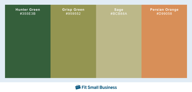
The new color palette used tints and shades of green, with a tint of orange as a highlight color, creating a sophisticated brand color palette.
We chose new colors to represent our more refined brand, focusing on shaded hues of green and earth tones. The new color palette was beautiful, combining Hunter Green, Crisp Green, and Sage with Persian Orange as an accent color. My client invested more than $25,000 in the rebrand—a new website, new printed materials, and new billboards. We even wrapped a truck (price tag: $3,500). One word describes that palette: sophisticated. And therein lies the problem.
The results were nothing short of disastrous. Remember, the logo, products, messaging, and pricing had all stayed the same. We were still the “value” contractor. Our colors, though, said something completely different. And that had a profound effect. Within a week of the rebranding, sales were down more than 10%. A month in, sales had plummeted 20%. They didn’t recover, either.
We pondered our situation and determined our mistake. The brand was now too fancy, and the core product wasn’t fancy. So we went into storage and dug out all the old materials, replaced the billboards, and stored all the new stuff.
Within a week, sales started to rebound. But a full recovery took almost a year.
Do’s & Don’ts of Choosing Brand Colors
That’s how important brand color palettes can be. To help you avoid some of our mistakes, here are a few do’s and don’ts of brand coloring:
- Do consider the psychological effects of colors: How customers perceive a brand starts with how the brand’s colors affect the viewer. A law firm probably isn’t best served by a pink and yellow palette, as this indicates a light-hearted, playful personality.
- Don’t select branding colors that compete with color psychology: Choosing a color with a competing psychological effect means you have to overcome the customer’s biases in your marketing and sales efforts. Avoid choosing blacks, grays, and browns for landscaping companies unless you want your customers to think you like killing plants.
- Do select colors that align with your industry: If your industry uses a lot of reds and yellows, you might consider staying in that same lane. Customers have come to associate certain colors with those industries, and you can go a long way to attracting customers if you lean into those impressions.
- Don’t select colors closely aligned with a competing or adjacent industry: Retail boutiques are notorious for poorly selecting colors. That’s because no one color is closely associated with “retail”—but many colors do align with certain segments of retail. Blacks and yellows appear most often in fine dining restaurants, while reds and golds suggest fast foods. That’s why you might not want a red and gold logo on your high-end Italian restaurant sign.
Frequently Asked Questions (FAQs)
Choosing the right colors for your brand is a complex process weighing conventions of your industry, color theory, and the psychological effects color can have on the viewer. To select the right brand colors, weigh each of these factors carefully and make informed decisions about how color can provide potential customers with information about the products and services you’re selling.
While there is no set number of colors a brand can use, a good rule of thumb is to keep your brand color palette simple. For most brands, three to four colors are all you’ll need. Choose a primary color, a secondary color, a color for accents, and a color to highlight features like calls to action or website menu selections.
Brand colors are perhaps one of the most important—and misunderstood—choices a small business owner can make. The colors you choose impact potential customers in myriad ways, including both how the colors agree or clash with one another and how each color affects the viewer. Color can even affect whether potential customers view your business as a premium brand or a value choice. These are just a few reasons why choosing brand colors is so vital.
Bottom Line
Learning how to choose brand colors can help you attract more customers, growing both brand presence and sales at the same time. The right brand colors will help you succeed, cementing your brand in the minds of customers as trustworthy, vibrant, intelligent, or sophisticated. The wrong brand colors will give customers a bad impression, which could cost you leads or make selling to those customers harder.
