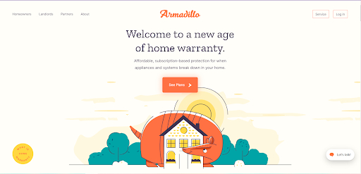
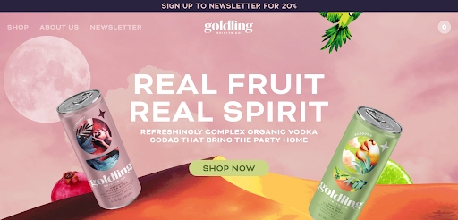
When building your business website, the right color scheme or palette enhances legibility, appeal, user experience, and brand recognition. Picking the right color scheme is not just an aesthetic choice. It’s a method that requires strategic thinking around understanding color theory and psychology, integrating your brand identity colors, and possibly leveraging color palette tools.
In this article, we’ll share strategies on how to pick colors for a website, create your website color palette, and improve your brand presence. The process has four parts: understanding basic color theory, determining your brand identity colors, exploring and leveraging color tools, and finally, choosing your main, secondary, and accent colors.
For a speedy onramp to choosing a brilliant color palette for your small business website, you can try a color palette selector or generation tool like the one in Canva. Canva is our favorite for its robust, fun-to-use features combined with great graphic design tools and templates.
1. Understand Basic Color Concepts
Ultimately, when making a small business website, you’ll need to look at it from your target audience’s point of view. Your audience should always be the first and last consideration in your website design. Remember, your website will be your brand’s main representation in the online space.
So, it helps to learn basic color concepts to get a foundation on the building blocks of your website’s color scheme. You might already know that different colors give off different emotions, and your chosen colors will affect how your website is seen, felt, and remembered.
There are three essential parts of color concepts: color theory, color schemes, and color psychology.
Color Theory
You might remember studying color theory in grade school art class, which still holds true today. Color theory is the set of principles that guide how color is used. Often used by designers, color theory provides a logical structure that can be used to create harmonious and meaningful color compositions.
Although color theory is prevalent today, it might surprise you that it’s based on a systematic and scientific approach to human perception going as far back as the ancient world.
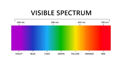
Visible color spectrum based on wavelength (Source: Vecteezy)
Color theory dates back to the ancient Greeks and Aristotle’s idea of colors composed of light and dark. The precursor of modern color theory as we know it was developed by Sir Isaac Newton. He was the first to study the science of colors by experimenting with prisms and sunlight. From there, he developed the theory of color as human perceptions of wavelengths, which further led to the development of the visible color spectrum.
Newton categorized these visible colors into three groups, which make up the color wheel.
- Primary colors: Red, blue, and yellow
- Secondary colors: Green, orange, and purple
- Tertiary colors: Red-orange, yellow-orange, yellow-green, blue-green, blue-violet, and red-violet
The color wheel shows primary, secondary, and tertiary colors.
The primary colors cannot be created by mixing any of the other hues. The secondary colors are created by mixing the primary colors, while the tertiary colors combine a primary and a secondary color. From here, color mixing can create almost infinite variations of color. Artists, designers, and other creatives often use the basic color wheel as a starting point to develop color palettes.
Color Schemes
Color schemes are a combination of colors derived from the color wheel. Just as individual colors convey meaning and personality, the relationship between each color also communicates meaning to the viewer.
Although several website color schemes are used in website design, we’ll primarily focus on four of them here to help inspire your palettes: monochromatic, complementary, analogous, and triadic.
Monochromatic color schemes use shades, tones, and tints of a single color. A shade is created by adding black to a base color, a tone by adding gray, and a tint is a lighter version of a color created by adding white. A monochromatic color palette is often composed of three to seven variations of the base color.
These schemes create a strong sense of visual cohesion but with subtlety, allowing the content to be the focus. Creating a monochromatic color scheme is also easier for designers and pleasing for viewers, creating a safe, palatable design for most scenarios.
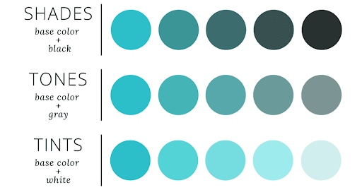
Monochromatic colors of different shades, tones, and tints (Source: Canva)
Complementary color schemes use colors on the opposite sides of the color wheel. They attract attention by using the sharp contrast between two complementary hues or can be used to focus viewers’ attention on a specific subject.
When choosing colors for website design, keep in mind that a complementary color scheme will result in extreme contrast and can create a visual clash. If you’ve ever seen the optical vibration effect created by two intense complementary colors, you know how jarring these contrasts can be. Using softer tints, tones, or shades of complementary colors can help soften this color scheme.

Complementary colors on a color wheel (Source: Copic Marker Tutorials)
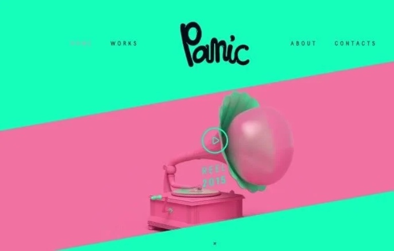
Panic Studio’s creative use of two complementary colors is made bearable using bright pastel tones. (Source: Panic Studios)
Analogous color schemes use three colors that sit right next to each other on the color wheel. These schemes are often chosen to create a sense of visual progression, using colors to instruct the viewer where and how to take action. Analogous colors are also used to create calming, appealing designs with minimal contrast.
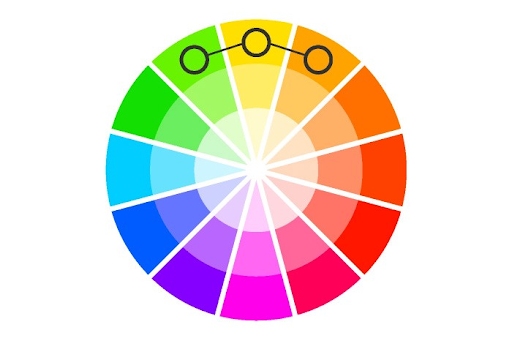
Analogous color scheme example on a color wheel (Source: UX Planet)

The Clerksy website’s analogous color scheme achieves strong contrast, but green, yellow, and orange are close neighbors on the color wheel. (Source: Clerksy)
Triadic color schemes use three colors equally distanced from each other on the color wheel, creating a triangle. One of the most vibrant color schemes, triadic colors create a powerful contrast that is best for bright and dynamic content.
Bright triadic colors can overwhelm the viewer, so consider toning down the three colors by experimenting with vibrance, tints, and shades. The visual contrast of the triadic color scheme can make your website pop as long as you can find the right harmony.
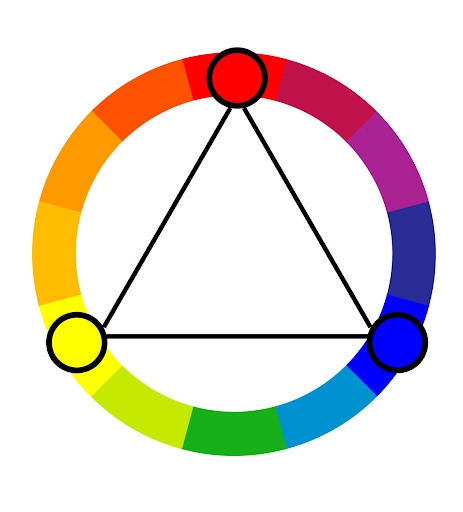
The triadic color scheme on a color wheel (Source: ColorsExplained)

In this example, a triadic scheme of periwinkle blue, green, and gold creates a strong but pleasing contrast between the major navigation blocks on a home page. (Source: Skillshare)
Color Psychology
The basic concept behind color psychology is that colors can affect humans emotionally. Color psychology considers the feelings, emotions, and ideas evoked by certain colors. As people view colors, they consciously and unconsciously associate them with different meanings, influencing their actions. Color psychology is a key consideration when deciding how to pick colors for a website.
Today, most colors are associated with a range of emotions.
- Yellow: Youth, happiness, creativity, and optimism
- Blue: Trust, peace, confidence, and security
- Red: Passion, energy, love, and power
- Green: Health, nature, wealth, and abundance
- Orange: Comfort, fun, warmth, and positivity
- Purple: Relief, luxury, sophistication, and royalty
- Pink: Gentleness, femininity, sweetness, and playfulness
- Black: Mystery, power, elegance, and luxury
- White: Cleanliness, sophistication, purity, and simplicity
Different colors evoke different emotions that people eventually associate with your brand.
2. Determine Your Brand Identity Colors
Color is a critical visual component of brand identity. In fact, color alone accounts for up to 90% of a consumer’s first impression, according to HubSpot. Since your business website will be the home of your brand online, it should effectively convey your brand identity.
Once you’ve grasped different color concepts, now would be an excellent time to focus on how you want your brand to be perceived. The first question is if your business already has an established logo or color scheme. If so, these colors should be incorporated into your website color scheme. If not, it’s important to consider the industry to which your business belongs and its visual and brand conventions.
Look at the most commonly used colors for large companies in your industry. They may have put significant resources into researching effective color schemes for branding. You can use this to influence your approach to developing a website color scheme that will fit your brand.
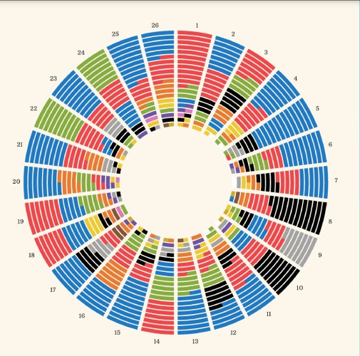

Brand colors used in the top 20 companies across different industries (Source: Visual Capitalist)
There is often significant latitude in how companies use color within a given industry. In weighing all of the factors that go into using color in branding and website design, industry practice is just one of many to consider. Other considerations are color psychology, personal preference, and the unique feeling and identity you wish to give your brand.
Color Blindness & Accessibility
When choosing website colors, considering the needs of people with color blindness ensures they can see important information on your site.
Red-green color blindness (Protanopia, the most common form) means the user may be unable to read green text on a red background on your holiday sale invitation—unless the red or green were at least three times darker in value than the other color.
Using colors with a high contrast grayscale value (how light or dark is something independent of color) in text and visual elements helps ensure they can be properly seen. Tools like Toptal can help you check and adjust colors for better color-blind accessibility.
3. Explore Relevant Color Tools
Even with all the background in the science of color and psychology branding, selecting the color scheme for your website can still be challenging. A color palette selection or generator tool makes this process faster and easier. Numerous tools are designed to help create color schemes for a strong brand presence, but I found in my testing that these three tools provide the best mix of functionality and ease of use.
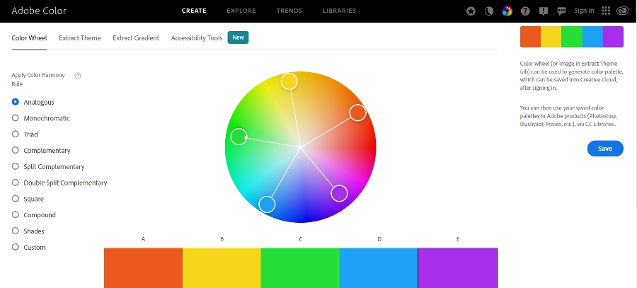
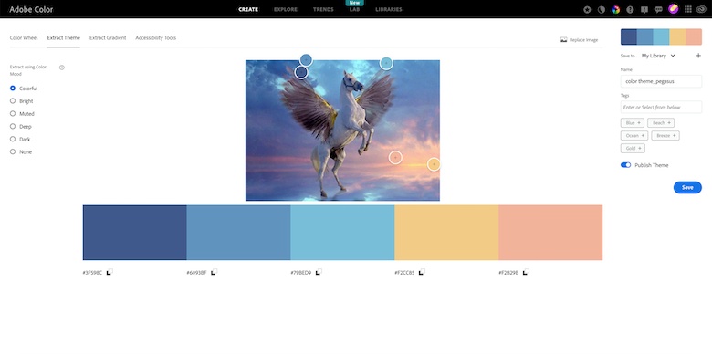
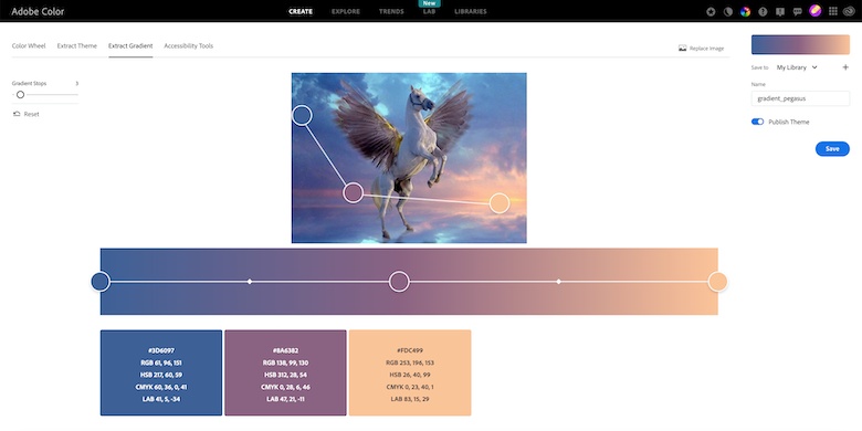
Adobe Color is one of the most popular color tools for choosing website color schemes. It syncs with the Adobe Creative Cloud and allows users to share or create color schemes for free. You can set a color scheme or color harmony rule to ensure the generated colors are visually appealing.
This tool comes with a robust community of creatives who share color palette inspiration and trends. Its best features include an automatic color wheel that calculates color scheme examples, an extraction tool to generate color themes or gradients from an image, color-blind safe checks, and a contrast checker.
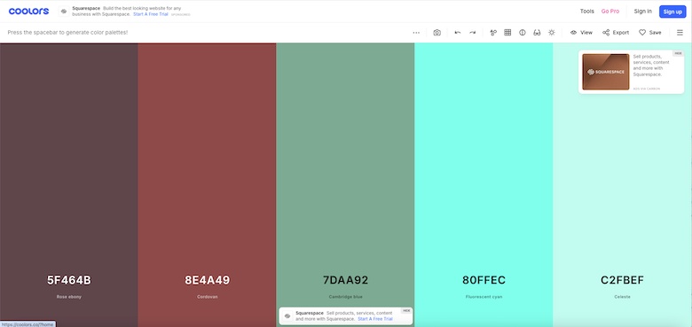
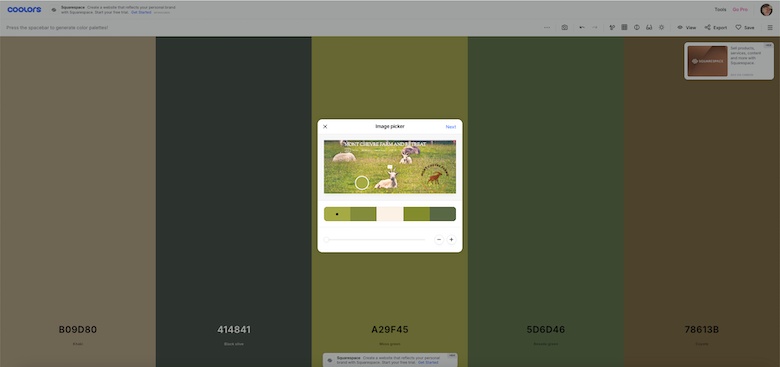
Coolors is a color palette tool with some very ingenious functionality. You can choose from the Palette Generator or browse a seemingly endless range of popular palettes. The generator cycles through successive color combinations. Lock specific colors in the viewer and keep toggling to cycle other colors around it.
Another option allows you to upload a photo to generate a palette, much like Canva, but Coolors allows you to look through a series of colors picked from the photo to arrive at just the right assortment of brand colors.
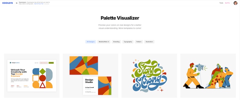
With any of these selection options, you can adjust the overall brightness or saturation (with a preview), adjust for color blindness, and save palettes. The Palette Visualizer then maps your chosen palette from the Palette Generator onto several sample images, including typography and illustrations.
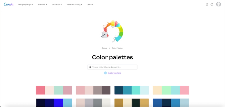
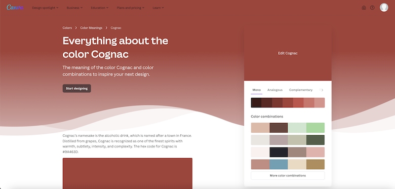
Canva’s brilliant Color Palette Generator uses either an uploaded photo to generate a four-swatch palette or a library of curated palettes. It’s an excellent tool if you have product or business photography to inspire your brand or even just a clipping of something that sparked your creativity.
If you just want to explore premade combinations, Canva’s Palette library is an excellent resource that allows you to search by mood, color, or keyword to find any one of their hundreds of curated four-color combinations.
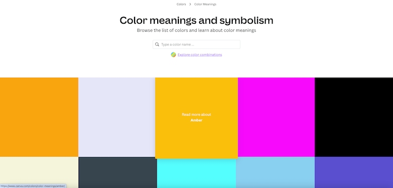
Want to go deep on a specific color? Canva’s Color Meanings lets you explore numerous colors and their history, symbolism, and emotional associations, as well as presenting palettes that integrate that color into harmonious combinations.
The biggest plus of Canva’s Palette Generator is that it integrates directly with the rest of the full-featured graphic design tool, Canva, with numerous design elements and templates at your disposal for social media posts, web pages, infographics, etc.
4. Choose Main, Secondary, and Accent Colors
With the color concepts, branding, and tools ready, you can now put them into practice and create a website color scheme that works for your brand. To make your site’s design stand out visually while remaining cohesive, choose at least three colors: the main color (also called the dominant or foundational color), a secondary color, and an accent, or “pop,” color.
The main color generally makes up about 60% of a website design. Choosing the main color relies heavily on the color concepts discussed above. What colors best convey your brand personality? What feelings do you want to evoke when people land on your website? Are there colors that best embody what your business is all about?
With a simple white or black-dominated color scheme, the main color will be one of these, and the brand colors may be introduced as secondary or accent colors.
The secondary color usually makes up about 30% of a website. In a simple white background site, this may be your brand or logo color. Depending on the chosen color scheme, such as an analogous, complementary, or triadic scheme, it is simply a matter of deciding which of the two or more colors in the palette is the supporting color to the main color.
The accent color often makes up 10% of a website design. In most multicolor schemes, it’s a contrasting color to the primary and secondary colors. It’s sometimes limited to small design elements like separators, subheadings in the text (e.g., H3, H4, and so on), and action-oriented components like calls to action to make these elements pop—thus the term “pop” color.

The ocean’s blue rules this scheme, with secondary colors of white and gray. Orange is used as a contrasting pop color. This color scheme creates a feeling of solidity through blue but with a spark of innovation represented by the orange color for this revolutionary startup shipping vessel company. (Source: Cargo Kite)
Examples of Website Color Schemes
Before putting your newfound knowledge of color into practice, explore these existing website color schemes to help perfect your process. We made sure to compile the best website color scheme examples from actual business websites. Use these examples to inspire your brand’s ideal color scheme.
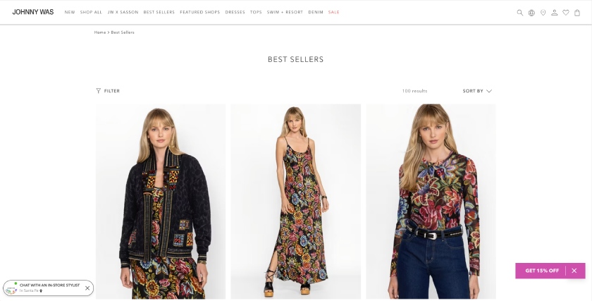
White increases the readability of text and highlights the images and logos. It also creates a light, airy feeling and brings attention to the product rather than the site’s design.
Notice that most high-fashion apparel sites follow this convention. With a wide range of ever-changing fashions in different colors, the garments need to take center stage. Bright background colors on a fashion site can clash with images of various colored garments as they change with style or season.
A very light and muted off-white color or gray can soften the text to background contrast for better readability. Areas of these light colors can also be used as gently contrasting blocks to separate closely spaced sections of differing content on a single page.
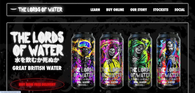
Black is the reverse: It can be used instead of white but has a different feeling and use case. It tends to be more dramatic and can feel more moody when used in a certain context. It’s no accident that Halloween or horror websites often pick black as their primary background color.
With black as a background, you might want to use a texture or dark image background to avoid the very deep abyssal feeling of pure, flat black.
A blue website color scheme can represent an array of positive associations, such as an ocean or blue sky. It is primarily used to inspire feelings of serenity, security, and trust, so we can find this color scheme in many different niches—most notably social networks, food, and healthcare.
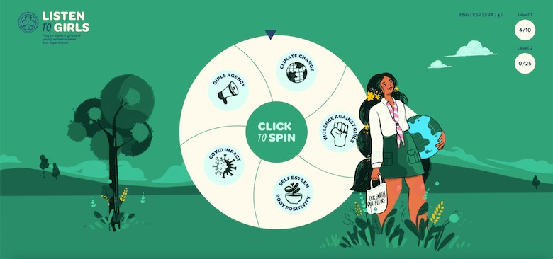
Green is strongly associated with nature, health, and abundance, making it a go-to for healthy and sustainable brands.
Because of these associations, green is often found in health and wellness services for nonprofit and environmental organizations, but it’s also used for businesses projecting an image of financial growth since the color green is associated with money.
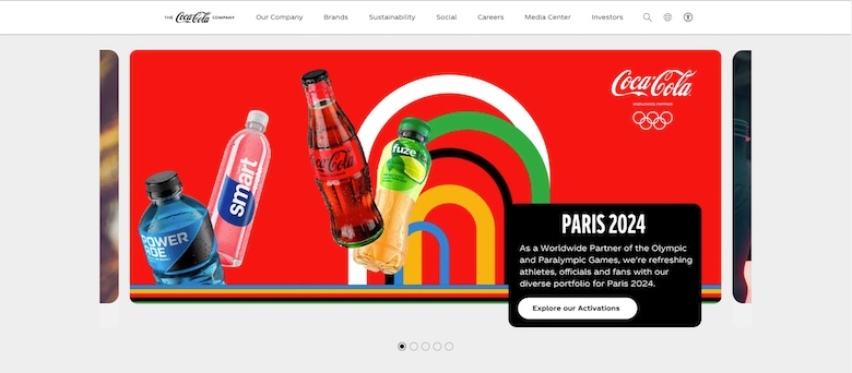
Red color schemes usually create bold, striking, and enlivening websites. Red inspires intense feelings such as passion, energy, and power, so it is a great option for brands that want to inspire action with their websites. Businesses in creative industries or high-energy brands like Coca-Cola popularly use red color schemes.
Yellow is the color of youth and optimism. Website designs that use a yellow color scheme often pair it with playful energy, such as bright or lively graphics. Because of the feelings of happiness and optimism that the color yellow invokes, leisure brands such as travel and food services often use it.
Websites that use an orange color scheme tend to radiate warmth and comfort to their users. Industries such as home improvement and pharmaceuticals often use this color, presumably to help reinforce these feelings in contradiction to the often challenging issues their products help address (home repairs or illness).
A different approach to choosing website color schemes is to feature a broader range of colors. Using color schemes such as complementary and triadic schemes can yield the basis for creative and striking palettes. These color schemes are often used in the arts and creative industries, and they have flexibility in using colors, demonstrating artistic versatility and freedom.
Strong complementary or triad color schemes in rich colors are not for everyone. But if you want to make your website stand out and appeal to certain demographics, these color schemes might be for you. Trendy, edgy boutiques or restaurants that target millennials, Gen Z, or even younger kids can use a juxtaposition of bright colors that are fun and energizing to their audiences.
Ready to build your website and looking for an easy-to-use but attractive website builder? Check out our Squarespace overview and discover how Squarespace simplifies choosing colors with hundreds of premade templates to pick from and easy-to-edit site-wide color theme settings.
Frequently Asked Questions (FAQs)
It’s ideal to have three colors in a website color scheme so that you can use them strategically in your website design. One can be white (or a light tint) or black (a dark shade) for a clean, minimal look or a strong color block as the main color. A stronger main or primary color can also be used in a triadic or other multicolor scheme.
A secondary color is usually your brand color, and lastly, a third pop or accent color. The 60/30/10 rule is a popular guideline for creating a great business website. In essence, it uses a primary or foundational color for 60% of the website, a secondary color for 30%, and an accent color for 10% of the website design.
If three colors aren’t enough, experiment with different tints (lighter) or shades (darker) of the same hues for a monochrome look. Or, if you want to convey strong creativity, go wild with bright and vibrant multicolor schemes.
Adobe Color is one of the most popular website tools for creating and sharing color themes. It has various tools that break down color theory and guide users to create perfect color harmonies. A rich community of designers and creatives share color palettes and inspiration with Adobe Color, all for free without a subscription.
The other is Canva’s brilliant color palette creator, which uses an uploaded photo to generate a four-swatch palette. You can also browse a library of curated palettes and a fun and informative Color Meaning tool.
White is the most popular background color for websites. It works well with any other color elements or photography you may use on your website and makes reading content on the page easier. With that in mind, you can also use a neutral color (gray or beige, for example) often derived from your primary or secondary colors, which can be good alternatives.
Conversely, you may use black (or a variation) as a neutral background, but keep in mind large amounts of text are not as readable on black, and this should generally be used as a dark, nighttime theme or for certain industries like nightclubs where a noir vibe is appropriate.
Bottom Line
Color is crucial to web design in terms of visual appeal, usability, and branding, so choosing a website color scheme requires intent and strategy. By understanding the basics of branding, color theory, psychology, and user experience, you can effectively communicate the brand message and visitor experience you wish to convey.
