Whether you’re networking or want to pass along your contact info to a prospect or client, business cards are the fastest way to connect. To make a lasting impression, your business card design should be legible, eye-catching, and on-brand. Check out our curated list of business card ideas and examples below to inspire your design.
1. Evoke a Luxe Feeling With Color, Layout & Finishes
Black and gold are a classic in conveying elegance in business card designs. More importantly, having a cohesive look gives your business cards a sense of professionalism and appeal and supports your efforts to build a strong brand identity.
This idea utilizes the logo as the design on one side against a black background. Black is often used in luxury marketing, is aesthetically pleasing, and makes the logo shine. When printing your design, choose a provider like VistaPrint that offers foil or metallic ink to create the full effect of the luxe elegance you want for your brand.


Black and gold business card example with minimalist mountain logo (Source: Canva)
2. Create Interest Using Oversized Graphics & Initials
When a person receives countless business cards, how do you make yours stand out? An oversize graphic with colors that pop is a great way to start. This example uses a close-up shot of a flower as the background of the design and the large initials “S | G” to evoke the brand name in a color that stands out from the colorful background.
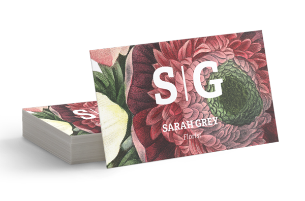
Example of a business card with oversize graphic and initial caps (Source: VistaPrint)
When your design is ready, go with our top pick, VistaPrint, or any provider from our list of the best places to print business cards. Each has options to make your finished product shine with standout materials, finishes, shapes, and more.
3. Take a Modern Selfie
Imagery that puts you in the spotlight as your business’ brand creates a personal connection. This example is very modern and editorial in feeling. It could work equally well for various creative professionals, from photographers to interior designers, graphic designers, copywriters, authors, and personal service providers like child care or dog or home sitters.
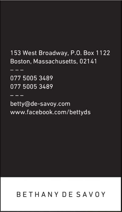

Business card examples with a modern selfie and color-blocked design (Source: MOO)
4. Lean on Classic Images & Vintage Fonts
Most companies in the automotive industry use business cards, whether they sell vehicles, change tires, or offer repair services. Business card design ideas that hint at the industry look professional and are versatile enough for any automotive business. This example, in particular, evokes a vintage, classic feel, which could be effective for nearly any type of auto sales, repair, or collector.


An example of a vintage auto business card design (Source: Canva)
5. Go Big or Go Mini
Not all business cards have to be the same standard size. Going oversize gives you more space to work with, but going mini can be equally impactful in capturing people’s attention. The example below is for a makeup artist; the card’s size makes it easy to keep in a wallet or hand out with samples.


Example of mini business card design ideas for a makeup artist (Source: Zazzle)
6. Set the Stage for Romance
The elements you choose to include can bring up all the right associations. For example, a soft pink motif with bespoke handwritten fonts, florals, and ribbons inspires feelings of love and excitement—perfect for wedding-related businesses like event planners, florists, caterers, bakeries, and venues. When coming up with creative business card ideas, think about how the design, colors, and fonts work together to evoke feelings or associations.
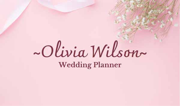
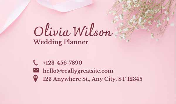
Business card idea for wedding planners (Source: Canva)
7. Read Between the Lines
The business card design idea below offers a clever nod to educators, tutors, and similar businesses with its notebook paper graphic. It’s versatile enough to work for administrators, teachers, and even writers. It’s also practical in that it’s easy to read, and you can choose a strong, eye-catching statement color for the side featuring your company name.
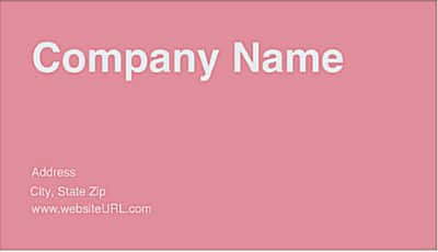

Business card idea for education-related companies (Source: PS Print)
Not sure what colors would work best for your business card and brand? Get inspiration from our list of the best website color palettes to fuel your business card ideas.
8. Create a Sense of Calm
A simple business card that leverages a calming color might be all you need to get your point across. For example, this muted green design showcases the company name and slogan. It is straightforward, uses earthy, calm colors and abstract shapes to hint at the business type, and doesn’t overwhelm people with a complicated design.
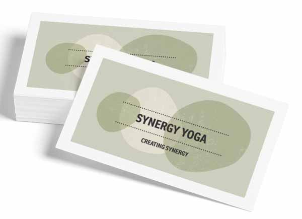
Yoga studio or fitness professional business card idea (Source: VistaPrint)
9. Take People on a Journey
A striking and memorable card that evokes thoughts of travel, like the passport imagery on the business card example below, can inspire people to hold onto your business card. Travel agents, hoteliers, travel planners, and others who work in the travel industry could easily make this layout work.
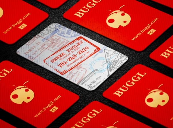
Travel-themed business card idea (Source: Staples)
10. Drive Traffic to Your Site With a QR Code
Combining helpful elements onto one card makes it as valuable for a customer as possible, which is why this example made our list. Adding a QR code gives customers a quick way to view your menu or daily specials online. The design in this example is meant for restaurants, but by replacing the fork and knife icon graphic, it could work for nearly any type of business.
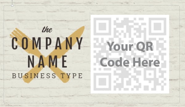
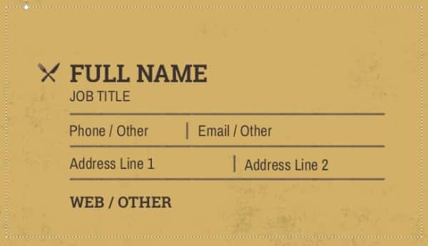
Business card ideas for using QR codes (Source: VistaPrint)
Did you know?
QR code usage quadrupled in 2022. Short for “quick response,” QR codes are barcode-like graphics people can scan with their smartphone’s camera. When they do, they can instantly visit the website URL associated with the QR code. VistaPrint has a free QR code generator to design your business cards.
11. Use a Silhouette Backdrop to Separate Content
Construction businesses have the potential to connect with contractors, subcontractors, real estate agents, and homeowners, often daily. When you use a clean design with a single identifiable element, like the silhouette below, it showcases what your business does and adds a design element that can be used as part of the overall layout of your content.
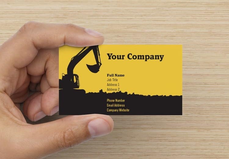
Creative business card ideas with industry silhouette graphics (Source: VistaPrint)
Want more examples of business cards for construction industry companies? Check out our roundup of the best construction business cards for ideas and inspiration.
12. Get Twice the Space With Folded Cards
Folded business cards are ideal for service-based industries, like the cleaning services example below. It essentially gives you twice the space of traditional cards, with room to print a service or pricing menu, list of products used, or instructions. Plus, with extra space to work with, it’s easier to add a QR code to take people straight to your appointment booking page.
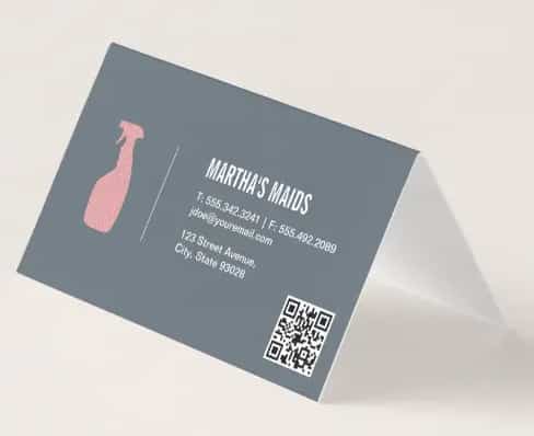
Cleaning services folded business cards with a QR code (Source: Zazzle)
13. Use Texture to Make a Tactile Impression
There are many ways to make sure your marketing materials stand out from the competition. Using a different texture or type of material for your card, like the brown construction paper texture in the example below, is an excellent way to catch a person’s attention. Printers like VistaPrint usually have unique options for texture, not only through paper stock but also with finishes and techniques like embossing and raised lettering.
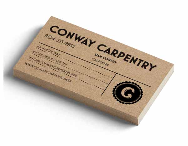
An example of alternative paper stock for business cards (Source: VistaPrint)
14. Let Your Logo & Brand Colors Do the Work
A simple, basic business card design with your logo and a bold statement color is a great choice for businesses wanting to create an instantly recognizable brand. This design from a Fiverr freelance graphic designer is a great example. You might also notice the use of icons that point people to the phone number, email, and web address, making it easy for them to find the best way to reach you.
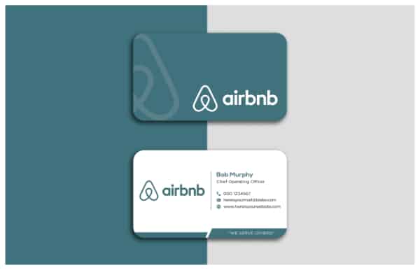
Put your logo front and center to make your card recognizable (Source: Fiverr)
If layout and graphics aren’t your forte or you want a custom design, there are affordable options. For example, you can hire a freelance graphic designer for as little as $5 to create designs for your corporate cards (and many other types of marketing materials for small businesses) on Fiverr.
15. Find a Layout You Like & Make It Your Own
An easy way to come up with cool business card ideas is to find examples you like in terms of overall layout and fonts. Then simply keep the elements you want in place and replace things like the main photo with pictures representing your work or brand.
For example, bakers and caterers can take the template below, upload their own imagery, and even print multiple designs in the same run with a business card printer like MOO. This way, they can show off a range of different types of products for various events or client types.
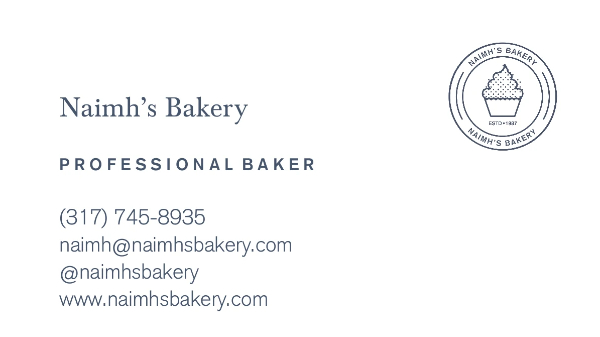
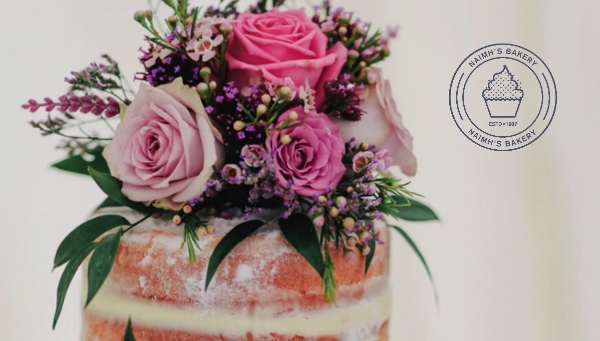
Example of a bakery business card (Source: MOO)
16. Add Reminders for Appointments
Including appointment reminders is very helpful for businesses like dentists, hair stylists, manicure and pedicure businesses, counselors, physicians—or any appointment-based business. It’s also easy to customize premade appointment reminder cards on sites like VistaPrint with your brand’s colors and visuals representing your company or industry.
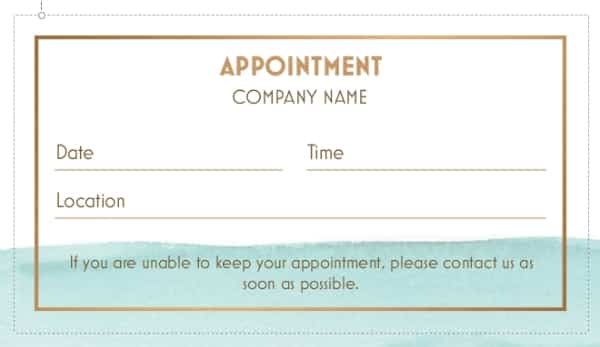
Appointment reminder business card ideas (Source: VistaPrint)
17. Go Retro to Reach Your Target Audience
Use retro-inspired images and colors to give all your marketing materials a fun vibe. Not only do graphics help represent what your brand is about, but they also add to the appeal of your design, especially with members of your audience who “remember when.” This is a great jumping-off point for cool business card ideas for a wide variety of industries.

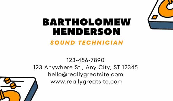
Retro business card idea (Source: Canva)
18. Use Icons to Send a Subtle Background Message
Small touches like icons and backgrounds that hint at your business make it easy for a client to know who you are and why they’re keeping your marketing collateral handy. In this example, it’s clear that the business is pet-related, yet the design appears almost floral and feminine, conveying a sense of the business owner’s brand and style.
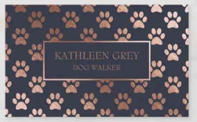
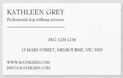
Pet sitter or pet groomer business card idea (Source: Zazzle)
19. Elevate Your Brand Image With Raised Lettering
Any time your marketing materials stand out with unique finishes and textures, it elevates your brand image vs competitors that opt for the least expensive options. While it’s hard to tell from the image below, the text and logo on the finished product are raised. Adding this small difference to appeal to the sense of touch can make a lasting impression on a client and makes your business card design stand out among others that fall flat.
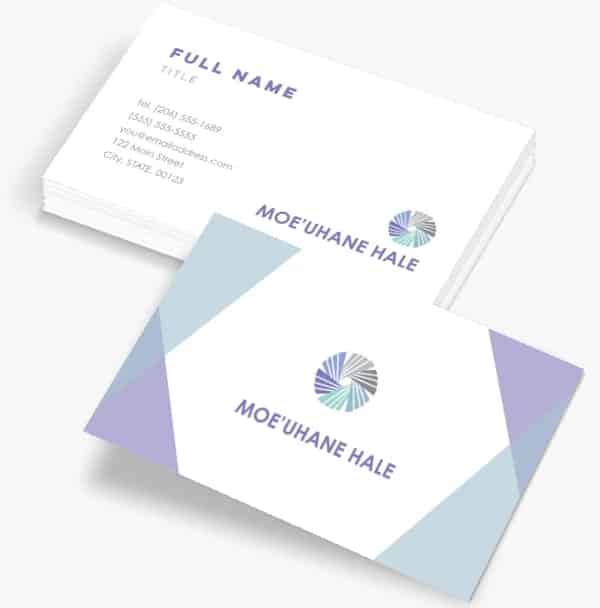
Example of business cards with raised letter embossing (Source: Staples)
20. Keep It Simple to Emphasize Your Authority
Minimalist layouts are often preferred by professionals like accountants, architects, and lawyers. They generally rely on white space to make important information stand out, which also helps to avoid a cluttered appearance. Bold fonts take the place of images, while brand color is still served with a simple bar.
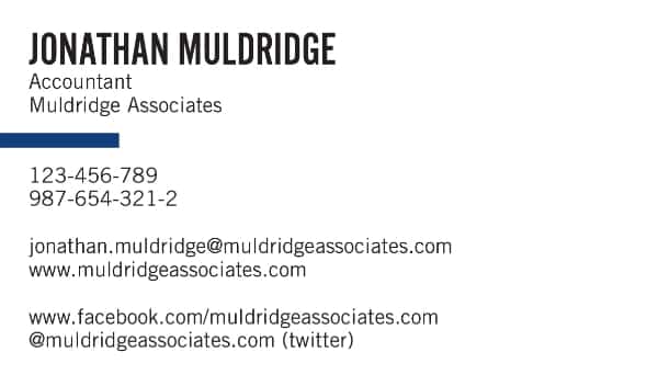
A simple and minimalist business card idea for professionals (Source: MOO)
21. Use Graphics to Call Out Your Specialty
Marketing collateral with industry-evoking graphics and bold colors can be very effective, as the example below demonstrates. This particular design could work well for private detectives, forensic experts, law enforcers, and related industries.
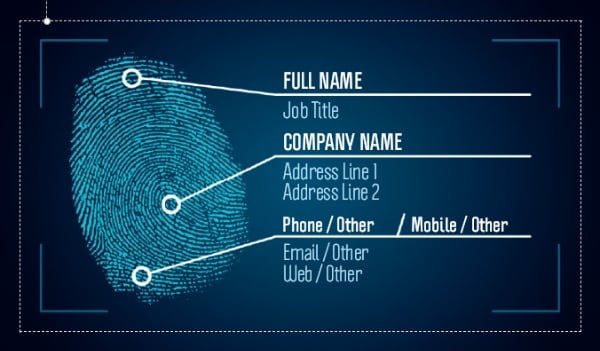

Utilize colors and graphics to come up with different business cards ideas (Source: VistaPrint)
22. Make Your Expertise Obvious
A great trick to make sure clients can find your card quickly when they need your help is to make its design bold and the connection obvious, like the idea below for electricians. Nothing else is needed on the front of the card, and your contact info on the back will be more than enough when they need you.
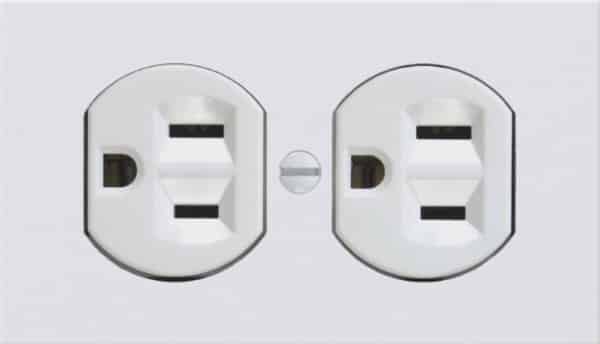

Electrician or electrical contractor business card idea (Source: Zazzle)
23. Double Down on Color
Bold, contrasting colors and geometric shapes can replace logos and photos. In this example, one side doubles down on color using negative space to make your information stand out, while the other side makes the color stand out through the use of white space. Using bold colors helps your cards stand out in a sea of neutral-colored business cards and over time, establishes a signature color people come to associate with your brand.


Ideas for using your brand’s signature color in marketing collateral (Source: Staples)
24. Use Images to Dictate Information Layout
It might seem obvious, but one of the most essential elements of any business card is your contact details. The example below makes it clear you’re in the real estate industry and puts your contact info in the spotlight. Add a logo to the front or back, or use your professional headshot.
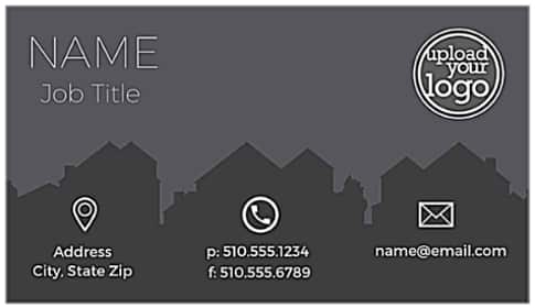
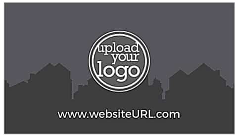
Real estate industry business card idea (Source: PS Print)
25. Put the Most Important Info in the Main Frame
Using a bold color puts your business’ contact details into the spotlight, as the example below showcases. This particular design is easily adaptable for landscapers, decking companies, and the like; however, the photo could easily be changed out to make it suitable for any type of business.
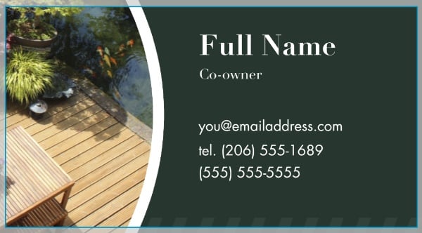
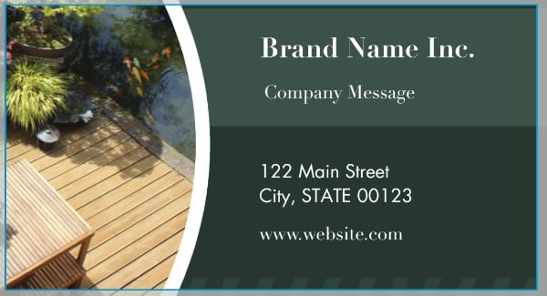
Landscaper or decking company business card idea (Source: Staples)
26. Showcase Your Own Original Artwork
Artists with talent in visual and graphic design have an advantage when it comes to coming up with cool business card ideas to represent their work. Instead of leveraging stock imagery or photography, creating your own artwork and uploading it when ordering your cards makes them truly one of a kind.
If you go through MOO, you can even upload multiple designs that will print in the same run. This would work well for graphic designers and artists as well as museums, galleries, theaters, and more.
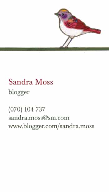

An example of how to use original artwork on marketing collateral (Source: MOO)
27. Be Brave With a Close-up Close Cut
Modern, editorial photo-based business card designs are perfect for beauty industry professionals. Stylists can use images of their work to remind customers of their hair color, trim, or style.
Include your website, email address, and phone number on your business card to make it easy for customers to connect. Better yet, if you have a landing page with online booking tools, add a QR code people can scan to easily book their next appointment.


Close-cut photo business card idea for barbers and stylists (Source: MOO)
28. Get Attention With an Unexpected Shape
A rustic, hand-made business card design is a great look for craft and jewelry entrepreneurs, wedding planners, local gift and home goods shops, and more. The square shape, rounded corners, and textured stock of this template all speak to a personal aesthetic. They are more memorable than traditional rectangular cards and support a higher-end brand and curated customer experience.
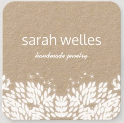
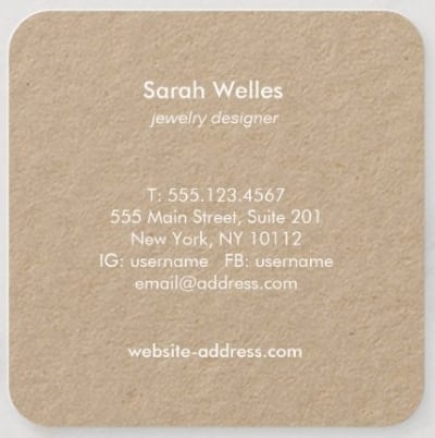
Examples of square business cards that feel handmade (Source: Zazzle)
29. Make Your Card Shine With Metallic Foil Ink
For a great first impression with your business card, add some bling—as in the gold or silver foil or metallic finishes many business card printing services offer. The shine adds texture and your cards are sure to be noticed by anyone you give them to. It’s bright and bold, and the material with a strong geometric design replaces other types of graphics.
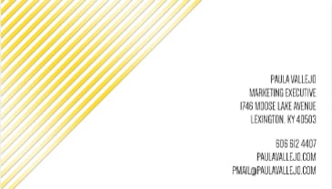
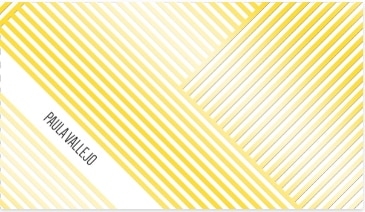
Ideas for using metallic ink and foil on marketing materials (Source: MOO)
30. Use Die Cutting to Give Your Brand an Edge
One of the unique styles of business cards is a die-cut card. You can choose almost any kind of cut shape to make your card look and feel different from other business cards. In the example here, the bite cutout shape mimics the name of the business. This die-cut method is similar to using raised fonts to appeal to the sense of touch, and visually it offers a bit of whimsy.
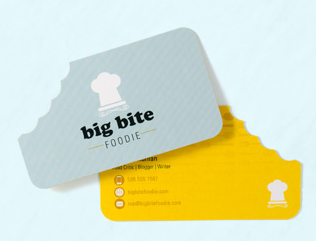
Die-cut business card examples (Source: PS Print)
31. Keep It Classic
You can stick to the basics and still get a bold, modern design with a classic business card. The great thing about this example is that you can add or remove whatever you’d like to make it uniquely yours. It’s more of a blank slate for any type of business, but the blue jeans pocket look of the graphic could also make this great for a handy services business or painter.
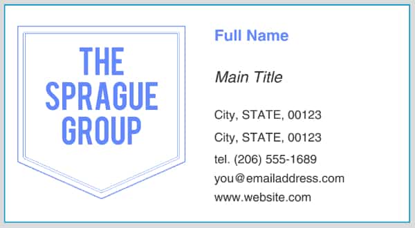

If unsure, stick to the classic business card design that makes your business look professional (Source: Staples)
32. Amp Up Your Design With Embossing
As we touched on above, effective business card design doesn’t rely on visuals like images or color alone. In the example below, it’s all about texture. You can intrigue a contact by including textural elements, like embossed dots, to make your business card stand out (and the use of bold color doesn’t hurt, either).
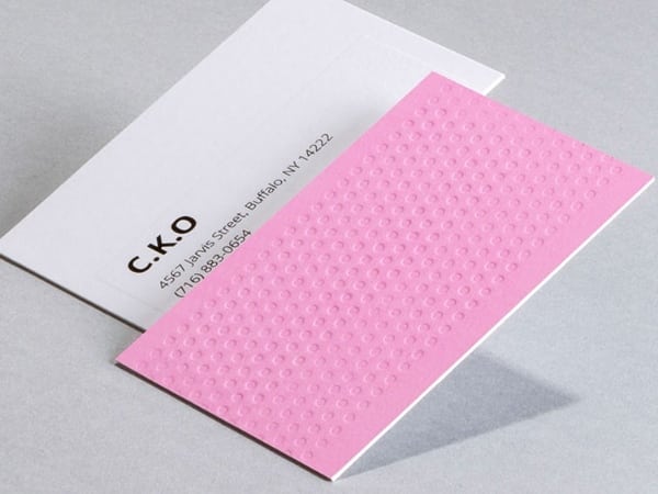
Ideas for embossed business card designs (Source: MOO)
33. Create Intrigue With Art-inspired Graphics
In this example, the eye-catching abstract graphic element mimics the movement of a musical conductor’s motions on the front and back of the card. In fact, if you hand a card like this with the graphic-only side up, they are almost sure to turn the card over to find the story behind the design.
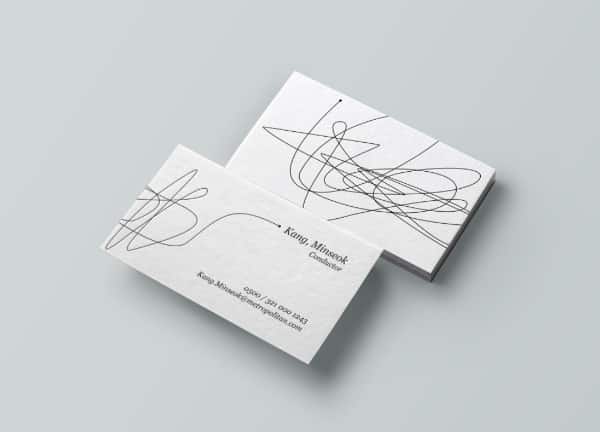
Cool business card ideas for musicians or conductors (Source: 99designs)
If you’ve got an idea for a custom graphic but can’t create it, or you’re struggling to come up with cool business card ideas, 99designs can help. You can hold a contest on the platform inviting multiple artists to submit designs and choose the one that best represents your brand.
34. Get People Interested in Your Story
A traditional layout can be simple and still stand out with a professionally designed logo and bright colors. A traditional layout usually includes the logo on the back and your basic information on the front of the card. This example combines several elements that catch the eye, from a bold standout color to a whimsical fish logo in the shape of a storybook, and great use of white space.
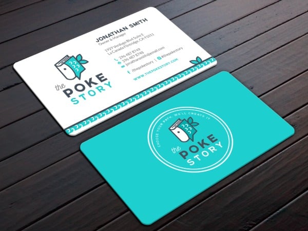
A business card idea for a poke restaurant (Source: 99designs)
35. Use Creative Finishes to Stand Out
In this example, a Fiverr designer used non-traditional colors to create the appearance of holographic iridescence with pastel rainbow colors and shading. When ordering your cards, printers like VistaPrint may be able to support this further with metallic inks and glossy finishes. Finding a way to make your business card pop in a handful of other business cards can be challenging, but getting creative with finishes can help.
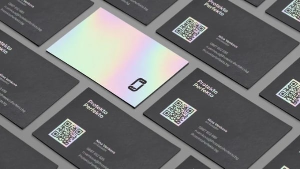
Examples of business cards with a holographic feel (Source: Fiverr)
Frequently Asked Questions (FAQs)
How do I design a professional business card?
The easiest way to design a professional business card is to go to a platform like VistaPrint, find a template you like, and edit it with your information and branding. If design isn’t your forte, you can get low-cost designs from graphic designers on Fiverr for as little as $5 or search online for free templates you can edit yourself. For more options, check out the templates and editing tools offered by top business card printers.
What should you not put on a business card?
You shouldn’t put any information on a business card you wouldn’t want to be public information (such as your home address or a personal phone number). Another general guideline is to avoid putting too much info on your cards. Otherwise, they might look cluttered or make it hard for prospects to figure out how to reach you.
How can I make my business card stand out?
To create cool business card designs that stand out (while also representing your brand well), make your brand colors the star of the show. Add an eye-catching visual like a QR code that does double-duty in sending traffic to your website or landing page. And upgrade from standard paper weights, colors, shapes, and finishes to fully set your cards apart.
Bottom Line
Take some time in the design stage of creating business cards to leverage colors, images, white space, and other elements effectively. Think about the ideas or emotions you want to come to mind when people see your cards, as well as what will make your design stand out in a memorable way that represents your brand.
The easiest way to make your business card idea a reality is with VistaPrint. Start with any of the thousands of free templates, or start from scratch, and use the platform’s editing tools to finalize your design. Then select the finishes, paper stock, and other options that can take your cards to the next level.