


The best construction business cards highlight your contact information, give credibility to your business, build trust with potential clients, and set your brand apart all at once. Even in 2023, a business card is often the first interaction clients have with your brand. You can leave a positive impression on your potential customers with this curated list of eye-catching construction business card ideas.
The designs below are sure to inspire. When you’re ready, head over to VistaPrint, choose and edit your favorite design, and have your business cards printed and shipped to you in minutes. Use the code FREESHIP to get free shipping on your order.
- 1. Clean Logo-centric Design
- 2. Cards That Highlight Brand Color & Logo
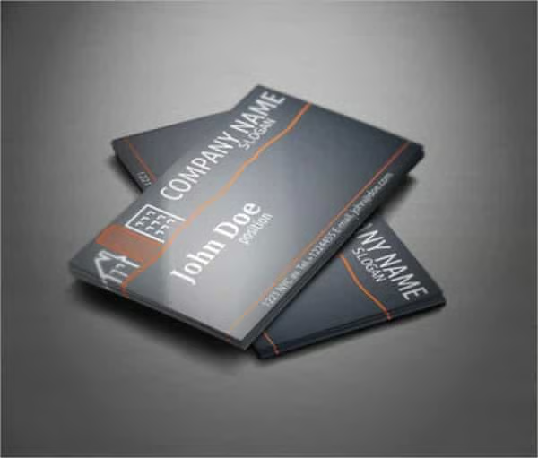
- 3. Cohesive Minimalist Design
- 4. Embossed Business Cards
- 5. Plastic Long-lasting Construction Business Cards
- 6. Traditional Paper Business Cards
- 7. Classic Glossy Grays
- 8. Vector Graphic Design
- 9. Picture Background Business Card
- 10. Luxury-inspired Business Cards
- 11. Matte Black Business Card
- 12. Enterprise-level Details
- 13. Strong & Unique Colored Designs
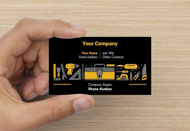
- 14. Heavy-duty Construction Elements
- 15. Area-inspired Construction Business Card
- 16. Themed Business Card Designs
- 17. Information-centric Business Card
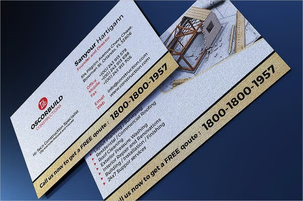
- 18. Flyer-type Business Card
- Design Takeaways From Construction Business Card Examples
- Best Places to Print Your Cards
- Frequently Asked Questions (FAQs)
- Bottom Line
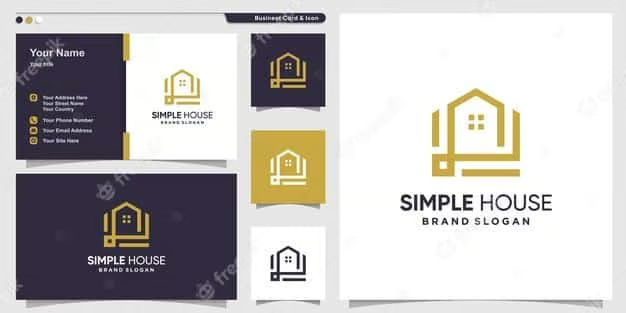
1. Clean Logo-centric Design
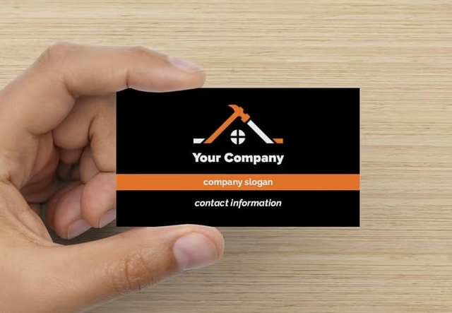
Icon construction business card example (Source: VistaPrint) 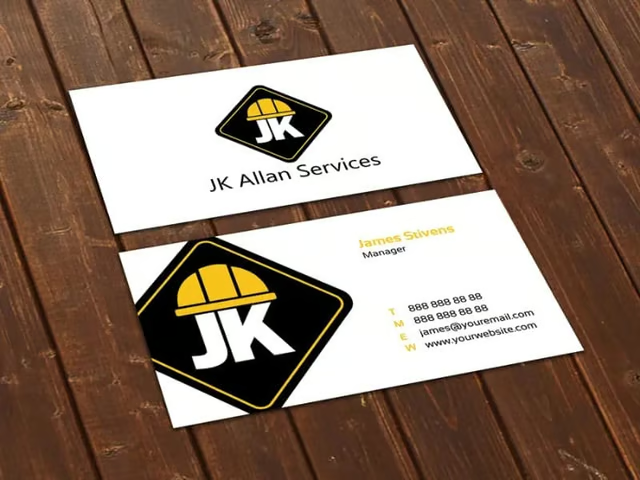
Clean logo contractor business cards (Source: Freelancer)


Some clients prefer a good clean, construction business card instead of a business card cluttered with various design elements. This type of business card is also more affordable as it uses fewer colors and can be printed without a glossy finish. One thing construction company business owners can do to make the logo more personalized is by playing around with the font.
2. Cards That Highlight Brand Color & Logo
Minimalist classic business card (Source: 99designs) 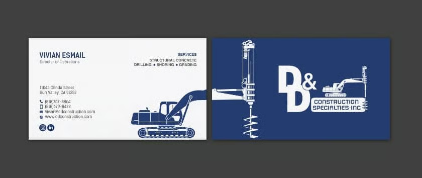
A sample dual-colored logo business card (Source: 99designs)


An uncluttered, color-forward business card highlights your logo, provides key information, and is aesthetically pleasing—making it hard to throw away. To achieve this design, declutter excessive elements (e.g., over-use of lines, large shapes, and complex icons) and focus on the essentials like your contact information, logo, and colors that represent your brand identity.
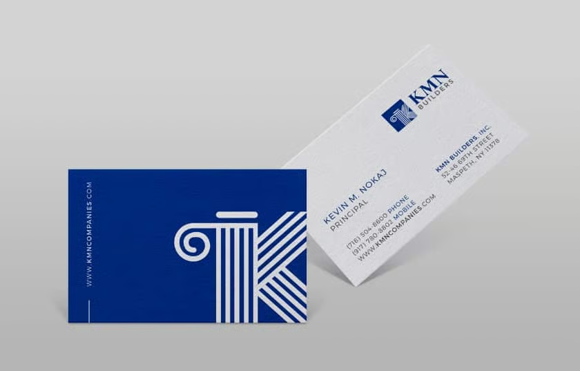
3. Cohesive Minimalist Design
Modern simplistic construction business card examples (Source: Freepik) 
Dual-colored roofing business cards (Source: Canva)


The benefit of a modern simplistic business card is that the design and motif can easily be duplicated in your flyers, website, and other promotional materials. This makes it easier to build a consistent visual brand image. As much as possible, avoid using different themes on your marketing materials, as they can hurt your branding and can be confusing to potential clients.
4. Embossed Business Cards
One way to make business cards for construction better is by embossing them and providing a nice feel to the cards. Embossed business cards use a process where the elements on the card are pushed from the other side to create a raised surface on the front. This invites clients to read the card while feeling it. At the same time, the additional sensation can also make your card memorable.
5. Plastic Long-lasting Construction Business Cards
Transparent, heavy-duty plastic cards give an impactful appearance that will stand up over time compared to their paper counterparts. A great benefit to having a plastic heavy-duty construction card is that it is more durable than the traditional paper card. If your customer retains the card longer, the longer they’ll have your contact details on hand too.
6. Traditional Paper Business Cards
While classic card stock construction cards are affordable options for businesses, they can still be an effective way to build your brand image further. It is important to invest in a good design when using traditional paper business cards since you are competing against many others who rely on the same materials. However, with a good design, you can still set your business apart at a more affordable price.
7. Classic Glossy Grays
The gray backdrop in this design elevates the quality of the glossy card. It is a simple way to make quality business cards without making the cost of printing business cards overly excessive. Glossy business cards are used for their sophisticated appearance, not just in the construction industry but in many others as well.
8. Vector Graphic Design
Using vector graphics ensures your design remains high-quality no matter what type of material you use it for. These icons of classic construction tools are a simple and fun way to let your clients know you’re in the construction business. If you provide all-around construction services, this design is a great fit since it will show clients that you offer a broad range of services. If you’re in a specific niche, choose vector art relevant to your field to avoid confusion.
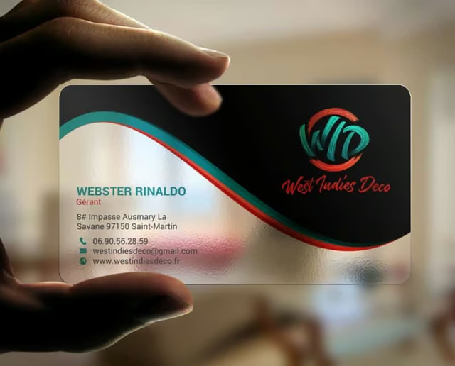
9. Picture Background Business Card
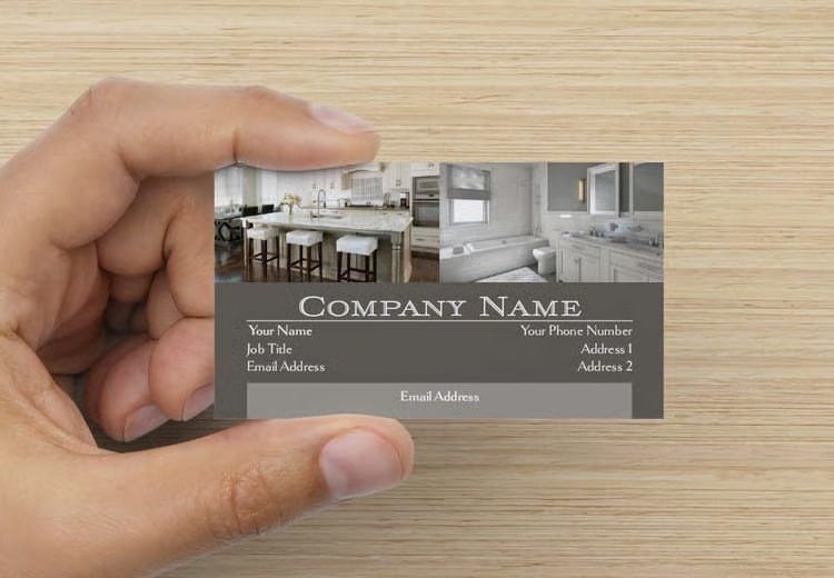
Having a construction card with a picture as a background allows you to showcase your work. This is especially beneficial if your business is in the roofing, tile, or other construction niches that rely on portfolios to get clients. Don’t forget to link your business website so clients can access your complete portfolio.
Putting your website URL on non-digital marketing materials, like your business cards, brochures, flyers, and direct mail postcards, is an effective website marketing strategy for driving traffic to your site. Once there, use a pop-up extending a special offer or link to a free download, like an e-book, to capture the contact information of site visitors for future marketing campaigns.
10. Luxury-inspired Business Cards
Plastic luxury construction card example (Source: 99designs) 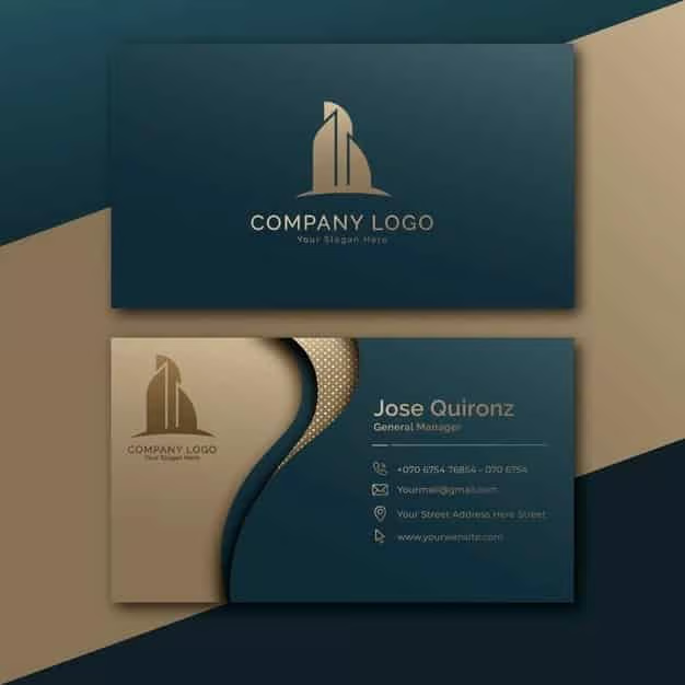
Contemporary luxury construction business card examples (Source: Freepik)


The layering of color and perceived textures in these card examples conveys luxury, while the clean fonts evoke elegance. Luxurious designs give a perception that it’s an important card worth saving for future reference. Nearly three-quarters of people who participated in a Statistic Brain Research Industry study said they judged professionals by their business cards, and 39% of people said they wouldn’t do business with a company if they had a “cheap-looking” card.
This design solves the issue by eliciting a sense of luxury and holding a subtle perceived value similar to how they would feel with a credit card. Plastic business cards cost quite a bit more to print than paper cards. However, you can think about printing business cards with a luxury design to use in conjunction with traditional card stock cards—just save them for special occasions or VIP clients.
11. Matte Black Business Card
Nothing says luxe design like matte black, as the design of these cards demonstrates. A classic matte business card also increases attention retention due to how it feels in your hand. With most clients receiving glossy business cards left and right, a matte black business card stands out thanks to its color, feel, and minimalistic design.
12. Enterprise-level Details
An enterprise-level business card pays extreme attention to detail. With home improvement and remodeling business cards like this, you’ll impress clients right off the bat with the level of detail in your card—a strategy used by over 58% of business card printing customers.
13. Strong & Unique Colored Designs
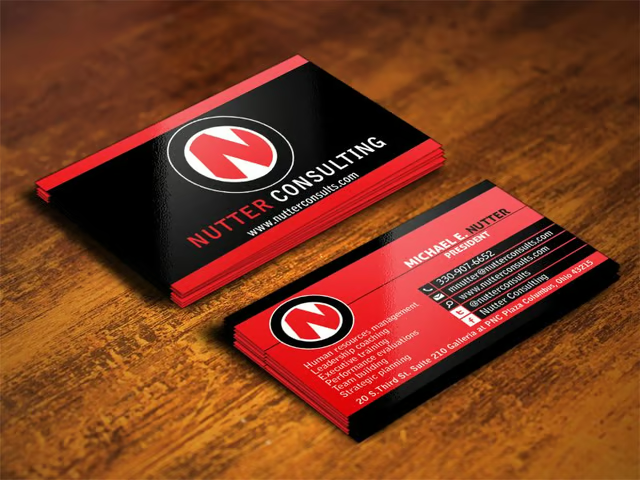
Red and black business card sample (Source: DesignCrowd) 
Screamin’ green-colored business card (Source: Canva) 
Contemporary-colored business cards (Source: Canva)


Design trends indicate that vibrant colors in marketing materials are expected to be popular in 2023. A red and black business card does the trick for businesses that want a bolder approach with color. Strong colors like “screamin’ green” are a great way to catch your clients’ attention. Use different colors to your advantage to evoke specific emotions from your customers.
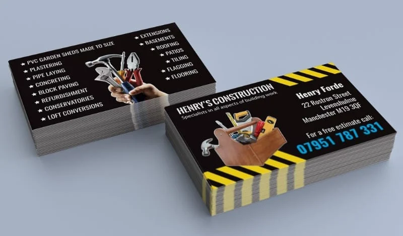
14. Heavy-duty Construction Elements
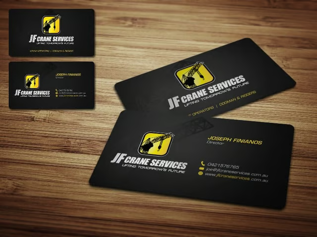
Black and yellow construction business cards (Source: 99designs) 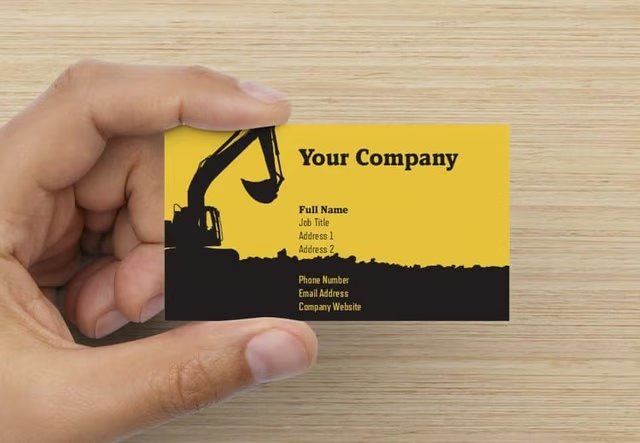
Heavy-duty backdrop construction business card examples (Source: VistaPrint)


Keeping your promotional materials simple with a single identifiable element is another marketing strategy employed by successful construction companies. Black and yellow are colors often associated with construction thanks to their prolific use in cautionary road signs. Let your potential clients know you’re in business by having a backdrop of what you do.
15. Area-inspired Construction Business Card
If your business is located near the ocean or nature in general, expressing this in the card is a clever idea to catch a client’s attention. Aside from offering construction services, having a card that embodies the location’s essence is a way to build rapport and signals your company’s love for the local surroundings. Discover other local advertising ideas to help your business grow.
16. Themed Business Card Designs
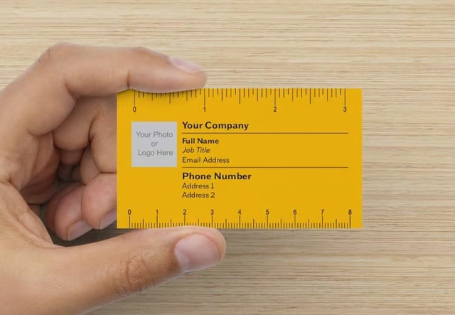
Ruler-themed business card construction design (Source: VistaPrint) 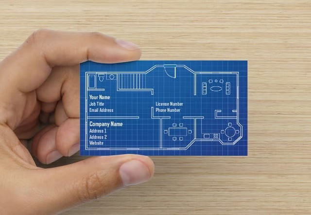
Blueprint business card (Source: VistaPrint)


Having a business card that not only stands out but is also useful is a great way for you to gain attention. In the example above, prospective clients can grab the ruler-themed business card and use it as a small alternative tool for measurement. Functionality makes the business card harder to disregard since, in certain instances, potential clients can use the construction company business card themselves.
Alternatively, a blueprint-inspired business card intrigues potential clients and lets you showcase your information by mimicking an actual blueprint. Due to the font matching the card design, it’s a cool way for clients to take in your information.
Finding a theme that matches the services you provide is an excellent way to make your construction business card impactful and memorable.
17. Information-centric Business Card
Using hashtags, social media icons, and a footer (the green box at the bottom) is essential to making a client contact-friendly business card. It makes it easy for the prospect to research your company, engage with your brand online, and then get in touch when they are ready to work with you.
18. Flyer-type Business Card
A flyer-type business card allows clients to know what services you are offering. This is extremely useful for businesses that offer all-around services. Instead of clients having to go online to search for the service they might need, having them on your business card will increase the chances of them calling you.
Design Takeaways From Construction Business Card Examples
Like all of the construction business card ideas seen in the examples above, your design should aim to make the person:
- Read your business card
- Remember its information
- Hang onto your card for future use
- Refer others by sharing it
Common elements that you can use to achieve this are identifiable logos, high-quality graphics, unique finishes or themes, and good use of color. Like all types of business cards, it should clearly articulate your business information. Lastly, make sure that the design you use reflects your services well.
Do’s & Don’ts
In addition to the design takeaways, there are specific do’s and don’ts that apply to not only business cards for construction companies but all business cards as well. Keep these tips in mind as you design your cards:
| Do's for Construction Business Cards | Don'ts (What Not to Do) |
|---|---|
| Prioritize essential information like your name, job title, contact details, and logo. | Don't clutter your design with excessive text, images, or messy elements. |
| Highlight your brand by using colors, graphics, and fonts consistent with your brand identity. | Don't use outdated or irrelevant information, and make sure to proofread your design before printing. |
| Invest in good-quality cardstock and prioritize high-quality material for a more professional result. | Don't use low-quality images or graphics. |
| Incorporate unique design elements, such as embossing or a thematic approach, to make your card stand out. | Don't rely solely on DIY design software, especially if you are not confident with your design skills. |
Best Design Resources for Construction Business Cards
There’s nothing more frustrating than having a design vision in mind for your business cards without the means to turn that vision into reality. Below are some resources you can tap into quickly and affordably (some even for free) to design and print your business cards for your construction company.
- Logos and icons: There are dozens of places to get free logos and icons on our list of the best sites for logo design.
- Royalty-free images: Check out over a dozen sites where you can get free images for your business cards.
- Online design tools: VistaPrint offers an all-in-one option with online design tools and business card printing. Alternatively, Canva gives you more design freedom and thousands of free images and premade templates to spark a more custom design. Both are on our list of the best places to order business cards.
- Custom design services: A fully custom, one-of-a-kind design that makes a big impact doesn’t have to come with a big price tag. For example, you can visit Fiverr and get a custom design for your cards for as little as $5 from a freelance graphic designer.
Best Places to Print Your Cards
VistaPrint tops our list of the best business card printers, but it’s not the only option available to you. Here are some of our top recommendations based on use cases.
| Best Overall | Best Same Day Printing | Rush Printing |
|---|---|---|
|
|
|
| Visit VistaPrintUse code FREESHIP to get free shipping on your order | Visit Staples | Visit GotPrint |
Frequently Asked Questions (FAQs)
How can I get a custom design for my business cards?
You can get custom business card designs easily by exploring platforms such as Fiverr, where you can hire a freelance graphic designer for as low as $5. 99designs also allows you to submit a design brief and hold a contest where you can select the winning design for your business cards in packages starting at $299. Another option is trying VistaPrint’s design services for a custom-made card.
Where’s the best place to have business cards printed?
VistaPrint is the best place to get business cards printed, but it’s not your only option. Staples is the go-to for same-day printing, MOO offers the most unique card designs and styles, while GotPrint is one of the cheapest business card printing options, and offers rush services.
Can I design my own construction business cards?
Designing your own construction company business cards is an option, and you can do so online for free. For a custom look, try Canva. You can use it completely free and start from scratch or tap into the thousands of templates and premade designs on the platform.
Bottom Line
From minimal to ornate and bright to bold, these construction business card examples run the gamut of what’s available to help you build a strong brand image. Sites like VistaCreate offer templates and artwork to help you create unique business card designs, while VistaPrint has exceptional templates to save time using a premade design. Use code FREESHIP on your VistaPrint order to save money with free shipping on your business cards.