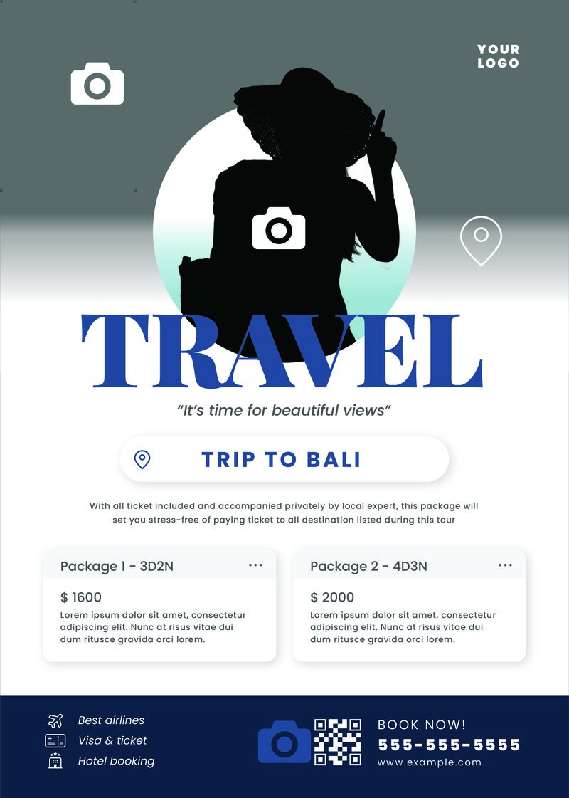
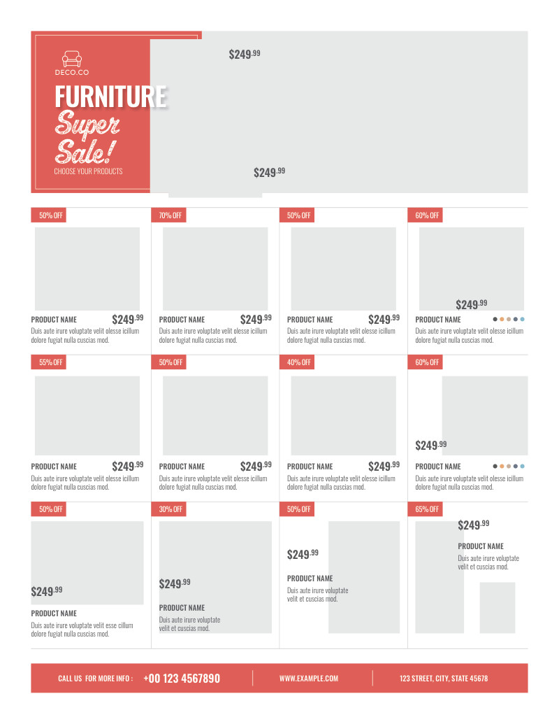
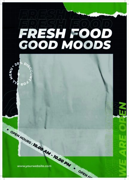
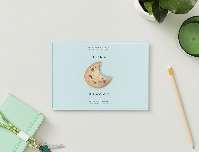
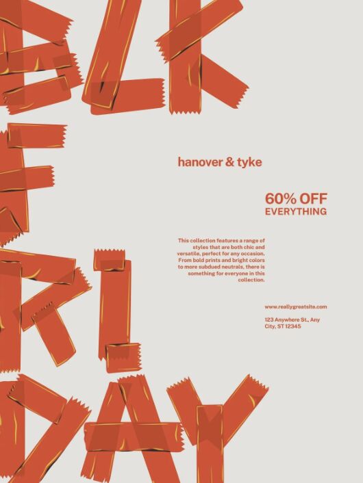
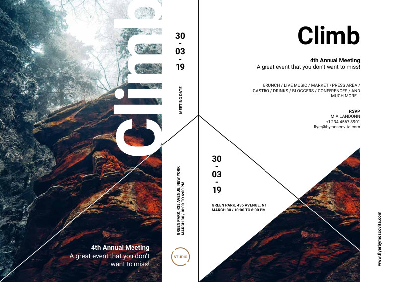
In a world inundated with digital screens, flyers give you a more personal and local feel—helpful if you’re marketing to your local community. Good flyers need to be well-designed enough to catch the attention of passersby. For instance, you can explore hand-drawn illustrations to stand out, offer coupons, or insert QR codes. Regardless of the design, make sure to use your brand colors.
Flyers are a staple in small business marketing, and even in the digital age, I’d argue that they’re effective. If you need inspiration, I’ve rounded up the best flyer examples for businesses and why they work.
Where do flyers fit in your marketing strategy? Flyers can fit in almost every part of your marketing plan, but they’re most useful for growing your brand awareness among your local community (especially if you have a physical location). They’re also great for announcing upcoming campaigns and events, for example, if you have an upcoming holiday sale or event.
1. Have One Clear Message & Call to Action
My number one design tip with advertising flyers is to focus on one message and call to action at a time. Just like landing pages, flyers need to be clear and simple enough to understand at first glance. Remember that you’ll only have your audience’s attention for a few seconds, and you’ll need to communicate your message effectively in that time.
Don’t confuse your reader with multiple messages or actions. Stick to one action you want them to take, whether it’s signing up for your event or visiting your online store. Clearly indicate how you want them to take it, whether by visiting a link or a physical location. The marketing flyer examples below do just that effectively—they give readers one clear action to follow.
2. Leverage QR Codes for a Digital Experience
Calls to action (CTAs) for your flyer can also take the form of QR codes your audiences can scan. QR codes are one of the handiest small business marketing tools, as they provide a simple, instant way to connect traditional to digital marketing. Use them to lead passersby to your website, offer a discount voucher for your store, or show a product demo.
Your QR code will be your flyer’s main call to action, so make sure it’s clear and visible. Of course, you should also let your customers know how they’ll benefit from scanning your QR code, as in the flyer examples for businesses below.
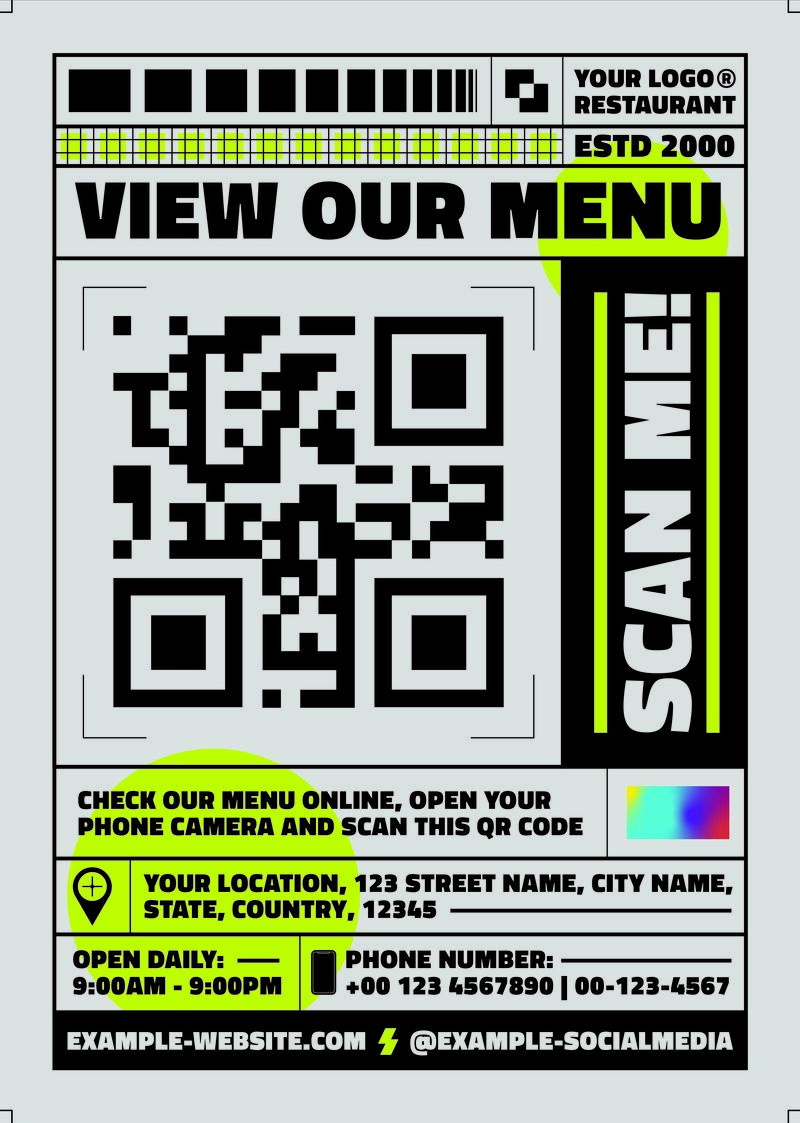
QR codes can instantly take your flyers’ audience to digital experiences—for example, viewing an online menu.
If you’re making flyers with QR codes, the best platform I recommend is VistaPrint. VistaPrint has dozens of flyer templates with QR codes (and other types of flyers) that you can easily customize, have printed, and delivered to your door. It’s trusted by many small businesses worldwide.
3. Use Simple, Emotional Language
Visuals are just one-half of your flyer design. The other half is your copy, which is how you’ll maintain your viewers’ attention and get them to follow your call to action. The way to do that is by using simple but emotional language in your flyer. It’s one of the most basic rules of copywriting: Keep your message simple, but add a dose of emotion.
If you think of the most successful flyer examples for businesses, you’ll notice one thing that makes them all tick: impactful but simple language that speaks to your audience’s wants and needs.
The key to a good flyer is an impactful, emotional copy.
You don’t need to be a professional copywriter to write good copy. Effective copywriting comes down to the following:
- Having a good understanding of your audience, along with their needs and interests, to pinpoint the right talking points.
- Knowing and completely inhabiting your brand voice, including your language and tone (casual vs formal, etc.).
- Keeping it short and sweet. Copywriting is all about impactful, action-oriented language.
- Offering benefits and solutions, not products and services. Don’t just tell your audience what you’re offering them; show how they’ll benefit from it.
4. Follow the 60/40 Design Rule
While the 60/40 rule primarily applies to email design, it’s still a good principle to follow when designing marketing materials. While I mentioned above that copy is one-half of your flyer design, in reality, text should take up no more than 40% of your entire space. Otherwise, it’ll look too cluttered. The remaining 60% should fall to your visual design.
This goes hand-in-hand with using minimal but effective text in your flyer. Short but clear copy makes your flyer easier to understand and more likely to generate conversions. Your visuals and copies should work together to tell a story, like the advertising flyer example below.
Your flyers should strike a good balance between text and visuals—ideally, 40% text and 60% visuals.
5. Use Your Brand Colors to Promote Your Brand
Flyers can be a good way to promote your business among your local community, especially if you’re still in the beginning stages of your marketing journey (i.e., you’re still introducing your business to audiences). Flyers have helped businesses build their brand presence for hundreds of years.
One way to do that effectively is by using your brand colors in your poster design. Brand colors are fundamental to your brand identity and can help you be more memorable to audiences, like how red and white represent Coca-Cola and blue and yellow define IKEA. Using a consistent color scheme makes your brand more memorable across different marketing channels, from flyers to websites to social media.
A clear and consistent color scheme is sometimes all it takes to make your business memorable.
6. Add Testimonials for Credibility
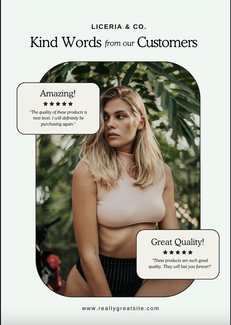
According to Brightlocal’s Local Consumer Review, 91% of consumers say local reviews and testimonials impact their perception of a business. Testimonials are a powerful form of word-of-mouth marketing that can instill credibility in your brand. They’re also versatile, fitting into almost any type of marketing material, including flyers. Especially in the service industry, testimonials are one of the best ways to let prospects know your services are worth their trust.
Design-wise, testimonials can be wordy, so incorporate images and use good spacing to balance them out. If you have their permission, adding photos of your previous customers boosts your credibility even more.
Testimonials can help boost your credibility. (Source: Canva)
7. Offer a Coupon as an Incentive
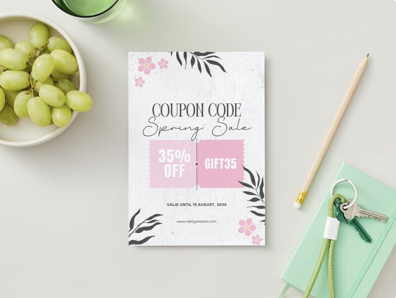
Marketing coupons and flyers go hand-in-hand. Both are key elements in local marketing, and coupons can act as an extra incentive for people in your community to check out your business. When creating your coupon flyer, make your coupon the focal point of your design and write action-oriented copy. Briefly explain how your coupon works and what they’ll get from it.
Flyers can also double as coupons to incentivize people to visit your business. (Source: Canva)
8. Stand Out With Stylized Designs
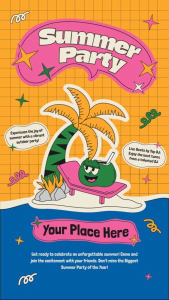
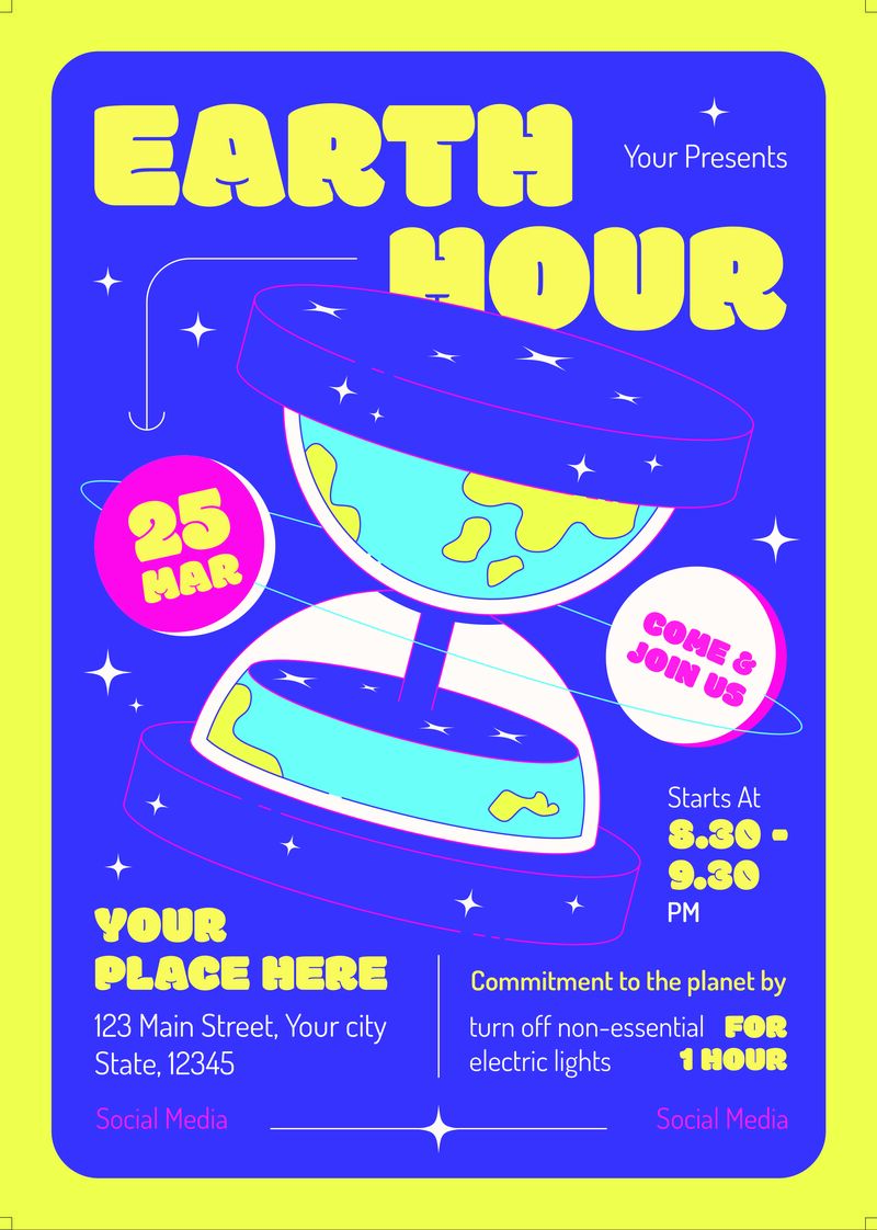
If there’s one design element that’s guaranteed to stand out from the crowd, it’s stylized illustrations and designs. Stylized designs are unique and sure to leave an impression on your audience. You can even go a step further and stick to a two- or three-color scheme and hand-drawn illustrations.
9. Capture Attention With Hand-drawn Illustrations
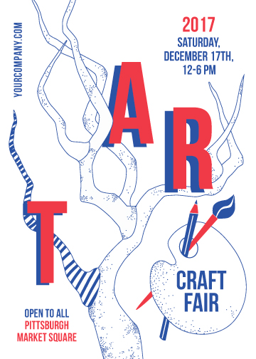
In a similar way, using hand-drawn illustrations and fonts can also grab people’s attention more effectively than generic ones when you’re handing them out or tacking them up on a bulletin board. Anything hand-drawn is always interesting and unique, especially in a world with design tools and templates within reach. A manually drawn illustration or font makes your flyer exponentially more memorable.
A hand-drawn illustration and font instantly make your flyer unique and memorable.
10. Use a Hero Image
When designing flyers, you’ll need to direct your audience’s attention to your most important information, then to your second and third most important information, and so on. One way of doing that is through hero images, which are so-called because they act as the “hero” of your flyer and are the first thing people will notice about it. They often take up half or one-third of your flyer’s space.
A good hero image should help you convey your message effectively, whether you use a photograph or an illustration. When people see your hero image, they should immediately get a sense of your message.
A hero image can instantly help convey your message to audiences.
11. Use High-quality Photos of Your Products
If you have an amazing product, you need to show it off. Including images of your products is one of the most common and effective flyer design examples. These work especially well if you have a product with high visual impact, like food or furniture. In these industries, a good picture is worth a thousand words.
12. Use Negative Space to Direct Attention
Eye-catching images and colorful designs can grab attention, but sometimes the exact opposite is just as true. Negative space (or white space) can be a handy tool to direct people’s attention when used the right way. Take, for instance, the flyer examples for businesses below, which communicate a lot with a little, using negative space to direct your attention to the most important pieces of information.
Negative space can direct people’s attention to your most important details. (Source: Canva)
13. Add a Visual Metaphor
Photographs and images are enough to tell a story, but if you really want to send a message, visual metaphors are a good way. However, they can be a little tricky to nail and will require you to think outside the box. If you get them right, though, your flyer can have an impact without using too many words or design elements. It’s for this reason that visual metaphors are often used for public awareness campaigns or by brands who want to be a little disruptive.
When done right, visual metaphors can send a clear, impactful message.
14. Offer Value With an Infographic
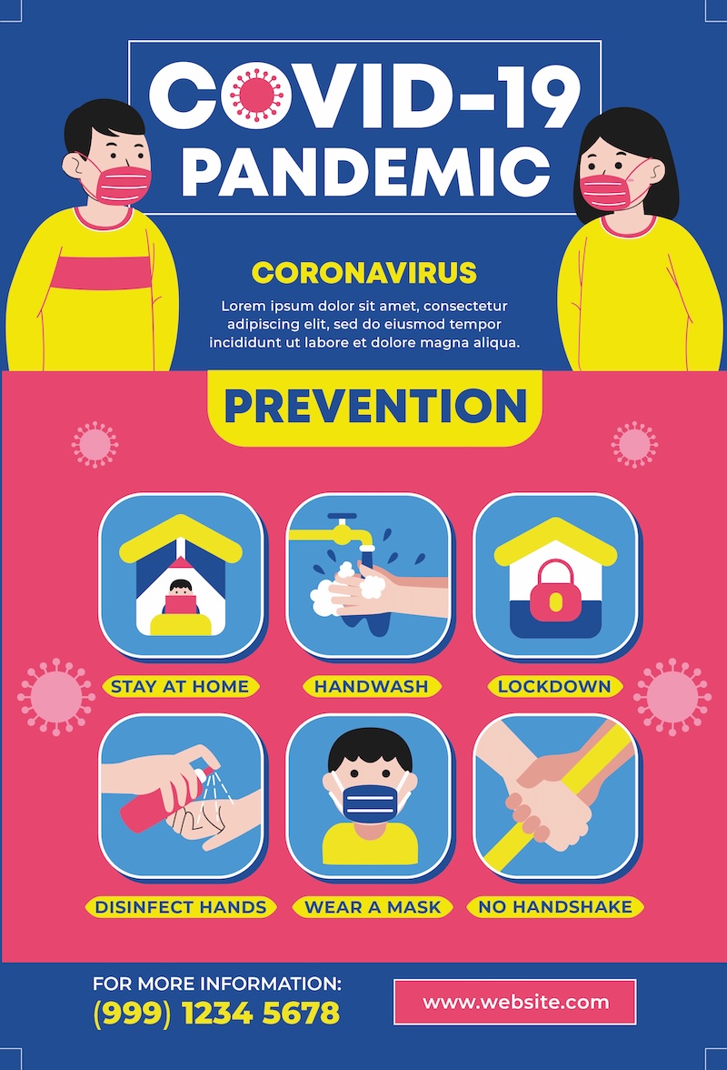
Flyers don’t always have to be advertisements. You can also use them to offer valuable information to your audience (which is the core of content marketing), specifically through infographics.
A good infographic should share valuable information related to your business or industry. For instance, if you’re in the medical industry, you can share tips to protect against illnesses, or if you offer landscaping services, you might want to offer lawn care tips.
Because infographics contain longer information, make sure to lay out your design carefully and do test prints to make sure all your text is readable. Also, add visual elements like icons and illustrations to support your text.
Infographics let you share valuable information about your business or industry with audiences.
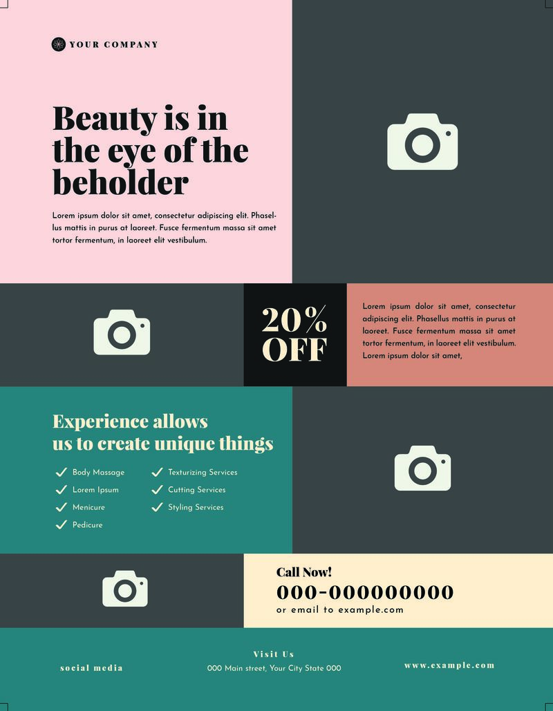
15. Use a Grid Layout to Share More Information
As mentioned, flyers can also hold longer information—it all depends on how you use your space. One good way is by using a grid layout and alternating images and text between boxes. They can be especially helpful if you’re using your flyer as an infographic or a brochure to share information about your business or industry. The ad flyer example below uses a grid layout to tell audiences about its services.
Grid layouts are helpful for sharing longer information.
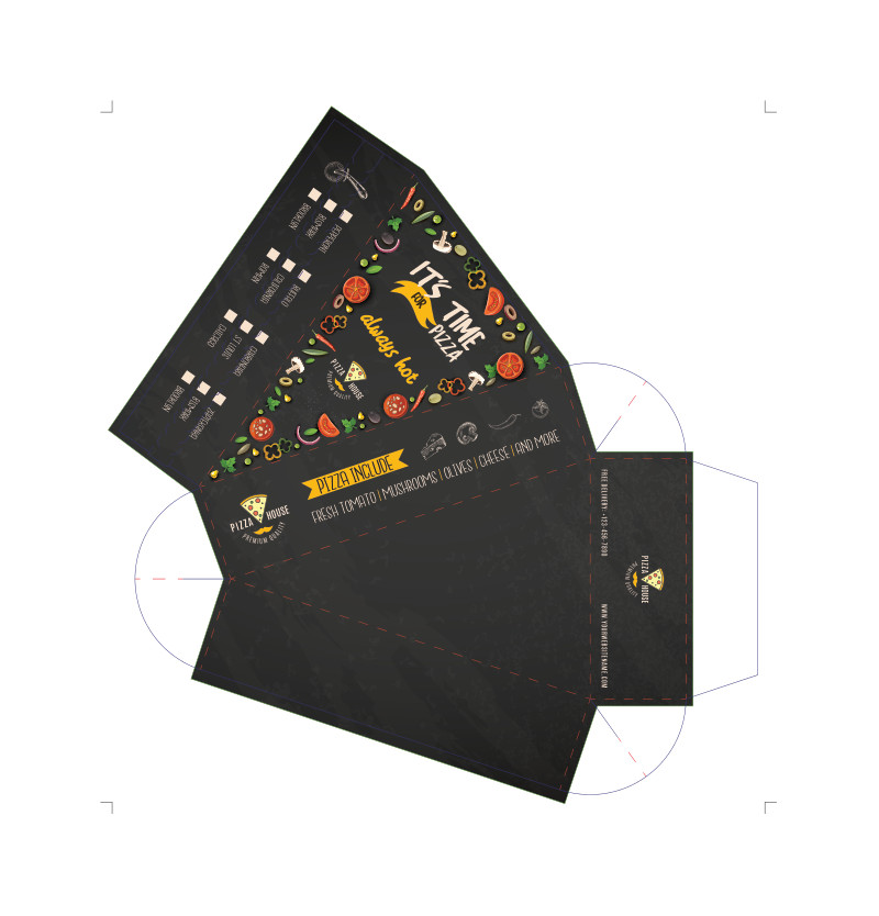
16. Use Die-cut Flyers to Stand Out
When you think of the best flyer examples for businesses, there’s always one element that helps them stand out. Sometimes, it’s as simple as a unique, die-cut paper shape for your flyer. While it’s a little extra cost, your flyer will definitely stick out from a pile or in someone’s mailbox. You can use die-cut flyers to cut outlines of your product or to show off an element of your brand identity.
Die-cut flyers are a guaranteed way to help you stand out from a pile.
17. Grab Attention With Good Typography
Any graphic designer will tell you that good typography can be enough to grab attention and send a message. Typography combines text and design, and it can even help promote your brand. When using typography in your flyer, keep your text as short as possible, and use font hierarchy (aka different font sizes for different text) to balance everything out.
Typography can function as both text and visuals on your flyer. (Source: Canva)
18. Go Bold With a Full Image Background
Good photography always captures attention, so why not make it the focal point of your flyer? The key to using photographs as your flyer’s background is to use a well-balanced image relevant to your message and keep the rest of your flyer clean and simple.
A simple stock image of a landscape might work if you’re promoting an event like a film festival, or you can use a photo of your business. Whatever image you choose, do a test print to make sure it comes out clear and high-quality.
Full background images for your flyers are an understated way to make an impression.
5 Elements That Make a Good Flyer
You might have noticed from the flyer examples above that there are no set rules for making a good flyer for your business. The best thing about flyers is they’re a blank canvas—you can be as creative as you want. But there are still certain things that make a flyer effective and well-designed. Below are some of them.
- A clear message and call to action: It’s worth repeating: every good advertising flyer should have no more than one message, objective, and call to action. Having multiple messages will only confuse your audience and make your flyer far less effective.
- A good understanding of your brand: While not overtly so, flyers are still an expression of your brand identity. Every design element and line of text of your flyer communicates something about your brand, which is why it’s essential to know your brand to its core. It’s especially important because your flyers will be seen by audiences who may not have heard of your business before.
- Basic design principles: You don’t need to be a professional designer to design good flyers, but you do need a basic understanding of design principles, like the text-to-image balances, hierarchy, and basic color theory, because flyers are still a primarily visual medium.
- A clear design direction: Along with basic design principles, every flyer also needs a clear design direction (also sometimes known as a “design brief” if you’re working with a creative agency). Your flyer can’t be both minimalist and extravagant at once. You don’t need to box yourself into a specific category, but you do need to have a clear overall design direction.
- Simple, approachable language: Language is also key to nailing a good flyer. Because you’ll only have a very limited space for your flyer’s text, it should be immediately impactful and easy to understand. Write and rewrite your copies until they’re as short and impactful as possible.
Frequently Asked Questions (FAQs)
More than anything, a good flyer should include one clear, easy-to-understand message and call to action. It should also have a clear design direction and simple but impactful copy, ideally with an emotional pull. A good flyer should also help express your brand identity in some way.
The number one element that makes a flyer eye-catching is a strong, cohesive design direction. Whether you opt for a minimalist or extravagant design, your flyer should have a strong design direction to immediately catch attention. Other details that can make your flyer attractive are a consistent color scheme, a hero image, and bold typography. Then, hold people’s attention with engaging copy and a clear call to action.
To write a good business flyer, use clear, concise, action-oriented copy, ideally with an emotional pull. Start with a clear message you want to send, and then rewrite it from your target audience’s point of view, taking into account their needs and wants. Offer them benefits and solutions, not products and services. Write several drafts of your message, gather feedback, and revise it until it’s as clear and concise as possible.
Bottom Line
Flyers are one of the most tried-and-true business marketing materials. Part of the reason for that is their versatility. As the flyer examples above show, flyers can be used for just about any marketing campaign, business, or industry. They’re an effective and convenient way to get a message out to a wide audience in your local community and get your brand in front of more customers, increasing your brand awareness.


