Branding is crucial to growing your business in today’s ultra-competitive, digital-first world. Your audience won’t likely remember your business by its name alone. They’ll likely recognize it by its logo, its colors, or even its tagline. Think about it: what comes into your mind when you think of golden arches in an “M” shape? McDonald’s isn’t the only business with a highly successful brand. Here, we’ve compiled 15 effective small business branding examples to get you inspired.
What is branding? Before diving into the best examples, first, a few definitions. Your brand is anything about your business that’s presented to the public. It includes visual and identifiable aspects like your logo, color scheme, fonts, and designs. But it also includes how you interact with your audiences, which is expressed through your brand values, mission, and vision, and even your brand voice when communicating with customers.
In the long run, branding includes everything attached to your business identity—including things that are available to the public, as well as factors that aren’t. You probably know your business name, logo, brand colors, and tagline are all part of branding. However, a few core aspects of branding are less public and may have more to do with how you see your brand. These factors can include:
- Your mission statement: Your mission is your business’ main objective, purpose, and reason for existing. All of these are central to shaping your brand.
- Your vision statement: This defines what your business wants to become in the future. Like your mission, it also affects how you present yourself to the public.
- Your core values: Your values represent the most human parts of your business. They’re also the aspects of your brand audiences will connect to most.
- Your brand voice: How you communicate with your people also affects how your brand is perceived, and the kind of audience you attract.
- Your logo: Your logo can often stand in for your business name in branding and marketing materials like social media posts, ads, email headers, business cards, and so on.
- Designs, imagery, fonts, and color schemes: After your logo, these are the other visually identifiable aspects that people will recognize about your brand (just like the Starbucks siren logo).
Altogether, these elements form the public’s idea of your business, aka your brand identity.
Now that you know what comprises a good brand, here are 15 examples of effective branding from small businesses and startups, and what you can learn from them.
1. Glossier: Strong Brand Philosophy & Positioning
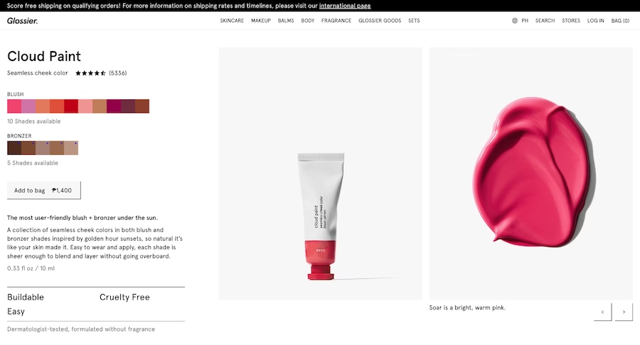
When it comes to the best examples of modern branding, few are as memorable as the millennial beauty brand Glossier. Starting only in 2014, Glossier has since grown into a formidable force in an already very competitive cosmetics market, and that’s all thanks to its minimalist yet impactful branding that’s now become its signature.
What works: Almost everything about the Glossier brand works effectively and seamlessly. But most of all, Glossier’s successfully built a formidable brand presence because all its brand elements stem from its “Skin first, makeup second” brand philosophy (which is also its tagline). This philosophy guides everything from the products’ minimalist packaging to its website design and social media content.
What can improve: While Glossier’s branding is so tight and recognizable today, its biggest challenge will be evolving as time goes on and trends evolve. Having a well-recognized brand has many benefits, but it can also make it difficult to evolve in the future as audience preferences inevitably change.
Pro tip: Glossier’s brand also works so well because it created an effective brand positioning in the market that highlights how it differs from the hundreds of other beauty brands, aka its unique selling proposition (USP). This helped it attract the right clientele and grow its presence even in an ultra-competitive market. Find out more about positioning your brand effectively in our guide to writing a brand positioning statement.
2. Better Sour: Cohesive Visual Branding
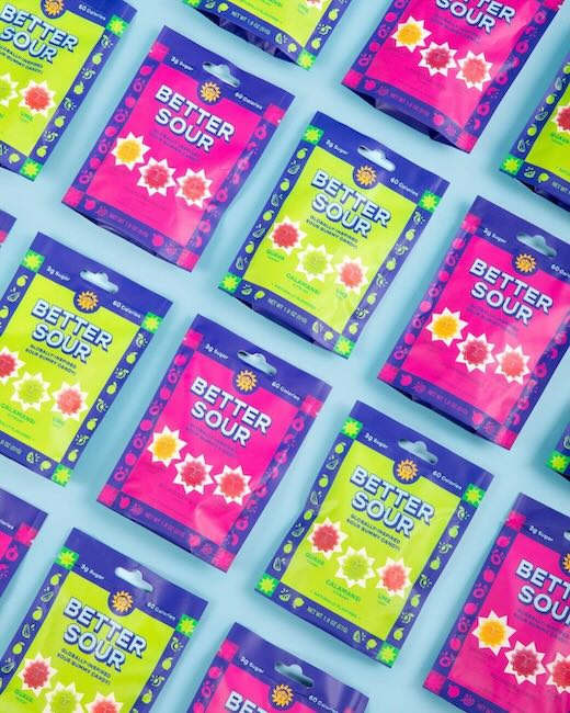
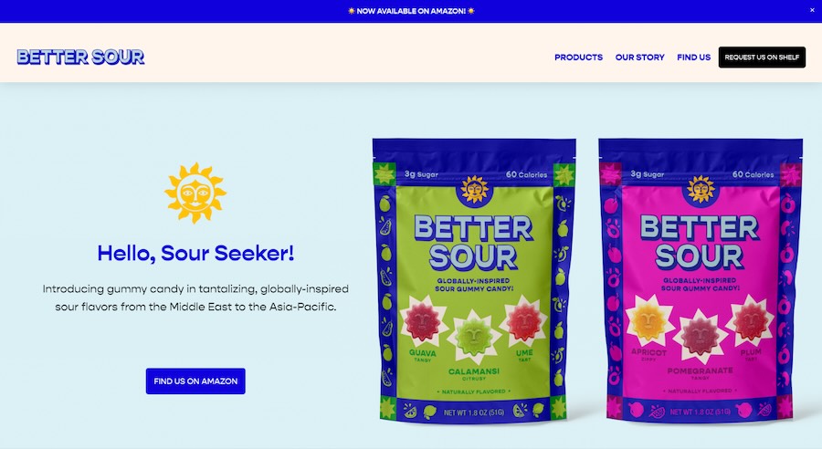
When your small business is in an already competitive field, a good, solid visual branding is your best chance at standing out. One of the best examples of this is Better Sour, an Hawaii-based candy brand. One look at the brand’s website, social media, or even its product packaging, and you immediately get a sense of a fun, vibrant brand that stands out even among other candy brands.
What works: The strong, visually impactful, and cohesive branding that’s present in all of Better Sour’s public-facing materials. This strong visual identity—and good use of brand color psychology—makes Better Sour easily recognizable wherever it appears, from social media to store shelves. Its designs also call out what makes it unique: its globally inspired flavors.
What can improve: Designs and color can do a lot to make your brand stand out, but they aren’t everything. Better Sour could build its brand presence more by creating a brand positioning statement to better position itself against a very competitive market.
3. Duolingo: Distinct Brand Voice
Not all branding is visual. A large chunk of it is also how you communicate with customers in public spaces like social media. That’s also why the language learning app Duolingo is one of the best examples of how good branding in your communications can make your business go viral and even create a loyal community. Duolingo’s since been known for its humorous, sometimes snarky brand voice, which has since garnered it a loyal following on social media.
What works: Its strong brand voice in all its communications, which incorporates a lot of humor. Duolingo’s highlighting of its green owl mascot has also been effective, which has since become its most recognizable brand element.
What can improve: Duolingo is an expert at leveraging its brand voice on social media and hopping on lots of trends. But ultimately, constantly chasing after trends doesn’t offer audiences much information about what the brand stands for, even if its company values are available on its website. Duolingo’s videos are enjoyable to watch, but they don’t offer much insight into the principles and ideas behind the brand.
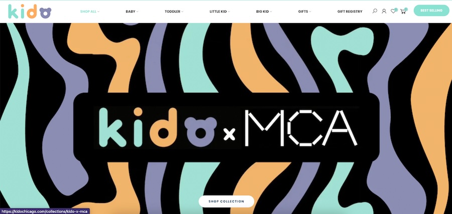
4. Kido: Values-led Branding
Sometimes, good branding is simply being true to your values. In fact, studies show that customers increasingly prefer brands with values over those without. Values are the most human parts of your business and are what your audience will relate with the most from your brand.
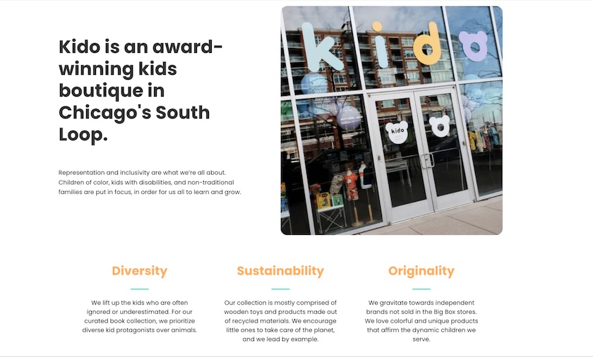
One of the best small business branding examples that encapsulates this perfectly is Kido, a kids brand based in Chicago. Scroll through its website and you’ll immediately get a sense of the values that guide the brand: diversity, sustainability, and originality, which they highlight front and center and are present in all the brand’s communications.
What works: The brand’s transparency toward its values—and its commitment to following them through in its operations. It’s one of the best examples of how centering your brand around its values builds a steady, long-term foundation for the rest of your branding elements.
What can improve: A clear mission and vision statement. While Kido has some of the strongest brand values in any small business, its overall identity could be more well-rounded with an equally strong mission and vision statement to support its values.
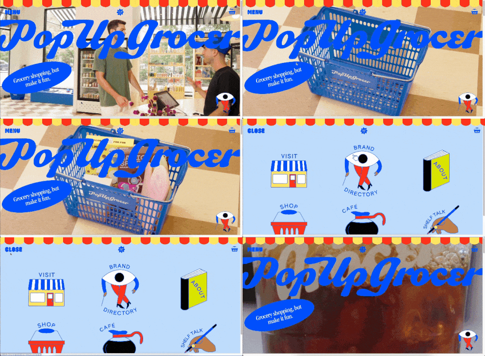
5. Pop Up Grocer: Fully Branded Digital Experience
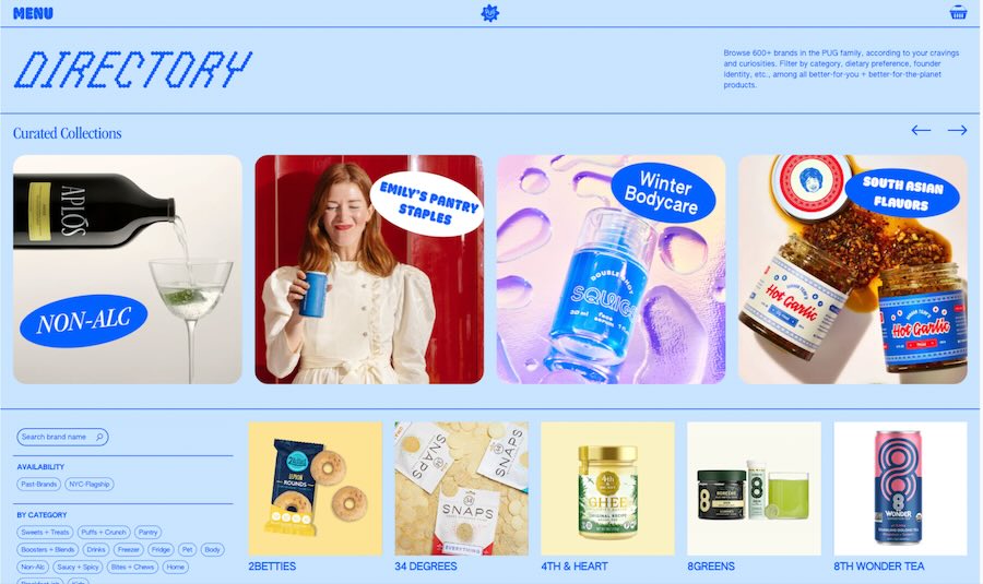
Pop Up Grocer is one of our favorite examples of how you can have a strong brand even if you don’t produce your own products. Pop Up Grocer is an online retailer of grocery products, and while that may sound like a dull description in writing, its website, social media, and packaging are anything but. Visiting any of the brand’s public pages is a positive customer experience in itself thanks to its captivating branding.
What works: Its use of branding to create positive customer experiences in every stage of the customer journey. From the moment you enter its website to the moment you check out, the entire experience is fun, unique, and worth repeating. It directly answers its brand mission of making buying groceries memorable.
What can improve: Pop Up Grocer states on its website that one of its core principles is responsible sourcing. This wasn’t apparent at all in any of its marketing materials. Transparent values from brands are one of today’s top concerns for customers and are therefore worth highlighting more.
Pro tip: One of our biggest branding tips for small businesses is to highlight your brand values in your marketing materials—and to follow through with them. This is because 53% of customers expect small businesses to have a brand purpose. Find out more branding statistics to guide your branding journey.
6. Ventana Surfboards & Supplies: Good Logo Design
Your brand logo is often the main representative of your brand identity. Therefore, it needs to accurately encapsulate your business. When people see your logo, they should immediately get an idea of what your business offers.
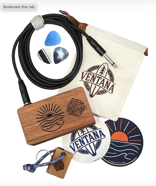
One of the best small business branding examples of this is from the brand Ventana Surfboards & Supplies—one look at its logo immediately lets you know that it sells surfing supplies. The logo’s simplicity also captures the brand’s values of environmental responsibility and artisanship.
What works: The brand’s logo, which is a simple but accurate and effective depiction of what the business offers. It’s unique while being easy to understand, and overall one of the best small business logo designs.
What can improve: While Ventana gets an A+ for logo design, the rest of its visual branding isn’t quite as strong. It could be a lot stronger if it expanded its brand logo’s visual elements into illustrations and imagery and spread them out over other marketing materials.
Pro tip: Your logo is one of the most vital parts of your visual branding. The good news is that you easily create one even without any design experience using a logo design platform. We’ve compiled some of the best ones for small businesses in our guide to the best logo design sites.
7. Kaldi’s Coffee: Mission-led Branding
Kaldi’s Coffee is a Missouri-based coffee brand that sells coffee two ways: fresh via its cafes and packed and sealed for home use. Both of these are very different modes of business, and yet what unifies them is the strong, distinct Kaldi’s Coffee branding all throughout. For instance, the walls of its cafes are the same shade of navy blue as its coffee packaging. While these details seem minute, they play a significant role in maintaining brand recognition.
What works: Kaldi’s Coffee’s branding is a great example of a well-maintained brand journey. Throughout every stage of the business’ growth, it’s managed to maintain a consistent brand identity grounded in its mission to provide a quality customer experience.
What can improve: Its social media branding. Kaldi’s Coffee branding is strong and distinct throughout its in-store experiences and its website, but there is a noticeable gap in its social media presence. Given that so many of today’s customers discover new businesses to visit via social platforms, they could potentially be missing plenty of high-quality leads.
8. Monday Morning Management: Signature Colors & Illustrations
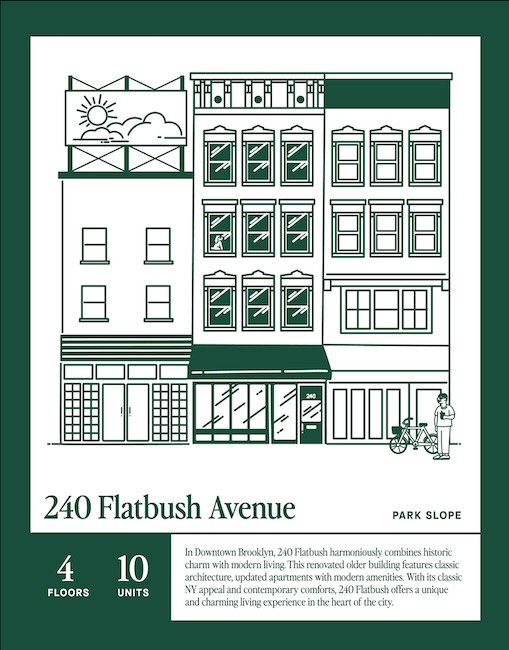
One of the most exciting things about branding is how it can transform something familiar into something unexpected, intriguing, and even exciting. That’s branding at its best. It has a transformative power when done right. A great example of this is from the New York-based property management service Monday Morning Management.
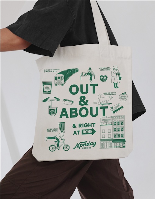
Property management may not be the most exciting practice in the world, but Monday Morning Management immediately stands out and captures attention. This is all thanks to its simple but impactful combination of a signature color scheme and illustration style. It’s overall an excellent example of how simple visuals can instantly make your brand memorable.
What works: The brand’s consistent use of a signature green-and-white color scheme and hand-drawn line illustrations give it a young, approachable feel that stands out. Most of all, it makes property management feel more exciting and energetic compared to other companies.
What can improve: Its brand voice. Monday Morning Management excels in the visual branding department, but the same can’t be said for its copy and communications, which all feel very bare and formal. A brand voice that matches the dynamic feel of its illustrations would build a stronger brand identity.
9. Snackpass: Building Credibility Through Branding
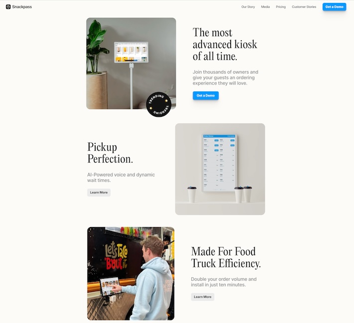
Tech software can be one of the trickiest products to brand. Not everybody can be Apple, yet you’ll still need to stand out from the crowded tech market. One brand that’s managed to do this successfully is the startup Snackpass, which creates ordering software for restaurants. While new, it’s been steadily gaining attention and customers thanks in large part to its modern and attractive branding.
Throughout its website, you’ll see repeated use of the blue-and-black color scheme, serif fonts, and lots of white space. Altogether, they give off the impression of a credible and professional company. At the same time, they make the software product easy to understand for new customers.
What works: It’s simple, easy-to-understand brand design and language. Simplicity should always be a priority for any tech startup. You want audiences to easily understand what your product does. That’s what Snackpass does well as a brand—anyone reading its website or blog can instantly get a clear idea of what its app does.
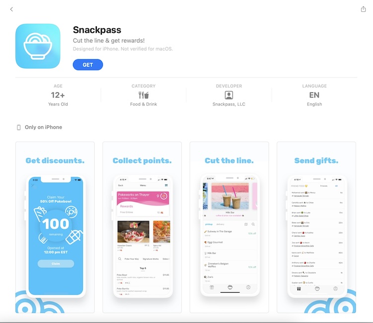
What can improve: A more cohesive visual identity. While the Snackpass website has a very distinct visual identity, it looks noticeably different inside the app, which uses different colors and fonts. This could potentially create confusion with its customers. Having a more cohesive visual identity across all its platforms would build a far stronger brand overall.
10. Tacos Neza: Culture-inspired Branding
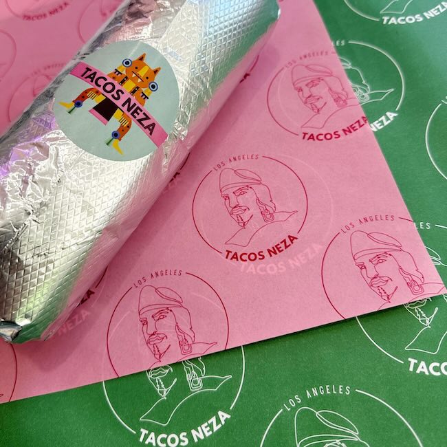
In the restaurant industry, branding plays a vital role. You could have the best-tasting food in your area, and yet no one will take notice if you don’t have a recognizable brand. But one restaurant that’s managed to brand itself well is Tacos Neza, a California-based restaurant that offers Mexican cuisine and culture.
The restaurant stands out thanks to its unique logo that draws on Mexican culture and its consistent color scheme, both of which appear consistently throughout its website, social media, physical store, and even its food packaging.
What works: Its design illustrations that distinguish Tacos Neza from other restaurants, which also express its Mexican heritage. These brand elements are also consistent throughout its digital and physical marketing assets.
What can improve: Its brand story. While the core aspects of Tacos Neza’s branding are airtight—its mission, vision, values, and logo—one thing that would make it even stronger is a good brand story. It already has a clear unique selling point, and leveraging it in a brand story would make it stand out even more.
Curious about how to write your business’ brand story? Find out how in our guide to writing a brand story, which also has a free template you can start with.
11. Death Wish Coffee: Strong USP
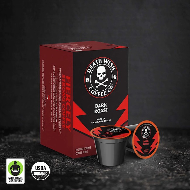
When it comes to disruptive branding, few brands do it better than Death Wish Coffee. You could have any coffee in the world, but if you want your coffee strong, no-nonsense, and no-holds-barred, there’s no other than Death Wish Coffee—which is precisely what makes its branding so effective.
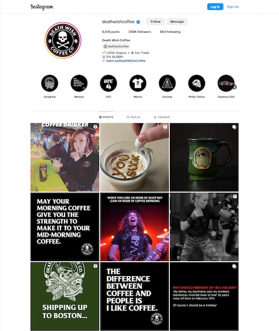
Looking at Death Wish Coffee’s branding collaterals, from its imposing skull-and-crossbones logo to its snarky, dark-humor brand voice, it’s clear there’s no other coffee brand like it on the market. The brand also has a clear understanding of its target audience, in effect building a strong brand community.
What works: Death Wish Coffee truly understands its unique value proposition (USP), which is the main reason it’s built its brand identity so effectively. It’s also helped them identify their target audience’s interests and behaviors. Altogether, these create a successful brand position for the company.
What can improve: While Death Wish Coffee’s branding is strong enough, it could be even stronger with a good tagline. At this point, the brand has matured enough and built a strong enough community that it can take its branding to the next level, which is where a good tagline can help.
12. Moustache: Memorable Brand Color Scheme
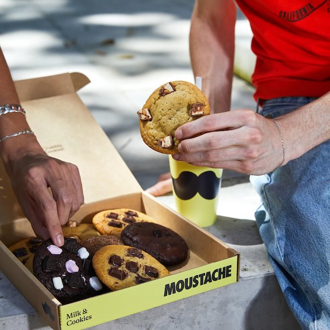
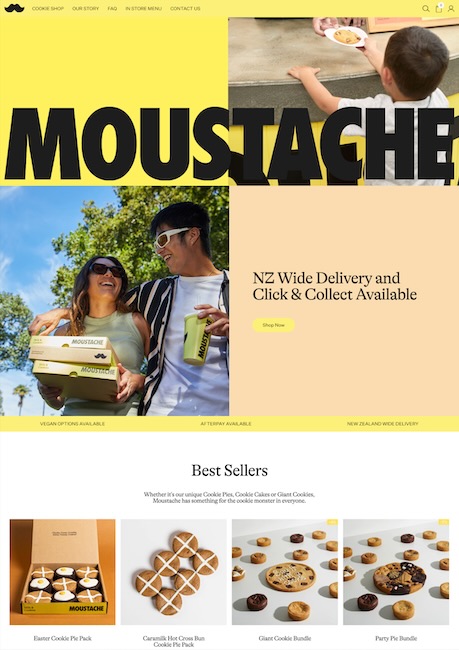
Cookies can just be cookies, but with the right branding, they can be a fun, memorable experience. That’s what makes Moustache, a New Zealand-based cookie brand, one of the best examples of small business branding. With its bold, black-and-yellow color scheme and simple yet memorable mustache logo, its visual identity is hard to miss and easy to remember, even among dozens of other cookie brands.
What works: Its logo and color scheme, which together create a memorable visual brand identity. This helps elevate Moustache cookies beyond mere consumable goods into memorable experiences.
What can improve: Its core brand pillars—its mission, vision, and core values—can be more well-defined. Also, its brand logo could incorporate more elements of its product to give audiences a better idea of what it offers.
13. Sun Day Carwash: Distinct Brand Personality
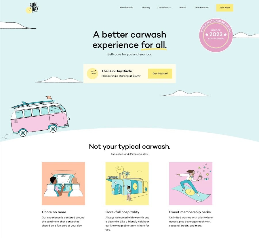
It’s not easy to make car washes feel fun and exciting. And yet that’s exactly what Sun Day Carwash manages thanks to the strong, positive branding throughout its website, social profiles, and even its building design. At every point of contact you have with the brand, you immediately encounter its sunny, positive-vibes branding that you don’t often find with many other car wash services.
What works: Sun Day Carwash’s brand mission is to reimagine car washes, and it does it excellently. Its bright, colorful branding—both in its visuals and brand voice—is so distinct from what you’d expect from a car wash that it instantly feels memorable and inviting.
What can improve: Sun Day Carwash’s brand identity is memorable and unique, but if there’s one thing missing, it’s a good brand story. Its brand mission and values are expressed clearly enough, but a brand story would round them out even better.
14. Hotel Palms: Branding Through Customer Experience
In the hospitality industry, building a brand is all about creating an unforgettable experience for customers, from the moment they enter your website to the moment they step into your door. Branding and experience are one and the same in this industry because your customers will remember your brand based on how they remember their experience—especially when you’re an independent business.
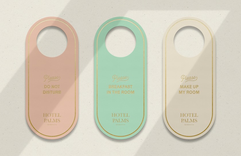
For this reason, Hotel Palms is one of the best small business branding examples in the hospitality industry. As a boutique hotel, Hotel Palms’ best chance at standing out is by creating an unforgettable brand, and it does this in every detail from its logo down to its door hangers and business cards.
What works: Hotel Palms’ distinct branding down to the minute detail is what makes it memorable. At every point, customers immediately feel a sense of luxury, attention, and care—everything you’d want from a hotel.
What can improve: While Hotel Palms’ physical, in-house branding is nearly flawless, it could extend further into the digital space. Extending its brand into its website, social media, and other digital fronts would build a stronger brand presence overall.
Have a website for your small business yet? Your business website is one of the foremost pillars for growing your brand in the ultra-competitive digital world. Find out how to get started in our guide to building your business website. Then, check out the best small business website builders to get you started.
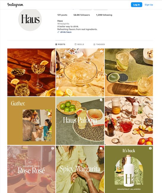
15. Haus: Using Minimalism to Stand Out
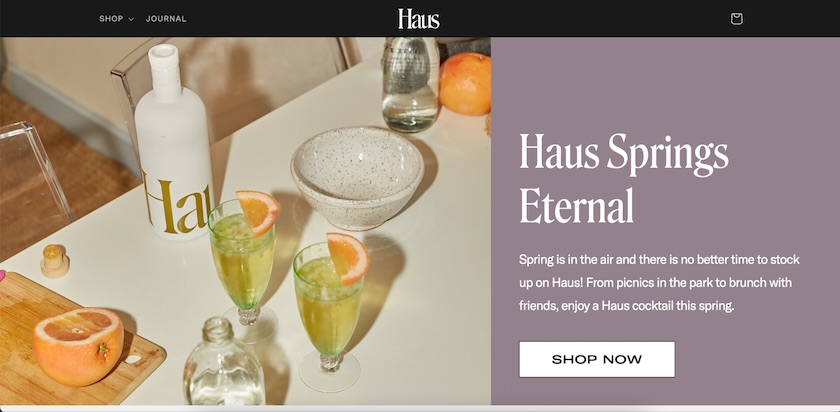
Many brands use lots of colors and imagery to stand out. But sometimes, one of the best ways to capture attention is to do the exact opposite, which is what makes Haus’ branding work so well.
Haus is an aperitif brand, but it stands out on any beverage shelf thanks to its understated, minimalist, white space-heavy design. This branding also extends throughout its website, social media pages, and brand voice, all of which create the impression of a sophisticated and high-quality yet approachable brand.
What works: Haus’ minimalist approach works in its favor because it immediately stands out. It also keeps this approach consistent across all its digital fronts, creating a consistent customer experience.
What can improve: A heavier emphasis on its unique value proposition (USP). Haus’ branding is very aesthetically cohesive and impactful, but its messaging could be improved to better highlight what makes its product different from others. This would make Haus’ brand equally strong in its communications.
How to Get Started With Your Small Business Branding
Branding is an always-ongoing journey. It’s not simply designing your logo and then calling it a day. A good brand is the product of lots of planning, strategizing, testing, and constant editing. Even a well-crafted brand will need to recalibrate its strategy from time to time. In fact, your brand should change with the times. Just look at the likes of Apple or Nike, which have been around for generations because they’ve been able to adapt deftly.
However, if you’re still starting out building your brand, these tips will help you get started.
- Finalize the core pillars of your business first: A brand is only as good as the pillars that uphold it. The first part of building your brand is always to create the core mission, vision, and values that guide all your operations. These are the ideas and principles that will influence your other brand elements the most.
- Identify what makes you unique: Whether you’re marketing a brand-new invention or entering a crowded industry, you’ll need to identify and understand what makes your business unique, aka its unique selling proposition. This is because your USP plays a crucial role in marketing your brand and finding your target audience.
- Create a brand story and positioning statement: With your core pillars and USP, the next step is to create your brand positioning statement and brand story. Your positioning statement is a clear guideline of how your brand fits in the market, while your brand story is a narrative of how your brand relates to your customers. Both of these help lay a stronger foundation for your brand.
- Form your brand’s visual identity: After finalizing your core pillars, USP, brand story, and positioning, use them to craft your visual identity: your logo, brand colors, imagery, fonts, and brand voice. Each of these elements should be directly connected to your brand pillars, so people always get a sense of what your business is about. For some good examples, check out our list of the best brand logos and why they work.
- Market your brand: After creating your brand, the final step is to market it. You can do this through online, offline, or broadcast strategies, in multitudes of ways. For instance, publish blogs that highlight your brand values, use your brand colors in your website design, use your brand voice in your social media communications, and so on.
Branding your small business can be a lot of work and tricky to get right. However, you don’t have to go it alone. A good small business branding agency can do all the work for you—from creating your logo to crafting your brand voice—at affordable pricing. We have a guide to the best digital marketing agencies that can help, most of which also have branding services for small businesses.
Frequently Asked Questions (FAQs)
To brand your small business, first identify its internal pillars: its mission, vision, and core values. Then, identify your business’ unique selling point (USP), and use it to craft your business’ brand positioning statement and brand story. Using these elements, create your brand’s visual identity, including your logo, color scheme, design motifs, and brand voice. Once you have all these elements, you can then market your brand.
Yes. Even small businesses need a good brand to compete in the market and reach their target customers. Your brand is your business’ core identity and is how audiences will get to know you and recognize you in the long run. It’s also what differentiates you from other businesses in your industry, and it shapes all your marketing strategies, from your business’ website design to how you communicate with your customers.
Some of today’s most effective brands in business include Apple, Nike, and Starbucks. These brands have stood the test of time and are among the most recognized in the world, mostly because they’ve established what makes them different from others. They also have strong values, missions, and visions that guide their operations, have easily recognizable visual identities, and deftly adapt to changing times.
Bottom Line
Your brand is so much more than how it looks. Visual branding is one part, but it’s also how your brand feels and how it’s experienced and remembered by your customers. This includes everything from your core values to your online communications. The small business branding examples above are some of the best that encapsulate all that—use them for inspiration as you start your own branding journey.
