Presentation is crucial for marketing services and products—for businesses primarily selling online, good website design is your first tool for impressing visitors and turning them into actual buyers.
As the overall ecommerce revenue in the US continues to climb, businesses stand to gain a lot with online buying experiences that effectively capture potential buyers. We’ve rounded up 11 of the best ecommerce website examples with good design principles you can follow, whether you’re starting an online store or aiming to improve your current website.
Ease of Use: Pazzion
Lifestyle and fashion brand Pazzion gives visitors a visual feast of all its retail products, including shoes, bags, and accessories. The site is easy to use and has an SEO-friendly structure, with available products not only filterable and categorized into menus, but also sub-menus such as sneakers and loafers for shoes; and handbags, clutches, and backpacks for bags. The high-quality images not only show the items from multiple angles but also examples of how people would look while wearing or carrying them.
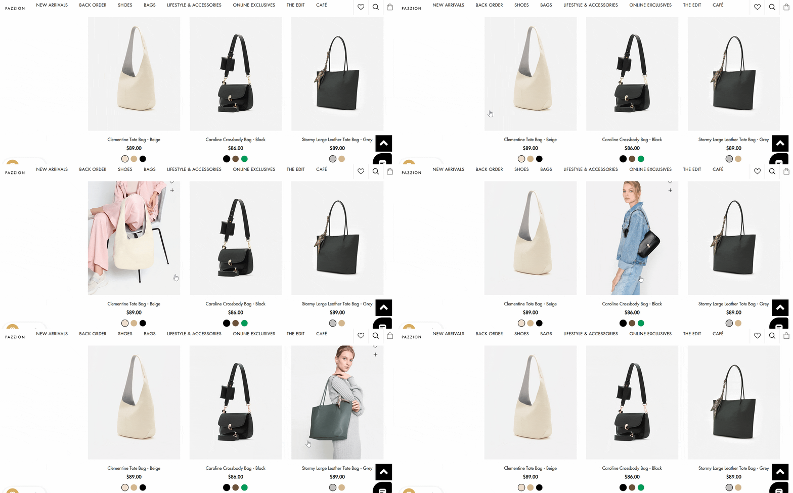
If you hover your cursor over some of the product images, you’ll see an example of how the item looks while being worn or carried. (Source: Pazzion)
Strong Landing Page: Bikeary
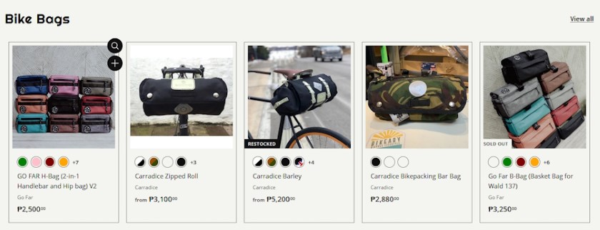
Bikeary’s website lets you immediately view images, pricing, and available colors for its products. (Source: Bikeary)
Bikeary, a Philippines-based store specializing in bicycle parts, accessories, and bags, condenses vital information right on the landing page. Visitors can use the menus or simply scroll down to see item categories like bags, new items, and featured products. You’ll also see what the items look like attached to a bicycle, as well as pricing, available colors, and whether the item has been restocked recently. Having such a detailed and convenient landing page hooks visitors in, makes them want to see more products, and reduces bounce rate—the percentage of people who visit the site but then leave without doing or buying anything.
Aesthetics as Branding: Path
Image-editing company Path uses clean but striking website design, and the landing page immediately gives visitors an idea of what the company does with the slogan “Wake up to perfectly edited product photos.” The site’s visual aesthetic—lots of white space, large fonts, and colorful images and graphics—also serves as branding for the idea of image editing. The site offers pathways to different pages on topics like image background removal, shadowing, and retouching.
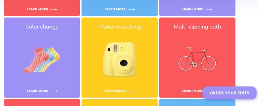
The Path website is easy on the eyes and lets you learn more about the different services on offer. You can also order photo edits at any time using the button in the corner. (Source: Path)
Interactivity: Natrol
Natrol is a vitamin, mineral, and supplement company that specializes in melatonin, a supplement that aids sleep. Its website not only shows its range of products—both on the landing page and also grouped by menus—but also filters products for you via a one-question quiz. You can view items based on whether you want something for falling asleep, staying asleep, or waking up refreshed. You can even shop for items based on the specific ingredients present.
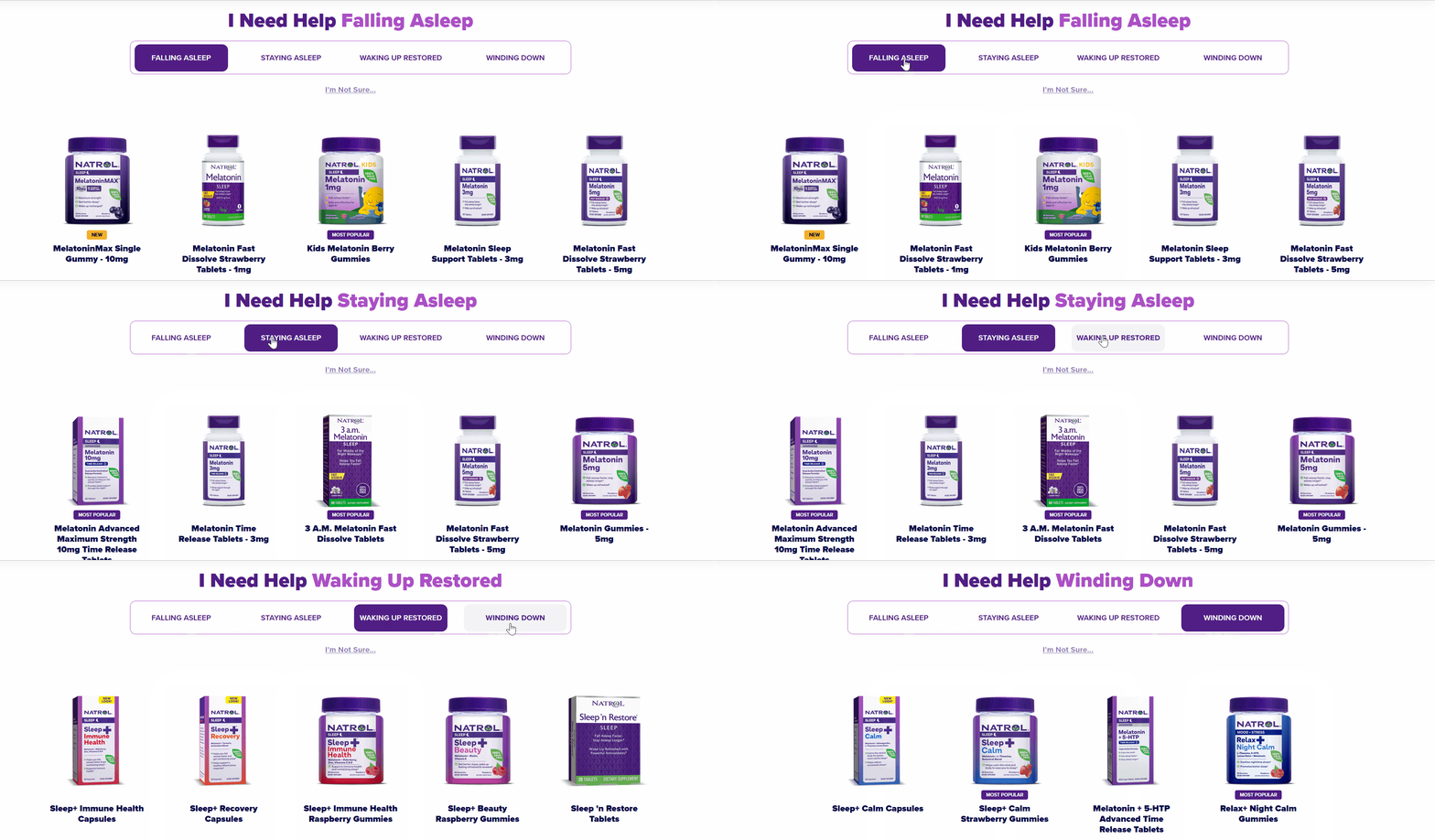
You can quickly filter products based on the result you want, such as falling asleep more effectively or waking up more refreshed. (Source: Natrol)
Selling a Feeling: Hydro Flask
Hydro Flask sells insulated bottles, tumblers, drinkware, and coolers. Its website excels at showing their products in use by people in different environments and circumstances and gives viewers a sense of adventure and athleticism. These lifestyle-focused photos and images allow shoppers to envision the items in their own lives, thus improving conversion rates. As the old advertising quote goes: don’t sell a product, sell a feeling. The site’s landing page also includes information on advocacies supported by Hydro Flask, such as donations to maintain parks and nonprofits.
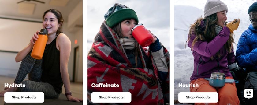
Hydro Flask’s website images appeal to viewers interested in sports, adventure, and travel. A chat option is also available in the corner. (Source: Hydro Flask)
Transparency & Trust: Decathlon
As with Hydro Flask, sports retailer Decathlon’s website gives an aesthetic of fitness and adventure. The landing page lets viewers browse different types and layers of athletic clothing, bicycles and cycling gear, and other sports-related items. Decathlon even emphasizes and describes elements of their manufacturing process that benefit customers, such as production processes that minimize manufacturing costs and an optimized supply chain that reduces retail prices. This emphasis on transparency helps foster customer trust and loyalty, and lets them feel more confident about making purchases.

Decathlon’s website uses large, striking images that give a sense of adventure and excitement. (Source: Decathlon)
High Visual Appeal: KitchenAid
Appliance brand KitchenAid’s website catches your attention with a combination of looping video clips and large, clear images of appliances and how they fit into a kitchen. The site also features a “Just for owners” section with one-click options to register your products, sign up for email subscriptions, access manuals and guides, and view replacement parts. Free delivery, zero-percent financing, and returns are also advertised on the webpage.

KitchenAid’s image-based product menus make it easier to identify the items you’re looking for. (Source: KitchenAid)
Personalization & Recommendations: Purina
Pet food brand Purina emphasizes product personalization: you can immediately filter different pet foods by the age of your pet, wet vs dry foods, grain-free options, and more. You can go even deeper and opt for a personalized food product recommendation based on a short question-and-answer form. The site also features testimonials from happy customers, plus a section on tips for taking care of your pet cat or dog.

Purina’s personalized pet food recommendation tool lets you find the best option for your dog or cat, based on advice from a nutritionist. (Source: Purina)
How-to Tutorials: Nars Cosmetics
NARS Cosmetics makes convenience and accessibility a top priority for website viewers, with product images, GIFs that show how to apply each product, and options for quickly viewing different available colors and adding items to your shopping cart. New or limited edition product lines are also visible from the landing page, with a single “Shop Now” button each.
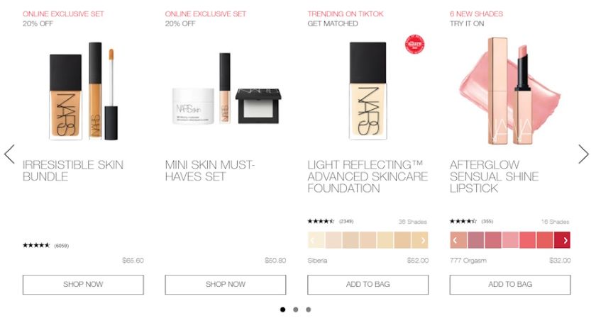
The NARS Cosmetics website makes it easy to see pricing and available colors for makeup items. The site also features one-click “Shop now” and “Add to bag” buttons. (Source: NARS Cosmetics)
Proving Expertise: Titleist
Golf supply brand Titleist uses enormous, inspiring photos of golfers in action on their website. There are menus available for product categories such as golf balls, clubs, and other gear, as well as fitting services. The brand emphasizes the superior handcrafted technology of its products and features tools for choosing balls and different types of golf clubs. Finally, you can quickly sign up for a Titleist newsletter, and find a golf store near you using the locator tool.
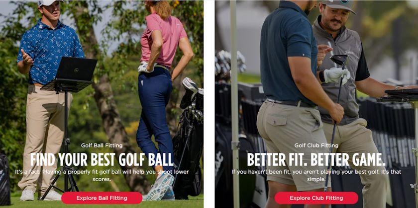
Titleist’s site gets your attention with large high-quality images, plus succinct slogans and quick-access buttons. (Source: Titleist)
Convenient Checkout: Nike
When a customer has loaded up their shopping cart and reached the checkout page, they’re just about ready to finalize the purchase and send you their payment. However, this is no time to get sloppy with user experience. Checkout optimization is vital, and customers who were close to handing over their money might still abandon their carts if the checkout experience proves frustrating for them. Retail brand Nike makes things easy by summarizing information on payments and delivery on their checkout page. More critically, they include a guest checkout option, removing the obligation for buyers to create an account just to purchase something.
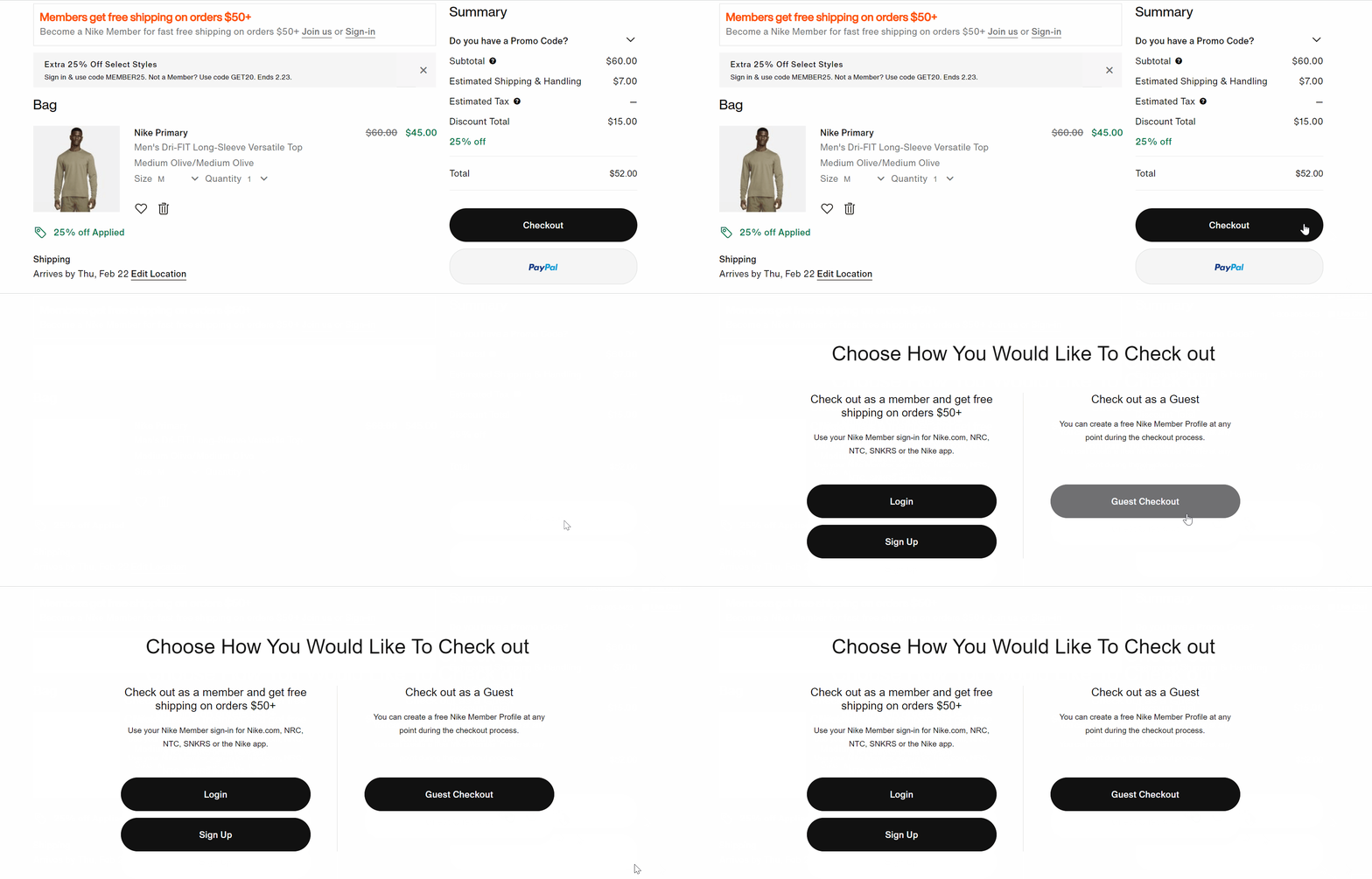
Nike’s checkout page summarizes key information while staying clean in design, and includes a guest checkout option.
What Makes an Ecommerce Website Design Good?
The overall appeal and ease of use of your ecommerce website will drastically affect the user experience of anyone who browses—so ecommerce website design can make the difference between visitors either closing the site or beginning to load a shopping cart. If your goal is to maximize customer browsing and purchasing, here are a few characteristics to keep in mind when designing your website.
Ease of Use
Your paramount concern when designing an ecommerce website will be to make it easy and convenient for customers to view and compare items, navigate the site, find exactly what they want in as few clicks as possible, and not feel overwhelmed at any point.
Accomplish these by organizing your product sections and menus; adding filter options for any relevant characteristics like size, color, and price; and avoiding a crowded or cluttered look on your webpages. You’ll also want to make it easy for the customer to access, fill, and check out from their shopping cart from any part of your website.
Visual Appeal
Because customers visiting your website aren’t physically inside your store where they can see and touch items, images are all they can rely on to know what your products look like. It’s crucial that you use high-quality images with good lighting, non-distracting backgrounds, and as many visual angles as possible.
It’s also helpful to show your products in use or in action—this is particularly good when showcasing fashion or accessory items like shoes, bags, and clothing in general. Even if you’re running your ecommerce business from home, you can and should take good product photos and create compelling product videos.
Product Descriptions
Well-written product descriptions push people browsing your ecommerce site closer to making a purchase. Writing a good product description is a whole science in and of itself—and we’ve created a full guide with template and examples for this—but if you get it just right, it’ll build customer interest and trust, inform potential buyers and get them to learn something new, and help convey your brand as a whole.
Aside from simply painting a picture of your product, effective descriptions also drive conversions via keywords and various other SEO optimizations. While these may not be obvious to people browsing your website and viewing your products, they make a difference in terms of ranking your site well on search engines. We’ve written a full beginner’s guide to SEO for ecommerce.
Customer Support
When you’re running a physical store and a customer needs help or has a question, you need to have staff on hand at all times to offer assistance or answer queries. The same holds true for an ecommerce store, except that the assistance will come in the form of online chat or phone numbers that customers can call.
Whatever form of online support you choose to implement, make sure it’s as convenient as possible for the customer. Avoid having them fill out long and tedious online forms, and make sure someone is standing by to answer your phone help line at all times. Instant messaging is a good option to offer, as it lets the customer get the answers they need quickly.
Frequently Asked Questions (FAQ)
Click through the following sections to learn more about what an ecommerce website is, and how to design a good one.
Any brand or company website that showcases products and services, and allows visitors to purchase these online, can be considered an ecommerce site.
The main principles of good ecommerce website design are: prioritize ease of use with easy navigation, product menus, and filters; use high-quality visuals and images and show products and services in use when possible; and add customer support features such as online chat or help numbers.
Bottom Line
Simply creating a website and displaying your products there doesn’t guarantee an effective online sales channel that brings you steady revenue. While the quality of your products and services will always matter the most, following a few core principles of good ecommerce website design will help ensure that customers see your wares in the best possible light and become more likely to click the “Buy” button.