

Good ecommerce website design is critical when building your online store, as it attracts potential customers, provides an enjoyable user experience, and increases sales. Designing ecommerce websites differs from building regular websites—it involves highlighting products and creating a seamless buying experience for your customers.
This guide outlines tips and strategies for designing highly effective ecommerce websites, along with tips on how to apply good ecommerce website design principles and achieve them for your online store.
- 1. Inspire Trust & Security With Design
- 2. Design for Transparency
- 3. Be Consistent With Branding
- 4. Design Mobile-first
- 5. Create Visual Appeal
- 6. Keep It Simple
- 7. Implement User-friendly Navigation
- 8. Display Customer Reviews & Testimonials Strategically
- 9. Optimize Product Pages
- 10. Build a Seamless Checkout
- Good Ecommerce Website Design Examples
- Frequently Asked Questions (FAQs)
- Bottom Line
1. Inspire Trust & Security With Design
When designing ecommerce websites, instilling trust should be a priority. Shoppers need to feel they can trust your website to protect their personal information and that their purchase transactions are secure. They will simply shop somewhere else if they don’t feel your online store is trustworthy.
Action Items:
- Ensure a secure payment system for your online store. Follow and strictly implement ecommerce payment security practices.
- Prominently display security seals. Users will more likely purchase products if they feel your online store has top-notch security. Don’t hesitate to use badges to show your security compliance and all the payment methods you accept.

Some of the most popular security seals for ecommerce sites. (Source: Oberlo)
2. Design for Transparency
Don’t forget to be transparent and clear with your policies. These should be easily found in any page of your website, written in simple words with minimal jargon, and provide information that will help customers trust your business.
Action Items:
- Display your shipping, refund, and returns policies prominently on your website. Make them easy to find.
- Make it easy for customers to reach you. Have a Contact Us page visible throughout your website—in your website’s main navigation and footer areas. Display your email address, phone number, and physical store location (and hours, if applicable).
- Add a frequently asked questions (FAQs) page to address common questions.
- Link to social media profiles, if there are any.
- Provide multiple ways to get in touch. Live chat and automated chatbots can help customers find and select the right products and increase sales conversions.
- Set clear timeframes when it comes to getting back to your customers.
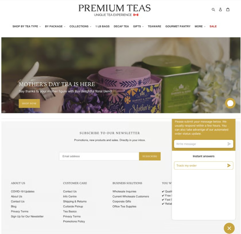
This premium tea online store provides a chat feature that functions as a help desk, allowing customers to resolve their common concerns, such as tracking orders. A customer care section is seen clearly in its footer, with links to shipping, returns, privacy policy, an information center/location, and a Contact Us page.
3. Be Consistent With Branding
Your brand identity is what makes you stand out from the competition. When designing ecommerce websites, you should show solid brand identity and convey the same values that the products embody. Take time to define your brand and infuse that into your website design.
More importantly, you should present your brand consistently across all your platforms. For example, when visitors browse your website, then look at your social media channels like Instagram, the colors and messaging should be the same. If they reach out to your support team, its tone should be similar to that used on your website—conversational, casual, formal, etc.
By creating a distinctive brand that trickles down to your ecommerce design and shopping experience, you are securing your business’ spot as a favorite brand, one interaction at a time.
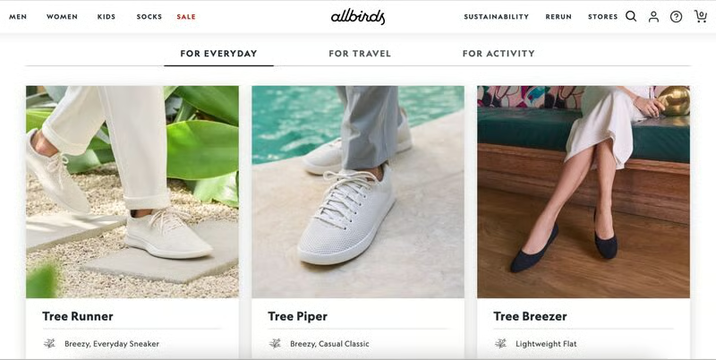
Allbirds is an online apparel store with a focus on sustainability. From its copy, high-quality photos (with nature elements), and shopping icons, they show consistent branding and clearly communicate what they value—the environment.
Action Items:
- Choose your logo, signature colors, and fonts well. Apply it to all your customer touchpoints.
- Match your ecommerce website design with your brand’s tone. For example, does your brand have a fun, light tone and evoke happiness in your customers? Then, your website design should have the same style and deliver the same emotions.
- Go with a website builder that allows you to customize your ecommerce website to reflect your branding. Ecommerce website builders like Shopify and Squarespace are highly-rated for their customizable templates. Check out our best ecommerce platform buyer’s guide to find the best fit for your business.
4. Design Mobile-first
Ecommerce website design should be planned with a mobile-first perspective. With 45% of ecommerce shopping coming from mobile commerce (m-commerce), your ecommerce website builder must provide mobile-responsive (if not mobile-first) templates. Responsive templates display consistently across all devices (from tablets to smartphones) and deliver an equally great on-site experience—with zero to minimal design constraints.
Action Items:
- Provide a consistent shopping experience across different browsers and devices.
- Ensure that your website sections’ padding and margins do not disappear on smaller screens. Moreover, font sizes and line spacing should adjust automatically to the amount of white space on the screen.
- Your website should also load fast, as mobile shoppers are more likely to purchase from sites or apps that help them make purchases quickly. For example, Google found that a 0.1-second improvement in mobile site speed improved retail conversion rates by 8.4%.
5. Create Visual Appeal
Historical research from Consumer WebWatch, which still holds today, showed that the average consumer paid far more attention to the superficial aspects of a site, such as visual cues, than its content. For example, nearly half of all consumers (46%) assessed the site’s credibility based on the appeal of the visual design, including layout, typography, font size, and color schemes.
It is clear that people are primarily visual, and appeal is an important factor in converting visitors into buyers.
Action Items:
Here are a few ways to amp up your site’s visual appeal:
- Use high-quality images. They increase conversion—as much as 40% for 360-degree product photos—so it’s vital to put them into the spotlight, especially with product images.
- Make sure that your images are optimized for the web. Some high-quality images take a long time to load. Choose an ecommerce website builder that compresses and optimizes your images automatically for easy website viewing.
- Use lifestyle images of people using or interacting with your products whenever possible. For example, clothing products are more appealing when worn by a model instead of photographed flat on a surface or a mannequin.
- Use color to your advantage. Applying color psychology principles in your ecommerce website design can help with conversion. Using color and imagery can inspire and motivate a person to take action, as multiple historical studies show using red, for example, in CTA buttons can increase click-through rates.
- Choose colors that are consistent with your branding.
- Have website colors that pass accessibility guidelines.
- Follow the 60-30-10 design rule in using color throughout your website—60% dominant color, 30% of secondary color, and 10% for accent colors.
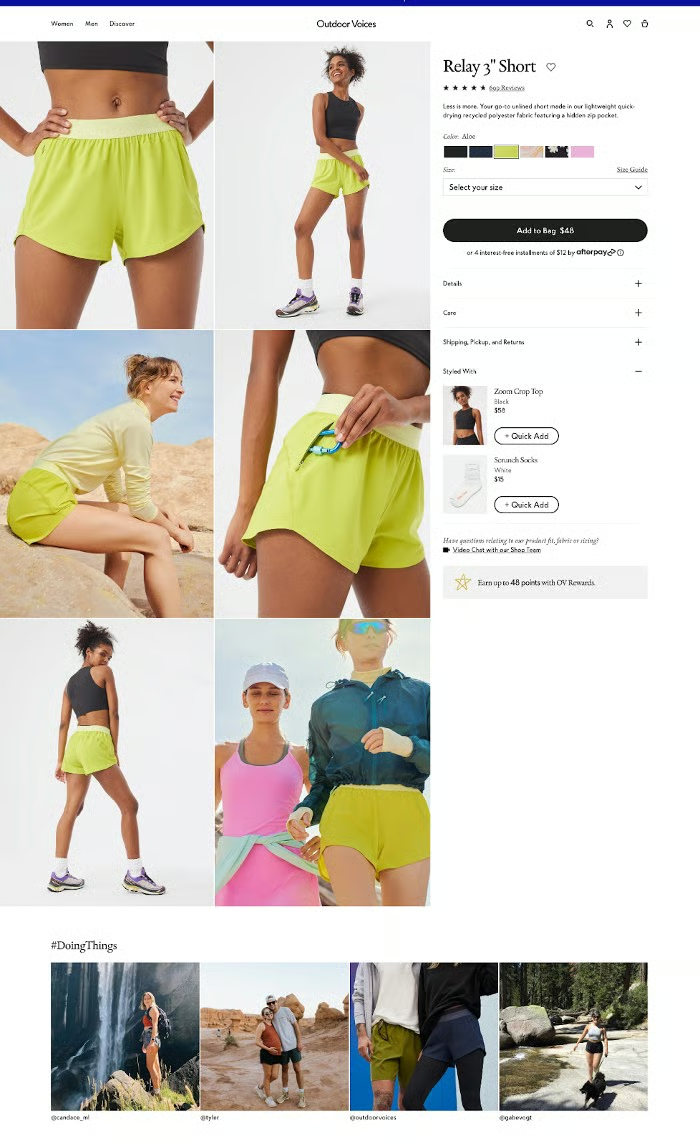
This recreation apparel brand incorporates lifestyle photography with product photos, providing customers with images of how the items look indoors and outdoors. Notice how these clothing pieces are shot at different angles when worn.
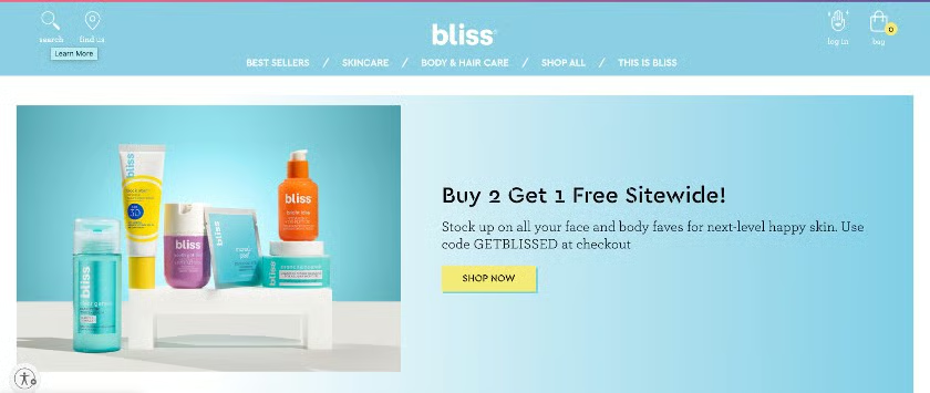
This spa-powered skincare brand effectively uses color to appeal to its primary buyers visually. It uses three colors throughout its website—millennial pink, baby blue, and Gen-Z yellow—giving off the funky and friendly brand they want to impart.
6. Keep It Simple
Several studies and surveys indicate consumers prefer simple and familiar website designs. In fact, a GoodFirms survey of web designers found that about 85% of them said the most common mistake small businesses make is having a website that is too complex and overly cluttered.
Approach ecommerce website design from a shopper’s perspective. Can you find what you need quickly or with fewer clicks? A good ecommerce website is easy to browse and digest and makes every element purposeful. Keep your website design clean and simple—focusing on obtaining a sale and providing a positive buying experience for your customer.
Action Items:
- Utilize white space, limit your website colors to no more than three per page, and employ simple and readable fonts.
- Make content scannable. Use headers and break up content into an easy-to-scan format with bullets, short paragraphs, and bold typeface to focus on crucial information.
- When using a grid layout for displaying products, we recommend limiting a row to display up to three or four products only to maximize its visual appeal.
- Eye-tracking studies of website visitors have historically shown that they usually follow an E or F formation when viewing a site. Use this as a basis to drive them to the primary conversion points of your website, such as CTA buttons or navigation menus.
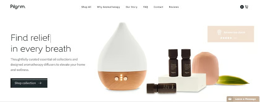
Pilgrim designed its ecommerce site with its target audience in mind, employing a clean and modern website design that communicates the products’ theme with beautiful packaging and photography that keeps you interested in buying.
7. Implement User-friendly Navigation
Convenience is the top consideration for online shopping and, not surprisingly, one of the main reasons for shopping cart abandonment. Good web design for ecommerce should enable your customers to find what they need easily, and it starts with user-friendly and effective navigation. This usually helps propel a customer from browsing your online store to purchasing.
Navigation refers to all the website elements that help users get to specific information on your website. This includes the header navigation menu, product category pages, on-site search, product filters, and website footers.
Action Items:
- Your brand logo should lead to the homepage and always remain in sight, no matter how deep the user goes.
- Display your main navigation menu on top of your website and have well-organized website sections.
- Include a search bar with an auto-complete feature or relevant filters.
- Have a CTA button on each website page, especially the homepage.
- Enable filtering by size, color, brand, etc., especially if you have an extensive product catalog.
- Activate breadcrumbs on your product pages. Breadcrumbs allow users to return to several product categories and subcategories—and can serve as an expansion of the search.
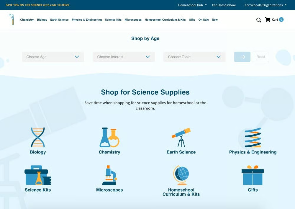
Home Science Tools guides its visitors to products they need by displaying product categories and search filters (age, interest, and topic) prominently on its website. It also provides dropdown categories in its main navigation and displays a search bar in its header menu. Busy parents would not find it hard to look for what they need on this ecommerce website quickly.
8. Display Customer Reviews & Testimonials Strategically
When designing ecommerce websites, look for ways to display the reviews and testimonials you’ve gotten from your existing customers to potential buyers. Use social proof to your advantage because the most effective recommendation is what real customers ultimately buy.
The more website visitors see how other people have had a good shopping experience on your website, the more trustworthy you’ll appear—and ultimately, an increase in sales will result.
Action Items:
- Add a rating system to your ecommerce website design, and encourage buyers to leave honest reviews.
- Display a testimonials section on your homepage and product pages.
- Leverage user-generated content (UGC) by adding a widget or section for UGC to your site. This content serves as testimonials and proof of how real people are using your product.
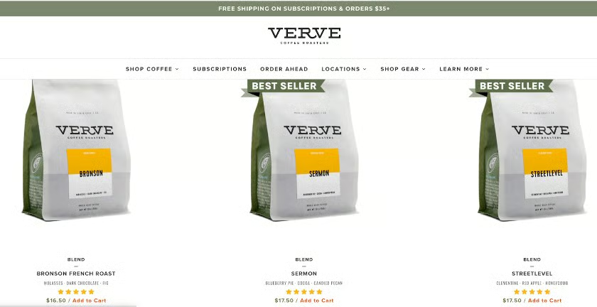
We like how Verve Coffee Roasters displays its five-star reviews on its shop page as part of product captions—along with the product name, price, and an add-to-cart link. When you click on the product page, you will see actual reviews left by customers.
9. Optimize Product Pages
Products make ecommerce websites different from the usual websites. Keep your products front and center, which you can achieve by optimizing your product pages. Most of what we have discussed above—navigation, social proof, easy checkout, and high-quality images—also applies to your product pages.
You need to remember that an optimized product page is designed to be found using search engines and, more importantly, to convert browsers into buyers.
Action Items:
- Add more than one image for your products, ideally from different angles or perspectives. Better yet, create slideshows on your product pages that allow customers to view your product from different angles.
- Add keywords relevant to your product’s title and image alt tags.
- Incorporate videos, if helpful.
- Place the Buy Now button above the website fold and use striking color to make it stand out from the page.
- Have clear pricing.
- Write well-crafted product descriptions that align with your brand and appeal to your target audience’s language.
- Add social proof.
- Optional features: Add-to-wishlist or buy-later options, product recommendations (upsell or cross-sell)
Pure Cycles’ bicycle product pages strive hard to give an in-person shopping experience it delivers online. You can see close-up pictures of specific parts, learn their specs, read reviews, and even watch videos right from the product page. You can also view photos from actual people who use it. It gives you all the information you need to make an informed buying decision.
10. Build a Seamless Checkout
Unexpected shipping costs, a complicated checkout process, and the need to create an account are three of the top five reasons for shopping cart abandonment. All of these revolve around the checkout process. Your checkout page design needs to be simple and easy to navigate. Make everything about the checkout process clear—price, shipping fees (if any), the information you need to process the purchase, and what to do if they need to do a return or encounter a problem with their order.
Action Items:
- Give your customers an option to check out as a guest or register for your website.
- Have your customers fill out as little information as possible—only get what is necessary for a purchase to push through.
- Be upfront with your shipping options and how much they will cost.
- Have clear return and refund policies on your checkout pages.
- Enable the one-click checkout option if the feature is available. For example, Shopify businesses can use Shop Pay.
- Provide as many payment options as possible—like Google Pay, Apple Pay, and buy now, pay later options.
- Guarantee site security by employing ecommerce security best practices and display security seals on your website pages.
Good Ecommerce Website Design Examples
Below are ecommerce websites that show all the design principles we outlined above. Take your cue from how the following brands executed the design strategies mentioned.

We like that it highlights its five-star product reviews from thousands of customers on its homepage and reviews from media outlets like BuzzFeed and HuffPost. This clearly fosters trust among first-time site visitors. 
It also leverages and displays UGC strategically, with a link to shop from its social media platform, Instagram. 
Given its variety of offered products, you won’t get lost in its store as you can quickly search its category pages right on top of the navigation menu (and it’s collapsible too). 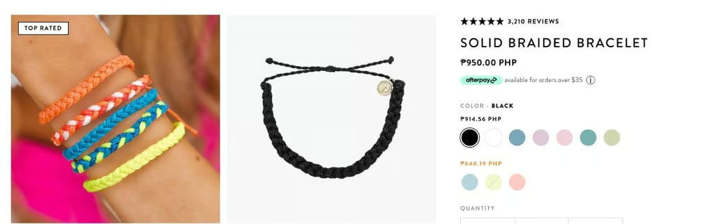
It uses high-quality images for its product pages and prominently displays user reviews and links out, again, to user-generated content. We also tried checking out a product, and the buying experience was seamless, with security seals and return policies linked throughout the checkout process.


Skullcandy’s website powered by BigCommerce has always been a frontrunner for showcasing brand identity and design. It is a terrific example of using color effectively—using appropriate colors to evoke emotions based on its products’ target audience. The website is also easy to use and provides an engaging customer experience for its visitors.
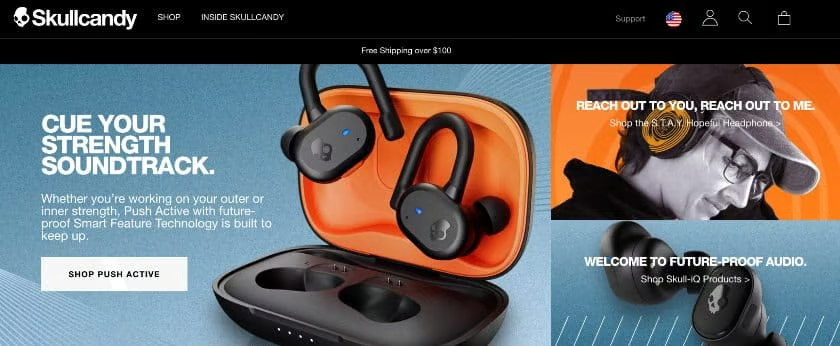
We just love how BigCommerce incorporates product photos into its website design, letting the images draw customers in. Notice how its call-to-action (CTA) button is displayed prominently above the fold and in a position where eye-scan studies say viewers see first (and longest). 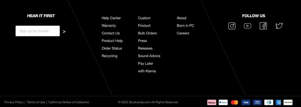
Its footer stays the same throughout its website pages, displaying links to policies, social channels, support, and company information. Its security seals are also seen, with badges of its accepted payment methods. 
Its product pages use very effective color combinations, typically on-point with SkullCandy’s image and branding. Click on any of its product pages and you get a full-blown sales page, complete with videos, UGC, product descriptions, and amazing images.


The family-owned business based in Australia runs its ecommerce store through Ecwid. Upon viewing its website, you immediately get a sense of its brand—feminine and dainty—because of its typography and color choices. All their product photos also showcase how their dresses look for their target market—little girls.
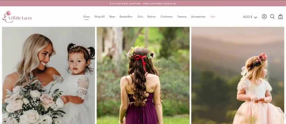
The website’s branding is clearly on point, highlighting little girls wearing their products. 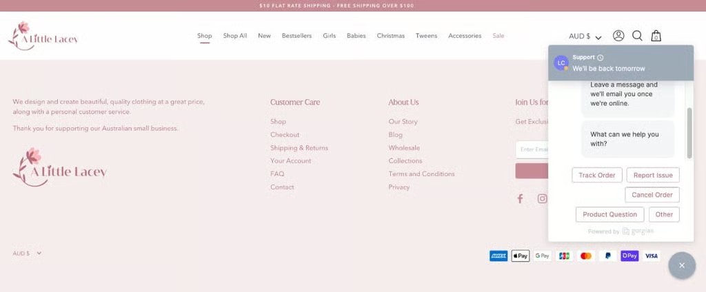
We like that they incorporated a chat feature for customer inquiries. It is also clear which links are relevant for customer support, and they also include a little snippet on what their business is all about—all great for fostering customer trust. 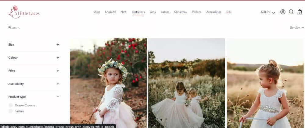
Upon looking through their shop, you can quickly niche down to whatever dress you are looking for, as it provides the main navigation menu on top PLUS category filters on its right side. They got the user-friendly navigation principle to a T.


This Squarespace-powered ecommerce website clearly made use of an ecommerce website design principle to the fullest—visual appeal. From color to product photos and easy website content flow, Supernatural got everything perfectly.

With effective use of color, simple font choices, and design elements, Supernatural’s website just draws you in. 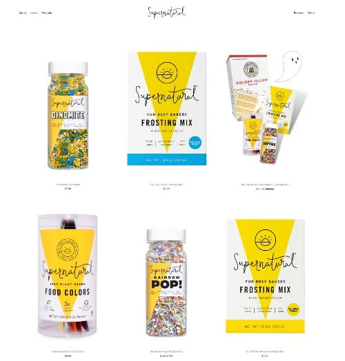
Its product pages are stellar, and when you hover over product images, it shows different images of how the product looks without its packaging. 
The website keeps a dedicated page for its product reviews, UGC, and social proof. It is readily accessible from the main navigation menu.


The business owner of Twig Flowers has been a long-standing Square seller, using its systems to sell their floral arrangements in-store. He went with Square Online when he built his website so that inventory and sales integration will be seamless.

Your eyes are instantly drawn to the website’s banner image, which showcases one of its floral arrangements. Its homepage has clear sections, punctuated with useful information on how to order, availability schedules, and product photos. 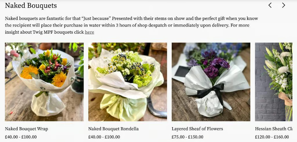
Since the business also operates in person, the site makes it clear how to order and links them out to more information about each floral arrangement they offer.


Frequently Asked Questions (FAQs)
Click through the questions below to get answers to your most frequently asked questions when it comes to designing ecommerce websites.
Designing for an ecommerce website slightly differs from designing a regular website as it involves creating effective product pages for visitors to purchase and providing a seamless buying experience for them. You need to ensure your website leaves a trustworthy impression on visitors.
A good ecommerce website design incorporates five design principles: trustworthiness, a high level of visual appeal, a mobile-first design, user-friendly navigation, and a seamless checkout experience.
The best ecommerce platform for designing an online store would greatly depend on your business needs and level of website design proficiency. For example, if you plan to build your online store yourself, website builders such as Shopify and Squarespace are user-friendly and intuitive for beginners. If you have a developer, going with ecommerce platforms that allow for high levels of customization, such as WooCommerce, would be a better fit.
Bottom Line
A well-thought-out ecommerce website design helps increase sales. This is important as 42% of consumers say that they abandon websites with poor functionality. So, always begin with your customers in mind when designing an ecommerce website—make it easy for them to purchase (and for you to close a sale).
Apply our ecommerce design tips in building your online store and go with a website builder that allows you to customize and infuse your branding and give you native features to enable you to list and sell products easily.