A store window display is the scene you create in your exterior facing windows and one of the most powerful elements in your merchandising arsenal. Your retail window display is an instrument for bringing in new and existing customers, displaying new products, highlighting promotions, and enhancing your brand image.
Creating window displays will be a major part of starting your retail store and driving continued sales. This guide will give you the tools to design something that will pack a punch and help you grow.
Here are our top tips and examples to help you create a retail window display that wows.
Planning Your Store Window Display
To start creating your window display, you will want to consider whom it should appeal to and how it will reflect your brand. Checking out competitors’ displays and aligning your display to the season will keep it relevant.
To effectively entice customers, you have to know who you’re directing your displays to—in other words, your target audience.
To determine your target audience, you’ll first want to observe who shops at your store and consider what other groups would be interested in your products. At my boutique, we sold modern bohemian-style clothing at a relatively low price point. We knew we were not going to appeal to shoppers going for luxury labels. Instead, we catered our message to women aged 18–45 with more laid-back lifestyles and clothing tastes.
Then, think about the types of displays that would appeal to that group. In my example above, this meant displaying scenes of park strolls or casual brunches in our boutique window displays, as we knew that those stories would be more appealing to the women who would actually shop in our store.
Another example is The Home Depot, which has gone so far as to name its target market the DIYers, do-it-yourselfers, or those who take on home improvement projects themselves. This customer profile focuses on people who are willing to get down and dirty to get a job done. All of its displays and messaging, then, focus on depicting scenes of weekend landscaping projects or bathroom renovations, and the sense of personal satisfaction that comes with doing those jobs yourself.
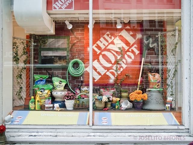
Home Depot displays the remnants of a DIY landscaping project. (Source: The Home Depot)
Your store window display should reflect your brand. This will ensure the impression your display makes is an accurate representation of what your business stands for and the brand experience. Additionally, this will help you hone in on your target audience, as your brand voice will speak to those interested in your offerings. If your display doesn’t match your brand, customers may feel misled and distrustful.
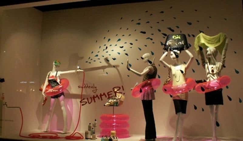
A fun window display reflects this youthful and funky brand. (Source: Boutique Window)
Going back to my bohemian-style clothing store, suppose our window displays featured mannequins carrying designer handbags and enjoying tea at a fancy table setting. This would not only deter our target audience but also create a false impression of what we offer. Customers would be confused and likely annoyed by the misleading window displays and would not want to visit again.
Consider your brand, what it stands for, and how you can convey this in your store window displays. This will attract the right customers.
It’s helpful to choose a story or theme you want to portray in creating your retail store window display. This will make it cohesive and understandable to customers and will guide your own creation process.
An article from Forbes discusses the importance of storytelling in branding and merchandising and how it appeals to customers. “In this [tech-driven] environment, businesses can no longer afford to be faceless entities. To survive, businesses need to connect with audiences, pull at their heartstrings, and engage with them on a much deeper level than seen before. That’s where brand storytelling comes in.”
In the image below, the theme in this retail’s window display is a woodland party, complete with forest critters dressed in their best garb. By creating a thematic scene in its window display, this retailer is able to engage audiences, add artful elements, and create interest around the products it showcases.
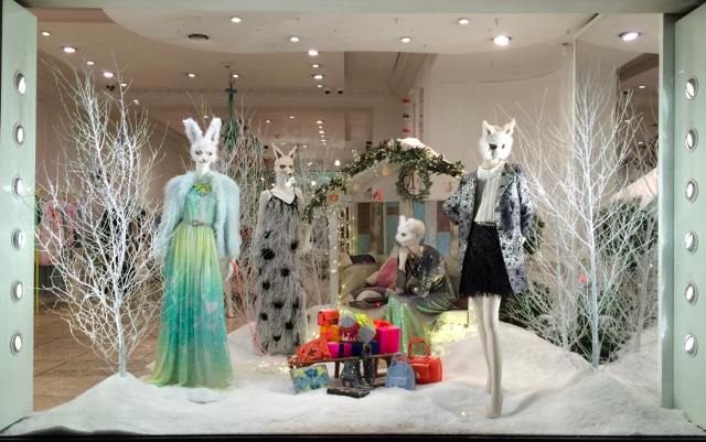
(Source: Zen Merchandiser)
A helpful tip for deciding on a story is to start with a theme and then move into something more specific from there. For example, say your theme is travel. From there, your story could be a tropical cruise or a ski lodge retreat. Or say your theme is Halloween, then you move to something like trick or treating or a seance.
If you find yourself stuck in the process of creating your store window displays, take inspiration from your environment. Take a walk around your block or your closest mall, and look at what others are doing.
Notice what captures your attention. Which elements are most exciting to your eye? It might be a light display, window decals, or an elaborate scene. You can also observe the displays that are attracting other shoppers. Pay attention to what stores people are drawn to and what displays are translating to increased foot traffic.
One final tip—look at the merchandising leaders in your industry and take notes on what they’re doing to stand out. Large corporate retailers have massive budgets and research departments dedicated to guiding their merchandising decisions, so look to them to see what the best strategies are for creating effective store window displays.
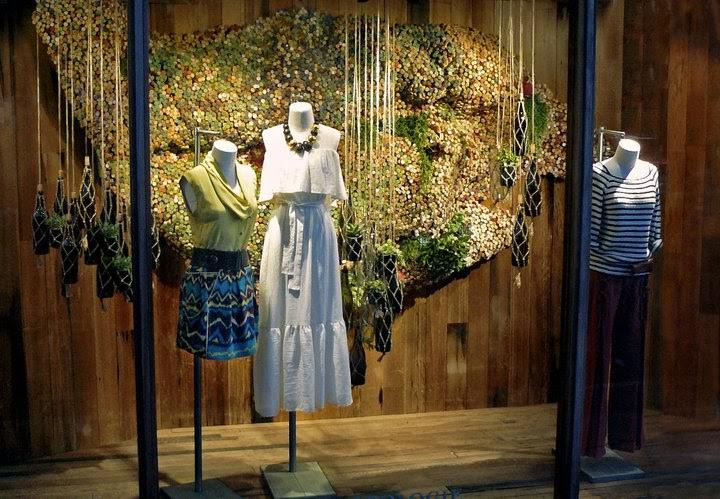
Anthropologie, a major fashion retailer, is known for creating some of the most inventive and elaborate retail window displays. (The Steen Style)
Window displays should be timely and in-season to be relevant to your shoppers. This signals your store has with seasonally appropriate merchandise. It’s also a great opportunity to capitalize on seasonal buying potential, like during the winter holiday season.
Use your window displays to advertise any relevant holidays and seasonal merchandise. Seasonal window displays are a great opportunity to advertise products that will only be available during the season in question, so you aren’t left with extras.
For example, I’m sure you’ve seen pictures of New York City department stores during the holiday season and the elaborate displays they create to evoke feelings of holiday cheer and promote holiday shopping. These displays are over the top for a reason. During the holiday season, there are huge profits to be made, and an elaborate window display will help you capitalize on those sales.
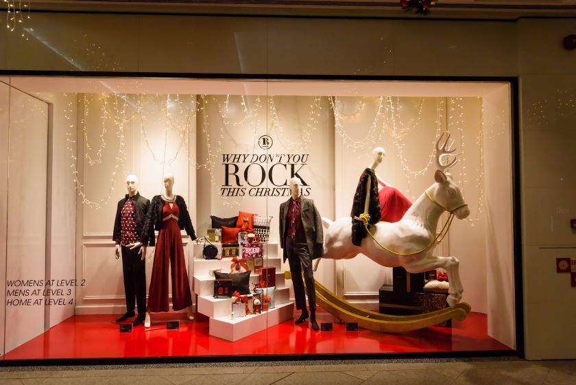
A holiday window display features holiday party outfits and a festive setting.
Window displays don’t have to be overly costly, and one of the best ways to save money is to invest in props you can use over and over again in different ways. For example, clothing retailers often invest in mannequins because they can put them into different outfits and use them in many different ways without any need for replacements.
Additional props to consider investing in are product stands, display screens, LED lights with color customization, pin boards or wall hangings, and large images that you can rotate in and out.
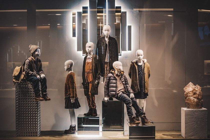
These mannequins are dressed for the season, and can easily be changed for the months to come. (Source: Foko Retail)
Assembling Your Store Window Display
A store window display has several elements—color, lighting, props, accessories. Knowing how these elements work together is key to creating a balanced yet engaging display.
Color has strong psychological effects on human perception, so the palette you choose will elicit specific reactions. For example, red triggers feelings of excitement, passion, danger, energy, and action, so a red palette would work well in store window displays that are conveying stories about love, exercise, or excitement.
Meanwhile, green is associated with peace, growth, and healing and would be better suited for retail window displays telling stories of vacation or nature. Reference the color wheel below for more on the sentiments evoked by different colors and hues.
When choosing your palette, you should not only consider the emotional responses you want to create with your color choices, but limit the number of colors in your palette. Too many colors will create a sense of chaos and disorder and can blur your story. Stick to two or three colors in your display to avoid creating confusion.
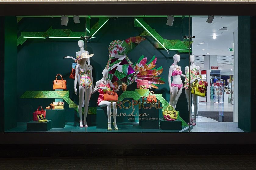
A tropical-inspired window display uses green and orange hues. (Source: Planarama.com)
You can, however, create more colorful displays by sticking to a color family (say, reds, pinks, and purples), by maintaining a consistent color tone (think pastels or primary colors), or by using many different shades of the same color (maybe teal, hunter green, and olive). The key is cohesiveness, so you want to be sure that the colors you choose work well together and do not clash and create a sense of disarray.
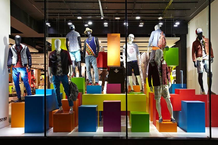
A vibrant window display uses primary colors to create a cohesive and colorful scene. (Source: Mall Xplorer)
While you want your display to be exciting and draw people’s attention, displaying too much merchandise is likely to overwhelm and even deter passersby. Don’t try to do too much in your display or you’ll just end up with something busy and unfocused.
For this point, I like to follow a rule of three:
- First, you should have a subject, or the main focus of the display
- Second, a background, or the backdrop for the display
- Third, accessory items, or supporting pieces that add depth
You can choose to use all three of these elements, or you can stop after the first or second. You should never, however, have more than one subject. Otherwise, the display loses focus and becomes too busy.
In the example below, the subject is the figure, outfitted in winter gear. The backdrop is the winter forest landscape and lights. And, the accessories are the firewood and the bird figure. By sticking to the rule of three, this window display creates interest and intrigue without cluttering the space.
Your focal point is the subject of your window display and the aspect of your display that customers will first notice and pay the most attention to. The rest of your display—from your background to accent pieces—is built around this point, so be sure you are placing it wisely and making it bold enough to carry visual weight.
The most important part of placing your focal point will be making sure it’s at eye level for people passing by. To figure out the best positioning, take a step outside your store to see exactly where eye level falls.
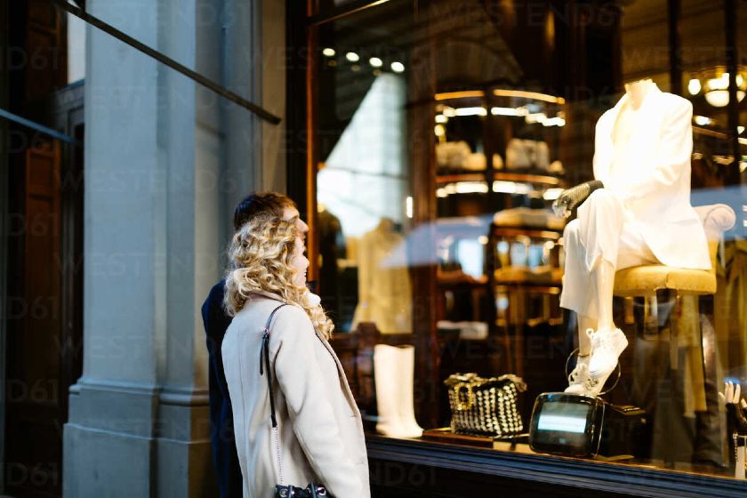
A couple admires a well-positioned window display. (Source: Westend61)
Lighting evokes an ambiance, highlights products, and creates a dramatic setting for your store window display. Being strategic with lighting can pay dividends in directing onlookers’ eyes where you want them.
Consider using spotlights to create a dramatic lighting scheme around your focal point. You might also want to play with contrast or create areas of high and low exposure that will help guide customers’ eyes through your display and draw their attention to key areas.
Remember: Areas of bright lighting will attract the eye, while dimly lit spots will detract attention.
Your window displays are a great place to play with dramatic lighting schemes that may not work in other areas of your store. Use colorful or overly bright lights, or use your lighting as a prop in the display. Be bold with your lighting choices and watch the eyes (and foot traffic) follow.
Want to learn more about lighting your retail store? Check out our comprehensive guide on creating your store lighting plan.
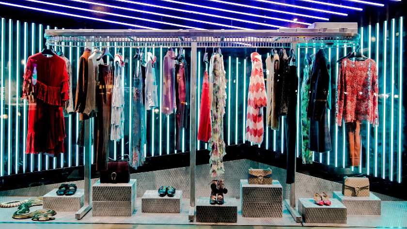
Vibrant LED lights create a dramatic, eye-catching window display. (Source: FashionNetwork.com)
It can be tempting to fill your display with all your best products so you can showcase as much as possible. At the end of the day, this will be cluttered, disorganized, and unappealing to your audience.
So, related to our earlier Keep It Simple tip, it’s best to choose one or two products or sets of products to highlight when creating your display. From there, seek to fill the rest of the space with decorative elements. This will create a spotlight on the featured products, and the decorative elements will promote visual engagement.
Another tip is to take a look at your display once it’s assembled and ask yourself whether there is anything you can remove that wouldn’t take away from the overall impression. This will help you parse out unnecessary and distracting elements. Don’t be afraid of minimalism—sometimes it’s all you need to create something stunning.

A minimalist window display draws attention to key products and avoids clutter. (Source: CreativeNYC)
One of the best ways to promote engagement with your window display (and thus drive foot traffic) is through interactive elements. This might look like a QR code that people can scan to sign up for your emails, a screen-printed social media handle on the outside of your window, videos that customers can scroll through, or even augmented reality technologies.
For example, the home goods brand Clas Ohlson installed large screens in its store windows that customers could control with their phones. People could scroll through its product catalogs, see the latest deals, and even make purchases right there. Because its display was so innovative, it attracted new customers and created relationships with shoppers who didn’t even step foot in its store.
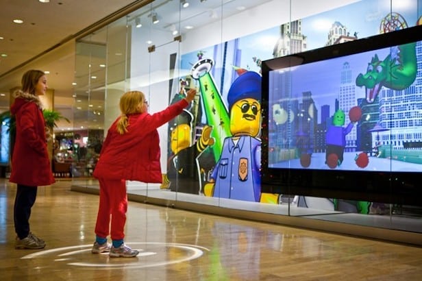
A window display at a LEGO store allows shoppers to control a figure on the screen with their own body movement. (Source: This Is Retail)
In addition to the focal point, use complementary elements to create depth. When assembling the different parts of your display, always create balance. An unbalanced display will be displeasing to the eye, whereas one that’s harmonious will be pleasing and easier to understand.
Here are some tips to maintain balance:
- Use backdrops, props, or even interactive components. These features will make your window more interesting to onlookers, promote greater engagement, and ultimately drive more people into your store.
- Place darker and heavier items near the bottom of your display and lighter and more colorful elements near the top. This will prevent your display from feeling top-heavy and will help draw the eye up.
- Spread out your background elements evenly—don’t leave one side full and busy and the other barren. Humans are more inclined to look at scenes that are symmetrical, as symmetrical objects and images are recognized more easily and mimic the world around us.
- Take a step outside and take a look at what you’re creating.
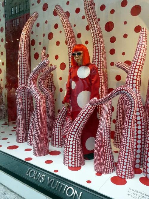
Everything in this display creates interest for onlookers, from the focal point to all the accessory elements that create a complete scene. (Source: Pinterest)
Digital signage is becoming increasingly popular and accessible for retailers of all sizes. It’s an attractive element because it’s so versatile—you can customize the message or visual in a matter of minutes with just a few clicks or taps, depending on the platform you’re using.
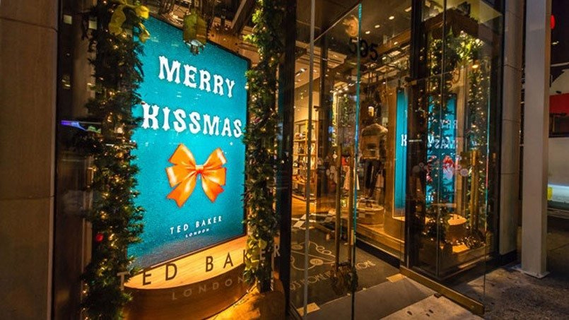
Like decals, digital signage is excellent for showcasing seasonal or temporary promotions, such as this Christmas store display below at Ted Baker in London. (Source: AD Metro)
Movement can be an eye-catching visual element to set you apart from other displays. You might have rotating product displays, a scrolling screen, or even lightweight elements that blow with a breeze.
In the window display below, from a clothing store in London, the retailer uses spinning mirrors. The mirrors are visually engaging for a number of reasons—they reflect light to catch people’s eye, they showcase different angles of the product, and they create a clean, modern aesthetic.
Optimizing & Updating Your Store Window Displays
You can continually iterate on your retail window displays—whether that means fully revamping it every once in a while or refreshing it with some new elements. Evaluate how your display is doing by analyzing foot traffic to your store and observing trends among your neighboring stores.
As a rule of thumb, update your window displays completely at least every six to eight weeks. It’s important that your displays are timely, up to date with the seasons, and continue to engage repeat customers.
You should update your windows for pertinent holidays to capitalize on seasonal buying potential.
When evaluating how often to change your window displays, consider the frequency with which people are visiting your store. Retailers that see more frequent visits from shoppers—like convenience stores, grocers, and fast fashion shops—should consider changing their window displays more often.
You can do light weekly refreshes or biweekly overhauls. You don’t have to do a complete revamp every time, but strive to keep things fresh so customers always have something new to engage with.
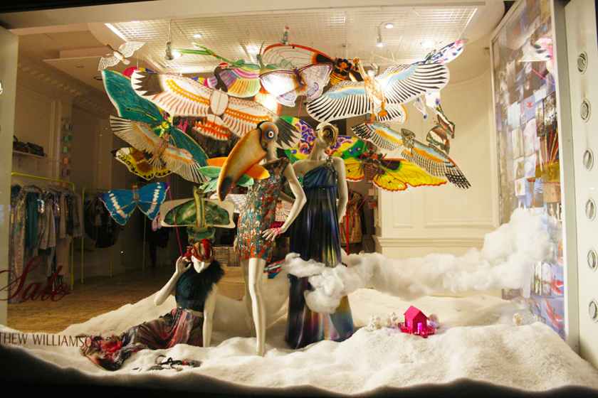
Change your window displays frequently to keep things interesting. (Source: The Window Display Blog)
A store window display makes the perfect canvas for an art installment. Collaborate with a local artist to bring something unique to your storefront. There are many paints made specifically for exterior glass windows, both permanent and temporary. So whether you want the art installment to be a permanent fixture or just a temporary display, you’ll have lots of options to pull this idea off.
Plus, collaborating with an artist can also boost brand image, especially in the local community. You’re supporting the arts and getting your brand in front of a new potential audience—the artist’s fans.
If your store is in a large shopping center or around other shops, you’re competing for attention with your neighbors. If you decide to set your store window up with a few subdued mannequins and minimal decor, but your neighbors have chosen to go with a brightly lit display with interactive features and bright colors, you’ll fall into the background. Shoppers would be too distracted by your neighbors to notice your store.
To avoid this issue and ensure you are the one catching eyes, walk around and take inventory of your neighbors. Put yourself in the shoes of your customers. Would your display catch your eyes, or would another storefront be more enticing? Seek to be the best display on your street to capitalize on your local foot traffic.
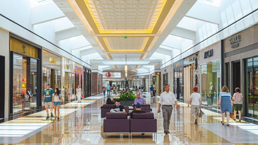
Shoppers walk through a shopping center full of stores with competing window displays. (Source: Visit Philadelphia)
Window decals, which are customizable vinyl window stickers used for promotion, are perfect for retail displays because they’re affordable, flexible, and customizable. You can easily switch out decals to promote different campaigns, promotions, or products.
In the example below, Andrews uses a large red window decal to lure shoppers in to explore its 70%-off sale.
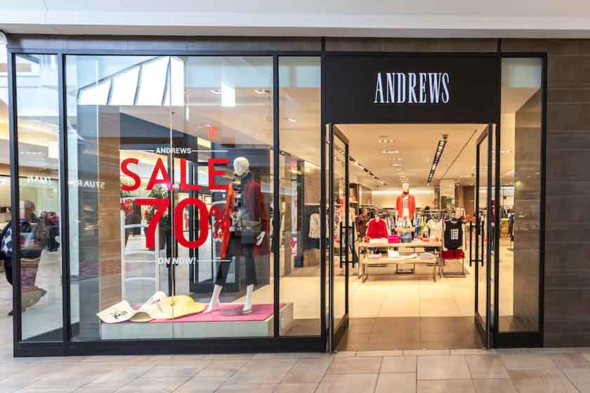
Decals can make sure your promotions immediately catch shoppers’ attention. (Source: Adobe Stock)
Your store window displays don’t necessarily have to be in the window. If your location allows for it, you can even extend the display beyond the window. This allows you to create a full-fledged scene and even play around with interactivity.
D’Harry took this approach with its store display below. The store essentially spills out into the storefront, allowing people to browse products before they even step foot inside.
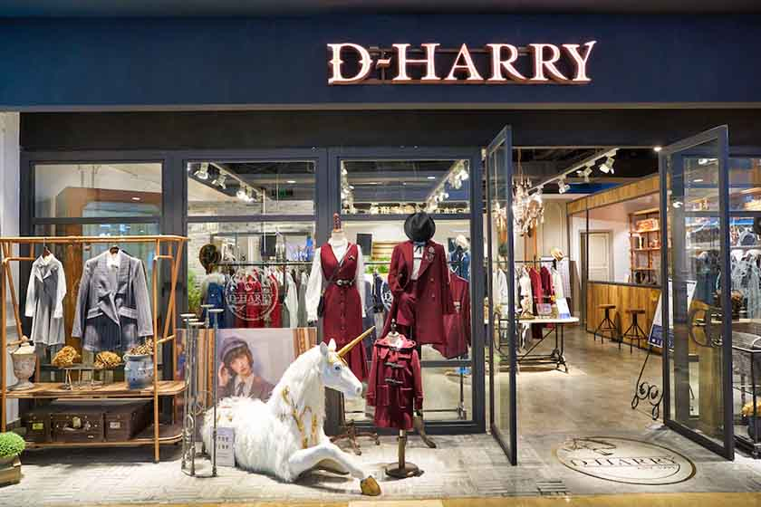
D’Harry’s creative display, with decor and items spilling out of the store, makes it more interactive. (Source: Adobe Stock)
Once your story is told and all the elements are in place, it’s time to review your display and admire your handiwork. This is not, however, the end of your window display journey. You should continue to update your display and monitor its performance to keep customers engaged.
When you’re analyzing your window display, the main thing to look at is foot traffic. To start, track the number of people who enter your store before and after your display is installed. Then, you can track how that traffic increases or decreases as you try different display methods to determine which strategies are most effective. Foot traffic counting methods include the manual click counter and infrared sensors.
Learn more with our guide to measuring foot traffic.
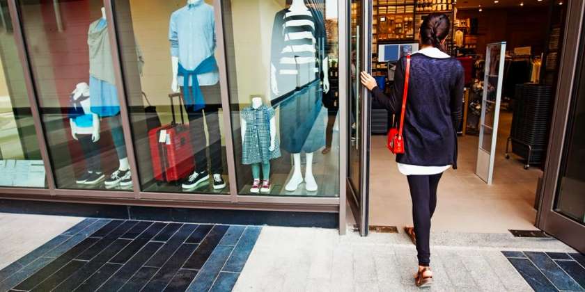
Foot traffic is the top metric for measuring the success of your window displays. (Source: Dumpsters)
Store Window Displays Frequently Asked Questions (FAQs)
Click through the questions below to get answers to some of your most frequently asked store window display questions.
A window display is typically a storefront scene in your exterior-facing windows. Window displays attract new and existing customers, display new products, highlight promotions, and enhance brand image.
- Seasonality
- Clear messaging
- Consistent brand aesthetic
- The right balance of merchandising to empty space
- Choose a story or theme
- Identify a focal point
- Build your display around your focal point
- View your display from outside and adjust as needed
Bottom Line
Store window displays are one of the most important parts of your business. They are the first impression you give to customers, tell a story of who you are, and have the power to drive foot traffic, and ultimately, sales. Setting up your window display does not have to be intimidating, and you can make an effective display by focusing on the best practices outlined above.
