







Gantt charts visualize your accomplishments vis-a-vis your project schedule over time. Team members use these charts to track milestones and monitor scheduled tasks. To create a Gantt chart in Microsoft Excel, make a project data table, insert the Excel bar chart, and format your chart. This article will walk you through how to create a Gantt chart using Excel, including a free template and photos of each step.
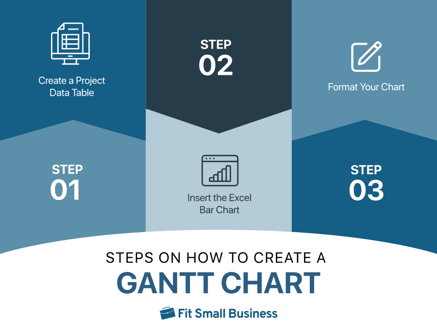
Unfortunately, Excel lacks a built-in Gantt chart template, but templates like the one we’re providing below are available. Create one from scratch, and when making a Gantt chart on Microsoft Excel, follow these three easy steps.
Download and customize our free Gantt chart template. The template applies to personal computers and Macs.
Step 1: Create a Project Data Table
When making a Gantt chart in Excel, open a new Excel file and add your project data. If you don’t have data readily available, create a data range. The data should include your project tasks, start date, and duration, starting at the left-most column. Each row should reflect the following details:
- Task: The work or activity to be undertaken
- Start date: When you will begin the task
- Duration (days): The amount of time the task requires
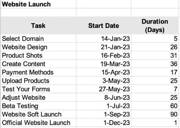
You may opt to include an end date in your Gantt chart. You can manually enter the dates and the duration by noting the following formulas:
- End date – Start date = Duration
- End date – Start date + 1 = Duration
- Start date + Duration = End date
- End date – Duration = Start date
Step 2: Insert the Excel Bar Chart
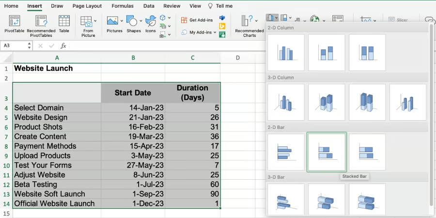
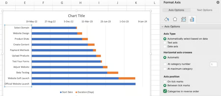
Once you have your data set, create a Stacked Bar chart because it’s the closest option to a Gantt chart. To do this, select all the cells with data, including the headers. Under the “Insert” tab, select “Chart,” then “Stacked Bar,” located under the 2-D Bar options. This will create a bar graph with horizontal bars from the left showing your start dates and durations in different colors.
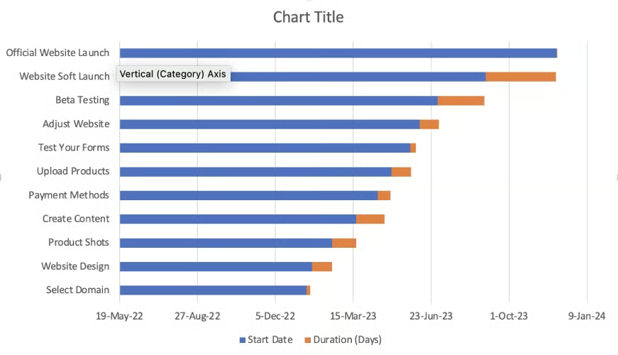
Notice that the tasks on the chart are in reverse order. To rectify this, right-click on the list of tasks and choose “Format Axis.” To adjust the order of tasks, check “Categories in reverse order.”
Step 3: Format Your Chart
This step tackles how to design a Gantt chart and make it your own. You can make adjustments to the graph to resemble a Gantt chart. Right-click on the blue section of the bar and click on “Format Data Series.” This will remove the blue fill color; all you’ll see at this point are orange points referring to task timelines and duration.
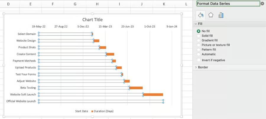
The next stage is to remove the legend at the bottom of the chart, change the chart title, and there you have it: a Gantt chart in Excel. Remove the legend by clicking on it, and when highlighted, press delete. To change the title of the Gantt chart, click on the temporary title and write your preferred title.
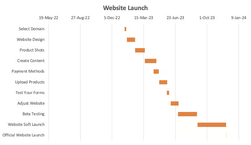
Make other design changes as needed. To change the colors of your chart, click on the “Chart Design Tab” and the “Change Colors” button. Now you know how to create a Gantt chart and can use these as clear visual representations of your project workflow. Follow these three simple steps and create Gantt charts for all your projects based on business needs.
Benefits of Using Gantt Charts
Gantt charts are used for planning and monitoring—simplifying complex projects by breaking details into an easy-to-follow plan. Gantt charts are used by professionals and teams across different departments and industries because they are excellent for tracking the status of tasks as work progresses. Here are some of the main benefits of Gantt charts.
High-level Project Overview
Gantt charts provide a high-level overview and top-line perspective of a project and help managers better understand overall progress. For those managing or tracking projects, this tool is excellent for allocating resources, improving communications, and measuring the progress of tasks.
Actionable Insights
These charts allow leaders to closely track tasks and milestones and reveal possible issues so managers and members can adjust quickly. It clearly shows how tasks may conflict or overlap, what lacks resources, and other details that project leaders need to know to ensure the timely completion of a project.
Improved Productivity & Time Management
Gantt charts provide a clear overview of workloads and team productivity so companies can work toward improving time management. These tools allow workers to collaborate efficiently and maintain task visibility so teams remain focused on the work they must complete. Transparency also ensures teams are accountable for their assigned tasks.
Reduced Risk of Resource Overload
Projects have finite resources, and as tasks happen simultaneously, improper resource allocation and monitoring increase the risk of resource overload or resource depletion. Gantt charts highlight milestones and make spotting bottlenecks and delayed tasks easier.
Gantt Chart Best Practices
When making a Gantt chart, you need to problematize and break down the entire project into tasks to create an accurate project timeline. Here are some tips to help you get the most out of Gantt charts:
Be Specific
Remember, the devil is in the details. The more specific your details (dates, duration, notes, assignees, and subtasks), the better guided you will be. Providing granular data makes your Gantt chart easier to follow and creates a one-stop source for everything related to your project. This level of detail minimizes confusion among team members. Aim to provide sufficient and concise information and avoid going overboard and ending up with a cluttered chart.
Track Periods of No Work
To ensure your timeline and schedule are realistic, account for non-work periods like holidays, scheduled vacations/ leaves, and weekends. This will give you a more accurate estimate of timelines and target days and avoid conflicts in schedule and overworking employees. Get a better understanding of when projects will be completed by adding non-work dates to your timeline. This will also allow you to manage stakeholders’ expectations better.
Use Colors to Visualize Information
When learning how to design a Gantt chart, keep in mind that colors can significantly improve a Gantt chart’s readability, aesthetics, and effectiveness. Colors can help differentiate and categorize your chart’s elements, making it easier for team members to understand information.
Account for Dependencies
Reflecting task dependencies lets you and your team plan and delegate tasks more transparently. It allows users to locate their roles across the project and minimizes errors and delays by structuring critical activities in the correct order. Task dependencies let managers closely monitor task progress and make everyone aware of their impact on other tasks.
Best Gantt Chart Providers
Now that you know how to create a Gantt chart using Excel, you can use it to help move large projects forward efficiently. Several popular providers offer Gantt chart functionalities useful for complex projects and large teams. Refer to the table below for our top picks for best Gantt chart providers for small businesses:
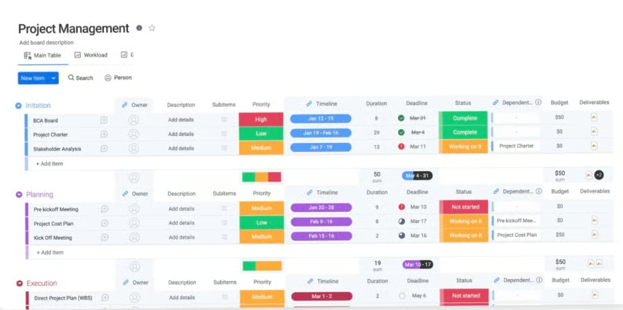
 monday.com offers Gantt charts that help users plan, manage, and track projects with tools such as custom templates, list and prioritization of tasks, and dependencies. Its free plan includes a search function that allows users to locate tasks and team members. Colleagues can communicate within the platform using an @mention. monday.com is our recommended best free project management software, and its free plan comes with up to three workflow boards.

Trello offers several project views, including tables, lists, and Gantt charts, making it one of our best task management software. Assign tasks with details and tag colleagues to follow up. The platform lets you prepare project schedules, distribute assignments, and track real-time progress. Use Trello’s Power-Ups to integrate additional features. For example, use the Planyway Power-Up and build team schedules that help balance workloads and map tasks.
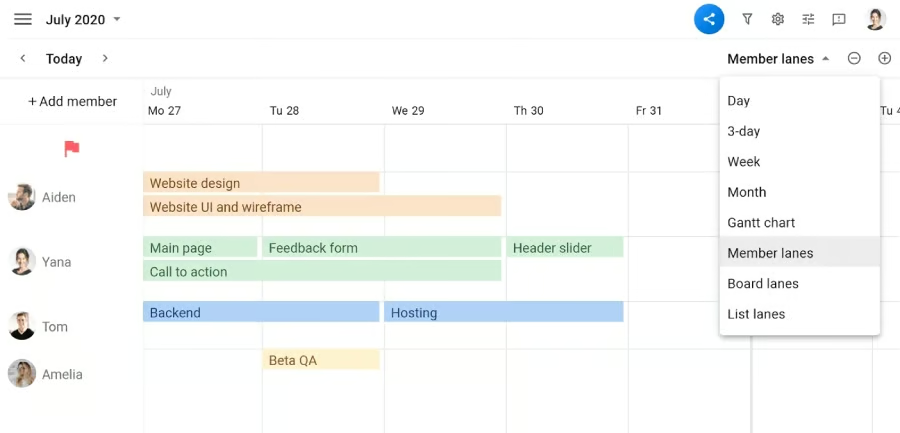

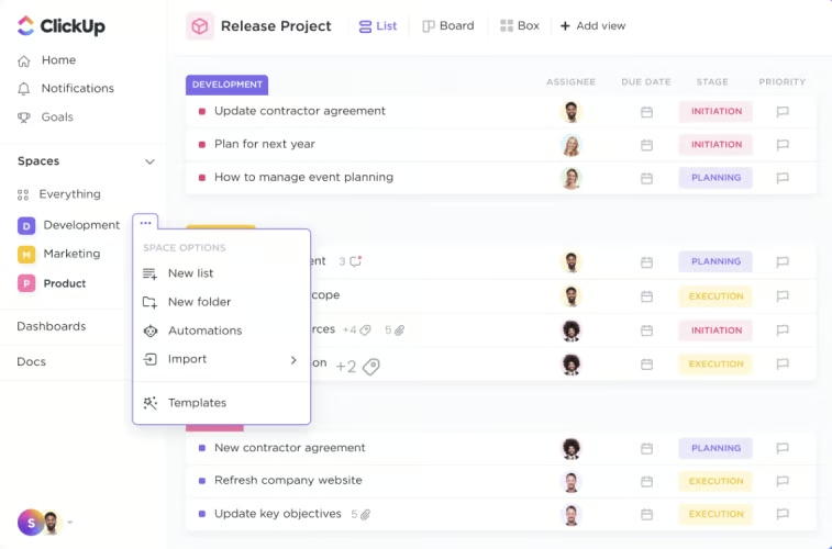
ClickUp is one of our recommended best team management software for high-level tasking. One of its standout features is its intelligent dependency-path tracking that highlights where potential bottlenecks may develop. ClickUp also allows users to create tasks and link them with dependencies so you can see how projects are connected. Its free plan can be used with unlimited free members and has five spaces.
Frequently Asked Questions (FAQs)
When should you use a Gantt chart?
Gantt charts are most helpful in seeing what needs to be done, who needs to do what, what resources are required, what will be done, and when. They can be used by all kinds of teams, including, but not limited to, marketing units, IT and software development departments, project managers, and professional services teams. In addition to knowing how to create a Gantt chart, learn about these other tools and see which one best suits your needs.
How specific should a Gantt chart be?
Gantt charts, depending on the intricacies of a project, can vary in depth and complexity. The three main elements of Gantt charts include activities or tasks that need to be accomplished, milestones or progress stages, and progress bars denoting the progress of each task. We recommend including four other essential elements: dependencies, project timeline, resources, and critical path.
What are alternatives to Gantt charts?
There are many Gantt chart alternatives that may be suited for other types of projects, such as Kanban boards, Scrum boards, timeline charts, and project checklists. Employing multiple ways to view a project may be helpful depending on how a team operates.
Bottom Line
Gantt charts are used by businesses of all sizes across any industry to track project milestones and progress against a set timeline. These tools help list project tasks and show the time requirement of different items. Even though Microsoft Excel doesn’t have a built-in Gantt chart template, now you know how to create a Gantt chart for project management.
