A well-planned retail store layout is key to maximizing revenue. The right design guides customers to high-priority products, encourages impulse buys, optimizes traffic flow, and enhances the shopping experience.
Large or small, most retail stores use one of nine basic types of retail store layouts: grid, loop, spine, boutique, herringbone, diagonal, forced-path, angular, or free-flow. Your choice should align with your space, product type, and desired customer experience. Selecting the right layout or floor plan helps you maximize your profits and create a positive customer experience.
Continue reading to learn how to create a sales-driving retail store layout, or download our store layout guide to read later:
Your store layout is more than just a floor plan — it’s a powerful tool that shapes the shopping experience, influences purchasing decisions, and drives revenue. It dictates product placement, controls customer flow, and establishes your store’s overall atmosphere, making it a critical factor in your success. Choosing the right layout requires careful consideration of your space, product assortment, and target customers to create a seamless and profitable shopping environment.
Retail Floor Plan | Best For | Example Store Design |
|---|---|---|
Grid Floor Plans Used in grocery, big box, and convenience stores | Shelf-stocked goods such as books, toys, specialty foods, hardware, and homewares | 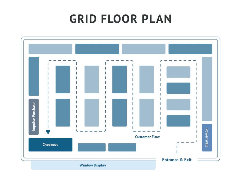 |
Loop Floor Plans Maximize wall space and lead shoppers along a set pathway | Apparel, accessory, toy, homeware, kitchenware, personal care, and specialty retail | 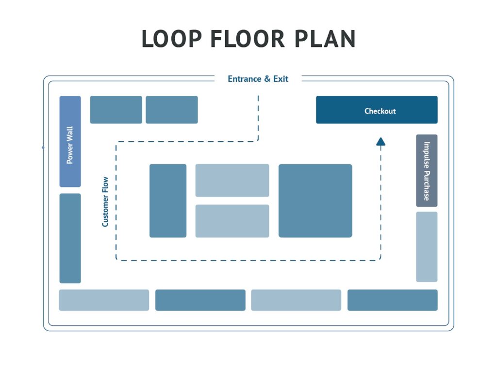 |
Diagonal Floor Plans Maximize employee visibility in retail stores with lots of product testing | Self-service kiosks, tech and electronic stores, beauty and cosmetic retailers | 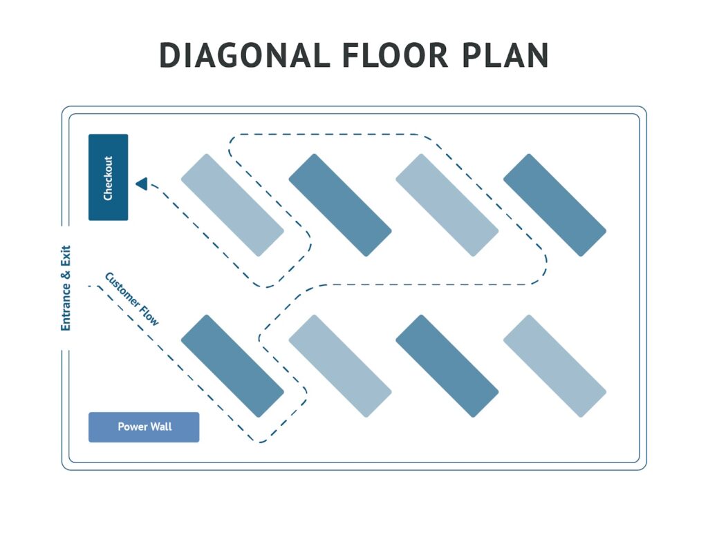 |
Forced-path Floor Plans Customers are guided through a predetermined path and exposed to every product | Furniture, home decor, experiential retail stores, showrooms | 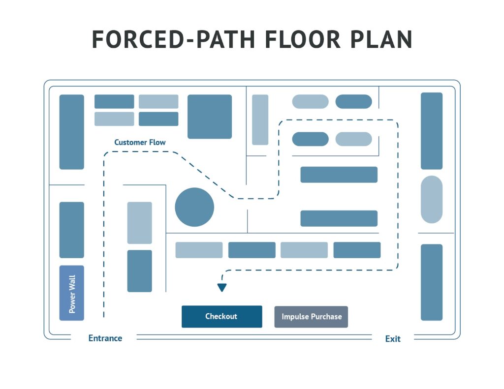 |
Angular Floor Plans Showcase curated or edited inventories in designer or specialty shops | Designers, artisans, high-end apparel and accessories retailers, and curated or limited collections | 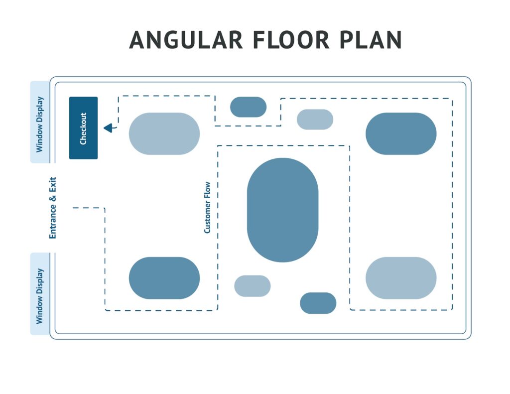 |
Spine Floor Plans Easy to navigate and organize product categories with one big, center aisle | Small grocers, department stores, markets and marketplaces | 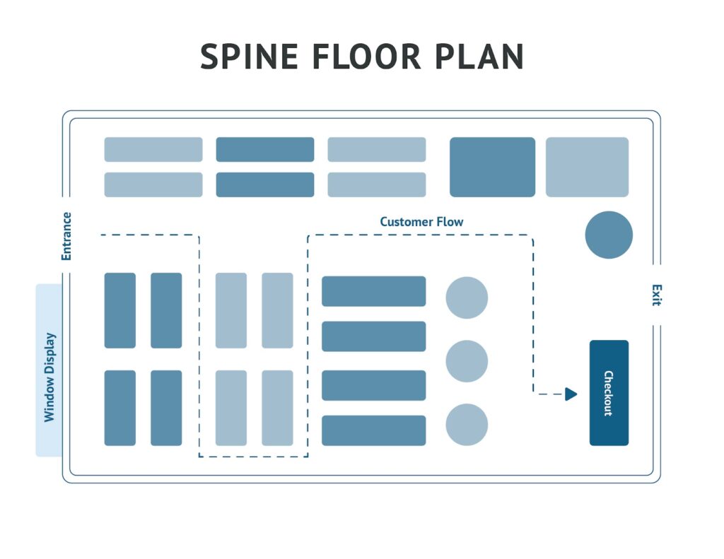 |
Herringbone Floor Plans A type of grid floor plan with a big center aisle | Small footprint stores and/or stores needing to fit in lots of product | 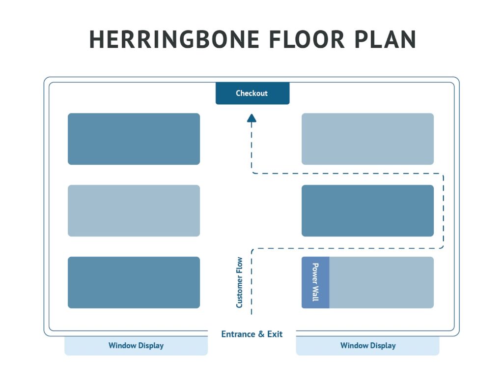 |
Free-flow Floor Plans Used in specialty and boutique settings | Apparel, accessory, personal care, specialty, and mixed-use stores like bakeries that display packaged goods
|  |
Boutique Floor Plans A type of free-flow plan that prioritizes visibility and open space, often highlighting “pop-in” shops | Boutiques and specialty retailers use this floorplan to highlight brand collaborations, guest or “pop-in” retailers, or new product categories | 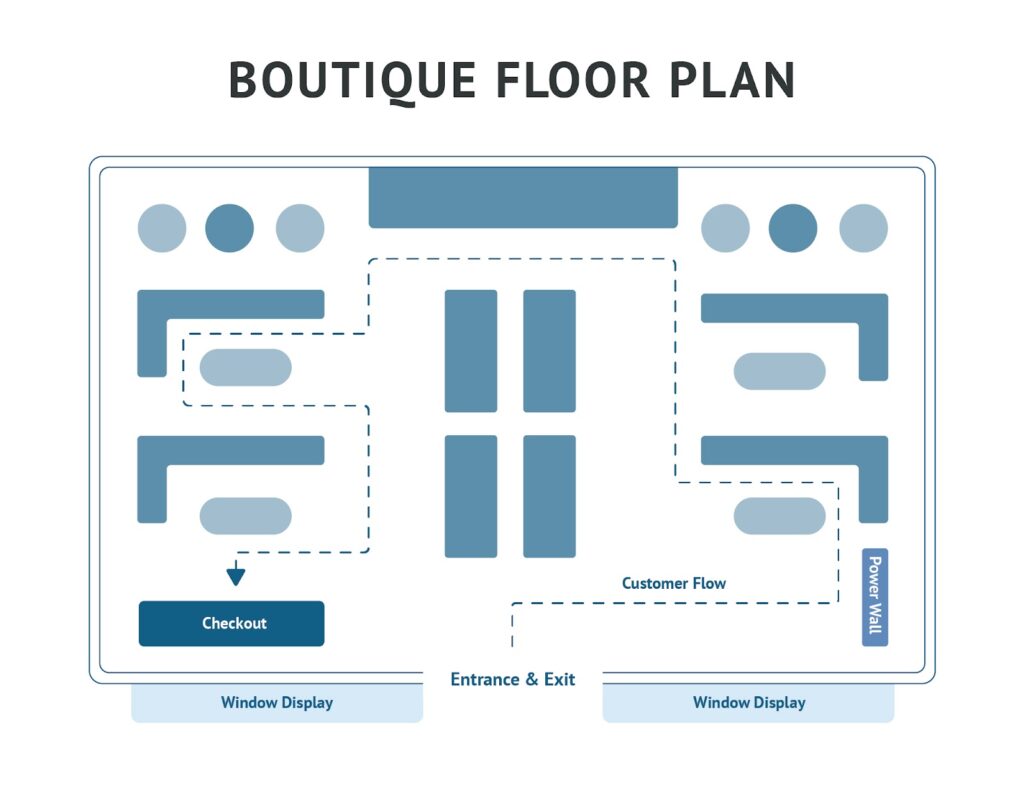 |
Let’s explore each floor plan option in detail.
1. Grid floor plan
A grid floor plan — also called a straight layout — uses a grid-like arrangement to create a series of parallel aisles and displays. It is great if you have a lot of merchandise, as it maximizes every inch of available floor space, including the corners. Grid plans are also easy for customers to navigate. Plus, these layouts offer plenty of endcaps and feature wall exposure for promotional items and seasonal products.
- Commonly found in: Grocery, big box, and convenience stores, retailers requiring a lot of shelf-stocking space
- Best for: Shelf-stocked goods such as books, toys, specialty foods, hardware, and homewares
- Pros: Easy to navigate, can accommodate high foot traffic, established merchandising techniques, encourages browsing, maximizes product space, fosters customer familiarity
- Cons: Unimaginative, moving things around can lead to frustrated customers, difficult to feature new products, can stimulate rushed shopping behaviors
2. Loop floor plan
A loop floor plan, sometimes called a racetrack layout, has a defined pathway throughout the store, which creates a guided shopping experience and exposes customers to every item on display. Your store’s central area can then use a grid or free-flow layout, or a mix of the two. This floor plan is highly customizable and provides an excellent base for combining layouts.
- Commonly found in: Apparel and accessories stores, toy stores, homewares, kitchenware, personal care, specialty stores
- Best for: Maximizing wall space and leading shoppers along a set pathway
- Pros: Engaging shopping experience, guided shopping path, high product exposure, customizable
- Cons: Difficult to update displays, can lead to browsing rather than buying, does not maximize floor space, frustrating for customers in search of something specific
3. Diagonal floor plan
Diagonal floor plans are a variation of the grid layout, using aisles placed at angles to increase customer sightlines and expose new merchandise. They feel more open than grid layouts, which improves visibility and promotes more browsing.
- Commonly found in: Self-serve kiosks, tech and electronic stores, and beauty and cosmetic retailers
- Best for: Maximizing employee visibility in retail stores with lots of product testing or self-service options
- Pros: Easy to navigate, high visibility for both employees and customers, maximizes display space, easy to implement theft protection measures
- Cons: Prone to narrow aisles, less room for creativity, difficult to change
Since it lets customers move easily between aisles while providing store employees with good angles to view shoppers, this type of store layout creates open sightlines throughout the store, and this visibility is excellent for pointing customers toward a central sampling or demonstration area.
4. Forced-path floor plan
A forced-path floor plan, also known as a guided layout, directs customers along a single, predetermined route through the store, ultimately leading them to checkout. This design mimics a guided tour or museum, ensuring shoppers pass by a variety of products and displays.
A prime example is IKEA, which uses marked pathways and directional arrows to lead customers through its expansive showrooms while minimizing congestion and maximizing exposure to its product range.
- Commonly found in: Warehouses, large showrooms, experimental stores
- Best for: Guiding customers through a predetermined path and exposing them to every product
- Pros: Ample opportunity promoting impulse buys, immersive experience, lots of control over customer experience, promotes exposure to every product
- Cons: Can be frustrating when shopping for a specific item, risk of boring customers, difficult to design, can cause traffic jams if not well-regulated
5. Angular floor plan
Angular floor plans use many smaller displays in the center of the store to create a dynamic shopping experience that highlights a smaller number of products. Table displays automatically draw customer attention, promoting interaction and engagement with all the products on the floor.
Stores with angular floor plans need substantial inventory storage space for restocking items and holding additional sizes.
- Commonly found in: Stores with small or curated merchandise that also have large inventory storage spaces — showrooms, high-end boutiques, and designer stores
- Best for: Showcasing a small number of products that you want customers to engage with
- Pros: Perception of higher value, draws attention to merchandise, promotes engagement, easily updated and changed
- Cons: Limited display space, difficult to manage traffic flows, not suited for a high volume of customers
6. Spine floor plan
A spine or straight store layout uses one large, wide aisle that runs from the front to the back of the store, with smaller aisles branching off of it. This style is popular in large stores like department stores because it can accommodate large volumes of shoppers, makes it easy to wayfind between departments and multiple floors, and is effective in encouraging shoppers to walk the full length of the store.
- Commonly found in: Department stores, marketplaces, markets, and stores with lots of different departments or product categories
- Best for: Guiding shoppers through the entirety of the space
- Pros: Easy to design, efficient, shoppers typically make it to the back of the store
- Cons: Not conducive to product discovery, products not on the main aisle might go unnoticed
7. Herringbone floor plan
A herringbone layout is essentially a variation of the grid layout, just a compact version for smaller spaces, as it only has one center aisle — which is also similar to the spine layout. This layout is common in stores with a narrow floor space and stores that are packed with products.
- Commonly found in: Small bookstores, warehouses, hardware stores, toy stores
- Best for: Fitting in lots of product
- Pros: Easy to create, simple to navigate, allows for lots of display space
- Cons: Can feel cramped, limited visibility — difficult for customers to see products and difficult for employees to keep an eye on customers.
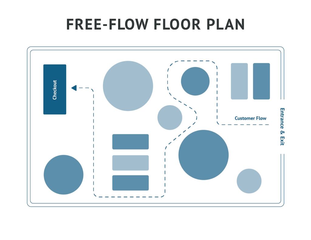
8. Free-flow floor plan
A free-flow or mixed retail store layout uses different display types throughout the store—there is no set path, allowing customers to shop freely. This layout is the favorite among specialty retailers because it enables maximum creativity, is easily changed and updated, and fosters an exploratory shopping experience.
Free-flow plans create open sightlines throughout the store, making your wall space highly visible and poised for display features. The open sightlines also make it easy to funnel customers toward specific merchandise zones using eye-catching accent colors and product groupings.
- Commonly found in: Gift shops, specialty stores, boutiques, retailers with limited inventory
- Best for: Creating customizable displays and promoting shopper exploration
- Pros: Uses different displays for different products, promotes exploration and product discovery, open sightlines, good for wall displays, works well in irregular spaces, easy to update
- Cons: Easily cluttered, can be difficult to navigate, customers won’t see the same things, encourages loitering, can be difficult to maintain
9. Boutique floor plan
The boutique layout is a type of free-flow floor plan. In fact, the two names are often used interchangeably. The boutique floor plan is similar to the free-flow plan in that it uses a mix of layouts and allows customers to roam the store freely and discover products. The main difference, however, is that the boutique layout has pop-in or shop-in-shop features, creating the feeling of multiple shops or sections within a store.
While Target has a grid floor plan, you can think of all of its private label pop-ups within its larger departments — like apparel, beauty, and home goods — as examples of a boutique layout. Another example is Disney stores that have dedicated areas for each story or character group.
- Commonly found in: Boutiques, specialty shops, stores with a larger footprint — ideal for stores where shoppers want to browse and discover products, as it allows for lots of creativity and cross merchandising.
- Best for: Encouraging product discovery, highlighting multiple brands, making use of a large floor space
- Pros: Allows for browsing, sparks creativity and curiosity, can appeal to a wide range of shoppers
- Cons: Can be confusing to navigate, prioritizes visual appeal over fitting in a lot of product or creating a streamlined shopping experience
Store layout design tips
Choosing the style of floor plan you want is just the beginning. Next is actually putting the design in place and customizing it to fit your space and store needs. When finalizing the details, keep these tips in mind:
1. Consider traffic flow and customer behavior
Customer flow is one of the most critical aspects influenced by your store layout. A well-designed layout should align with the natural movement of shoppers, preventing congestion and enhancing the overall shopping experience. When your floor plan supports customer behavior, it creates a seamless, comfortable environment that encourages browsing and boosts sales.
To optimize your layout, consider these key shopping behaviors:
- Decompress upon entry: To ensure your customers are not overwhelmed at entry, create a decompression zone The space at the entrance of your store where your customer makes a mental shift from the outside world to your store environment. Upon entry, they take stock of your store, develop an opinion of your brand, and even make subconscious judgments about the pieces and prices they expect to find. in the first five to 15 feet of your entrance. Decompression is vital as it allows customers to enter your business with a clear head, ready to shop. Avoid overwhelming customers and allow sightlines throughout your space by sparsely decorating your decompression zone.
- The Right Turn: Most US shoppers automatically turn right when they enter a store. Leverage this by directing traffic counterclockwise, placing promotional displays on the right side of your store, especially the area just beyond the decompression zone, and placing checkouts at the end of the path, or to the left of the entrance so you can maximize the right side of your store for product exposure. The leftward placement will also make the counter fall along the natural exit path.
- Personal space: Customers do not like to feel cramped when shopping, so you should allow ample space for movement. Aisles should be at least 3.5 feet wide to accommodate strollers, wheelchairs, and multiple customers browsing simultaneously. Consider carts and baskets when designing pathways to allow smooth two-way traffic. Prevent the “butt-brush effect”, where customers avoid tight spaces that force unwanted physical contact, by keeping high-interest areas open and accessible.
2. Place your checkout strategically
A cash wrap, also known as a cash well or checkout counter, is the area that houses your point-of-sale (POS) system or cash register and where customers pay for their merchandise.
The recommended locations are the following:
- The front left: Shoppers naturally drift to the right when they enter a store, loop around, and then leave on the left side. A checkout counter at the front left of your store puts the last step of the shopping experience on your customers’ natural exit path. Plus, this placement doesn’t distract people from shopping or take up prime product display space.
- The rear of the store: This is great for larger retailers that have many in-store associates at a time as it frees up product space in the front of your store. However, placement in the back is not practical for small retailers with limited staff since this positioning can leave the front of the store unattended.
3. Choose fixtures and displays that enhance your space
Once you have an idea of your general store design and product mapping plan, it’s time to consider your store fixtures and displays. Fixtures are permanent parts of your store such as lighting, counters, fixed shelving units, wall-mounted racks, and dressing rooms, while displays are pieces that hold products and tend to be mobile, versatile, and customizable — modular units, tables, slatwall, and free-standing clothing racks.
- Invest in fixtures that define your brand as they shape your store’s identity and influence how customers perceive your products. Choose cohesive, high-quality pieces that align with your brand while keeping the focus on your merchandise. Fixtures should complement, not overpower, your products—creating a consistent backdrop that enhances your store’s aesthetic.
- Use displays that enhance your products. For example, clothing stores need hanging space, while pottery shops benefit from shelving and tables. Opt for adjustable fixtures like slatwall, gridwall, and modular shelves to accommodate various products. Ensure displays are sturdy enough for heavier items while lighter products can be showcased on floating shelves or furniture pieces.
- Save money on specialty displays. Many manufacturers provide low-cost or free branded display fixtures to highlight their products. These are ideal for budget-friendly merchandising, especially for seasonal, temporary, or point-of-purchase (POP) impulse displays. Check with your product reps for availability and merchandising guidance.
- Use displays and fixtures to create speed bumps and guide flow. Speed bumps are displays designed to slow shoppers down and encourage interaction with products, like table displays, mannequins, and focal-point setups that attract attention. Place them in low-engagement areas and experiment with positioning to optimize their impact. Use an integrated POS system to track how speed bumps affect sales and adjust as needed.
Don’t forget comfort zones and amenities
A great retail layout isn’t just about sales — it’s about creating a welcoming, memorable experience that keeps customers coming back. Thoughtful amenities like seating, dressing rooms, and service areas enhance comfort and encourage longer visits. Prioritize these elements to make shopping more enjoyable and engaging.
See more guidance on setting your fixtures and displays:
- How to Select & Design Retail Lighting
- Fitting Room Design Tips
- Set Up Your Cash Wrap to Drive Sales
- Retail Store Window Display Tips & Ideas
4. Ensure your layout is accessible and ADA-compliant
To ensure your space is accessible to all and to avoid any costly fines, follow the guidelines set forth by the Americans with Disabilities Act. There are rules that retailers have to follow to ensure that spaces are navigable and comfortable for Americans facing disabilities.
The main things that you need to account for in your retail store layout include:
- Parking and entry: Keep parking areas clean and accessible, with designated handicap spaces and clear wheelchair-friendly ramps.
- Navigable store: Maintain at least three-foot-wide aisles, unobstructed pathways, and clear floor space to accommodate wheelchairs and scooters.
- Restrooms, fitting rooms, and elevators: Ensure accessible facilities are open and maintained during business hours. Remove obstacles from fitting rooms and keep elevators in working order.
- Customer information display: Post accessibility details online and train staff to assist customers in-store.
See more guidance in our article How to Maintain ADA Compliance for Retail Stores
How to evaluate the success of your store layout
To assess its effectiveness using these key strategies, regularly assess the following metrics:
- Sales performance: Track sales data to identify high-performing and underperforming areas of your store. Adjust product placement and displays accordingly.
- Customer flow analysis: Observe shopping patterns or use heat mapping technology to see where customers linger and which areas they avoid.
- Dwell time and engagement: Measure how long customers stay in different sections. High engagement areas indicate effective layouts, while low dwell times may signal a need for adjustments.
- Conversion rates: Compare foot traffic with actual purchases to determine if your layout encourages browsing or leads to sales.
- Customer feedback: Gather insights through surveys, online reviews, and direct conversations to understand how shoppers feel about navigation, comfort, and product visibility.
- Checkout efficiency: Evaluate wait times and congestion at checkout areas. A slow or confusing checkout process can deter repeat visits.
Regularly testing and refining your layout ensures it remains optimized for both customer experience and business success.
Common challenges when implementing store layouts
Designing an effective store layout comes with obstacles that can impact customer experience and sales. Here are some common challenges and how to address them:
- Limited space: Small stores must balance inventory needs with open, navigable pathways. Use vertical shelving, modular displays, and strategic product placement to maximize space.
- Customer congestion: Overcrowded aisles or bottlenecks can frustrate shoppers. Monitor traffic patterns and adjust displays or widen aisles to improve flow.
- Inefficient product placement: Poorly positioned high-margin or best-selling products can reduce sales potential. Use sales data and customer movement analysis to optimize placement.
- Lack of flexibility: Rigid layouts can make it hard to adapt to seasonal trends or new product lines. Choose modular fixtures and movable displays to maintain versatility.
- Poor visibility and signage: Confusing navigation or unclear signage can frustrate customers. Ensure clear pathways, visible category markers, and well-lit displays for a seamless shopping experience.
- Underutilized checkout areas: A poorly placed or congested checkout disrupts customer flow and leads to lost sales. Position registers near the natural exit path and streamline the checkout process.
Addressing these challenges proactively ensures a layout that enhances customer satisfaction and maximizes sales potential.
Technology in store layout design
Integrating technology into store layout design enhances efficiency, improves customer experience, and drives sales. Here are key ways retailers can leverage technology:
- Heat mapping and traffic analysis: AI-powered cameras and sensors track customer movement, identifying high-traffic areas and dead zones to optimize product placement.
- Augmented reality (AR) planning tools: AR software allows retailers to visualize and test different layouts digitally before making physical changes, reducing costly trial and error.
- Smart shelving and RFID technology: RFID tags and IoT-enabled shelves provide real-time inventory tracking, alerting staff to low stock and helping optimize shelf organization.
- Interactive digital signage: Touch-screen kiosks and digital displays enhance navigation, promote products, and personalize customer interactions based on preferences or demographics.
- Automated checkout systems: Self-checkout stations and mobile payment options streamline the purchasing process, reducing congestion and improving customer flow.
- Customer behavior analytics: AI-driven data analysis tools track dwell times, shopping patterns, and purchase behaviors, allowing retailers to refine layouts based on real-time insights.
By integrating these technologies, retailers can create dynamic, customer-friendly store layouts that adapt to shopping trends and maximize profitability.
Next steps: Product placement
Once you have sketched out your floor plan, it is time to begin product mapping. When placing your products, do so in a way that promotes customer engagement, creates a positive experience, and drives your sales.
1. Implement zone merchandising
When zone designing, you are categorizing products into “zones,” and the quantities of products determine the size of each zone. Zoning design makes it easy for shoppers to find what they are looking for, which will lead to more transactions and greater sales. Not only that, but your customers will also have a better experience shopping in your store.
Primary Zones are located in the back of the store and are where you display bestselling or essential products. For example, you will often find bread, milk, and cheese in the back of grocery stores. This arrangement will force customers to walk through your entire store, get exposed to new products, and even motivate impulse purchases.
2. Use cross merchandising to increase units per transaction
Implement cross merchandising techniques to make shopping easier for customers and to promote multiple-item purchases.
As you are laying out your store, consider what products work well together and how you can feature them together in a cross merchandising strategy. Zone your products so that customers can find things easily and that complementary items are together, even if that means placing categorically different items in the same area.
3. Add low-cost products to your checkout
Place impulse items like small toys, candy bars, lip gloss, or other small, low-cost items near your register. When customers approach the register to pay and leave, you don’t want them to stop shopping. Placing low-cost impulse-buy items near registers, as shown in the image below, encourages shoppers to add an item or two as they check out, which will drive your sales.
4. Design power walls to pique interest
A power wall is a wall in a high-traffic or key area of your store that you merchandise with items that attract attention and promote engagement. Typically, you place it on the right of your store, just beyond the entrance, so that it is one of the first things customers see when they enter your store and can draw people into your space.
Power walls can be anywhere throughout your store—just be sure that they are in a high-traffic area to get maximum visibility. Use them to showcase important departments and new and seasonal items, create vignettes, tell product stories, and feature high-demand, high-profit products.
However, you should remember that your power wall will need to change frequently, so plan for that. Outfit your power walls with hooks, shelving, or other fixtures that you can easily change to showcase various product groupings.
5. Consider seasonal or promotional layout adjustments
Adapting your store layout for seasonal changes and promotions helps capture customer interest, boost sales, and keep your space fresh. Here’s how to make strategic adjustments:
- Highlight seasonal or promotional items: Position featured products near entrances, checkout areas, or high-traffic zones to maximize visibility and impulse purchases.
- Create themed displays: Use decor, signage, and product groupings to create engaging seasonal or holiday-themed sections that attract attention and encourage browsing.
- Adjust product placement: Move best-selling seasonal items to eye-level shelves and high-traffic areas while temporarily relocating non-seasonal products to secondary spaces.
- Optimize traffic flow: Ensure promotional layouts don’t create congestion by maintaining clear pathways and adjusting displays to accommodate increased foot traffic.
- Leverage temporary fixtures: Use modular or movable display units for easy reconfiguration and efficient transitions between seasons or short-term promotions.
- Track performance and adapt: Monitor sales data and customer engagement with seasonal displays, making adjustments based on what resonates most with shoppers.
Strategic seasonal layout changes keep your store visually appealing, encourage repeat visits, and drive higher sales throughout the year.
Frequently asked questions (FAQs)
Here are some commonly asked questions about the basics of retail store layout design:
A retail store layout is the map or plan that you design for your store to determine the best placements for fixtures, products, checkout counters, and other permanent areas of your store. A store layout also dictates traffic flow, impacts customer behavior, and determines how shoppers interact with your products.
The most common types of store layouts are grid floor plans, loop layouts, diagonal floor plans, forced-path plans, angular layouts, spine or straight plans, herringbone layouts, free-flow plans, and boutique or pop-in layouts.
Choose a layout based on your space, product type, and customer shopping behavior. Consider traffic flow, product visibility, and ease of navigation. Test different setups and adjust based on sales data and customer feedback.
Avoid cluttered spaces, poor traffic flow, and confusing product placement. Ensure aisles are wide enough, signage is clear, and high-margin items are in high-visibility areas. Regularly assess and adjust to improve customer experience.
Use heat mapping, sales data, and customer feedback to analyze layout effectiveness. Try A/B testing by rearranging sections and tracking performance changes. Observe customer flow to identify bottlenecks and adjust accordingly.
Visual merchandising enhances product appeal, guides customer movement, and boosts sales. Strategic displays, lighting, and signage create a compelling shopping experience. Well-placed focal points encourage engagement and impulse purchases.
Refresh displays and key sections seasonally or during promotions. Adjust layouts based on sales trends, new inventory, or shifting customer behavior. Major layout changes should be evaluated annually to optimize performance.
Bottom line
A well-designed retail store design layout enhances the shopping experience, drives sales, and influences buying decisions. Strategic planning, merchandising, and technology help guide customers, increase engagement, and boost revenue. Regular evaluation based on customer behavior and sales data keeps your layout optimized and effective.
With the ideas in this guide and a little elbow grease, you’ll soon be on your way to mapping out a retail store that’s easy to navigate, welcoming to customers, and, best of all, profitable.