Despite the prominence of digital marketing, brochures have maintained their relevance as one of the most useful assets for marketing small businesses. They’re also a great way to go creative and showcase your branding, whether in print or digital form, and can tell customers lots of relevant information about your business. From content and layout to design details, here are 12 creative brochure design ideas and takeaways for inspiration:
1. Use Images to Organize Information
Brochure design takeaway: When thinking up brochure content ideas, keep a good balance of text, empty space (aka “white space”), and images in your brochure design.
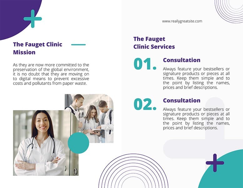
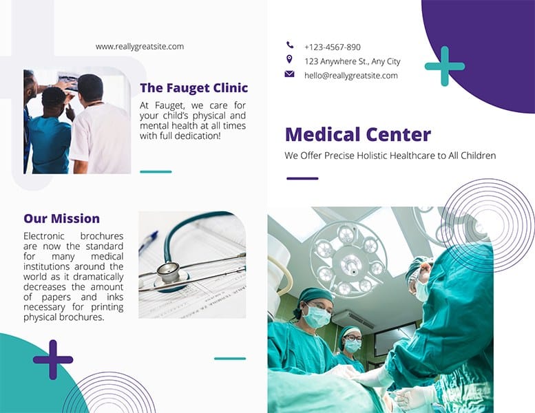
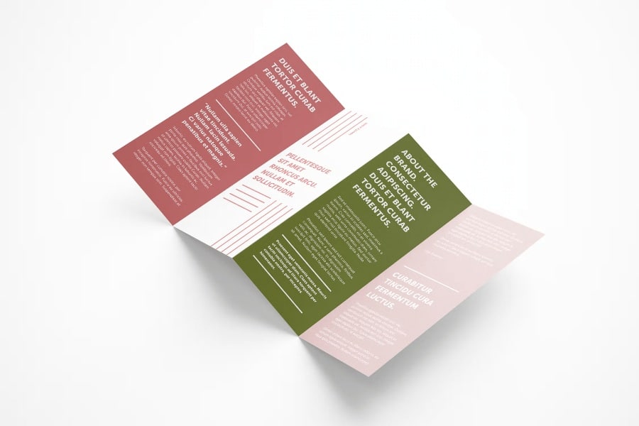
One of the key principles in designing a brochure—or any type of marketing material—is to balance text, white space, and images effectively so you don’t overwhelm your reader. A tried-and-true brochure design idea for readability is to use images to organize information, like in the example above.
Alternating images and text makes for a simple, easy-to-understand brochure design, and is a good option if your business is on the more technical side, such as a medical clinic or a tech startup. Keep this brochure as simple as possible by only including only the most essential information you want audiences to know, like best-selling products, featured services, and mission and vision statements.
2. Go Bold With Tri-folds
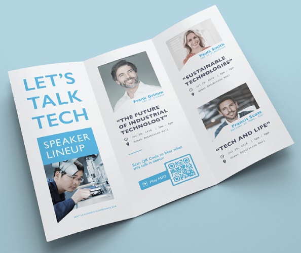
Brochure design takeaway: Tri-folds are one of the most recognizable company brochure ideas. To keep them interesting, go bold and creative with your designs.
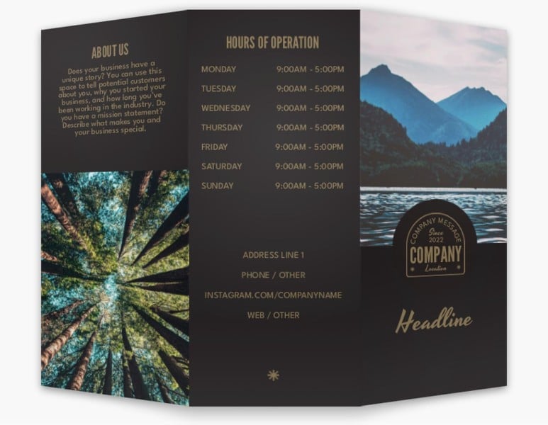
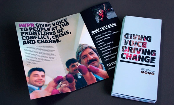
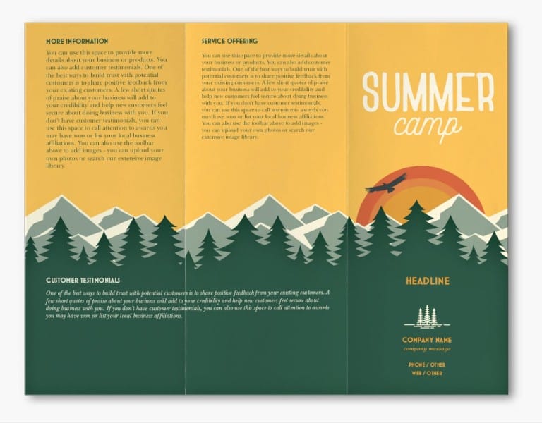
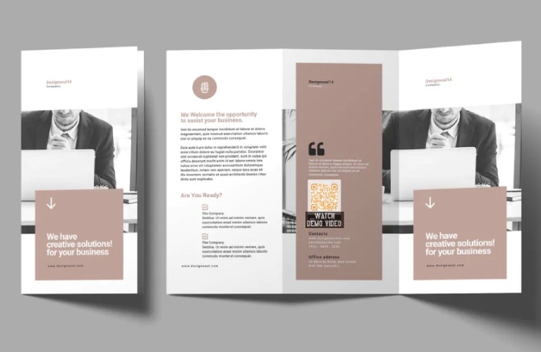
Tri-folds are one of the most common and well-recognized business brochure ideas design-wise, but that doesn’t mean they have to be boring. With six panels, tri-fold brochures can easily hold and organize lots of information, and a good way to capture people’s attention and make them pick up your brochure is by using bold and creative designs. Think bold typography, or full-page images and graphics.
Although they have more pages, a typical tri-fold will be slimmer in width than a bi-fold brochure. This makes it more convenient for your audience to pick up. Thus, they can easily be placed on the front desks of restaurants, spas, or any business with more products to feature.
Need a free resource for images? Our list of the best places to get free images for website design is a treasure trove of creative assets for brochures, websites, and newsletters.
3. Spread Out Designs Across Z-folds
Brochure design takeaway: For brochure design featuring an infographic, such as a timeline or step-based process, spread a continuous design using a Z-fold brochure.
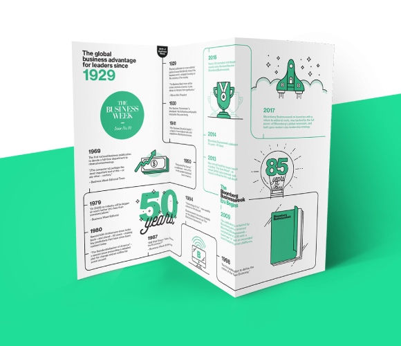
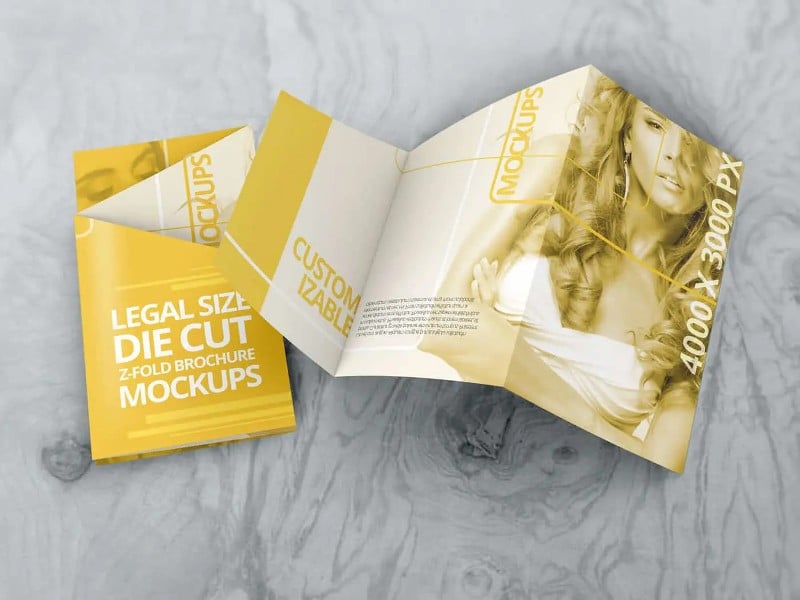
You’d be forgiven for thinking Z-fold brochures are the same as tri-folds, but there is one key distinction: Z-folds are created by making a double bend in a zigzag pattern, instead of a panel on the left and right that unfold like cabinet doors.
This makes Z-fold brochures a good option for spreading out images and designs continuously, as in the examples above. Z-folds are also one of the best brochure design ideas for holding infographics or showcasing timelines and processes.
4. Tell Your Brand Story With Accordion Brochures
Brochure design takeaway: Accordion brochures make for a great narrative experience. Use them if you have a brand story to tell.
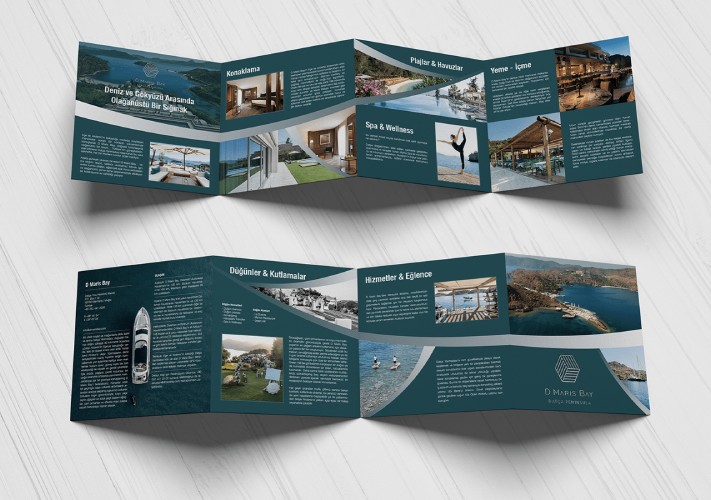
Accordion brochures have the same format as Z-folds, but instead of three panels, you can have multiple pages (usually six or seven). This leads to more space for information, and you can go big and bold with your visuals and fonts—great for telling your brand story, but in a more streamlined and concise manner than through booklets or catalogs.
5. Stand Out With Die-cuts
Brochure design takeaway: Stand out easily from competitors by incorporating die-cuts that represent your brand in your pamphlet design ideas.
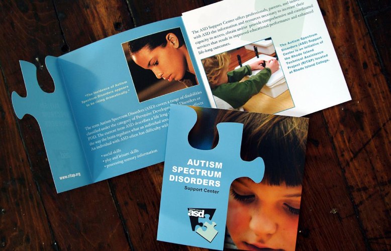
Beyond the usual square and rectangle brochures, an easy way to stand out from the pile of direct mail is with custom die-cut brochures. While die-cut brochures are undeniably more effective at branding than simple ones, they do cost a little extra, so we recommend saving them for special events like conferences, opening ceremonies, and fairs where it’s more vital for your brand to stand out.
A die-cut brochure gives your business a truly unique flair and is far better for building a strong brand presence. And, it can also easily tell customers about your brand and what it does at first glance.
You don’t have to reinvent the wheel to take a die-cut brochure design idea from concept to reality, either. Many of the best places to order business cards offer die-cutting for a range of marketing materials, including brochures.
6. Use Geometric Shapes
Brochure design takeaway: For a fully custom, luxe look, opt for geometric shapes that will set your brand apart in any marketplace.
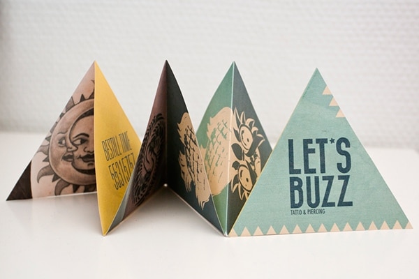
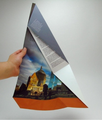
Another way to make your brochure memorable is to go full-on custom with an out-of-the-box format, such as a geometric shape. The brochure ideas above use a process similar to die-cutting and allow for a variety of brochure folding options.
7. Design Vertically
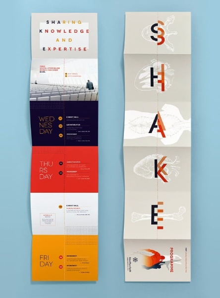
Brochure design takeaway: Laying out your content vertically is one of the best simple, yet creative brochure design ideas. For best results, use an accordion fold.
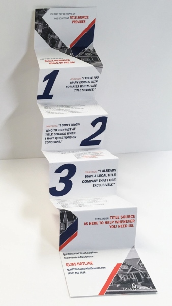
For one of the most creative brochure ideas, look no further than this brochure-poster hybrid. Though it uses the basic accordion fold, it reads lengthwise, making for a more interesting reader experience. As the examples above illustrate, vertical brochures can be great for showcasing a series of events or steps in a process.
When designing your brochure, don’t limit yourself to the usual layouts of the format. Go fully creative with your brochure design ideas on how you want to display your information to make it as memorable as possible for your readers. “Drop-down” brochures, like in the brochure designs above, are unique and affordable to create and are great for organizational information.
8. Take Creative Cues From Origami
Brochure design takeaway: If you have a creative or art-related type of brand, incorporate techniques like origami to infuse artistry into your brochure’s design.
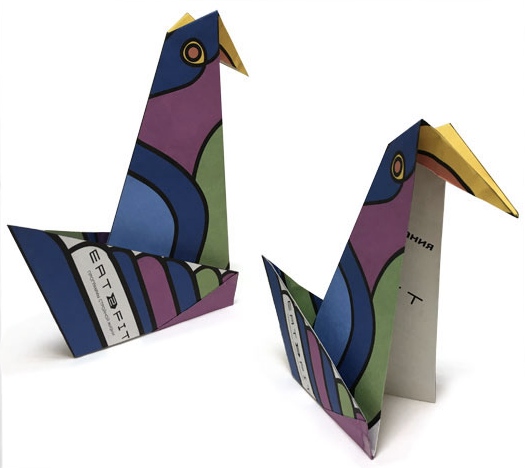
Origami is the height of paper art, so why not incorporate it into your brochure designs? Whether you choose to completely adapt the art form into your brochure or just take and adapt some elements, origami brochures are one of the most unique brochure ideas. No doubt readers will come away with a memorable impression of your brand, and they aren’t too difficult in terms of content layout either.
Because of its uniqueness, the type of brands and companies that would benefit best from these types of brochures are those that lean more creative or design-centric, such as architectural firms or art museums and exhibits.
9. Go Digital With E-brochures
Brochure design takeaway: Brochures can be digital too. One of the best digital brochure ideas is incorporating interactive elements (e.g., clickable buttons, page turns, and slideshows) and video.
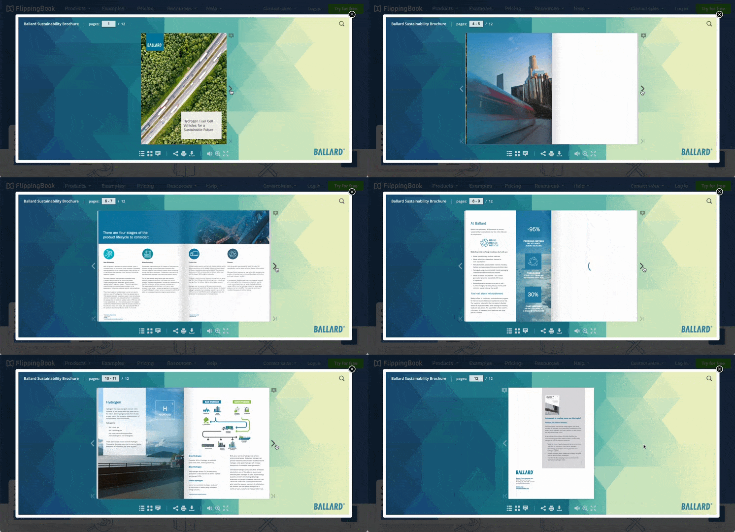
A digital brochure is a very interactive marketing tool. (Source: Flippingbook)
E-brochures (short for electronic brochures) are not only helpful for extending your digital presence, they’re also cost-effective since you won’t need to worry about printing costs. This type of brochure differs from static website images as it’s interactive, evergreen, able to hold lots of information, and easily recognizable as a source of information. Plus, e-brochures are easily downloadable as a comprehensive source of info about your business.
Aside from relative affordability, there are many benefits to adding e-brochures to your digital marketing strategy. They can be shared across a variety of platforms, audience views and engagement can usually be tracked easily (e.g., by including a call-to-action button with a tracker), and you can include elements like sound and video to enhance your brochure.
10. Use Video-in-Print Brochures for Pitches & Product Demos
Brochure design takeaway: Video brochures are one of the most unique brochure ideas—send them to your closest clients and customers at special events.
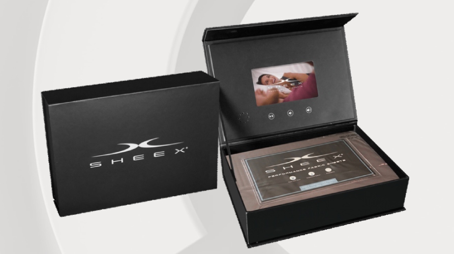
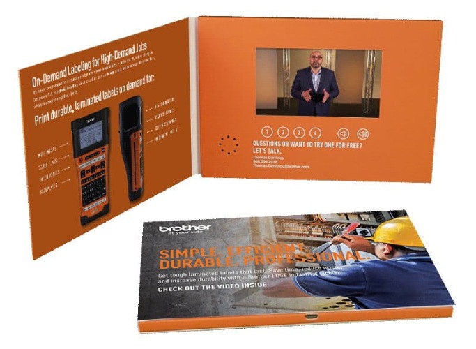
If you have a product that would benefit from a demo; for example, a high-value tech gadget, there are few more memorable brochure design ideas than video brochures. For obvious reasons, video brochures are a cut above regular paper ones—they feature a small LCD screen placed inside a thick booklet—but they can also boost your brand recognition by up to 139% more.
If you have the budget, video brochures are a guaranteed way for customers to remember your brand. Each piece will run you between $20 and $40, so they’re not made for mass production. Use them for your most valuable customers and clients instead.
11. Drive Prospects to Your Website With a QR Code
Brochure design takeaway: QR codes on your brochure designs are an easy and effective way to send web traffic to a landing page, product page, appointment booking app, or even your main business website.
If you’re hesitant about going fully digital with an e-brochure, a good middle ground is to include a QR code in your brochure’s content. That way, you can include all the main information about your business in your brochure, and then viewers can scan the code and visit a landing page or your website to learn more.
In short, beyond just growing your brand awareness, adding a QR code expands your brochure’s functionality and lets you create more diverse marketing campaigns. Plus, you can easily track your campaign’s effectiveness by adding a trackable link to your QR code.
Did you know? Dedicated landing pages increase conversions by eliminating distractions and offering site visitors a clear call to action. Check out these effective landing page examples and find out what makes them work.
12. Produce Functional Brochures
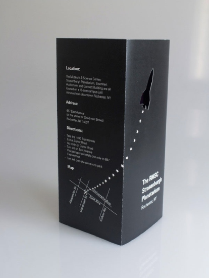
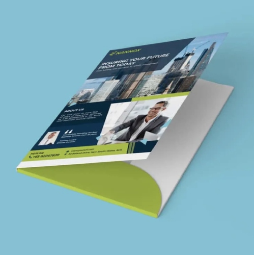
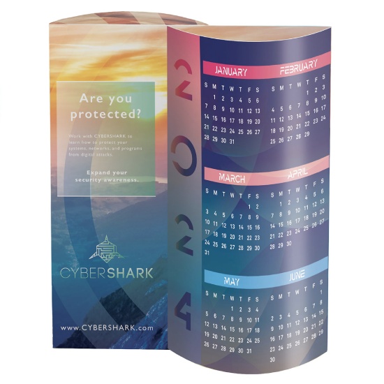
Brochure design takeaway: Give something your customers will find useful—it’ll increase your chances of brand recall.
A tried-and-true adage in marketing is to give your customers value—i.e., give them something useful that they’re more likely to keep rather than simply discard. The reason is simple: The more they keep your brochure around, the higher your chances of being remembered. With brochures, a simple way to do this is to incorporate useful content like calendars and maps or even design your brochure as a folder they can reuse.
Pro tip: Need more real-world brochure inspiration? Check out 20 more real-life brochure examples from small businesses.
What Makes a Good Brochure: Best Practices
Whether print, digital, or video, your brochure is a visual representation of your brand, so it’s a given that its design should be consistent with your overall branding. Brochures are one of the most well-established marketing assets around. Therefore, to stand out, there are a few things you’ll need to consider.
Here are the elements of a good brochure design to keep in mind when thinking up brochure and pamphlet ideas:
- Clear objectives: Every good marketing asset starts with a clear objective. Identify what you want to accomplish with your brochure, whether it’s to simply raise awareness or market a product. Your objective will guide the overall design and content of your brochure.
- Eye-catching, on-brand visuals: Of course, your brochure shouldn’t look like a legal document—it should be eye-catching enough that people will want to pick it up and read what’s inside. Design your brochure following proper design principles while staying consistent with your branding. You can design on an online platform like Canva or VistaPrint, or hire a freelance designer via sites like Fiverr.
- High-quality images: Part of having good visuals is to use high-quality images. A brochure is a very visual medium, so make sure each image you use is of high quality—the last thing you want is your brochure’s images to come out pixelated. If you’re using original photos, use a professional camera and do test prints first to make sure they’re printed clearly.
- Effective copy: While your copies will differ depending on your brochure’s objective, use customer personas to write compelling copy that speaks directly to the pain points your prospects and customers want to solve. Don’t try to be everything to everyone—choose just the most compelling selling propositions.
- The right balance of content: Not all brochure content is created equal. A travel agency, for example, will want more photographs and less text, while a consulting company may want the opposite. Make sure the content you include is valuable, well-organized, and has a clear user journey.
- A compelling call to action (CTA): Effective calls to action are short, compelling, and actionable. It should tell your audience what to do and how to do it in 10 words or less. Write a CTA that clearly explains what you want the reader to do, establish a sense of urgency, and illustrate the benefits they’ll receive.
- Appropriate format: Brochures come in different shapes and sizes, from classic tri-folds to modern digital ones. Make sure the brochure format you choose is appropriate to your main objectives, content, and overall brand. For instance, if you own a creative agency, a die-cut brochure would probably help you stand out best.
- Quality materials: Little details like your brochure’s paper material also count toward how customers perceive your brand. A classic card stock works perfectly well for most brochures, but you may also want to consider craft stock for a more artisan feel or gloss for extra shine, depending on your brand. For digital brochures, make sure all visuals are high-quality, even on mobile screens.
Pro tip: Staying on-brand matters. Studies show that consistent branding helps build trust and loyalty with your audience. See these other branding statistics you should know about when drafting brochure design ideas.
Best Brochure Design Tools & Resources for Small Businesses
Creating a brochure doesn’t have to be expensive. In fact, most of the brochure design ideas above can be done yourself. Plus, there are many online platforms with professionally designed brochure templates you can edit to fit your brand’s needs. Or, there’s always the option to outsource the design job to a seasoned graphic designer.
Here are some of the best resources for bringing your business brochure design ideas to life:
Free graphic design tools, artwork, and templates | Printing services for marketing materials and branded merch with online design tools and templates | Low-cost subscription for unlimited downloads of artwork, graphics, templates, video, music, and fonts | Affordable professional graphic design services for brochures and more |
Frequently Asked Questions (FAQs)
You can design a brochure by using an online design platform, such as Canva or VistaPrint, which also offers printing and delivery services. Or, if you have a printer and printing materials at home, you can simply download your finished designs and print them yourself. If you want a more custom brochure design, you can hire a professional graphic designer from Fiverr starting at $5 to create a design for you, and then find a separate printing service.
Some of the biggest brochure design trends for 2023 include mixing bold typography, using vibrant color schemes, and going beyond the traditional rectangular brochure shapes. Many brochures this year also incorporate illustrations like line art or 3D design elements, while others opt for a more minimalist layout with lots of white space.
The three most important things for making an effective brochure are compelling copy, good design that follows your branding, and a clear call to action that meets your campaign objectives. While these are the three most essential brochure traits, some other important elements are high-quality images, good content balance, and an appropriate brochure format and material.
Bottom Line
Brochures are one of the oldest, tried-and-true assets in marketing, and their continued relevance in the digital world is a testament to that. Whether in its traditional printed form or as a fully digital asset, brochures are a trustworthy and comprehensive source of information customers can use to learn about your business—and, they’re cost-effective to make. Design brochures for your small business today using our top easy-to-use design tool, Canva.
