

Good landing pages are captivating, well-designed, and have a single clear call to action, ultimately increasing conversions. They combine compelling language and effective design to motivate visitors to convert into customers. To fuel your inspiration, we rounded up the best landing page examples from around the web and explained why they work to convert site visitors.
- 1. Apple Airpods Max: High Design Inspires Desire to Buy
- 2. Zova: Appeals to the Core User Goal
- 3. Taboola: Double CTA Guides the Customer Journey
- 4. Elespacio: Let the Work Speak for Itself
- 5. Zenefits: Try Before You Buy Offer
- 6. Juicy: Sign Up & Be the First to Know
- 7. SpyFu: Try It Out for Free
- 8. Battesti Associes: Put the Portfolio to Work
- 9. Curology: Personalized & Curated Experience
- 10. Smart City: Reinforces the Site Visitor’s Decision (& Ego)
- 11. Pet Milestone Cards: Directs Site Visitors With Imagery
- 12. A Place for Mom: Multiple-choice CTA
- 13. Winc: Animation Delivers the Selling Points
- 14. Recess: Subscribe to Save Money
- 15. Tofu Design: Generates Leads With Design Style
- 16. Seal+Co: Use Experience to Inspire Trust
- 17. Axiology: Offer a Discount to Increase Sign-ups
- 18. ConvertCart: Provide Social Proof
- 19. Burga: Get Engagement With Interactive Elements
- 20. Aplós: Appeal to Lifestyle Aspirations
- 21. Later: Promise Subscribers a Clear Advantage
- 22. Webconf.asia: Deliver Timely Information
- 8 Ideas for Increasing Landing Page Conversions
- Key Statistics of High-converting Landing Pages
- Frequently Asked Questions (FAQs)
- Bottom Line
1. Apple Airpods Max: High Design Inspires Desire to Buy
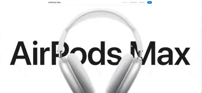
Apple Airpods Max’s landing page (Source: Apple)
Apple has several great landing page examples, including the product page for Airpods Max. It has a clean, high design that distinguishes Apple from other brands. This creates a sense of aspiration in site visitors to own the featured product. Moreover, it uses a mix of font sizes and widths to highlight key features and comparison tables that help visitors make purchase decisions.
Aside from how the information is presented, Apple makes generous use of high-quality visuals and parallax scrolling. Parallax scrolling is when the images in the foreground and background move at different speeds, giving a page more depth and visual interest. Wix and HubSpot, which are both on our list of the best landing page builders, offer the ability to create similar visual interest.
2. Zova: Appeals to the Core User Goal
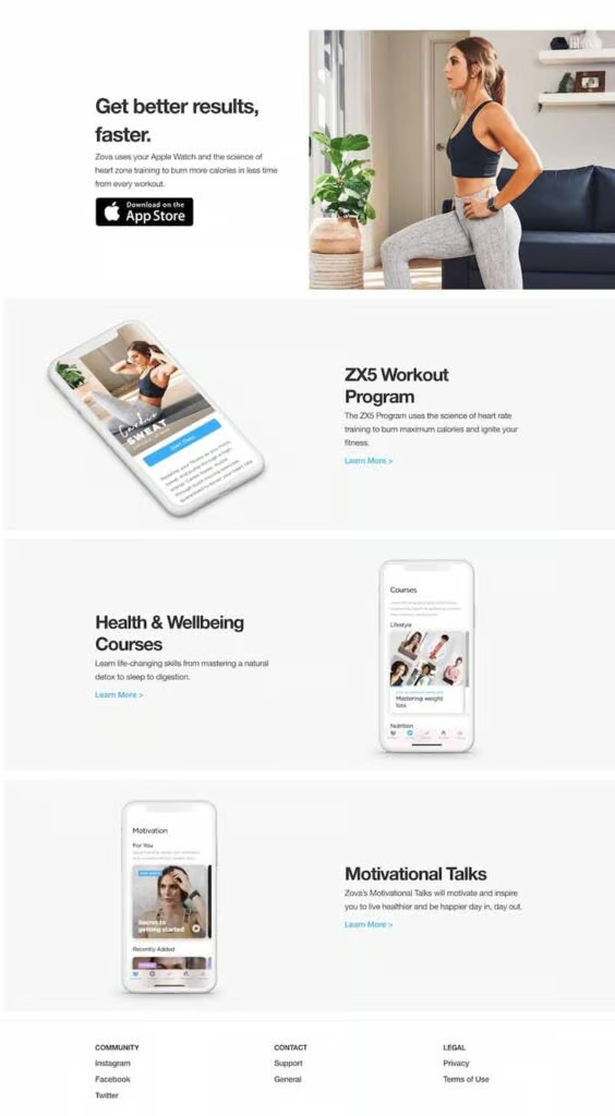
Zova’s simple, but compelling landing page (Source: Zova)
Zova is an excellent example of how simple landing pages are often highly influential, especially for personal apps. Instead of presenting a long and complicated page with all the information about the product, it briefly explains the benefits users get from the app in the hero section of the page.
This is immediately followed by a prominent app download button call to action (CTA) that takes site visitors directly to the app’s download in the Apple store. If a site visitor needs more reasons to get the app, they can scroll down for more, but for those ready to act, having an immediate CTA button facilitates immediate conversions.
3. Taboola: Double CTA Guides the Customer Journey
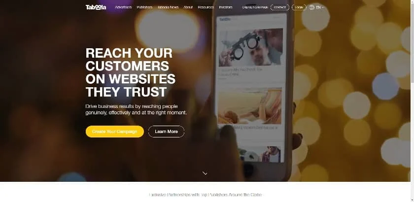
Taboola’s landing page offers users two CTAs. (Source: Taboola)
Taboola’s home page is where most of its site traffic originates. Like Zova’s example, it summarizes its primary selling proposition in the hero section. It then offers two call-to-action (CTA) buttons placed side-by-side.
A site visitor ready to buy can get started, whereas someone who isn’t quite ready can access information that might persuade them to take action. Together, these calls to action guide the customer journey—all above the fold. This makes it one of the best landing page examples for businesses offering professional services.
4. Elespacio: Let the Work Speak for Itself

Elespacio’s landing page follows the “show, don’t tell” to a tee. (Source: Elespacio)
Elespacio’s website home page immediately captivates with a full-screen video background. But beyond being visually compelling, it also follows the tried-and-true “show, don’t tell” principle in storytelling by using examples of the agency’s work to build brand presence.
This helps site visitors visualize the results they can get and how they’ll benefit from the company’s services. It’s creative, visually appealing, and compelling, and like all the best landing pages, it wraps everything up with clickable CTAs.
5. Zenefits: Try Before You Buy Offer
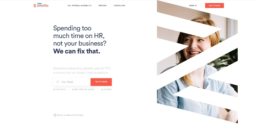
HR platform Zenefits’ landing page uses a free trial as a compelling CTA. (Source: Zenefits)
Zenefits is human resource (HR) software. Its landing page draws you in by referencing a common pain point (spending too much time on HR) and following up with a free trial offer. If you’re still unconvinced, you can scroll down to learn more about its products before signing up. The CTA is visually clean and simple, adding to its appeal, as it requests only an email address to access the free trial.
6. Juicy: Sign Up & Be the First to Know
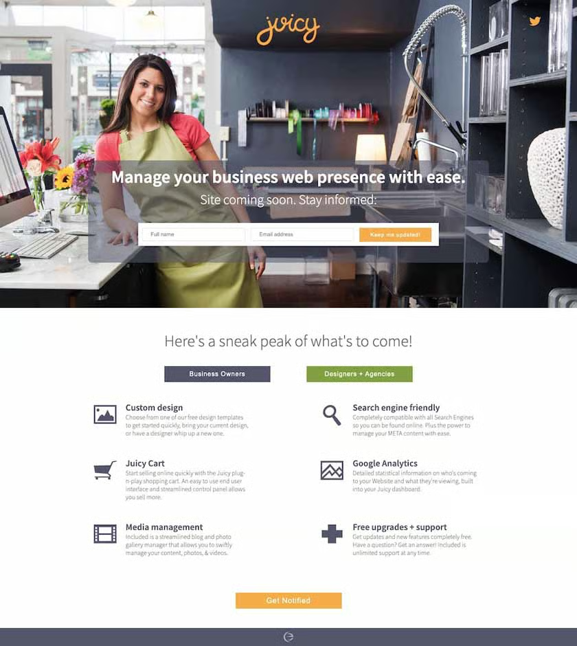
Juicy’s “coming soon” landing page (Source: Juicy)
If you have a website currently under construction, it’s best practice to leave a live page users can visit in the meantime, also known as a “coming soon” page. A coming soon page can still help you build your business by adding a call to action to sign up for site visitors who want to be the first to know.
The example above appeals to multiple audience types (business owners vs agencies and web designers) to maximize conversions. Moreover, having CTAs both above the fold and at the end of the webpage ensures that no matter where the visitor looks, they can sign up for the waiting list.
7. SpyFu: Try It Out for Free
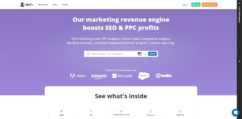
Analytics software SpyFu’s landing page (Source: SpyFu)
Analytics software company SpyFu’s home page allows users to test-drive its service by entering a domain (e.g., fitsmallbusiness.com), specific page URL, or keyword. It’s a tried-and-true strategy—showing users how your service works firsthand before requiring them to sign up helps establish trust. Plus, it also helps get high-quality leads interested in your product.
SpyFu also provides testimonials and reviews further down in the content. This builds on the established trust and supports its value claims, further convincing visitors to convert.
8. Battesti Associes: Put the Portfolio to Work
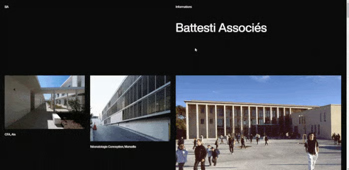
Battesti Associes’ landing page streamlines visitors’ attention. (Source: Battesti Associes)
Architecture firm Battesti Associes’ website home page displays images of past projects, thus eliminating the need to build a separate portfolio. Sparse use of text pulls the site visitor’s focus toward the images, then concludes with a simple call to action to get in touch.
Using your portfolio as the main component of a landing page is beneficial in more ways than one. It allows your work to speak for itself, but it also allows your audience to self-identify by immediately understanding if your design style, industry, or type of work is what they are looking for.
9. Curology: Personalized & Curated Experience
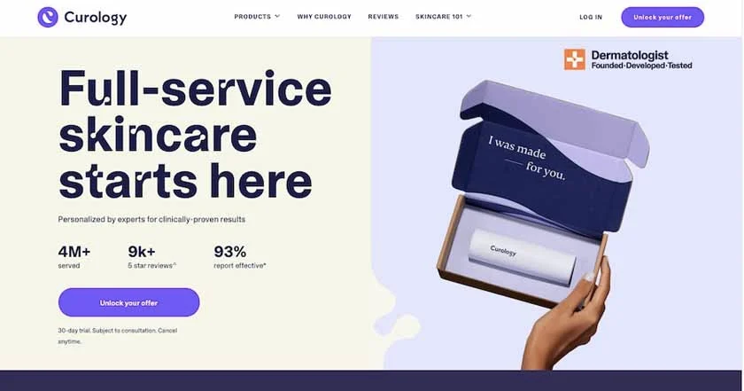
Skincare brand Curology’s landing page (Source: Curology)
Curology’s landing page promises site visitors a custom, personalized, and exclusive-feeling offer with specific results. They place statistics directly above the CTA as social proof to support the claim made in the headline, thus attracting more clicks and conversions. Overall, it’s a great example of how effective copywriting, social proof, and impactful visuals work together to create a high-converting landing page.
In addition, Curology makes great use of color. It divides the page into two, making the selling proposition and call-to-action button stand out. Learn more about how to use colors effectively in web design by reading our guide on how to pick a website color scheme.
10. Smart City: Reinforces the Site Visitor’s Decision (& Ego)
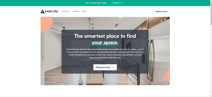
Real estate website Smart City’s landing page (Source: Smart City)
As with SpyFu’s example above, real estate company Smart City invites visitors to engage immediately by choosing a location of interest. Features like this that elicit immediate engagement reduce your site’s bounce rate (the rate at which visitors immediately leave a website). In turn, it also boosts your search ranking.
Moreover, the page’s copy also appeals to users’ egos. It essentially praises the site visitor’s intellect by telling them they’ve found the “smartest place” for their real estate search.
11. Pet Milestone Cards: Directs Site Visitors With Imagery
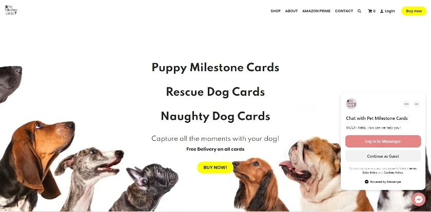
Pet Milestone Cards uses clever visuals to direct attention to what matters. (Source: Pet Milestone Cards)
Have you ever been in a public place and noticed people staring in one direction? Chances are you were immediately compelled to direct your gaze to the same spot. This landing page from Pet Milestone Cards draws your attention to the offer and CTA using a clever background image loaded with cuteness.
All the dogs are looking toward the button, thus directing the visitor’s eyes to where they need to click. Aside from smart use of imagery, it also features a clean banner and easy navigation, as it’s a one-page website. One-page websites are de facto landing pages—check out our list of the best one-page website examples to see why.
12. A Place for Mom: Multiple-choice CTA
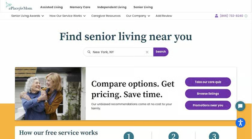
A Place for Mom’s website landing page with multiple CTAs (Source: A Place for Mom )
A Place for Mom has a simple and lighthearted home page with a heartwarming image, which works well with the emotional subject its website covers. However, as an online directory, it still remains functional and engaging by providing visitors with a menu of actions, from a search bar to buttons for quizzes and promotions.
This is an excellent example of how you can include multiple CTAs on your page without your design looking disorganized or distracting. Whichever button visitors choose, it still brings them a step closer down the sales funnel and converting into a lead.
13. Winc: Animation Delivers the Selling Points
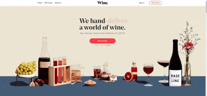
Winc’s landing page stands out for its simple but impactful text animations. (Source: Winc)
Winc combines relevant images and concise messaging to create an effective landing page example that converts. It also stands out for using impactful animations in its headline that showcase the variety and quality of its services. Then, it converts site visitors with a “Get Started” CTA button in the same color as the animated text.
14. Recess: Subscribe to Save Money
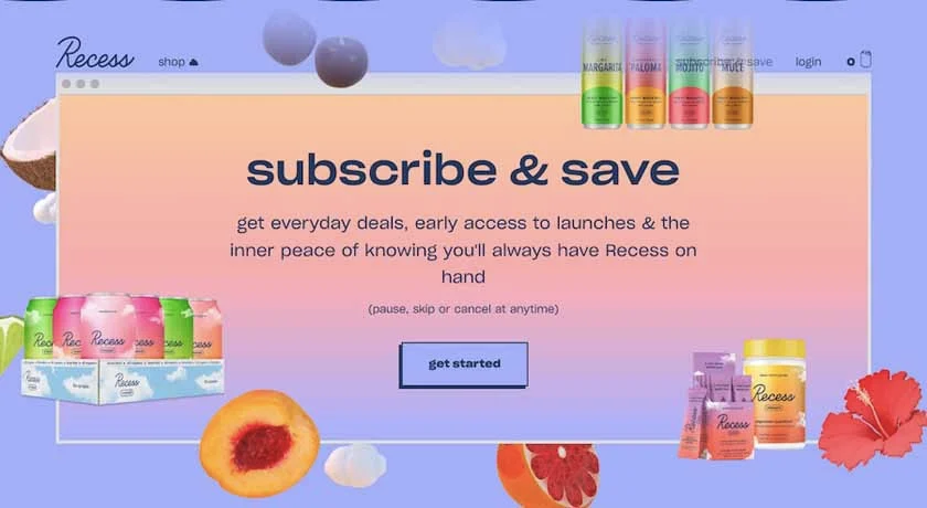
Recess’ landing page for subscriptions combines youthful creativity with a conversational copy. (Source: Recess)
Startup beverage brand Recess’ “Subscribe & Save” page is a newcomer to our list of the best website landing page examples. It captivates with color and creative, highly stylized branding, but it’s especially effective for its conversational, but compelling copy.
The heading immediately delivers the “how” and the “why” in three words: subscribe and save. And on the whole, all of the text feels simple and friendly, which works to convert the brand’s target market of young adults on a budget.
15. Tofu Design: Generates Leads With Design Style
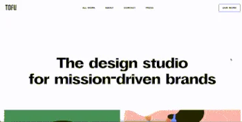
Tofu Design’s landing page gives a full user journey. (Source: Tofu Design)
From bold headlines to colorful, interactive graphics, the home page of design studio Tofu Design conveys the distinct design style of the brand. This works to convert site visitors who like the type of designs showcased with an invitation to start a conversation about their own project.
In one scroll, visitors get an introduction to the studio, portfolio examples, a testimonial, and a CTA to get in touch, which leads to an email form. While it isn’t a one-page website, it functions similarly to one by giving visitors a comprehensive tour on a single page.
16. Seal+Co: Use Experience to Inspire Trust
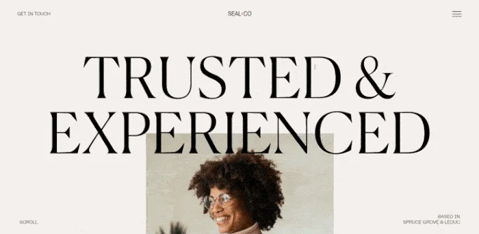
Accounting firm Seal+Co’s landing page (Source: Seal+Co)
Firms that deal in money matters often have to build trust just to generate leads, let alone convert them. Accounting firm Seal+Co’s visually impactful landing page leverages the company’s experience and expertise to convert site visitors. The page also uses parallax scrolling and interactive drop-down boxes to create on-page engagement while giving users an overview of what to expect from the company.
17. Axiology: Offer a Discount to Increase Sign-ups
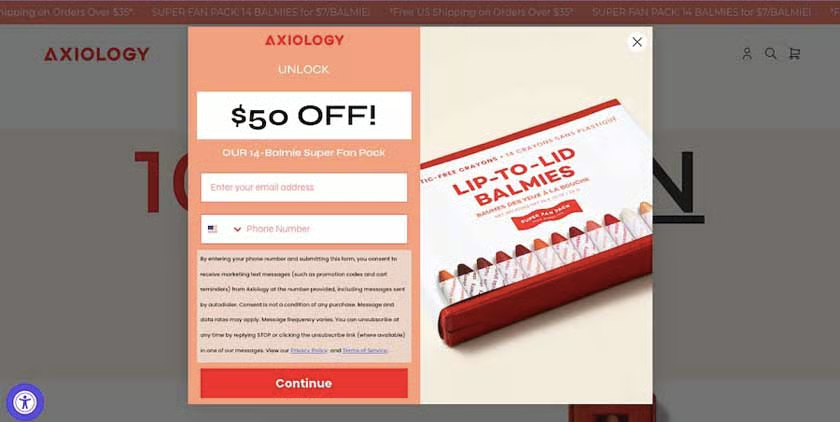
Axiology’s landing page for their discount offer (Source: Axiology)
Offering a discount is an effective way to get first-time site visitors to volunteer as leads by providing their email addresses and phone numbers. This is a proven way to build lists for text as well as permission-based email marketing for lead nurturing. This is precisely what makes Axiology one of the best small business landing pages.
The pop-up landing page offers an enticing $50 discount in exchange for the site visitor’s email address and phone number. It uses a simple, clear CTA followed by a two-field web form, terms and conditions, and a “Continue” button. Like Curology, it also uses color blocking effectively to draw the eye to what’s most important.
18. ConvertCart: Provide Social Proof
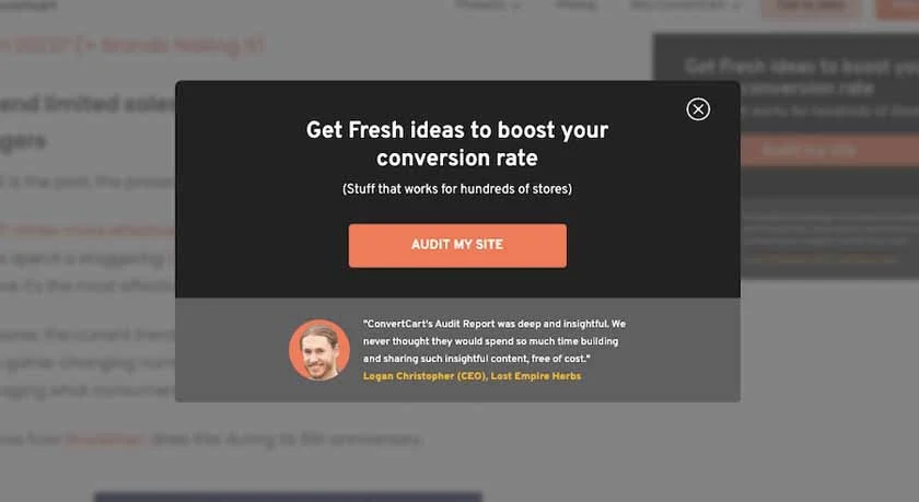
A landing page from ConvertCart (Source: ConvertCart)
Testimonials are a proven way to drive conversions. They build trust with prospects by using an “objective” third-party point of view to establish your company’s credibility. In fact, studies found that positive reviews were up to 94% more effective in influencing people to try out a business.
ConvertCart’s landing page employs this tactic well. The page is simple, using short, well-written copy and a call-to-action button at its center. Just below this, the page offers social proof in the form of a testimonial from one of the company’s clients. The testimonial even features a headshot to go along with the quote, further increasing its credibility, altogether making for a high-converting landing page strategy.
19. Burga: Get Engagement With Interactive Elements
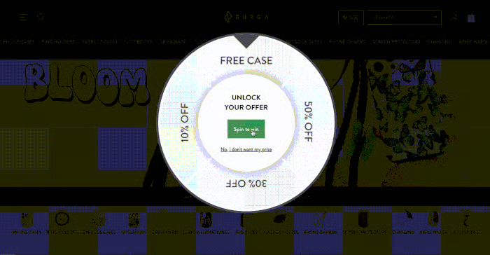
Burga’s interactive and dynamic landing page (Source: Burga)
Some of the best examples of landing pages are dynamic and interactive, like that of the accessories brand Burga. It includes an element of gamification by mimicking a “spin the wheel” game, immediately inviting visitors to engage with it. Website visitors only need to click a button to spin the wheel and instantly win a discount or a free case—with the caveat that they provide contact information to redeem the prize.
It’s a great example of using animation and interactive elements to create a positive user experience for visitors and entice them to convert. The landing page starts by being interactive, then it offers customers a benefit, before leading to the final sign-up form—creating one of the best-converting landing pages in the process.
20. Aplós: Appeal to Lifestyle Aspirations
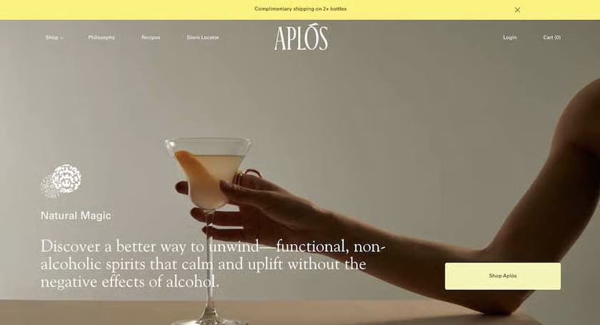
Aplós’ website home page makes for an effective landing page. (Source: Aplós)
The most effective landing pages have a single clear message. An excellent example of this is the home page of Aplós’ website. Its hero banner image has a luxe feel accompanied by brief, persuasive copy and a clear button as a call to action to shop the site’s products. The messaging appeals to those who want to abstain from alcohol but don’t want to miss out on the events and lifestyle that often go hand in hand with dining out and entertainment.
As the home page of the brand’s website, the landing page works great because it focuses the site visitor’s journey and leads them toward conversions. It’s well-designed with a modern and elegant layout that reflects the business’s branding.
21. Later: Promise Subscribers a Clear Advantage
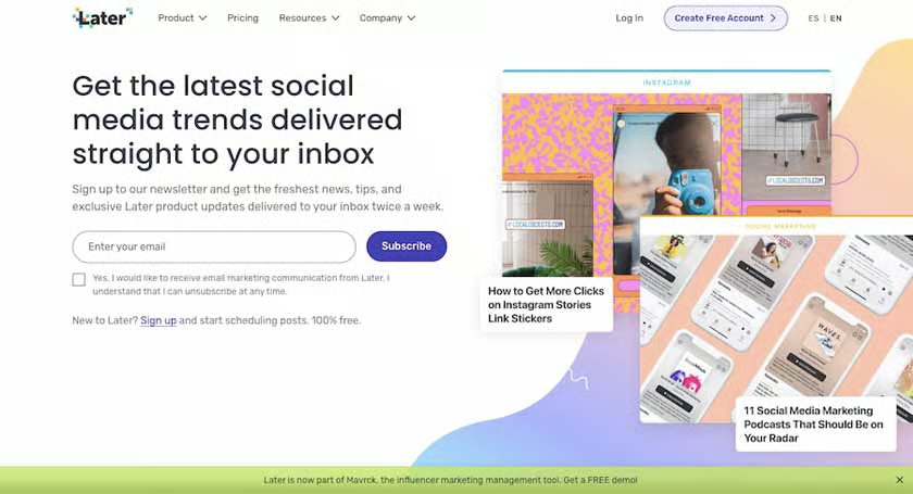
Later’s newsletter sign-up landing page (Source: Later)
It goes without saying that the best landing pages are attractive and eye-catching. But for email newsletter sign-ups, vibrant colors and great use of whitespace will only get the site visitors’ attention. To convert the subscription, you need to tell the site visitor what’s in it for them. One of the best examples that combine both is Later’s newsletter sign-up page.
Later’s landing page combines great visuals with short but effective copy that promises to give subscribers the latest trends and tips on social media. The page’s visuals even provide a taste of the content subscribers can expect from the newsletter. Combined with the one-field email sign-up CTA, it’s a tried-and-true formula for creating effective landing pages that convert.
22. Webconf.asia: Deliver Timely Information
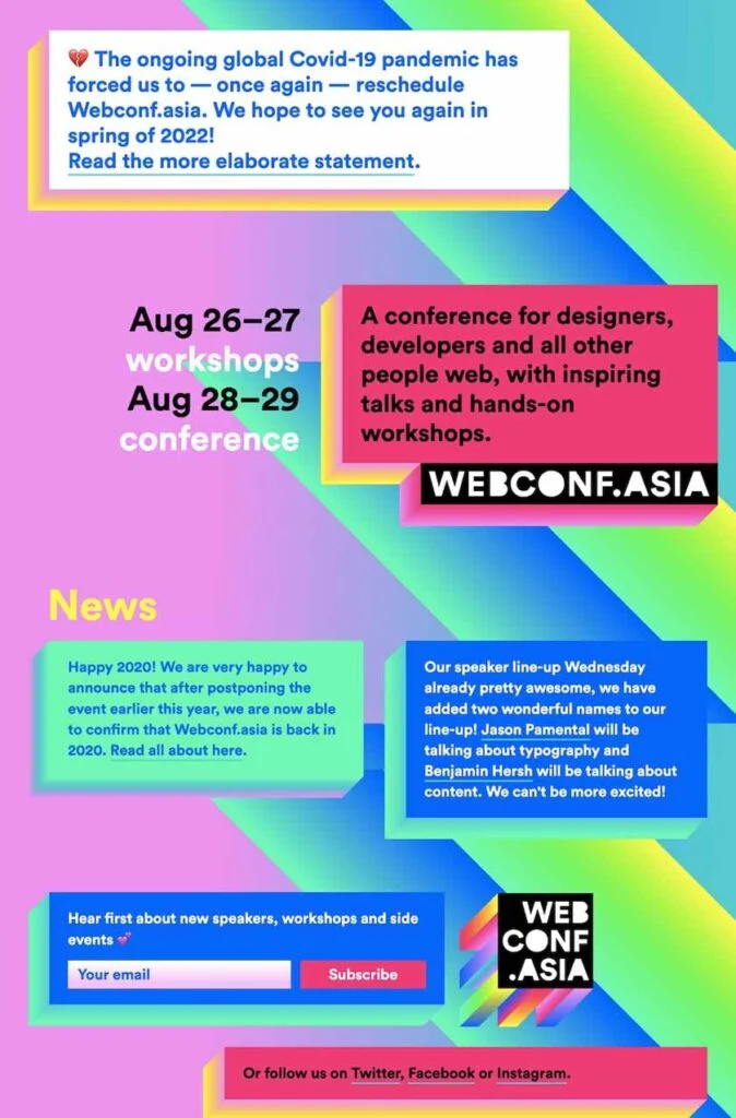
Webconf.asia’s landing page with announcements and news about its annual event. (Source: Webconf.asia)
If you have a website for a regular event like an annual conference, it may only be relevant to your audience during specific times of the year. However, it’s still best practice to leave a live landing page that tells site visitors what is coming next (and when) and allows them to sign up for email or text updates.
A great landing page that illustrates this perfectly is that of Webconf.asia, an annual web design conference. The page is simple to navigate but still engaging and informative, with their latest announcements in the hero section. The rest of the landing page features other news and bold and colorful designs, then concludes with a newsletter sign-up form and CTAs to social media pages.
8 Ideas for Increasing Landing Page Conversions
Landing pages are a versatile marketing tool for everything from generating leads to increasing sales. However, as the examples above show, there are some strategies and best practices that the best landing pages have in common, like providing some kind of incentive or appeal for the site visitor to take action and making it very easy for them to do so.
Here are a few more ideas to keep in mind to create effective landing pages that convert:
- Use concise, persuasive writing: Landing pages have a singular goal—to motivate visitors to perform a specific action, whether inputting their details into a form or completing a purchase. Use simple, clear, and persuasive language in concise copy, and don’t over-complicate instructions or use industry jargon or complex terms.
- Have a headline and subheadline: Dividing your text into a clear headline and subheadline makes it more readable and lends to brevity. Place the most important information (i.e., the incentive, pain point, or unique selling proposition) in the headline, then add a supporting sentence or two as a subheadline.
- Include a clear call to action: Your page should have a clear and easily accessible call to action (CTA). Whether it’s a form field or a button, ensure your CTAs are visible, offer easy-to-follow instructions, and can be easily completed.
- Design it well: One thing that holds all the elements of a landing page together is good web page design. Lean into the elements that make for a good website, like visual hierarchy, readable fonts, and proper spacing, among others.
- Provide an incentive: Incentives work exceptionally well for producing conversions. Whether a special discount or a free gift, offering users a meaningful perk can instantly increase landing page conversions.
- Use high-quality visuals: As several of the examples above prove, a significant part of what makes landing pages appealing is their images and graphics. Choose visuals that support your selling point, illustrate your prospect’s pain point, or appeal through aspirational, humorous, or emotion-evoking images.
- Make your case above the fold: Most landing pages convey the main message and CTA in the hero section. While some viewers may be looking for more information, you’ll get the most conversions if you put your selling proposition and call to action at the top.
- Test variations: If your landing page isn’t producing the number of conversions you think it should be, tweak one element at a time. This allows you to systematically test ways to increase conversions and discover which messaging, CTA, or imagery is most effective.
Key Statistics of High-converting Landing Pages
Now that you’ve seen some of the best landing page examples, you may be wondering what a good conversion rate for landing pages is. Anything above 5% is typically good, but the best landing pages can see conversion rates of 20% or more.
For perspective, a study by Unbounce found that the average conversion rate for landing pages is currently at 4.89%. However, this number varies from industry to industry. Here are other vital landing page statistics to keep in mind:
- On average, landing pages with clickable elements like buttons are 7.2% more effective than those with sign-up forms.
- In 2021, 47% of businesses used video on landing pages. And it’s effective—experts found that video can increase conversions by up to 80%.
- Placing a landing page section above the fold on a website can increase conversions by up to 14%.
- Tailoring landing pages to your ideal customer persona can lead to an 11% conversion rate increase.
- Landing pages that load in one second are 17% more effective in converting customers compared to those that take five seconds to load.
Frequently Asked Questions (FAQs)
What is a landing page & how does it work?
In simple terms, a landing page is a specific web page that people “land” on after interacting with an advertisement or a marketing campaign. They can contain anything from sign-up forms to special promotions, but the primary purpose is to incite users to take a specific action, like entering contact details or completing a purchase.
What should a landing page include?
At the very least, a landing page should include a short, persuasive copy and a clear call to action (CTA). While these are its primary components, the best landing pages also include a high-quality image or video, a testimonial, or a special incentive for users.
What are the three types of landing pages?
The three common types of landing pages are marketing landing pages, sign-up form landing pages, and website home pages. Marketing landing pages are promotional and often motivate customers to purchase a specific product or service, sometimes with a special offer or incentive.
Sign-up form landing pages are meant for lead generation and require visitors to enter an email address, phone number, address, or other contact details. Finally, landing pages can also exist as the home page of websites—specifically those that incite visitors to take a specific action.
Bottom Line
A good landing page is essential for many different types of digital marketing strategies. As the examples above prove, the best combine strategic elements and best practices to build pages that effectively convert visitors into customers. Whether you’re promoting a specific product or generating more leads, use the examples above for inspiration to create an effective and well-designed landing page for your business.