Ever clicked on a website link, but instead of seeing the main content, you were redirected to a page with a big, bold message and a call-to-action button? You were probably sent to a splash page. Splash pages are introductory pages or a specific section of a website. Learn more about what splash pages are and go through our curated list of best splash page examples to inspire your own.
Purpose of Splash Pages vs Landing Pages vs Pop-ups
Splash pages are mostly used as introductory screens for websites or as a promotional tool. How it’s specifically used depends on the industry or niche of the business. For example, it can be used to verify information (like confirming if you are above the legal drinking age on a site selling alcohol) or to gate content by requiring users to log in or subscribe first.
Now, there can be some confusion between splash pages, landing pages, and pop-ups. Since splash pages can also be set to trigger based on a visitor’s action, it’s understandable why people find it hard to differentiate the three. The difference comes down to how each tool functions on your site.

Splash page example by Zara (Source: Zara)
Splash pages are used for gating content, directing visitors, and sharing a broad message. Think of a website splash page like a receptionist or security guard. It’s ensuring that only appropriate visitors enter a site or see specific pages, direct visitors in the right direction, or share a general message all incoming visitors need to know.
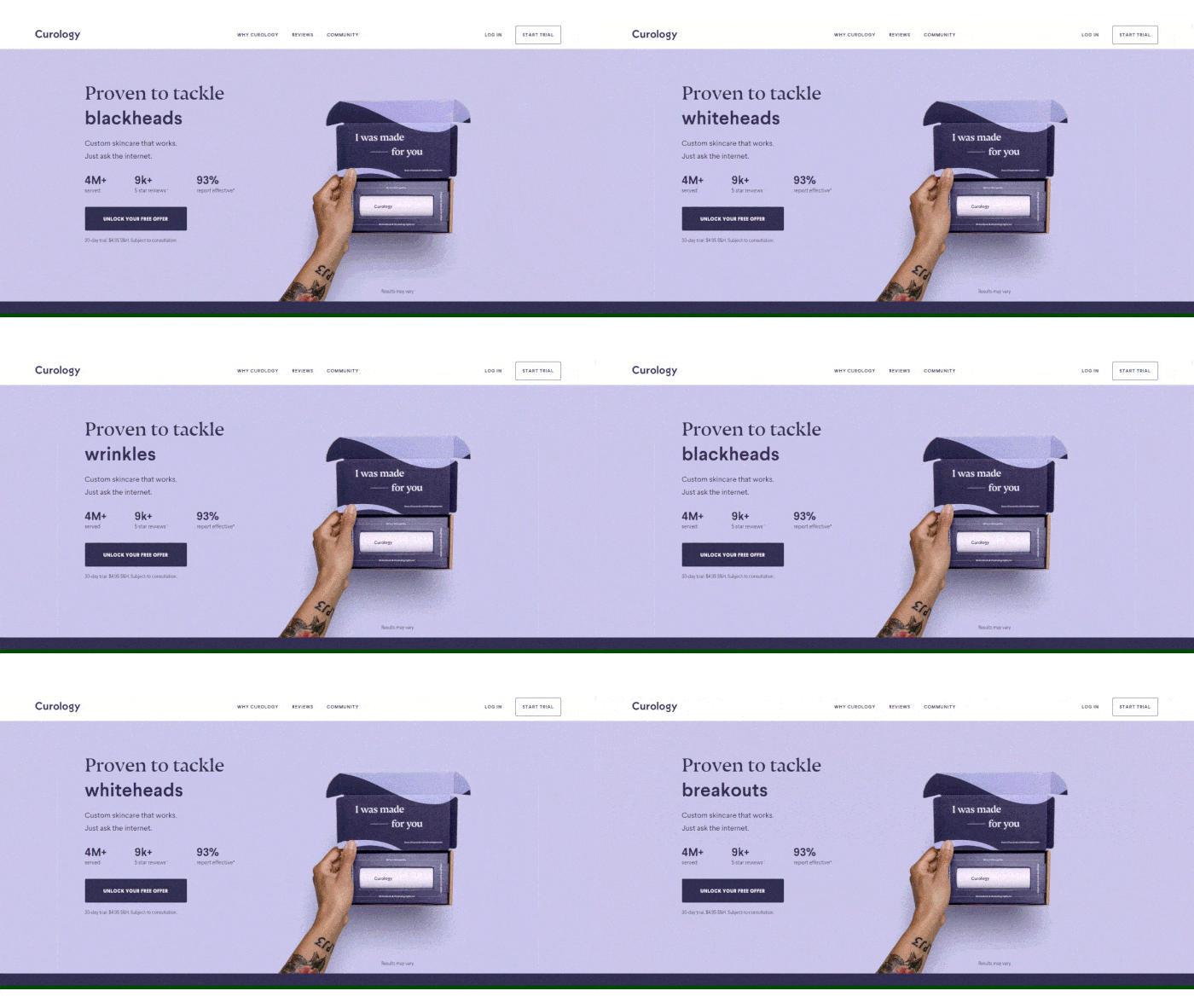
Curology landing page example (Source: Curology)
A landing page is a standalone page used to generate and convert leads from paid ads, such as Google Ads, email marketing campaigns, and so on. Landing pages, unlike splash pages, are designed to correspond with a specific sales or marketing campaign. Learn how to make a landing page and find out more about what they are.
Alternatively, get more insights with these landing page examples.
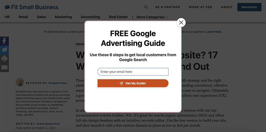
Pop-up example on Fit Small Business website (Source: Fit Small Business)
As the name suggests, pop-ups appear after a visitor has already entered your site. Like a splash screen, a pop-up is often displayed to all site visitors, as opposed to a landing page that is only displayed to the visitors who arrived on your site via a specific marketing campaign. However, unlike a splash page, a pop-up is typically used to advance a short-term promotional message or sale.
Another area of confusion when it comes to splash pages is how they differ from one-page websites. While a splash page may look like a single-page website, it is designed to be a navigational element for a website. If you aren’t looking to redirect visitors to other content on your site, head over to the best one-page website for examples for more about this kind of page.
What to Include on Splash Pages
Each splash page differs depending on the purpose and the industry. However, these common elements of splash pages can be found in most of them. Remember that your splash page should be clean and organized. Don’t bombard site visitors with content, but at the same time, make leverage elements like these to help build a strong brand for your business.
- Background image
- Branding elements (logo, color palette, etc.)
- Headline
- Call to action (CTA)
- Supplementary copy (like instructions or disclaimers)
- Additional graphics or videos
As you read through the list of splash page examples below, take note of how they used each of these elements.
When to Use Splash Pages
Besides introducing your home page, splash pages can precede other pages of your website, like a product or service, an online store, or an events calendar. Here are some of the most common business types and use cases for splash pages:
- Age-sensitive websites (e.g., alcohol, tobacco, or gambling-related sites)
- Subscription or membership websites
- Businesses with multiple locations where site visitors will be looking for one nearby, such as for location-based pizza delivery
- Large, multinational companies with multiple websites by country
- Businesses that serve many different audiences with specific needs
- Requiring a signup to access content
- Service businesses that serve only certain geographical areas (e.g., Uber-type services)
- Businesses with major news (e.g., change of location, recent acquisition)
- Businesses promoting upcoming events
Also, remember that splash pages typically don’t include much information. They’re meant to introduce certain sections of your website, whether it’s the homepage, a list of services, or your store.
15 Best Splash Page Examples & Why They Work
Now that you know exactly what a splash page is, let’s look at some of the best splash page examples on the web. If you’re brainstorming on how you want your splash pages to look, seeing how others use them is a great way to get ideas and inspiration for building your business website.
Here are 15 of the best splash page examples from around the web for inspiration:
1. Patrón
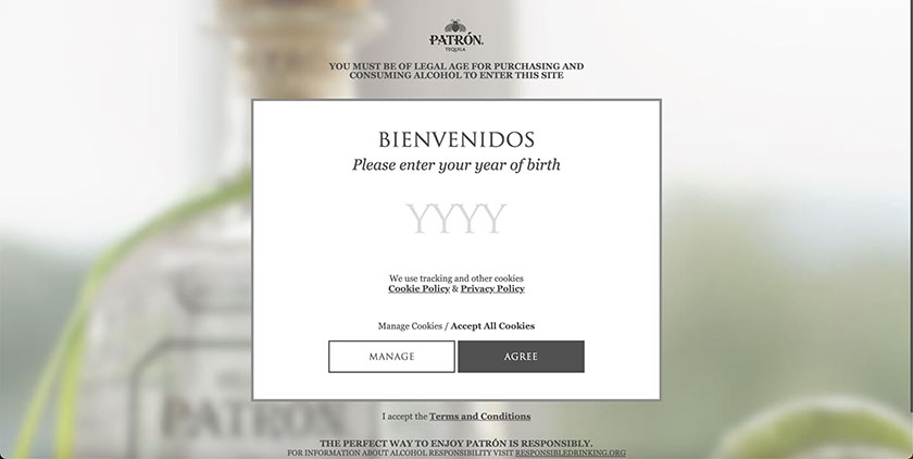
This splash page example is used to gate age-sensitive content. (Source: Patrón)
One way businesses use splash pages is to gate content. For example, liquor and alcohol brands nearly always use a splash for visitor age verification, such as this one from Patrón Tequila. Top website builders like Wix make it easy to add splash pages to gate off content on your website.
Why It Works
- Pleasant welcome message: Instead of a boring message to make visitors aware that website content is meant for a specific age group, this splash page makes the interaction more pleasant with a warm welcome.
- Informative background image: The image of the liquor bottle in the background lets the visitor know why the step is necessary.
- Simple copy: The use of the box element in the middle of the page makes the CTA clear and not too overwhelming.
2. Mango
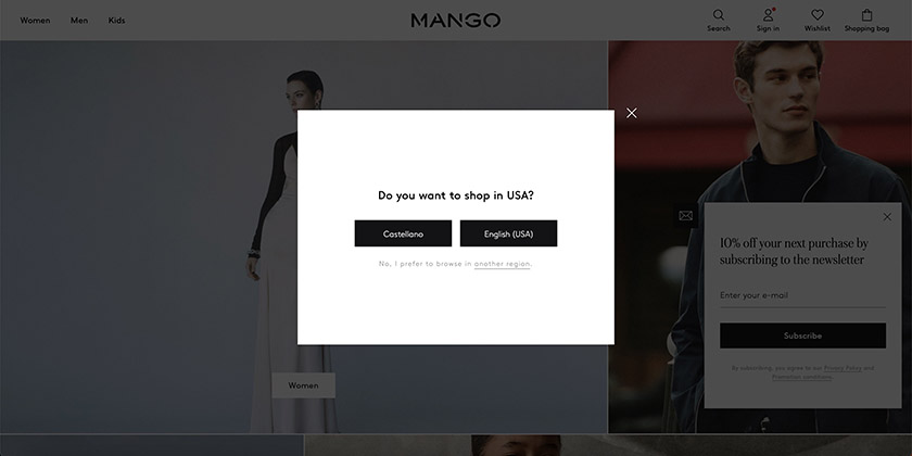
This splash page by Mango confirms that you want to shop in the U.S. (Source: Mango)
Multinational brands can use splash pages to direct visitors to the right language version of their website. In this example, Mango uses a splash page to guide visitors to its region-based websites to make sure they’re shopping on the website appropriate to their location.
Why It Works
- Clear and easy CTA: Instead of the usual drop-downs with locations, the button options make it easier and faster for the viewer to digest what the splash page is for.
- Clean design: The minimalist approach matches the sleek Mango website, which helps to support a strong brand presence. Although there is no branding element, it is still recognizably theirs and not out of place because of the matching colors, fonts, and modern feel.
Looking for the best website builder for multi-language sites? We listed Webnode as the best option for multilingual sites in our list of the best drag-and-drop website builders. With the PROFI plan ($22.90 per month), you can build websites in unlimited languages.
3. Matteo Greco

Redirect viewers to different web pages with a splash page. (Source: Matteo Greco)
The Matteo Greco website provides an example of how you can use a splash page creatively. It effectively redirects visitors to view four different web pages, of which three are different portfolios.
Why It Works
- Showcases work: It showcases his work with a full-screen hero image.
- Easy access to web pages: It funnels different sets of audiences in the right direction and gives them what they came to the site for immediately.
- Eye-catching background: The bright and eye-catching background image is memorable—a valuable first impression for small business websites.
Want to make your web pages as striking and visually appealing as this splash page? You can do it by choosing the right color scheme and incorporating it into the page.
4. The New York Times
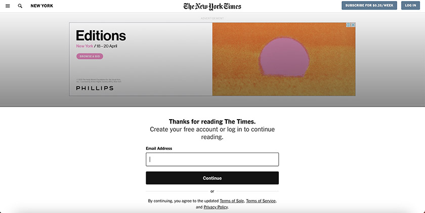
Encourage subscriptions by gating content via splash pages. (Source: The New York Times)
The New York Times provides a good example of how businesses can use a splash page to gate content via subscription. In this case, The New York Times allows visitors to consume a certain amount of its content without an account. Once you reach the time limit, you’re faced with the splash page that notifies you that you need to subscribe in order to continue reading.
Why It Works
- Simple CTA: Clearly articulates the CTA with only one field to fill up.
- Compelling approach: It allows you to view a tiny portion of the article’s introduction, making people want to read more, and thus sign up.
- Well-written headline: Utilizes the headline well, since a “Thanks for reading” is a positive spin to the usual “Log in to continue access.”
Coming up with an atttention-grabbing headline is easier said than done, but help is available. Check out our list of the best AI content writers to use with help writing titles, web content, and more.
5. BLK Cosmetics
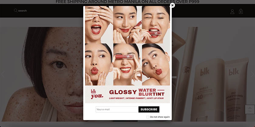
Use splash pages for more than one reason to maximize the page’s value. (Source: BLK)
You can use a splash page for more than one purpose, and BLK Cosmetics does an excellent job of doing this on its website. BLK Cosmetics is a cosmetics company that regularly releases new products. Although the CTA is to get users to subscribe to the email newsletter, BLK also uses the splash page to promote these new product lines.
Why It Works
- Stellar product photography. The splash page looks like an ad in itself with appealing photos of the product and how they’re used.
- Dual-purpose. Encouraging people to sign up for the newsletter and promoting new products go hand-in-hand, especially if the email campaigns include new product vouchers.
6. Facebook
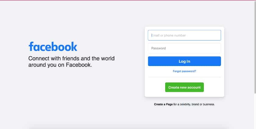
Facebook uses a log-in splash page to limit content to members. (Source: Facebook)
Facebook utilizes an extremely simple splash page to effectively gate off content to users who aren’t logged in. This is one of the most common use cases for the page and is typically seen with email providers, social media platforms, and other sites where you store personal information on an account.
Why It Works
- Easy to understand: The no-nonsense splash page directs users to either log in or sign up with no confusion.
- On-brand: Facebook’s logo and slogan take up a good portion of the page, which is good for branding.
- Good use of color: The viewer’s eyes are drawn to the elements in color: the Facebook logo and buttons.
7. Blackbird Bakery
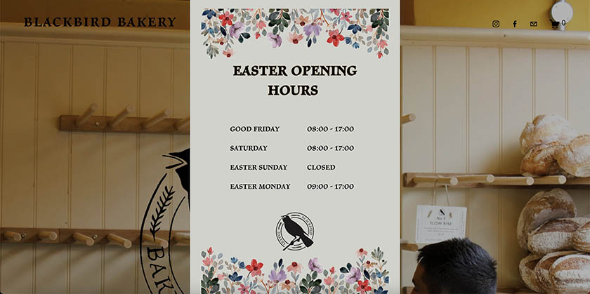
Blackbird uses a splash page to announce their schedule on holidays. (Source: Blackbird Bakery)
Splash pages can be used for time-sensitive announcements. In this case, Blackbird Bakery used a splash page to inform customers about their new temporary schedule for Holy Week. This is usually seen in businesses offering food and services like restaurants, bakeries, health centers, etc. In addition to announcements like these, you can coordinate splash pages with your coupon marketing strategy for max impact.
Why It Works
- Mobile-friendly: The splash page’s size and orientation are mobile-optimized. This is especially on point for websites whose primary traffic comes from mobile users.
- Design fits the brand’s personality: The light and floral design complements the lighthearted charm of the Blackbird Bakery website.
- Straightforward copy: The schedule is clear and easy to understand, with no irrelevant content included.
Did you know? By the last quarter of 2021, mobile devices accounted for 63% of all organic search visits. Find out more mobile search stats in our Google Search Statistics article.
8. Postmates
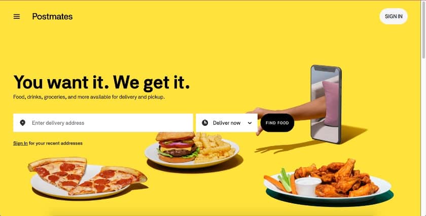
Narrow where your customers can order for an easier experience. (Source: Postmates)
Postmates’ food delivery service provides a good splash page example for businesses that service different geographic areas. This example sorts out where customers are located and which restaurants they can order from. This helps narrow down your customers’ selection. Plus, it helps avoid headaches for people coming to your site only to find later that they can’t actually order from the restaurant they want.
Why It Works
- Enticing background photo: The background image shows different food products they deliver. The media itself is high-quality and appetizing.
- Clear value proposition: Instead of using the headline and copy to say what the splash page is for, it reiterates the business’ value proposition “You Want It. We Get It.” which helps encourage users to order.
9. Food Network
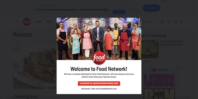
Lead viewers to the type of content they would prefer. (Source: Food Network)
Food Network has two websites: AsianFoodNetwork.com and FoodNetwork.com. They use a splash page to welcome their site visitors and inform them of their two sites. The GoDaddy website builder is an affordable option to create a simple splash page similar to this.
Why It Works
- Easy opt-out: The opt-out or exit link is clear and just below the CTA button, preventing any possible frustration from the viewers who want to continue to the site as is.
- Simple design: A simple design ensures that your splash page loads quickly and minimizes site visitors from bouncing.
- Valuable copy: Aside from welcoming people to the site, this splash page also briefly explains why the viewer would want to move to the other website.
10. Chase Center
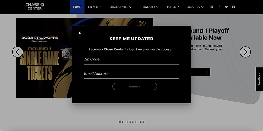
Chase Center uses its splash page for lead generation. (Source: Chase Center)
One of the most common purposes of splash pages is sales lead generation. Chase Center encourages visitors to give their information by guaranteeing presale access and valuable information to their “insiders.”
Why It Works
- Easy-to-load design: As one of the simplest splash page examples on this list, this is sure to load quickly and encourage users to sign up for permission based email marketing
- Customer-centric headline: Instead of using something generic like “Sign up for our newsletter” which is business-centric, this splash page’s headline shows what signing up can do for them.
- Iterates value of the CTA: In a single sentence, Chase Center uses the supplement splash page copy to highlight how signing up can benefit the viewer.
11. Duolingo
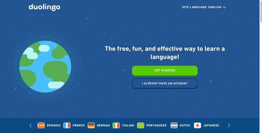
Duolingo’s splash page has different language icons to choose from. (Source: Duolingo)
Duolingo, an online language learning platform, uses a splash page for visitors entering the site to help visitors quickly find the right language tools for them. It uses icons to represent different sections of the site. You can source these types of icons online fairly easily, starting with the providers on our list of the best places to get free images for website design.
Why It Works
- Quick and easy access: The language selection bar at the bottom helps direct visitors to the content they’re looking for with a single click.
- Shows brand personality: The design for Duolingo’s splash page is not far off from the general feel of its app and website. This makes it easy to be recognized and shows off brand identity.
Need more website inspiration to go with your splash page website ideas? Check out our curated list of the best small business website examples for 2023.
12. Asana Rebel
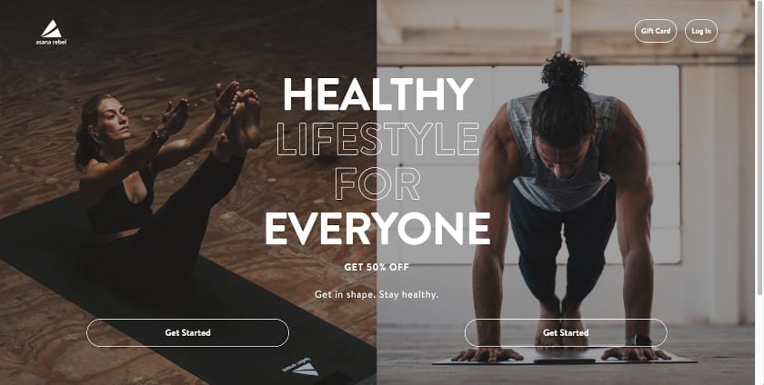
You can choose either male- or female-oriented workout plans on Asana Rebel’s splash page. (Source: Asana Rebel)
Splash pages are also commonly used for membership sites and subscription-based services to allow non-members to quickly sign up. Asana Rebel uses its splash page for registration, but at the same time, it directs users to specific content depending on their sex and fitness goals.
Why It Works
- Industry-specific content: In the fitness industry, it is important to find out specific information about the customer to provide effective recommendations. Asana’s splash page managed to collect crucial information right from the beginning of a person’s visit to their website.
- Comes with supplementary promotional info: Not only is the headline encouraging users to sign up, but the supplementary copy also promises 50% off, which doubles down on getting the site visitor to click.
13. Rustic Cuff
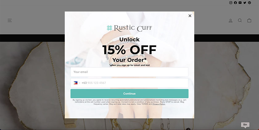
Splash pages can be used to relay promotional messages. (Source: Rustic Cuff)
Rustic Cuff encourages site visitors to sign up for its email and text marketing campaigns by sharing a 15% discount voucher. This is a strong use of splash pages in ecommerce sites since it can generate leads and entice customers to make purchases at the same time. Check out our list of coupon examples and ideas for more ways to leverage offers on your site.
Why It Works
- Strong branding elements: The design for this splash page might be simple, but it utilizes different elements of the page to showcase the brand. This includes the logo, company name, background image of their products, and brand colors.
- Highlights the discount voucher: The key to getting users to sign up for anything is emphasizing the benefits of doing so. The first thing you notice from this splash page is the 15% off.
14. Neil Patel
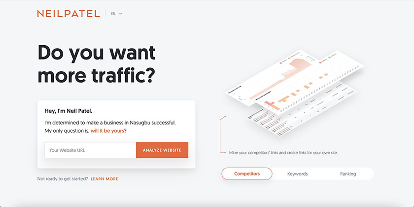
Neil Patel’s splash page invites users to try a free search engine optimization (SEO) analysis. (Source: Neil Patel)
Neil Patel, a well-known SEO content marketing expert, promotes his consulting services via a splash page that appears as soon as you enter his website. By entering your website’s URL, you get a free analysis that eventually directs you to a contact form. This is a great way to use splash pages to boost conversions–and who doesn’t want more traffic?
Why It Works
- Provides a “free sample”: A free sample or lite version of the services you provide can show the value of your work, which will lead to more conversions.
- Compelling headline: This splash page’s headline is succinct and effectively relays what the service can do for its customers.
15. Hozier
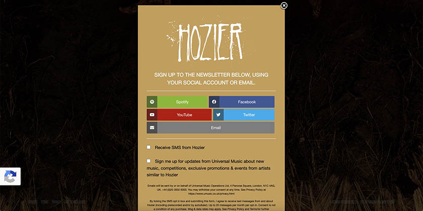
Use splash pages to promote your social media accounts. (Source: Hozier)
Hozier is a well-known musician who uses his website to promote upcoming music and events. The splash page drives fans to sign up for his newsletter and connect to his social media accounts. Hozier put it to good use by including different platforms, allowing fans to connect on the channels they prefer.
Why It Works
- Social buttons with recognizable icons: Viewers immediately know what the buttons are for, so it improves the user experience in connecting with the artist.
- Optimized for mobile: The size used for the splash page design and the plain text works great on mobile devices, which is where most people listen to music as well.
Frequently Asked Questions (FAQs)
Any good splash page should have a specific call to action (such as registering or logging in, or verifying their age) that is clearly communicated to the viewer. To make your splash page great, keep it short and sweet. At the same time, don’t neglect exit links that take site visitors to specific content on your site where they can access the information they want, continue a sign-up or login process, or close the splash page entirely.
Most content management systems (CMS) (e.g., WordPress, Wix, or Shopify) have tools or plugins that make it easy to create splash pages. For example, Wix and GoDaddy website builder users can set up splash pages right within the site editor. Alternatively, Unbounce is software you can use to create various types of splash pages for WordPress websites as well as the best website builders.
Essentially, any type of website can benefit from using a splash page since it can relay product launches, services, upcoming events, site variations, and important messages. Websites that also have other social media accounts can use a splash page to market their socials and boost their following. It is also best to use a splash page for multinational businesses to direct people to the right site.
Bottom Line
Splash pages enable you to help visitors access and navigate your site easily. Of course, they’re not for every business website, but if it is the solution you’re looking for, it’s a worthwhile investment of your time. Build your site on Wix or GoDaddy to easily create splash pages for site access or navigation, or to get an engaging splash page designed by a graphic design pro for as low as $5 on Fiverr.