Your website’s content is just half of the user experience—the other half is your website design. Some experts even argue that good website design is integral to good website content. The fact is, both play an equal part in your website’s search engine ranking and in providing a good user experience. When designing your small business website, here are 15 website design tips and best practices to have in mind.
1. Make Your Navigation Accessible
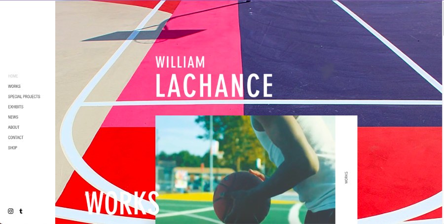
An example of great website navigation: the navigation bar sits neatly on the left side. (Source: William Lachance)
This is one of the foremost web design best practices, no matter what industry. Visitors need to be able to navigate around your website easily to find what they need. Therefore, your website navigation needs to be clear and easy to access from the moment they enter your website.
Think of your navigation as a map that they can easily grab to find what they need. The better navigation you have, the better experience customers will have on your site and the higher their chances of staying and revisiting. All those repeat visits will eventually help you rank higher on Google and boost your online brand presence.
2. Design for Mobile Screens First

Most internet users visit websites on their phones—ensure your site is mobile-friendly foremost. (Source: Puffin Packaging)
One of the most crucial website design tips for small businesses is to design for mobile screens first. While your instinct is probably to design for desktop screens, research shows that as of September 2023, 54% of all web traffic comes from mobile devices—a figure set to continue increasing in the next few years. That means that when building your small business website, keep in mind that it’ll have a much higher chance of being visited and viewed on a mobile screen.
Naturally, this means you should design and optimize your website for mobile screens first, then adjust it for desktops later on. It helps significantly if you use a top website builder platform that automatically supports both, like Squarespace or Hostinger. Find out more about your best options in our guide to the best website builders for small businesses.
3. Design With a User Journey in Mind
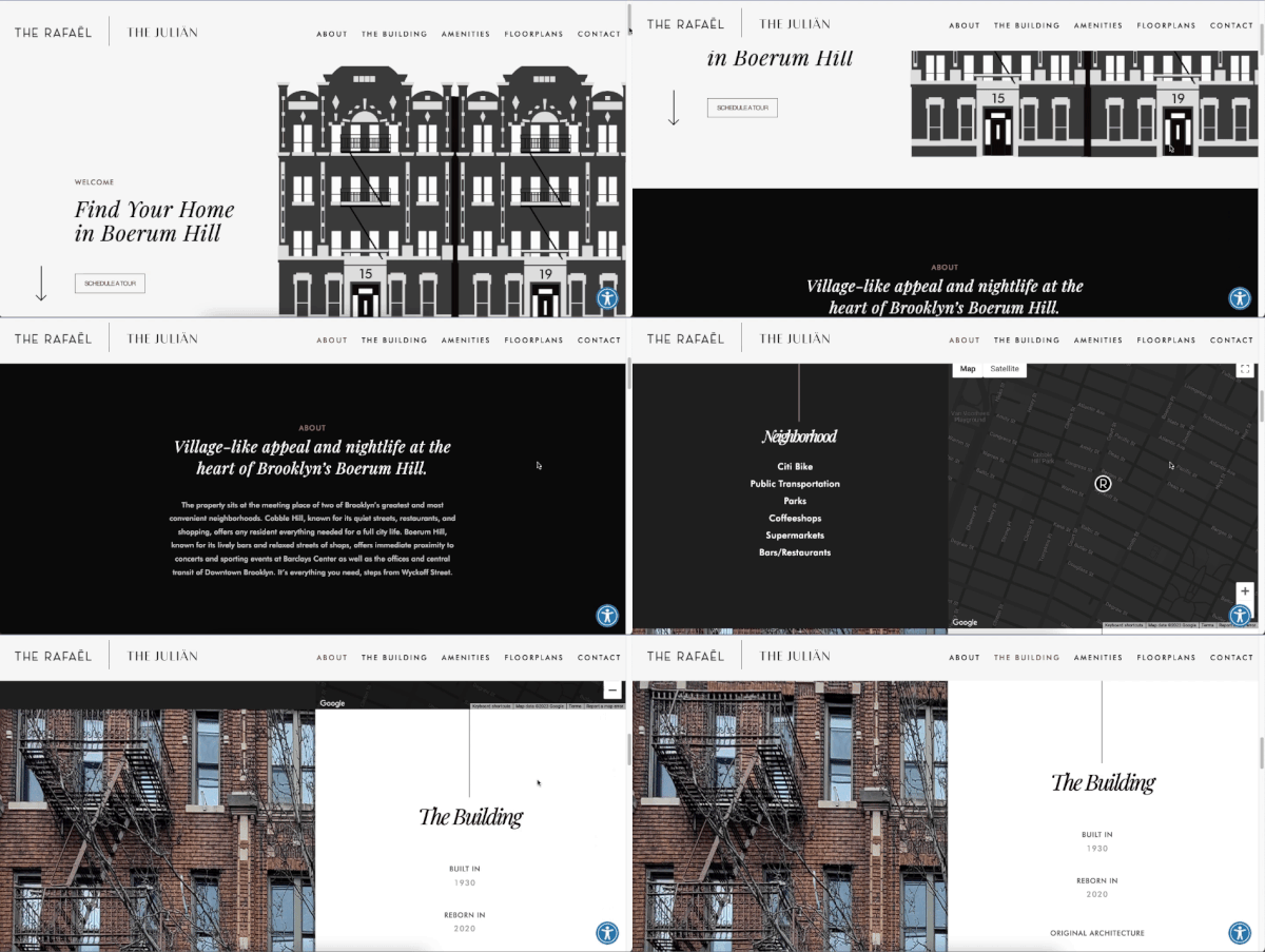
Center your website design on a user journey. (Source: The Rafael)
People don’t expect websites to be just images and text any longer. Customers are increasingly expecting a heightened user experience with their best interests in mind. This is why when learning how to design a good website, one of the best tips is to design with your users’ journey in mind.
This means not just placing what you think is the most important information about your business on the front page of your site. Instead, place yourself in your target customers’ shoes, then design the experience you want them to have when they visit your website. Do you want them to read about your brand story first or to immediately see your products? Make a plan of the journey you want visitors to take, then design your site around it.
4. Create an Interactive Experience

One of the best features of websites is their interactivity—use it to your advantage. (Source: FPP)
All websites are inherently interactive, but there are some ways to best utilize that trait to create a memorable experience that’ll truly leave an impression on visitors. One of the best tips is to design your website in a way that’ll motivate users to interact with it, like in the example above, which simulates a walk down a grocery aisle when you scroll.
Websites are a blank canvas. If you really want to impress, a great way is to go beyond the usual text and images. Create memorable experiences that’ll keep your visitors engaged with and interested in your website. It’s a double win: visitors stay longer, and you get more site interactions, both of which increase your site ranking.
5. Use Full-screen Images to Make an Impression
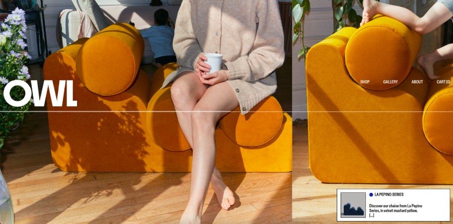
Furniture brand OWL’s full-screen product shots take center stage of their website. (Source: OWL)
You probably already know that a picture can paint a thousand words, but did you know that websites with images get up to 47% more clicks than those without? It’s for this reason that one of the best website design tips is to use full-screen images for your website background, especially for hero sections (aka the main front-page sections of your website), helping you make a standout first impression.
This works especially well if you have a visually oriented business, e.g., a beauty brand or a bed and breakfast, where images play a significant role in your marketing. Visuals are what make your website—and therefore your brand—more memorable.
6. Compress Images for Faster Load Times
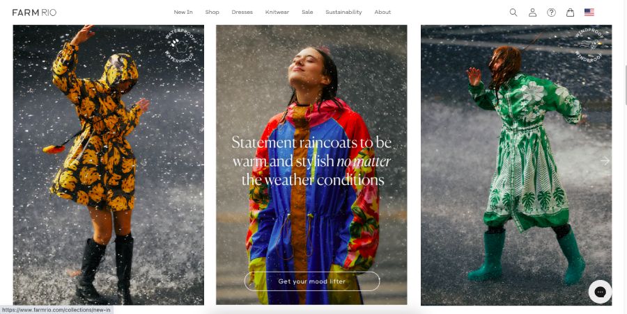
Keep your images no more than 2,500 pixels to keep your site loading speeds fast. (Source: Farm Rio)
While stunning high-res images are sure to impress, they won’t amount to much if they take forever to load. Fast loading times are also one of the most crucial elements of a functional, user-friendly website: not only do 40% of visitors leave websites that take over three seconds to load, but Google also ranks slow websites much lower.
So what’s an easy way to speed up your site’s loading time? Compress your image sizes. According to web design best practices, website images in general should be no more than 2,500 pixels for full-screen images. And, always use JPEG formats, as they’re generally more compressed than PNG files.
Pro tip: Unsure of where to find free images for your website? We’ve rounded up the best websites to get free images for your web design.
7. Make Your CTA Hard to Miss
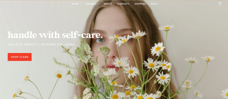
One way to highlight your CTA is to use a bright colored button against a muted background. (Source: Love Peace Organic)
This is one of the most essential small business website design tips (and basic web design principles). Calls to action (CTAs) guide your visitors to the most important places on your site, such as your online store or your newsletter sign-up form, so they should always be easy to find and click. For instance, don’t place your CTA button somewhere where there are many other distracting elements, and use the right size and colors to make it stand out.
Another important thing about CTAs: only use one for each section on your site. This is because having more than one CTA can confuse your visitors and make for an ineffective user journey—a principle known as “Hick’s Law” in design. This essentially means that the fewer the CTA choices, the easier users’ overall experience will be on your site.
8. Use Your Brand Colors
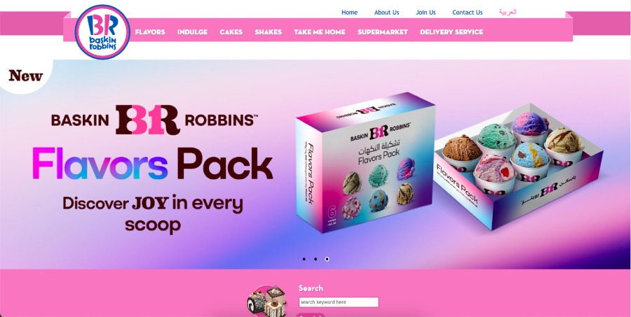
An example of great website color branding: Baskin-Robbins uses its iconic pink and blue colors to highlight important parts of its website. (Source: Baskin-Robbins)
Your website is one of the most essential marketing assets—it’s your brand’s main representative in the digital world. Therefore, it’s important that your website is consistent with your overall branding, and one of the easiest ways of doing so is via your website colors. When choosing your website colors, select those that match your overall branding for better brand recall.
This doesn’t mean that you have to make your brand colors the background of your website. Use them as accent colors for your headers and footers, CTA buttons, or other important website design elements.
Pro tip: Need inspiration to help choose the right color palette for your website? Here are the best website color palettes used by brands.
9. Avoid Lengthy Text
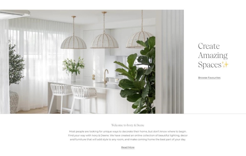
Keep your website copies short but impactful. (Source: Ivory & Deene)
Here’s one of the most essential yet often overlooked tips: use text sparingly on your website. While it’s tempting to add as much information about your business as possible, it actually has the opposite effect: most people are put off by sites with too much text, as most only like to scan through paragraphs. In fact, a study found that users are much less willing to engage with websites with longer lines of text.
This is why one of the best web design best practices is to keep your copies short but impactful. Only include the most essential information, and ensure all your text is simple to understand.
10. Use Typography Hierarchy
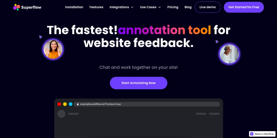
Using typography hierarchy organizes your site’s information and guides the user’s journey. (Source: Superflow)
Another important thing to writing the right content for your site is organizing it properly. This is why using proper typography hierarchy is one of the most important web design best practices. This simply means using the right font sizes and styles for your headings, subheadings, and regular text so your site visitors get a sense of the most important information they should read first on your site.
Typography hierarchy gives proper structure to your information, giving your site better organization, and in effect, a better user experience.
Pro tip: Boost your site’s search engine ranking by using search engine optimization (SEO)-friendly keywords in your site’s headings and subheadings. Discover more website marketing strategies to try.
11. Use White Space to Direct Attention

The white space on this website pulls attention to the most important details: the image and text. (Source: Pierre Thiam)
Nobody likes seeing a cluttered website, much less interacting with it. One of the most prominent website design tips in recent years is the principle of white space (or negative space).
Beyond just being background space on your website, you can incorporate white space into your website design and use it to direct attention to the most important information or call to action. It’s a simple but impactful way to do a lot with a little. White space can be especially helpful to add a touch of elegance to your site or to organize multiple elements, like products on your online store or posts on your blog.
12. Add Accessibility Features
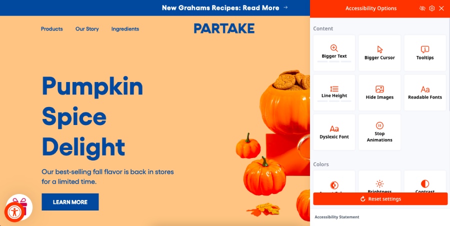
One of the most important website design best practices: making your site accessible. (Source: Partake Foods)
Online accessibility is more necessary than ever, and so one of the most important tips for designing a website is to add features to make it more accessible for users with disabilities. For instance, add a speech-to-text option on all your web pages, and add alt text to all your images and transcriptions on all your videos. Ensure all your headings are in order, and avoid using overly fancy and unreadable fonts.
For more help, you can check your website’s accessibility via sites like Accessibility Checker. These small accessibility upgrades ensure that your website—and therefore your business—is friendly to everyone.
13. Explain Through Video Instead of Text

Showing instead of telling on your website is often more effective—especially through video. (Source: Wistia)
We’ve mentioned how nobody likes to read long blocks of text on websites—that’s even more true if it explains a long and complicated process, like how your product works or its benefits. In these instances, one of the best tips for good web design is to use videos instead of text.
Videos are a growing staple in websites and are increasingly being welcomed by users over text: HubSpot found that 66% of users watched a video to learn about a brand or product. Some types of videos to use on your website are demos, customer testimonials, or explainers.
14. Make Your Social Icons Cohesive
Having cohesive social icons keeps attention focused on your content. (Source: Design Milk)
Social icons are one of the best marketing elements to add to your website design, as they lead your visitors to your social media pages. However, in their original form, social icons can be very colorful and eye-catching—in fact, they can be too eye-catching and sometimes distract from your website content.
When adding social icons, one of the best web design tips for small businesses is to make them cohesive. Instead of using their original icons, use a consistent color and style for your social bar. It is less distracting from your content and gives your site a more modern feel.
15. Add a Favicon
Favicons make your site more credible and recognizable.
An often underrated but meaningful website branding element is your site’s favicon, which is the tiny icon that visually represents your website on browser tabs or on search engine results. It’s often (but not exclusively) in the form of your logo.
Users are more likely to trust and remember your website if you have a favicon, and nearly all site builders have the option to upload one. If your logo isn’t well-suited to a favicon, you can design one similar to it easily through sites like Canva. Find out more about everything you need to know about favicons.
Pro tip: Need more web design inspiration? We’ve rounded up a list of the best small business website examples
Web Design Best Practices for Small Businesses
Having a website for your small business is important, but designing it well plays just as crucial a role to your long-term success. The website design tips above are helpful ideas to keep in mind when building your website, but there are a few essential best practices for website design that shouldn’t be amiss on any website. Here are some of them:
- List all your essential website elements: The last thing you want is to have a beautifully designed website, only to realize later on that an essential element is missing. Before you start designing your website, make a list of all the elements your website will need—if you need help, we have a checklist of 19 website basics every business website should have.
- Use a website builder that supports mobile sites: The importance of mobile-friendly web design can’t be understated. To make your design process easier, use a site builder platform that automatically supports mobile websites, such as Weebly, Wix, or Squarespace.
- Have a custom domain: Having a custom domain on your website that represents your business lets the world know that your site is professional and credible. Most site builder platforms have plans with custom domains included, but you can purchase one separately through domain registrars like GoDaddy or IONOS.
- Test your site’s health regularly: Part of effective website design is good functionality. If your site looks great, it should work great too. Do regular health checks on your site to ensure your site’s speed, layout, responsiveness, and more are all at their best.
- Understand design principles: While design isn’t a proper science, there’s a reason certain design principles have remained true all these years: they’re effective. Simple principles like having your logo on the upper left corner and using recognizable icons for certain pages (e.g., a gear icon for “Settings”) make your site easy to navigate.
- Incorporate marketing elements to your design: If you don’t have them yet, adding them to your site is one of the most important tips for web design. These elements include newsletter sign-up forms, SEO-friendly content, and social media icons. Adding these elements expands your site’s reach and function further.
Best Site Builders for Expert Web Design
Creating a well-designed website is no longer an impossible task even if you have zero web design experience, thanks to the dozens of beginner-friendly website builders around. We’ve tested many website builders for small businesses, and here are the best ones for expert web design. These platforms have strong design tools that let you build custom websites, user-friendly drag-and-drop platforms, and hundreds of templates to get you started.
Site Builder | |||
|---|---|---|---|
Features |
|
|
|
Best For | Most small business and ecommerce websites | Luxe site design | WordPress websites |
Pricing |
|
|
|
Learn More | |||
Try It Out | |||
*Intro pricing, renews at a higher cost | |||
For even more options (plus prices and expert insight), check out our guide to the 10 best website builders for small businesses.
Frequently Asked Questions (FAQs)
You can get better at web design with consistent practice. There are many free website design platforms that you can play around with and build sample websites, such as Wix or Weebly. Also, spend time researching various professional websites and taking note of their design principles. There are also free website design courses available on sites like HubSpot Academy and Udemy.
Not at all—in this day and age, website design is as easy as dragging and dropping design elements around, then clicking a button to publish your website. Many also have ready-made website templates that you can start with and customize. Make sure you use a website builder platform that supports all these, such as Wix, Squarespace, or DreamHost.
Yes. Designing your own website is an easy and low-cost option that we recommend for small businesses. Use a beginner-friendly website builder platform like Wix or Squarespace, then design your website from scratch or choose a website template to customize in the drag-and-drop editor. Be sure to follow web design best practices. After designing your website, publish it to let it go live.
The best place to get website design help is from a marketing or branding agency. These agencies have web design experts who can build a professional website for your business at affordable costs—you can find out your best match in our guide to the best small business digital marketing agencies. Overall, however, we recommend Straight North—it has long been an expert in website design and creative branding for small businesses.
Bottom Line
With your website playing such an important role in your business, having good web design is more crucial than ever. It can make the difference between a visitor staying on your site and converting into a paying customer, or simply leaving your site behind. Use the website design tips above as guides to help you design a business website that’s functional, competitive, and memorable.