Improve your customer’s path to purchase by providing a good user experience and experience a boost in your online sales.
Ecommerce UX Best Practices: Ultimate Design Guide
This article is part of a larger series on Retail Management.
The ecommerce user experience (UX) isn’t just about a website’s visual design—it’s about the customer’s journey from product discovery to purchase. Designing good ecommerce UX means ultimately providing an optimal shopping experience.
Great ecommerce UX motivates consumers to purchase, instills trust and confidence in your brand, and helps build relationships with your customers. Meanwhile, poor UX often leads to high bounce rates, low conversion rates, and confused consumers.
To achieve this, we outlined UX elements you need to consider and several ecommerce UX best practices you can follow, along with great website examples and actionable steps you can take.
Key Ecommerce UX Elements
When designing a seamless shopping experience for customers, you should consider certain standards for each UX element. As a small business owner, ask yourself these questions when going through your online store. Getting acquainted with these standards significantly helps when choosing which UX designer to work with to build your store and which ecommerce platform to use because it can be your criteria—look out for those who discuss these with you when doing their design pitches.
Online Store Architecture & Navigation
- Website layout and site map: Is your online store’s information presented in a way that it is easy to find what you’re looking for? Is it organized—do the product categories make sense?
- Search feature: Can site visitors search your online store easily? Are the results and suggestions relevant?
- Navigation: Are your online store’s menus organized with shoppers or site visitors in mind?
Visual Design & Ease of Use
- Overall visual appeal: Does your online store display the company’s brand identity well? Is it visually appealing?
- Responsiveness: Does your online store translate well and adapt seamlessly across different devices (desktop, mobile, tablet)?
- Accessibility: Is your online store accessible to users with disabilities? Does it meet the latest accessibility standards?
- Loading times: Does your online store load quickly and consistently across devices?
User Interaction & Flow
- Journey mapping: Is a potential customer or site visitor taken to the right place when they click a link or button?
- Browsing and filtering: Can site visitors easily browse products? Does your store have filters by category, brand, price, etc.?
- Adding to cart and checkout: Is the purchase flow fast, smooth, and efficient? Is there transparency on product pricing and total costs? Is it clear that your store is secure and able to handle multiple forms of payment?
- Account creation and management: Is it easy for users to create and manage their accounts?
Content & Communication
- Product descriptions: Are they clear, concise, and informative? Do they provide high-quality visuals? Are there reviews and ratings available?
- Customer support: How easy is it for site visitors to get help if needed? Are there multiple channels available (live chat, email, phone)?
- Personalization: Does your online store offer personalized recommendations or suggestions to customers?
Post-purchase
- Order tracking and delivery: Can customers easily track their orders and get updates on delivery? Can they see it in their accounts?
- Returns and exchanges: Is the process straightforward and hassle-free?
- Post-purchase communication: How do you stay in touch with your customers after a purchase?
UX Best Practices for Ecommerce
Based on the standards mentioned above, here are some ecommerce UX best practices you can implement for your ecommerce store.
1. Optimize for Functionality, Not Design
Website statistics show that 42% of visitors leave websites that don’t function well. Always prioritize function over design. Website speed, loading time, adaptability, and accessibility all play a role in functionality. A good rule of thumb is to always put yourself in a site visitor’s shoes—would your online store be easy to look around, shop, and track orders?
2. Make Your Website Mobile-friendly
Mobile commerce has been a top ecommerce trend over the past years with mobile shopping adoption increasing among shoppers. In fact, 67% are more likely to purchase from mobile-friendly websites.
- Offer mobile payment wallets in your checkout process.
- Keep call-to-action buttons concise for mobile devices.
- Sync shopping carts across devices.
- Add support for voice search and mobile-only gestures (double taps, pinching, etc.).
- Always view your ecommerce store on multiple screen sizes.
3. Optimize Page Load Time
The top reason users leave or abandon a website is slow loading time (88%). Google has set a standard that a two-second loading time is the threshold for ecommerce site acceptability—you lose visitors and potential sales as time goes by.
- Go with an ecommerce platform that guarantees site performance and speed.
- Optimize multimedia content. While there are ecommerce solutions that automatically compress and optimize images for maximum speed load time, you can use tools like TinyIMG SEO, Speed & Image Optimizer to optimize images for the web.
- Optimize product thumbnails in the same way.
- Avoid decorative images on your website—anything non-product related. These can be background images, buttons, and borders that take away focus from your product.
4. Ensure Website Accessibility
Features such as screen readers, software for text-to-speech or speech-to-speech, keyboard emulator, and screen magnifiers for people with disabilities are often overlooked for ecommerce websites. According to the WHO, one in six people have a disability—that’s roughly 16% of the population you are not catering to if you don’t include accessibility features.
- Follow the Web Content Accessibility Guidelines (WCAG).
- Run all your digital assets (audio, video, PDFs, and images) through an automated accessibility tool.
- Create a website accessibility section or policy page.
- Use image alt-text on your images, descriptive and relevant anchor text for links, “Skip navigation” links on webpages, and proper heading tags in a hierarchical structure
- Make sure site visitors can navigate your store even without a mouse or touchpad. A good example of complete functionality via keyboards is having the tab key enable users to jump between page elements.
- Avoid flashing content as content that blinks or flashes more than three times in a second can trigger seizures according to the W3C.
- Do a practice test with community users, such as those using screen readers.
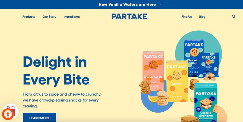
Partake Foods, a bakery, has an accessibility toggle button in its site’s bottom corner where a user can adjust site elements like text and cursor size, line height, hide images, stop animations, and even choose more readable fonts.
Related: ADA Compliance for Retailers
5. Provide Intuitive Navigation
A great deal of good ecommerce UX for site visitors is being able to easily find and look for products. When we say intuitive navigation, we aren’t just referring to the links in your online store’s menu bar, we are referring to providing the customer with tools to have a self-directed experience across your store.
When planning for your store navigation, anticipate a potential customer’s needs that they might not be aware of yet and predict the user’s actions at every scroll and click. This would mean making it easy to find your products—organizing your navigation in a way that site visitors take as few clicks as possible to achieve their goal.
Be wary of over-categorizing though. According to Baymard Premium’s study on UX design, 88% of sites incorrectly implement product types with shared attributes as separate categories. Overcategorization can lead to cart abandonment.
Action Items:
- Keep menus simple. Let them follow a logical structure. For example, stick to one-word titles for your main menu pages such as About, Shop, Contact, FAQ.
- Make your main menu detailed and hierarchical. Your main menu pages can have dropdowns to show more detailed subcategories, like Shop > Tops, Bottoms, Accessories. These subcategories can even be further categorized.
- Have your product listings organized into catalogs/categories, enabling product catalog pages to have multiple filters.
- Enable breadcrumbs on product pages—a progress bar or a visual trail—that allows customers to see where they are in their clicking. For example, during checkout, the breadcrumb on the user experience page will say Log In > Shipping Information > Payment Information > Review & Pay > Complete.
- Make it easy to locate important pages to the shopping journey such as your return, refund, and shipping policies, accepted payment methods, shipping and delivery options. These are usually included in the footer section of a website and are displayed in every website page.
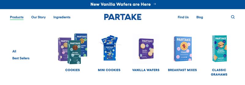
Partake Foods has a clear main navigation menu on top of its homepage. Notice how it highlights new products in the header announcement and has a separate category for bestsellers. All product categories are also displayed with clear product images.
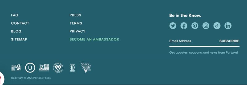
Its footer displays all pertinent information such as its FAQ, contact, and links to social media accounts. There is also a simple lead generation form, letting visitors subscribe to its newsletter.
6. Add a Robust Site Search Tool
A robust search feature should be included everywhere in your online store. It is better if the search tool comes with a smart feature (autocomplete, highlights relevant results, and more). Visitors who use the search box show clearer intent on what they are looking for and, hence, are more likely to purchase.
Remember, the longer it takes for a visitor to find what they are looking for, the less likely they are likely to convert into a sale.
Action Items:
- Enable the search bar on all of your pages (make it sticky—ensure it appears on top of your website no matter where users scroll).
- Implement artificial intelligence (AI)-driven search features to help with product discovery, like autocomplete suggestions.
- Allow result filters under many conditions: price, size, color, category, etc.
- Have search results sorted products by price, relevance, average rating, and other indicators. It is also a good idea to highlight relevant search results that are tagged as bestsellers, popular items, or on sale.
- Have product previews in search results show price, shipping time, rating, variants, etc. at a glance.
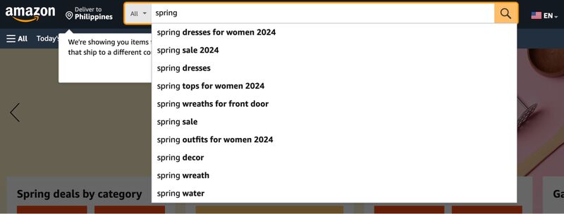
Amazon leverages AI-driven search features to help with product discovery. Look at how it generates search suggestions when one types a single word. Before even typing on the search bar, it also displays trending searches when you click on the search bar.
7. Use Clear & Prominent Call-to-Action (CTA) Buttons
Call-to-action (CTA) buttons are navigation guides that encourage and motivate users to “click” and take a specific action. In ecommerce, this is usually a direct way to tell people to buy or encourage them to give you their information. Strategically placed and well-designed CTA buttons are proven to increase conversions.
Action Items:
- Make your CTAs short and straight to the point.
- Place CTA buttons at the last place users will look. According to UX bootcamp, this is usually at the bottom right of a page (but will still depend on many factors).
- Use action and urgency words to make your CTAs more powerful. Verbs such as “Buy,” “Grab the Deal,” “Add to Cart” encourage action, while “Now,” “Last Day,” and “Limited” are words that put a sense of urgency to the action.
- Make CTA buttons interactive and stand out with color. In general, red buttons get more clicks than green ones. You can make buttons interactive by having them change when a user hovers them.
8. Highlight Key Features or Selling Points for Products
The centerpiece of your ecommerce store is undoubtedly your product pages. This is where most customers begin and end their journey, drawn by their interest in making a purchase. As such, your product pages should further entice them to check out.
To do this, ensure that prospective customers can easily locate the crucial information about your product—features, size, benefits, and more. Aside from sales-converting copy, ensure your product page is designed so that all the copy you wrote is digestible and easily scanned.
Action Items:
- Write user-centered copy. Learn how to write product descriptions that sell.
- Highlight product key features as bullet points to make them stand out and be easily read.
- Place product information—product rating, price, availability, variants, short descriptions, and product photos—above the fold of a product page.
- Present your products in search result pages in grids, and try to keep product thumbnails between two to four in a row.
- Have result pages show product thumbnails and keep product information—name, price, and shipping timeframes
- Showcase bestsellers with a distinguishing icon or banner, on product pages and search results. Doing this on sale and promo items is beneficial too.
- Provide a ratings summary of reviews shown on your product pages. Interestingly, 43% of the 60 top-grossing ecommerce stores don’t do this.
- Use a variety of font sizes and icons to draw attention to different aspects of the product. For example, a product name can be in bigger font size, in bold, and in all capital letters to make it stand out, and some icons easily depict a product feature like sustainability.

Fenty Beauty showcases its products well. Take a look at these features in one of its product pages shown above.
- Product images are viewable as thumbnails and you can clearly see a product video.
- Product name is easily read with a larger font size.
- Product ratings summary is included.
- Key features are highlighted, with special offers (discounts, bestseller tags) above the product name as little banners.
- Shipping information is clear with a minimum order amount.
9. Showcase Your Products Well
Aside from highlighting key product features, you should also be able to present or display products in a way that potential buyers can see the most information to decide on a purchase.
Striking the balance between maximizing product display and information and not overwhelming potential customers can be tricky. As a rule, you should prioritize the above-the-fold space in a product page; this is where key selling features should be easily read (as mentioned above). The rest of what you will place can take place below the fold.
Action Items:
- Showcase your products by using high-quality photos and product videos—both of which you can DIY at home with the help of our guides.
- Don’t forget to add mobile features for product images such as pinch gestures that allow users to zoom in on product images on mobile. Baymard research shows many ecommerce websites don’t support this feature on mobile—only 60% get it right.
- Have at least one “in-scale” product photo so potential customers can get a perspective of its size. Forty-two percent of users usually attempt to gauge the scale and size of a product from the product images.
- Provide product photos in a lifestyle setting—taken in real-life environments with people using them so customers can get a better sense of how the products are in real life.
- Include user-generated content (UGC). Social proof is one of the most effective ecommerce marketing strategies these days. Syndicate images posted by customers and have them show up in your product pages.
- Invest in AR and VR technology. Augmented (AR) and virtual (VR) reality let people can “try” products like how they usually do in person before buying. See how a virtual fitting room can be implemented for an online store.

A good example of highlighting key features is how Amazon organizes its product pages. All crucial information is above the fold.
10. Embrace Personalization
Online shopping statistics show that shoppers crave and expect personalization. Personalized shopping experiences are part of online shopping trends that aren’t going away anytime soon. Personalization functionalities should be part of your chosen ecommerce platform’s features.
Wishlists and product recommendations help users find and discover products faster, and since they are personalized, they can further nudge users to purchase.
Amazon is a great example of providing a personalized shopping experience to its customers. Its recommended products’ list consists of all the items you have searched for and then provides other items that similar users have purchased.
Action Items:
- Add related products as recommendations on product pages.
- Enable wishlist creations. By providing customers the ability to save an item to a list to review later (or monitor for price changes or special offers), you are increasing chances for a purchase.
- Based on browsing history and saved lists, determine if there is enough data to run push notifications, targeted marketing campaigns, and product recommendations. See which price point customers convert and use this as a basis to offer limited discount promotions or for your products’ pricing strategy.


As shown above, my browsing history in Fenty Beauty was instantly captured (without needing to create or log in to an account), and after a few searches, product pages reveal a reminder of products I recently viewed as well as recommended products.
Related: Personalization in Retail
11. Simplify Your Checkout Process
A simplified checkout process increases your chances for sales. A lengthy, complicated, or clunky checkout process (22%) is one of the top reasons why shoppers abandon their carts. By following the actionable steps we outline below, you reduce shopping friction and increase your chances for conversion.
Action Items:
- Provide clear information about extra fees upfront. Nearly half of shoppers abandon their carts because of extra costs (shipping, tax, fees) showing in their checkouts are too high.
- Make checkouts short. Baymard’s benchmark study shows that the average US checkout flow contains 23.48 form elements displayed to users by default. Usability tests reveal that an ideal checkout flow can be as short as 12–14 form elements (7–8 if only counting the form fields). Form fields are the details shoppers need to fill in such as credit card and shipping information.
- Enable one-click checkout if it is an available option with your ecommerce platform.
- Enable guest checkouts. In short, don’t require shoppers to register for an account in your store—26% of shoppers abandon their carts when a site needs them to create an account so they can purchase.
- Give users multiple payment options—13% of people abandon their carts because there weren’t enough payment methods available.
- Have progress indicators (breadcrumbs, numbered steps, or stages) on your checkout page so that customers know how long the process takes.
- For your checkout fields, enable auto-format fields (such as credit card number fields to have space), use input masks (restricted inputs especially on mobile), and mark fields that are required and optional for speedy checkout.
Related: Checkout Optimization Tips for Small Businesses
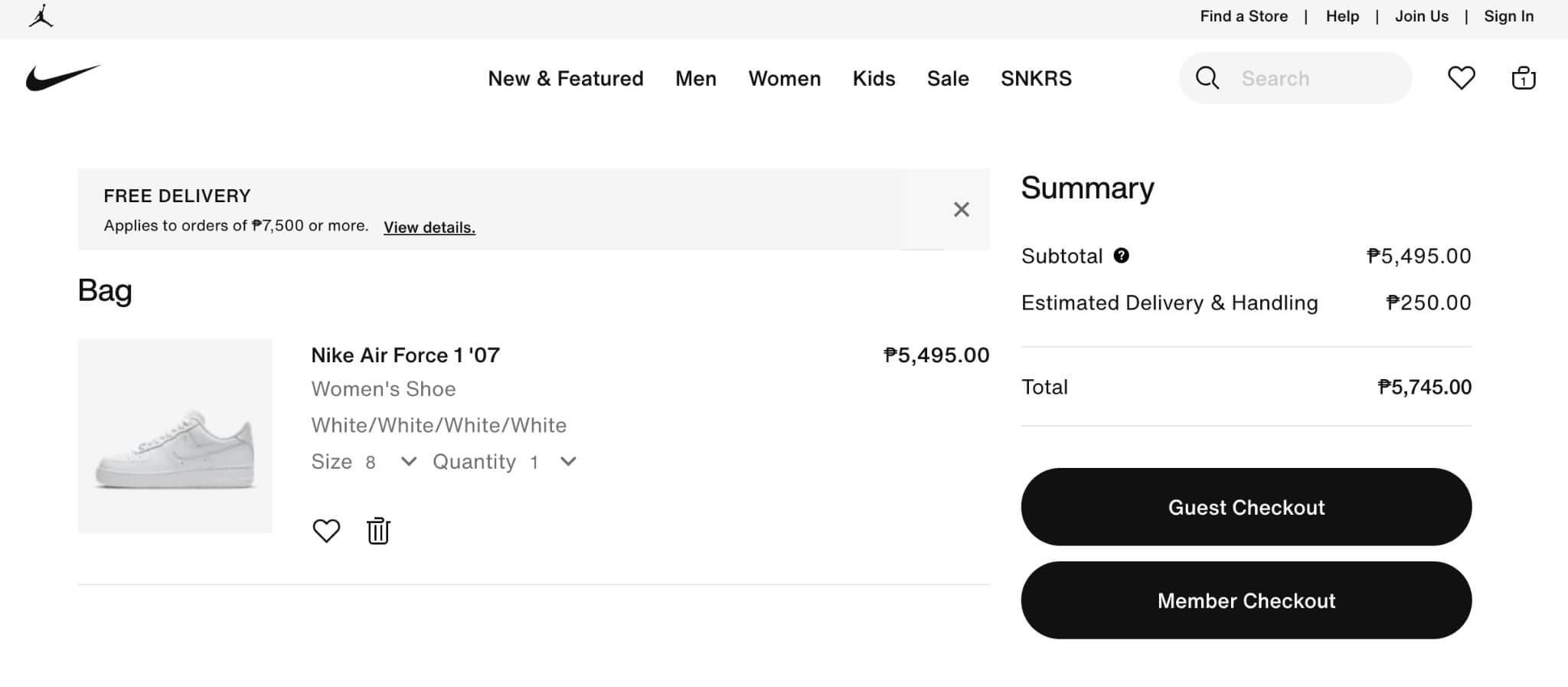
As shown above, Nike has clear buttons for guest and member checkouts and shows an estimated delivery fee for shipping, even without the customer’s shipping information yet.
12. Don’t Forget About Customer Support
Good ecommerce UX will always include helpful customer support. Forty-one percent of customers prefer live chat over other support channels. If this is not possible, there are other ways to ensure support is provided to customers. The key is to let customers know how to reach your support team easily.
Action Items:
- Prominently display customer support information on all your website pages.
- Have an in-depth FAQ section to address users’ common questions. Make this part of your main navigation.
- Consider employing chatbots if live chat isn’t feasible for your business.
Related:
Frequently Asked Questions (FAQs)
Click through the tabs below to get answers to your most frequently asked questions about UX best practices for ecommerce.
Ecommerce user experience (UX) refers to the overall experience a customer has when interacting with an online store, from the moment they enter the site to the moment they complete a purchase. It encompasses all aspects of the end-user’s interaction—including site navigation, load times, and product displays—aiming to create a seamless and enjoyable shopping experience..
Good ecommerce UX reduces shopping friction to increase engagement, improve customer satisfaction, and bring in more sales. Without a focus on ecommerce UX best practices, online stores typically see much higher bounce and shopping cart abandonment rates, ultimately costing them sales.
UX best practices for ecommerce prioritize the user’s shopping experience and optimize function over aesthetic design. Making your site mobile-friendly, increasing site loading time, ensuring accessibility, providing intuitive navigation and search tools, showcasing products in detail, embracing personalization, and simplifying the checkout process are a few ecommerce UX best practices that help increase sales.
Bottom Line
For every $1 spent on UX design, a brand gets $100 in return. This figure alone proves how important it is to implement ecommerce UX best practices to your online store. The path to purchase should always be optimized to reduce shopping cart abandonment, and it starts with your product pages and navigation—not just your checkout process.
Prioritize function over design when building your ecommerce store and increase your sales conversions, grow customer loyalty, and improve customer satisfaction.