The ease of single-page website navigation (especially on mobile) makes it a great option for promoting a brand online. We rounded up the best one-page website examples below. Learn why these one-page websites work well and learn what you need to know to recreate your favorite one-page website design.
1. The Visual Team
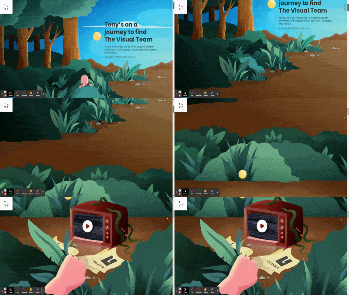
One-page website from the Visual Team (Source: The Visual Team)
The first of our examples is an extraordinary one-page website from The Visual Team, a graphic and animation design company based in Singapore. What made this example grab the #1 position in our list is how the entire website tells a compelling and visually engaging story to build brand presence.
As you scroll down, you see how the elements progress as viewers bear witness to an adventure. At the same time, certain design elements of the story reflect the brand’s information. The Visual Team’s landing page uses Elementor, which is one of the best WordPress website builders worldwide.
2. CL&PP Architectes
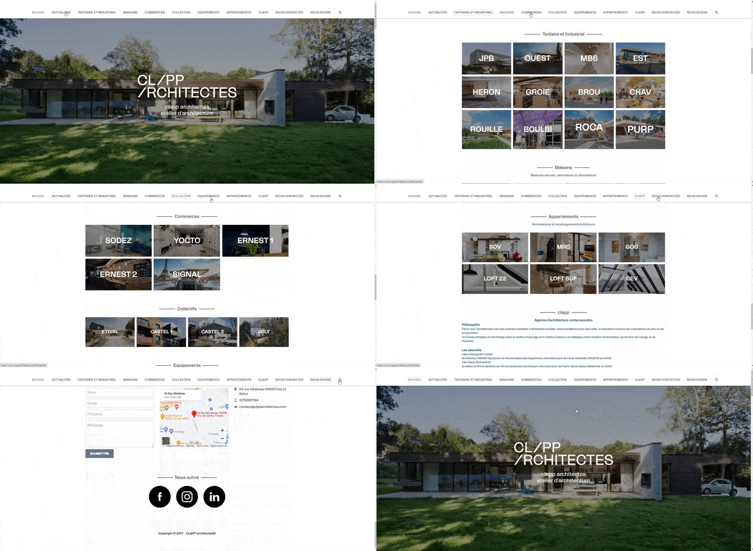
One-page website design by CL&PP (Source: CL&PP)
This one-page website by architecture firm CL&PP effectively showcases its properties and services without overloading visitors with information. Follow this example by using navigation buttons and a search bar to help your audience find what they need without having to scroll the entire page.
To easily build something similar, try Wix or Squarespace. Both are on our list of the best website builders for small business, and both have one-page website templates and drag-and-drop editors that make it easy to achieve the look you want for your site.
3. KamiKademi

Scroll through KamiKademi’s one-page website (Source: KamiKademi)
KamiKademi is an excellent example of a one-page website that provides comprehensive information about its site. It is an academic and professional platform packed with details, like what they provide for their community, their pillars and values, and who they’re best for. They use a top menu to help visitors navigate through the site easier.
Wix’s extensive editing capabilities and a slew of native tools and premade content blocks are ideal for building single-page websites with a lot of content. Learn how to build a website on Wix, including an easy-to-follow video tutorial.
4. All-N-1 House of Beauty

Elegant one-page website examples from All-N-1 House of Beauty (Source: All-N-1 House of Beauty)
Like Always Creative, All-N-1 House of Beauty uses a custom WordPress theme to create a single-page website that’s easy to navigate. A “Scroll” button on the landing page tells visitors to scroll down to get the information they want. Site visitors can click on the button to scroll or click on the buttons in the menu bar above.
In case you want to build a one-page website with built-in appointment booking, we recommend GoDaddy’s site builder. You can build an ad-free site on your own domain for as little as $11.99 per month, and starting with GoDaddy’s free version, you get a reliable built-in booking system for your clients. Follow our step-by-step process to build a GoDaddy website.
5. Geek Girls
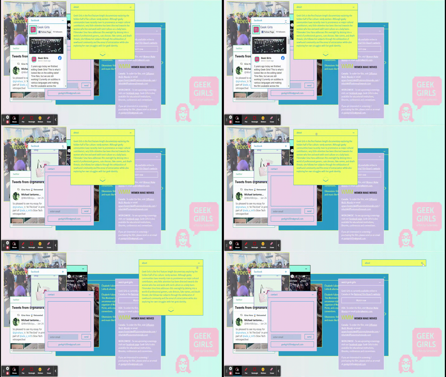
Modern and cool single-page website by Geek Girls (Source: Geek Girls)
A completely unique take on one-page websites is the Geek Girls page. Instead of strolling through their site, you can view the information through simulated pop-up windows. You can move the windows or minimize them to find more information underneath. This is a good way to pique your site visitors’ interest, keep them engaged, and leave them with a good and lasting impression.
Want to make sure that your business website has all that it needs no matter how you designed it? Check out the website basics every site needs—it comes with a free checklist.
6. The Bancroft
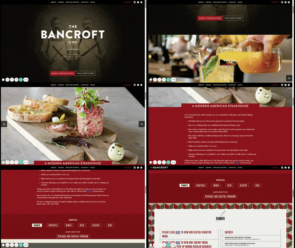
Restaurant one-page website (Source: Bancroft)
Bancroft’s one-page website example illustrates how a restaurant with multiple menus can seamlessly use a single page, rather than multiple pages, to display its array of offerings. It achieves this by including links on its single page so readers can view other menus on the same page. Also, like Always Creative and All-N-1, notice how it uses a slider gallery to include more images without the site appearing crowded.
The Bancroft is created using WordPress with the WooCommerce plugin for ecommerce sites. Learn how to set up a WooCommerce store and start selling on WordPress today.
7. Rest

Ecommerce one-page website by Rest (Source: Rest)
Rest’s Shopify store shows an example of how one-page websites are perfect for a single product or collection. By using the landing page to sell a collection, Rest can put as much information as possible while using a singular call to action (CTA) to entice viewers to buy the product.
As a bonus, it also uses a video as the banner, which tells Rest’s audience more about the product without visually clogging up the page. Learn how to set up a Shopify store in just a few simple steps.
8. Hardwicke Knight

Portfolio single-page website by Hardwicke Knight (Source: Hardwicke Knight)
Hardwicke Knight is a stunning photography portfolio that uses the website to showcase their work and story. What makes Hardwicke Knight one of the best single-page website examples is the way he curated the site’s photos. It doesn’t show as many images one usually might find in a portfolio, but all of the images fall under the same theme. This gives a vintage and classic feel to the entire website.
To create a website similar to Hardwicke Knight, use a trusted content management system like Squarespace, and carefully choose the photos to create a particular mood for your site. For professional and visually appealing images, try Canva, one of the best places to get free images for website design.
9. Cook Collective
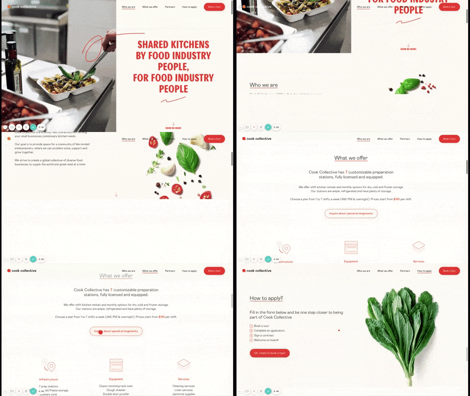
Food industry single-page website by Cook Collective
(Source: Cook Collective)
Cook Collective is a startup that offers shared commercial kitchen spaces. The uncluttered yet informative one-page website shows the information in an organized way.
The page starts with what Cook Collective is all about, ending with a contact form for interested site visitors to get more information or request to book a tour. It also includes a CTA button in the top navigation, which directs readers to the contact form at the bottom of the page.
10. Home Societe
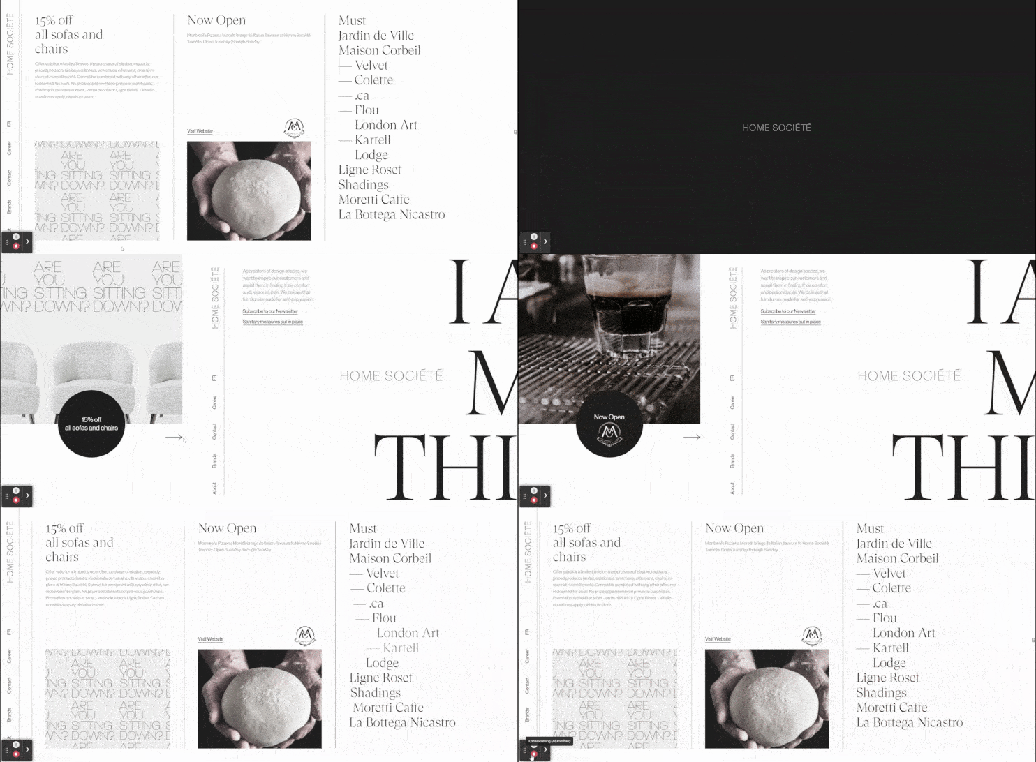
Horizontal single-page website example by Home Societe (Source: Home Societe)
Home Societe is a unique one-page website example in that it not only has an editorial feel, but it scrolls horizontally instead of vertically. In line with its horizontal scroll, it incorporates a left-hand vertical menu, making the single-page site read left to right like a book. It also utilizes a great deal of on-page animations, making the otherwise minimalistic site eye-catching and attention-grabbing.
The single scroll website above uses black and white to tell a compelling brand story, but color can make your website even more engaging. Find out how to pick a website color scheme and explore how different combinations of colors can evoke responses from your site visitors.
11. Dave Gamache

Simple one-page website example by Dave Gamache (Source: Dave Gamache)
No list of one-page website examples would be complete without a static, but striking single-page site. Dave Gamache, a designer based in San Francisco, has a basic landing page with links to his portfolio, social media profiles, and email down below.
Unlike the other examples on this list, Dave Gamache’s website doesn’t scroll down. Instead, it focuses on a single striking element in the middle of the site (i.e., the red moon) and the information is presented as icons, which you can access through a single click.
WordPress isn’t your only choice when it comes to building beautiful one-page websites. See the best WordPress alternatives and build your site without any hassle.
12. Ginventory
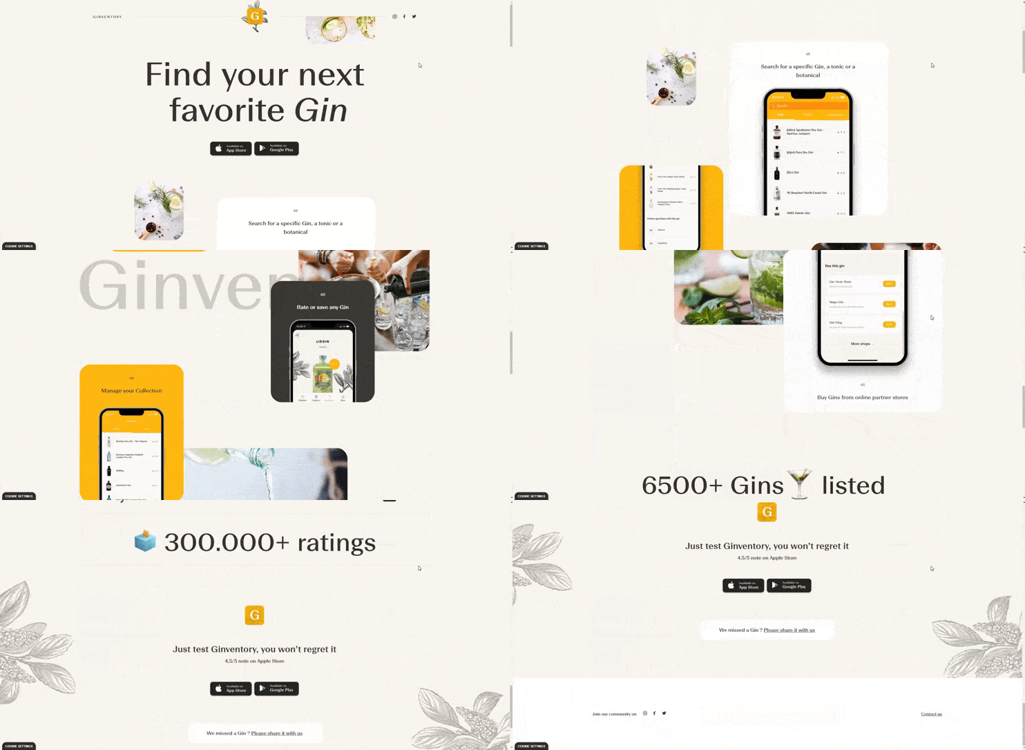
Example of one-page website by Ginventory (Source: Ginventory)
Ginventory offers a unique one-page website example that utilizes parallax scrolling. Parallax is when elements in the foreground and background move at different speeds, resulting in more visual depth and giving the page a more interactive feel. To make it easier for site visitors to take action, Ginventory includes the same CTA (to download the app through the app store) at both the top and bottom of the page.
Looking for more effects besides parallax to engage site visitors and keep them navigating through your website? Get more inspiration and ideas from our list of the best small business website examples.
13. Upstate Laundromat

Laundromat one-page website design by Upstate Laundromat (Source: Upstate Laundromat)
Upstate Laundromat easily lets you see where you can do your laundry by providing a CTA button on the banner. This banner instantly directs you to the map down below. The rest of the one-page website is immaculate. It tells the reader the services they can expect from the company and even adds some FAQs and customer testimonials to make everything more legitimate.
The example above uses white space, slate blue, and bold red accents to catch the attention of site visitors. To help you pick the best colors for your website, check out our list of the best website color palettes.
14. You Gotta Love Frontend

Event one-page website example by You Gotta Love Frontend (Source: You Gotta Love Frontend)
You Gotta Love Frontend, a nonprofit event for developers, is a fascinating and engaging one-page website example. What makes Frontend unique is that they keep all the relevant information (what the event is about, schedules, and contact information) on one page, but then uses subdomains to house information about past events.
Creating separate pages or even subdomains for other related events or products can help keep you from overloading your site without losing information site visitors may find relevant. Learn more about what a subdomain is and how to use them to augment your site’s content.
15. One Way Road to Beer
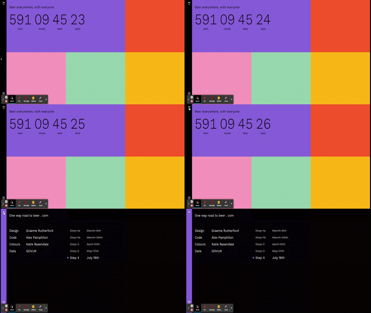
Timer-based one-page website by One Way Road to Beer (Source: One Way Road to Beer)
One Way Road to Beer uses a single-page website as a countdown for when people can have a drink with a set number of companions. Originally created during the start of the lockdown, the developers wanted to give people a sense of hope for when everything will go back to normal. The scrolling website uses five different colors, each meant to symbolize a specific goal.
16. Family Meal
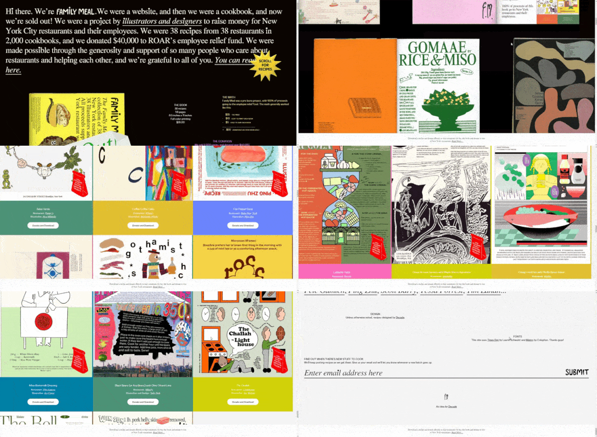
Multi-design single-page website by Family Meal (Source: Family Meal)
Family Meal is a nonprofit selling illustrated cookbooks to help New York restaurants and their workers. The one-page website is an eclectic mix of fonts, illustrations, and a storefront, showing the cookbooks you can download. All the colors and illustrations can be overwhelming, but Family Meal keeps it easy to read by using extra-large fonts and lessening the text.
17. FourFold Consulting

Minimalist one-page website by FourFold Consulting (Source: FourFold Consulting)
FourFold Consulting was built on Squarespace. Just like the one-page website example above, FourFold uses expanders to keep its content short. Its single page is exceptionally clean, but to help readers out, it has an easy navigation menu and a button that immediately brings you back to the top. This button is helpful, especially if you have a long-scrolling website.
18. Homebird
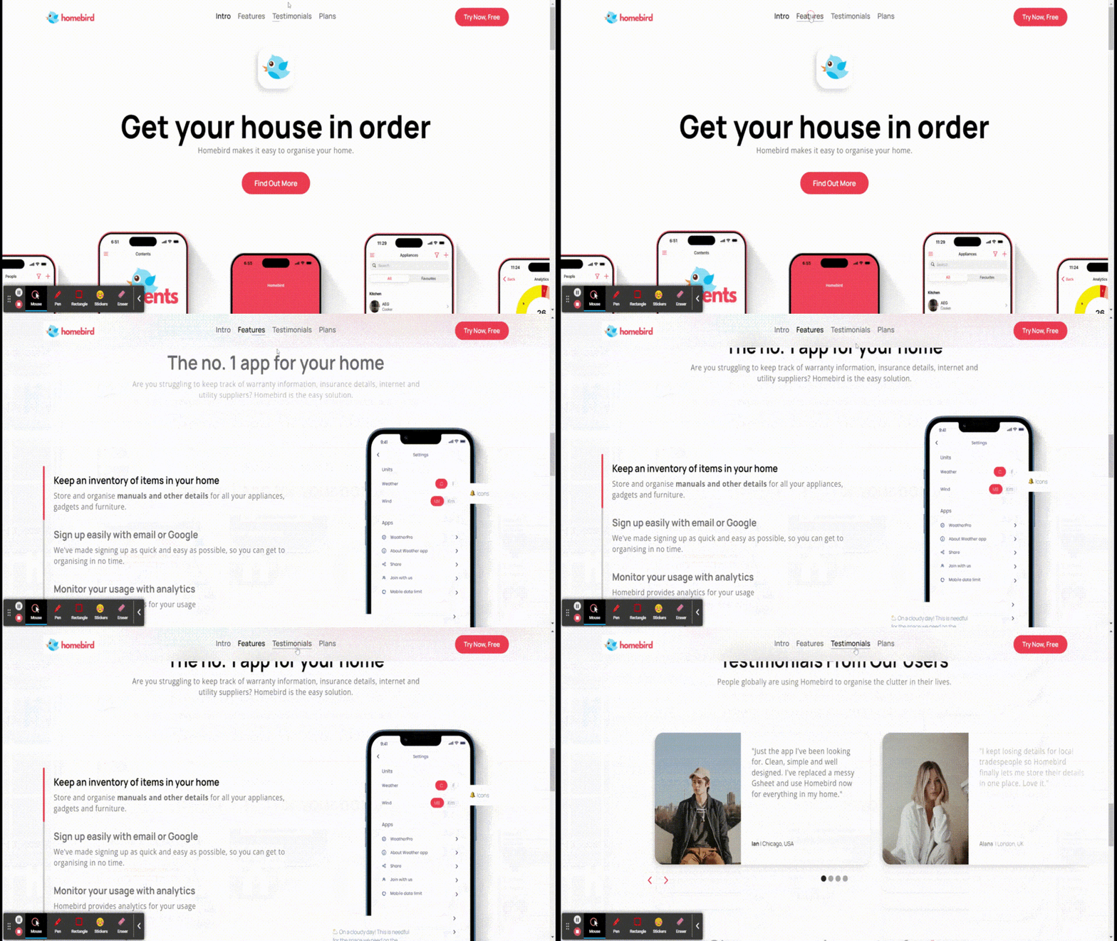
One-page website design by Homebird (Source: Homebird)
Homebird, a home organization app, uses the Denver – App Website Template from Webflow. It is a clean, bright-color, and mobile-friendly website with unique interactive animations that keep site visitors engaged. To create an equally striking one-page website design, you can use a monocentric color scheme focusing on one bold color. Use neutral or muted colors to accentuate this design for a sleek and visually appealing interface.
19. Ola Surfboards
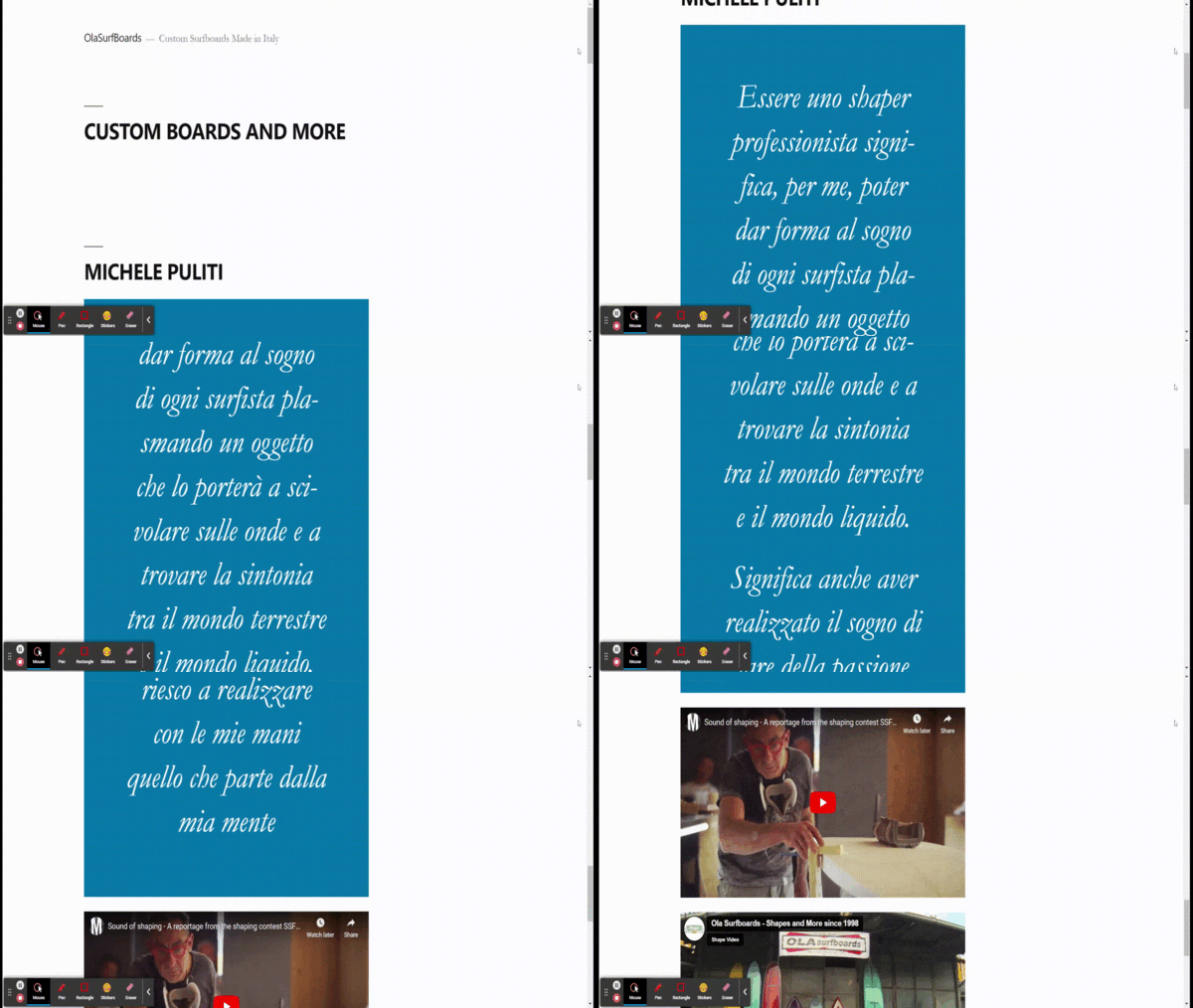
Simple one-page website sample by Ola Surfboards (Source: Ola Surfboards)
Ola Surfboards is a company that creates custom Italian surfboards. Its one-page website is one of the simplest and cleanest designs, as it focuses on highlighting the creator’s message and contact information. There are also two videos embedded into the site that shows their work and history. In using videos or other marketing materials for your website, use high-quality media to appear more credible and professional.
20. Mikiya Kobayashi

Project-based single-page website by Mikiya Kobayashi (Source: Mikiya Kobayashi)
An elegant one-page website example is Mikiya Kobayashi’s studio website. Although no template is available for this web design, it is an excellent example of how to showcase a product or design portfolio. Highlight your work by project and incorporate short descriptions for each when the mouse hovers over their icons. This will make your overall website cleaner without overwhelming viewers with text immediately.
21. 10Clouds

Vertical and horizontal scrolling website example (Source: 10Clouds)
10Clouds is an extraordinary example of a one-page website design. Single-page websites are linear, with the website dictating the flow of information. However, 10Clouds is designed with movement in mind.
As you scroll through the site, you see playful expressions of movement, from revolving instructions, side-scrolling banners to an energetic string of color that guides the movement throughout the screen. With this in mind, you can set your business single-page website apart by exploring different elements and site paths to break the linear flow of information.
What a One-page Website Is & Who It’s Best For
A one-page website, also referred to as a single-page website or a one-page scroll website, is (as the name indicates) a website containing all its main content on a single page. One-page websites are best known for the conciseness of their content and a sense of cohesiveness throughout the website as you scroll through.
With that in mind, one-page websites are best for:
- Creatives or agencies that want to showcase a portfolio
- Businesses targeting one specific audience
- Small businesses that don’t require a lot of content on their website
- Companies introducing a single product or limited series product line
- Event-based businesses or organizations, like conferences and trade shows
- Individuals or small businesses with website budgets that need to start small
- Companies with one main call to action
Best Single-page Website Builders
Learning how to make a one-page website for your small business can be easy with a reliable website builder. Some factors to look for include reasonable pricing, ease of use, integration with other tools, solid customer support, and a range of customization options to make your website stand out.
Here are our top options:
Site Builder | |||
|---|---|---|---|
Recommended For | Most single page web templates and premade section blocks | High visual impact single page websites | High-converting, one-page websites for sales and lead generation |
Free Plan or Trial | Free Plan | 14 days | 14 days |
Starting Cost/Month | $16 | $16 | $37 |
Learn More | |||
Get Started |
To learn about these providers or find more options, check out our article on the best website builders for small businesses.
Frequently Asked Questions (FAQs)
When should I use a one-page website?
One-page websites are great for businesses targeting a single, specific audience. They’re also popular for event-based businesses, portfolios, companies with one product or small product lines, and service-based businesses.
How much do single-page websites cost?
Building a one-page website can cost $0 with free website builders like Wix and GoDaddy. For brand credibility, however, you should plan to upgrade to a paid plan so you can build on your own domain name, which brings the cost of a do-it-yourself website to about $10 to $16 a month. Additional cost factors to consider are images and artwork and the cost of outsourcing to a developer, which could range from $100 to the tens of thousands.
What should a single scroll website include?
A one-page website should have a navigation menu that makes it easy for the site visitor to get to the right section (products, services, contact form, and so on). It should showcase your main selling point in the top hero section. If your business has a physical location, the address and phone number should be near the top or in the top bar above the main menu. Finally, it should include a clear call to action to drive conversions.
Is it OK to have a one-page website?
Having a single-page website is OK, especially if your business has a simple call to action and audience. For example, a one-page site could easily contain all content needed for a custom homebuilder, whereas it might not serve a new homebuilder with multiple communities well. Likewise, a local restaurant could find a one-page site with all that’s needed, while a restaurant chain might want individual pages for all its locations.
Bottom Line
A single page is a great way to create a business website. These one-page website examples show they can work for different types of businesses. You can build a one-page site on various platforms, but we highly recommend trying Squarespace for its award-winning templates. Get started for free today, with no card required, for 14 days.