

A sales metrics dashboard provides a visual representation of sales data in a centralized and accessible platform, making any sales-related, decision-making process efficient and effective. Various types of sales dashboards range from high-level sales overviews to detailed windows into specific aspects of your sales process. See our 10 sales dashboard examples to help your team make more informed and data-backed sales decisions.
- What Is a Sales Dashboard?
- Best Sales Dashboard CRM
- 1. Sales Overview Dashboard
- 2. Sales Pipeline Dashboard
- 3. Sales Activity Dashboard
- 4. Individual Sales Performance Dashboard
- 5. Sales Leaderboard Dashboard
- 6. Sales Territory Dashboard
- 7. Sales Growth Dashboard
- 8. Sales Live Monitoring Dashboard
- 9. Marketing ROI Dashboard
- 10. Lead Generation Dashboard
- How to Create Sales Dashboards
- Statistics on Sales Performance Dashboard Use
- Frequently Asked Questions
- Bottom Line
What Is a Sales Dashboard?
A sales dashboard contains a straightforward visual illustration of key performance indicators (KPIs). Sales data are typically shown in graphs, tables, charts, and other images. Metrics for the best sales performance dashboards commonly include revenue, monthly or quarterly sales targets, sales activities, conversion rates, rep performance rankings, and lead acquisition costs.
Customer relationship management (CRM) systems already have built-in sales dashboards that sales teams can use to monitor performance and sales growth. But if you’re not using a CRM, you can download our free sales dashboard template and sales metrics calculator. Use these tools to monitor your sales metrics and generate your own sales dashboard.
Best Sales Dashboard CRM
You can use a pre-made sales dashboard template from platforms like Tableau and Geckoboard, but using similar tools from your CRM will further centralize and automate your data analysis. Choosing the right CRM, however, encompasses not just your preferred dashboard but other functionalities that streamline your sales process, like lead generation tools, email marketing systems, activity trackers, and mobile apps.
If you are looking for sales dashboard software with high usability and customization properties, Pipedrive may be a great option for you. Its simple interface and drag-and-drop functionality make it easy for all users to create sales reports and dashboards. If you are looking for other options, check out the top CRMs for small businesses in the table below, which offer valuable sales analytics dashboard capabilities and other CRM features.
| Provider | Best For | Key Features | PricingRangeAnnual billing on a per month basis | Learn More |
|---|---|---|---|---|
 | Sales performance dashboard customization |
| $14 to $99 per user | Pipedrive Review |
| Visit Pipedrive | ||||
 | Multiple report views in a unified sales dashboard |
| $0 to $4,300 per userBased on the Customer Platform plans | HubSpot CRM Review |
| Visit HubSpot CRM | ||||
 | Comprehensive reporting and territory management |
| $25 to $500 per user | Salesforce Review |
| Visit Salesforce | ||||
 | Mobile sales performance monitoring dashboard |
| $0 to $52 per user | Zoho CRM Review |
| Visit Zoho CRM | ||||
 | Single-view sales milestone tracking |
| $0 to $72 per user | |
| Visit Capsule CRM | ||||
1. Sales Overview Dashboard
A sales overview dashboard provides a 360-degree view of your sales performance. It presents KPIs highlighting trends and up-to-date progress in revenue, goals, deals closed, and other metrics. This can also take the form of a sales management dashboard that shows sales leaders and executives the progress made by sales reps and overall team performance.
Frequently featured KPIs:
- Revenue
- Deals won/lost
- Deals open
- Sales by product/category
- Sales by month
- Average deal value
- Sales activity tracking
- Deal duration
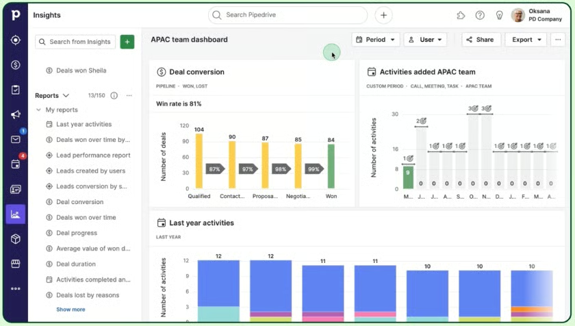
Example of Sales Overview Dashboard
Many CRM systems, like Pipedrive, import sales data into a customizable sales team dashboard. You can highlight the key metrics you want to monitor, including deals started, opportunities lost, and the average number of closed deals. Moreover, you can adjust the timeline for featured KPIs like monthly sales bookings and average profit margin.
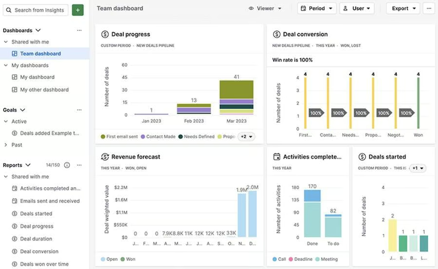
Pipedrive displays multiple metrics in its sales overview dashboard. (Source: Pipedrive) 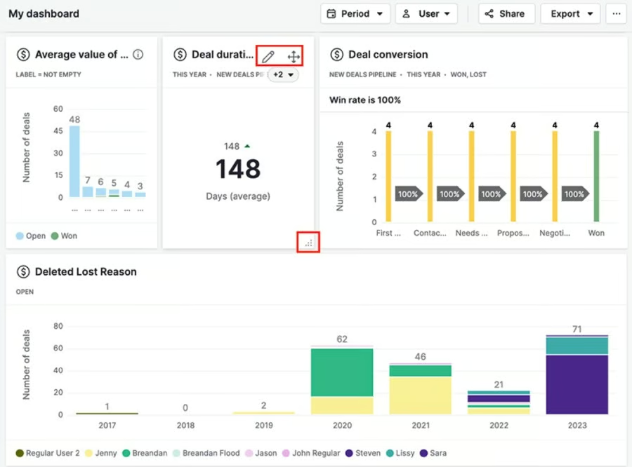
Pipedrive offers customization options for sales dashboards. (Source: Pipedrive)


2. Sales Pipeline Dashboard
The sales pipeline dashboard shows how many potential buyers were converted to paying customers. It also presents low-hanging fruit or glaring opportunities to close deals or move a lead to the next stages. Plus, you can use it to map out your revenue forecast and recommended actions to hit your sales goals.
Frequently featured KPIs:
- Pipeline forecast
- Opportunity stage/size
- Conversion rate
- Pipeline age
- Opportunity probability
- Recommended steps
Examples of Sales Pipeline Dashboard
Using a sales KPI dashboard ensures your pipeline is always healthy and full, providing an avenue to identify any gaps in the sales process. In doing so, you can turn to platforms like Capsule CRM to analyze the pipeline at different stages, from an initial assessment of sales opportunities to a breakdown of conversion percentages by different timelines.
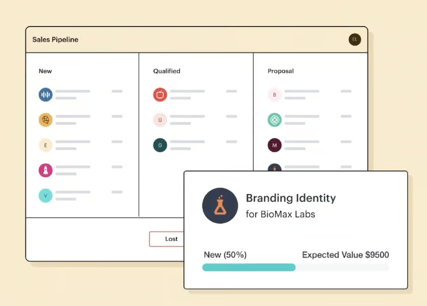
Capsule CRM’s sales pipeline dashboard organizes prospects by status. (Source: Capsule CRM) 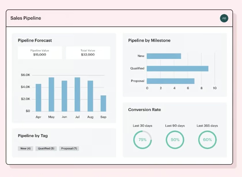
A second view of Capsule CRM’s sales dashboard has a time-based focus on conversions and sales value. (Source: Capsule CRM)


3. Sales Activity Dashboard
Sales activity dashboards provide a detailed look at the day-to-day work of a sales team. Whether viewed on a team or individual level, you stay updated on upcoming calls or appointments, compare task counts week-over-week, and connect activities to sales successes. This helps determine effective sales activities and improve or change those that are not.
Frequently featured KPIs:
- Activity type breakout
- Activity by rep
- Task completion rates
- Daily/weekly activity counts
Example of Sales Activity Dashboard
Pipedrive is one of the best CRM software for small businesses, known for its customizable dashboard and intuitive visualization tools. It comes as no surprise that you can tailor your sales activity dashboard to your preferred KPIs and show the key metrics in multiple panels within a single view. This dashboard functionality streamlines your decision-making process, especially when reviewing sales rep performance.
Pipedrive’s sales activity dashboard shows team performance and activities. (Source: Pipedrive) 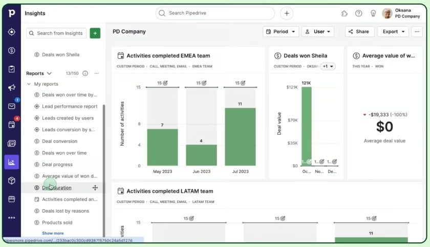
Pipedrive’s sales activity dashboard shows activities completed and deals won. (Source: Pipedrive)


4. Individual Sales Performance Dashboard
An individual sales performance dashboard provides a quick overview of a sales rep’s performance metrics, such as target quota attainment, as well as lead qualification status, sales forecast, opportunities, and activities. These dashboards allow reps to monitor their progress regularly and pivot as necessary. Furthermore, it encourages frequent use of your CRM to maximize its functionalities for optimal business benefits.
Frequently featured KPIs:
- Team rankings
- Individual pipeline
- Rep-specific activities
- Rep-specific forecast
- Top opportunities
Example of Individual Rep Dashboard
The image below is just one of the sales dashboard examples for reps. It shows what you can create with Salesforce—a highly customizable CRM with advanced reporting capabilities.
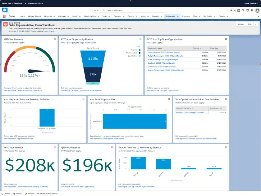
Salesforce sales rep dashboard with detailed insight into performance and opportunities (Source: Salesforce)
5. Sales Leaderboard Dashboard
If you’ve used activity or individual dashboards to understand each sales rep’s productivity, your next step is to push them to the next level. One proven way to do that is by holding sales contests in which the progress and results are presented in sales leaderboards. In a sales leaderboard dashboard, you can display the performance-based ranking of all reps to drive motivation and sales performance.
Frequently featured KPIs:
- Rep rankings
- Revenue created
- Opportunities won
- Pipeline by rep
- Net retention
- New account
Example of Sales Leaderboard Dashboard
By gamifying sales and offering rewards to high achievers, leaders can encourage employees to reach past their comfort zones. Sales gamification software streamlines this process while making it easy for sales reps to compare their performance with their peers. Using digital leaderboards, team leads can gauge which reps may be falling behind and need extra support.
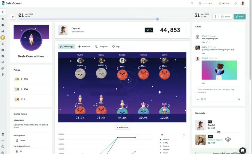
SalesScreen’s sales leaderboard shows a tournament-style competition (Source: G2)
6. Sales Territory Dashboard
For small businesses with sales reps assigned in multiple areas, a sales territory dashboard can map out resources, revenue per coverage, workloads, and potential opportunities. Customizing your dashboard promotes better territory management with more accurate and up-to-date data in easy-to-understand visual representations. For instance, bar graphs and color-coded maps with varying gradients can visually enhance the overlapping impact of each KPI.
Frequently featured KPIs:
- Revenue per segment or territory
- Number of transactions
- Prospective opportunities
- Account spend
- Open pipelines
- Onsite visits
Example of Sales Territory Dashboard
The sales territory dashboard provides insights into the sales process in a specific territory and segment without tediously scrutinizing individual accounts. You can find this feature in territory management software, which can help you implement an efficient sales management approach.
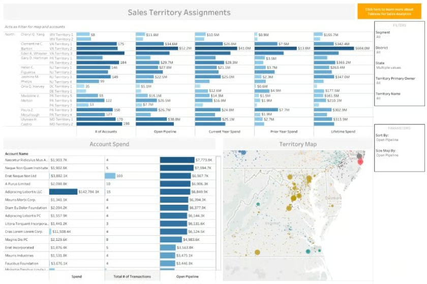
Tableau’s sales territory dashboard shows multiple graphs of territory assignment revenue and account spend. (Source: Tableau)
7. Sales Growth Dashboard
Even when sales reps are operating at their full potential, there’s a possibility that you may still fail to meet your sales goals. Closed deals may not be large enough, or there may not be sufficient sales reps on staff to meet volume benchmarks. A sales growth dashboard can reveal these issues, as it tracks key sales metrics changes over a specific period.
Frequently featured KPIs:
- Year-over-year performance
- Quarter-over-quarter performance
- Growth by region
- Growth by rep
- Growth by product/mark
Example of Sales Growth Dashboard
Examining a sales growth chart, like the sales dashboard example from Tableau (one of our recommended business intelligence platforms), can provide critical insights in circumstances like this. Data can be filtered by region or salesperson, allowing you to make year-over-year comparisons. With this information, you can easily tweak your business strategies to cover all sales management aspects, adjusting where, what, and to whom your reps are selling.
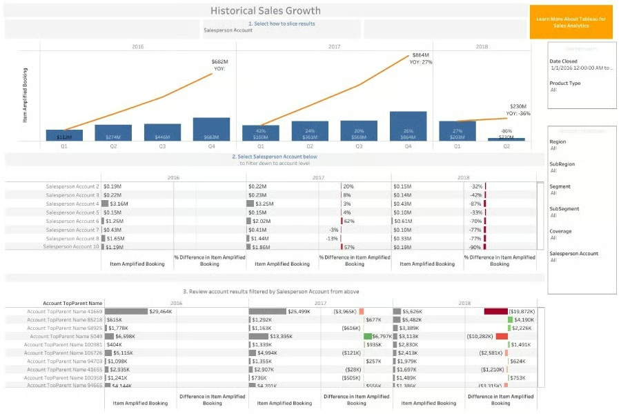
Tableau’s sales growth dashboard shows historical sales growth, sorted by region, segment, and salesperson account.
(Source: Tableau)
8. Sales Live Monitoring Dashboard
If you have a large or fast-moving sales organization, one of the best sales dashboards you can use is a live monitoring dashboard. Monitoring real-time performance can help you identify issues that need immediate attention and adjust your sales strategies accordingly. For example, if your weekly revenue is declining, you can assess your sales activity dashboard to identify bottlenecks, such as resource shortages, system downtimes, or delivery obstructions.
Frequently featured KPIs:
- Current sales
- Current lead status
- Week-to-date revenue
- Real-time activity count
- Daily leaderboard
Example of Sales Live Monitoring Dashboard
The example above comes from data visualization/sales dashboard software, Geckoboard, which enables you to use data from 80-plus sources to create your own dashboards. It integrates with some of our most recommended CRMs, including Copper, HubSpot, and Pipedrive.
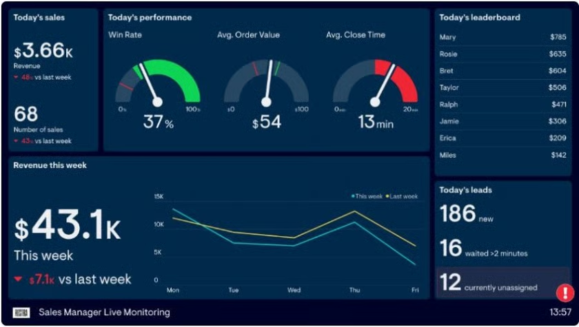
Geckoboard’s live monitoring dashboard allows you to track and respond to sales performance in real time.
(Source: Geckoboard)
9. Marketing ROI Dashboard
Sales and marketing efforts usually fall under separate departments. However, businesses must still have full sales and marketing alignment to save time and resources while ensuring more closed deals and robust revenue. Even when there is alignment between the two teams, it’s also important to know which specific marketing strategies are most effective in driving sales.
In a marketing return on investment (ROI) dashboard, you can keep track of your marketing efforts relative to their impact on your sales and revenue—all in a single view. For example, if you have launched an email campaign, you can see visuals of its progress, such as open rates, click-through rates, abandonment, and opt-outs.
Frequently featured KPIs:
- Average acquisition cost
- Click-through rate
- Cost per click
- Campaign ROI
- Lead conversion rate
Example of Marketing ROI Dashboard
A marketing ROI dashboard provides quick insight into how customers are engaging with your marketing campaigns to buy your products and services. In the example below from Zoho CRM, it’s easy to see that free tutorials net more than seven times the return of the business blog. This is important data to have when considering where to invest marketing spend in the future.
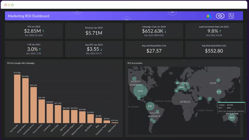
Zoho CRM’s marketing ROI dashboard highlights the amount of money spent on marketing tactics and the cost of each resulting sale. (Source: Zoho)
10. Lead Generation Dashboard
Like the marketing ROI dashboard above, this lead generation dashboard allows you to examine the successes (and failures) of the relationship between sales and marketing. Visualizing how your different lead generation tactics are impacting sales helps you quickly determine what’s working and what’s not so you can improve results.
Frequently featured KPIs:
- Lead counts
- Leads by source
- Lifecycle stage
- Lead-to-MQL (marketing qualified lead) rate
- MQL-to-customer rate
Example of Lead Generation Dashboard
A lead generation dashboard, like the one HubSpot’s CRM offers, can help you understand the impact of various marketing activities on sales. With this information, sales leads and reps can quickly determine where their efforts are best spent—or whether adjustments need to be made.
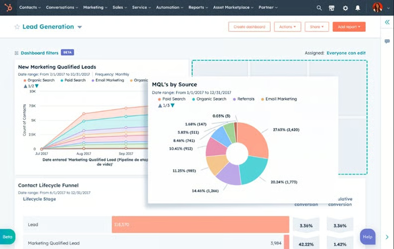
This HubSpot dashboard highlights lead generation data such as total count and leads by source. (Source: HubSpot)
How to Create Sales Dashboards
Now that you have seen the common examples of sales dashboards, it’s time to try your hand at creating your own. Here are the steps in creating a sales performance dashboard:
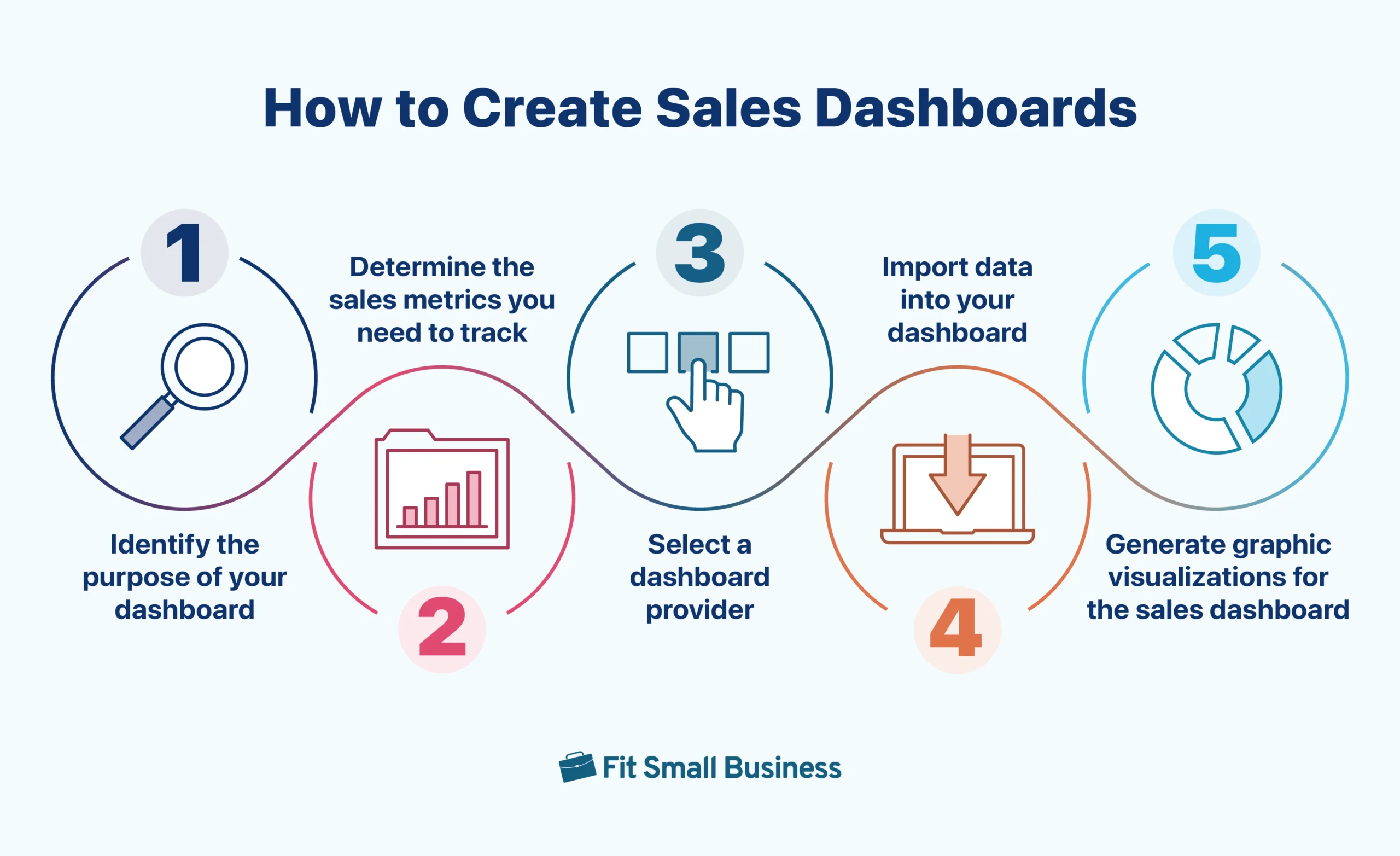
Step 1: Identify the Purpose of Your Dashboard
Think about who will view your dashboard, how it will be used, and how often it will be checked. Sales reps and managers will most likely check it daily, while higher-level executives will probably view it weekly or monthly. Also, consider making the dashboard mobile-friendly if you have field sales reps who will view it on the go.
Step 2: Determine the Sales Metrics You Need to Track
Take a look at the list of frequently featured KPIs under the sales dashboards examples in the previous section. Choose the sales metrics that you want or need to track based on their level of importance.
Step 3: Select a Dashboard Provider
You will find the best examples of sales dashboards from reputable providers. If you’re not using a CRM to manage your business, you can choose a provider like Klipfolio or Smartsheet to import data to create reports and dashboards. This process, however, is easier if you’re already using a CRM with built-in reporting dashboard features.
Step 4: Import Data Into Your Dashboard
After selecting a dashboard provider, use that platform to manually pull in data from your Excel or spreadsheet database. CRM users, on the other hand, can either sync data with dashboard software or directly generate sales reports from customer data in the CRM database.
Step 5: Generate Graphic Visualizations for the Sales Dashboard
Now that you have all the data you need, you can start building a dashboard that can help your organization make informed sales decisions. Use a wide range of visualizations such as charts and graphs to compare sales values, illustrate compositions, and show trends over a period of time. Then, you can start sharing the dashboard with relevant team members.
Statistics on Sales Performance Dashboard Use
Many sales teams and small businesses continue to find value in the best sales dashboards as the data presented in this tool is easy to grasp and digest, allowing everyone to get on the same page quickly. The best dashboards may also be updated in real time, providing the most accurate information to help teams adjust sales strategies at any time.
As obvious as the benefits of sales report dashboards are, not everyone maximizes the use of these visualization tools to modify their sales strategies and pivot to address the gaps. But those who do find themselves with the necessary information to refine sales team training and sales targeting initiatives. Here are some of the must-know trends to get the most out of your sales dashboard.
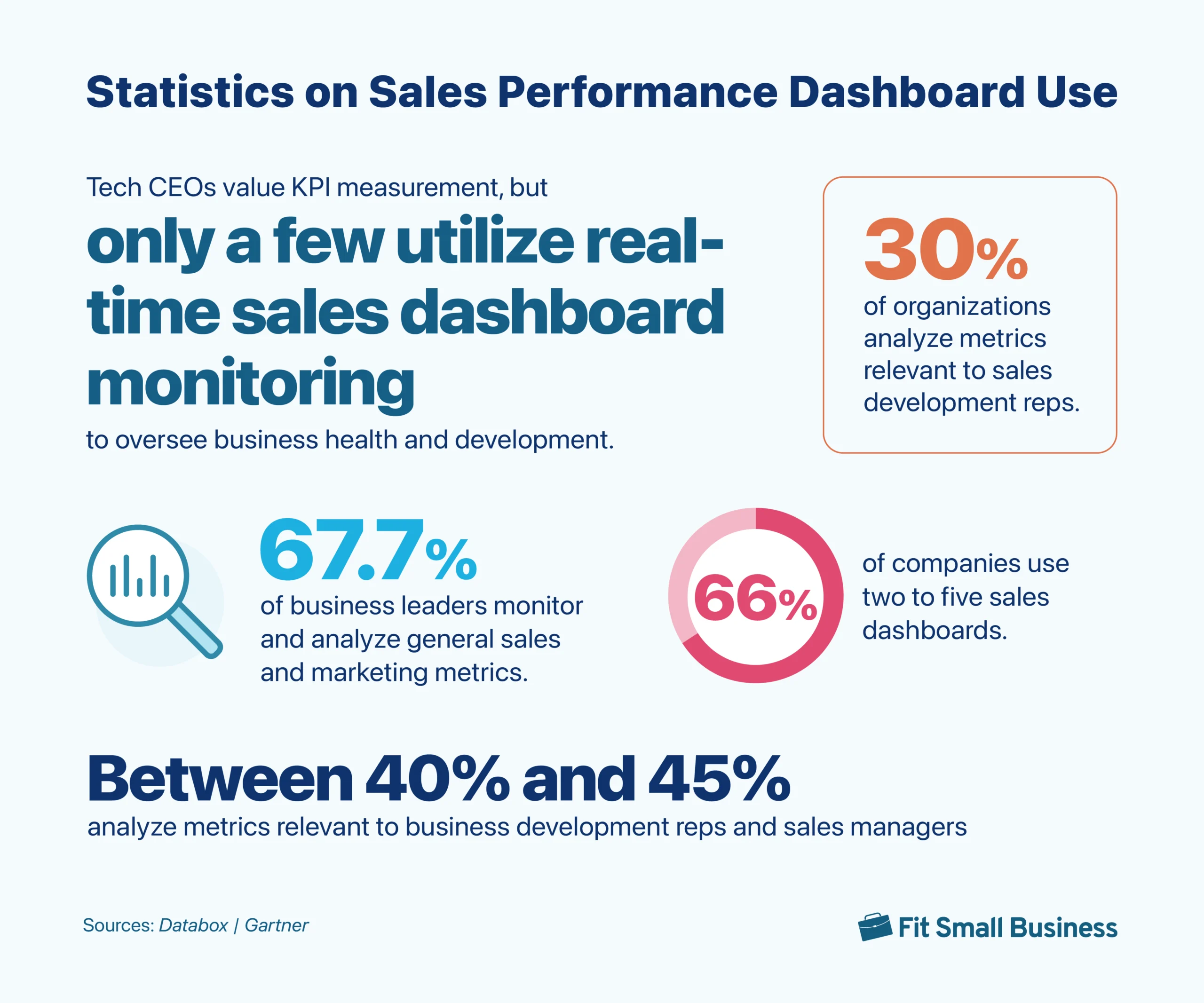
66% of companies use between two and five sales dashboards.
Takeaway:
Sales teams from these companies find using multiple sales dashboards effective in improving sales-related performance metrics. A sales dashboard software offers various dashboard formats with multiple views for quick data access and more informed decision making.
67.7% of business leaders monitor and analyze general sales and marketing metrics.
Takeaway:
Business executives use sales dashboards to analyze sales and marketing metrics. A well-designed sales KPI dashboard provides real-time data on sales targets, conversion rates, and other sales-related key performance indicators (KPIs).
Between 40% and 45% of companies analyze metrics relevant to business development reps and sales managers.
Takeaway:
Companies analyze various metrics relevant to sales development like lead response time, sales cycle length, and win rate. Moreover, business development metrics include
, conversion rate optimization, gross margin, and potential return on investment (ROI). Monitoring these metrics lays the foundation for sales strategy building to boost sales and revenue growth.
Tech CEOs value KPI measurement, but only a few utilize real-time sales dashboard monitoring to oversee business health and development.
Takeaway:
Business development refers to implementing strategies like prospecting and lead nurturing. Monitoring relevant KPIs about business health and development using a real-time sales dashboard is crucial in meeting and exceeding your sales and overall business goals.
Frequently Asked Questions
A sales dashboard must have an easy-to-interpret illustration of relevant metrics, like conversion rates and monthly quota to improve sales performance and overall business operations. Some helpful features include multiple data views like Kanban view and advanced analytics and reporting for more accessible and accurate data gathering, helping you make more informed sales-related decisions.
A sales key performance indicator (KPI) dashboard includes metrics based on the area of sales performance you want to analyze. For instance, you can monitor your year-to-year sales revenue in your sales KPI dashboard, as well as your total number of sales, total value of sales, and number of lost deals. Moreover, you can also view sales rep activities and individual productivity metrics, including the number of calls, appointments, and sales proposals.
A sales dashboard in Excel shows your sales-related metrics in tabs, cells, and tables, depending on what sales-related metrics you want to enter and analyze. Excel can do quick calculations based on set formulations, allowing salespeople to track their sales performance. However, Excel’s capabilities as a sales dashboard are very limited (lacking advanced analytics and reporting) compared to customer relationship management (CRM) software.
Bottom Line
A sales performance dashboard can help you save time and resources by compiling critical data into an easy-to-share and easily understandable visual representation. Your sales team can analyze the most relevant metrics and make adjustments to the strategies impacting your revenue and growth. Build your own sales dashboard from scratch using our free downloadable template or use a CRM like Pipedrive to easily create dashboards with its drag-and-drop capability.