A good startup website is user-friendly, helpful to its target audience, and reflects what makes the business stand out from others. The best startup websites generate traffic, leads, and sales effectively by showcasing unique solutions and using clear calls to action. Here, we explore the 15 best startup websites, see how they combine form and function, and learn why they work.
 Building a standout website for a start-up is a big part of establishing your new brand. It needs great design, ease-of-use, and all the essential functions. Squarespace is a platform with all this and more, which we recommend if you’re building a website for your new business. It’s user-friendly and has dozens of award-winning designer templates. Sign up today and get a 14-day free trial. |
Receive 10% off your subscription with the exclusive code FITSMALLBUSINESS10 |
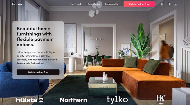
1. Pabio: Great Site Visitor Experience
For tech startups, your website is one of the most valuable assets. Explaining technology can be tricky, whether it’s to investors or potential customers. Therefore, the dynamic, interactive, and visual nature of websites makes them the perfect medium for communicating complex ideas.
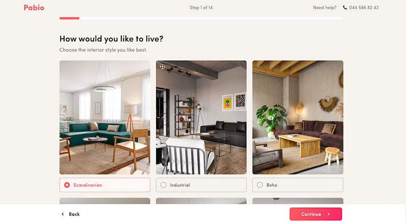
Home renovation startup Pabio’s website reflects this principle to a tee. Its website is clean and easy to navigate, clearly stating to visitors what its product does. Besides being informative, it’s also interactive in prioritizing customers’ user experience by adding a quiz that helps guide their purchase decisions. This shows that the company has its customers’ best interests at heart.
Pro tip: Getting expert help can jumpstart your new venture vs. going it alone. Find the best partner to grow your startup in our list of the best startup marketing agencies.
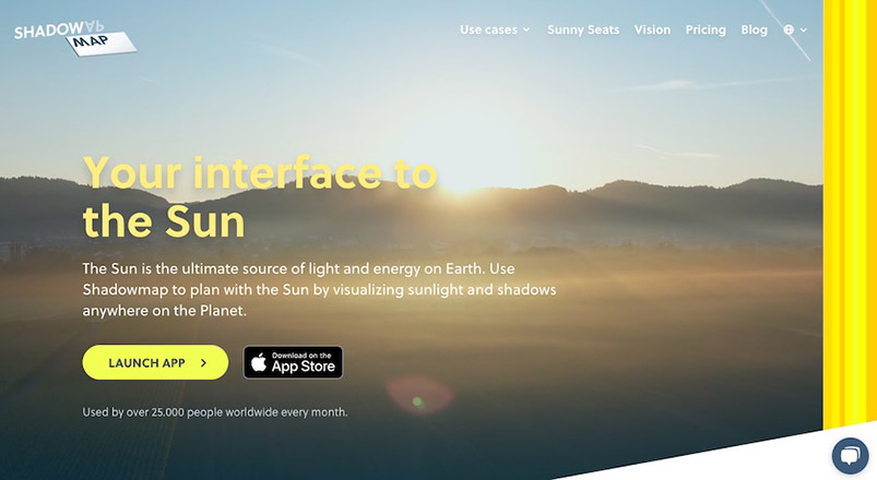
2. Shadowmap: Excellent Use of Hero Section
Shadowmap uses its hero section in two crucial ways. First, it lets visitors know exactly what the business is about with a professionally shot video. Second, it provides a call to action (CTA) that immediately gives users access to their technology without signing up for an account. Visitors can preview the app and are encouraged to purchase a subscription for full access to its features.
The hero section is the first thing visitors see when they open your website and is your first chance to make an impression. Good visuals, clear and effective copy, and a button that lets users access your product are guaranteed ways to keep them interested in your brand.
Pro tip: Having a website for your business is your gateway to success in the digital age. Learn everything about how to build a small business website in our step-by-step guide.
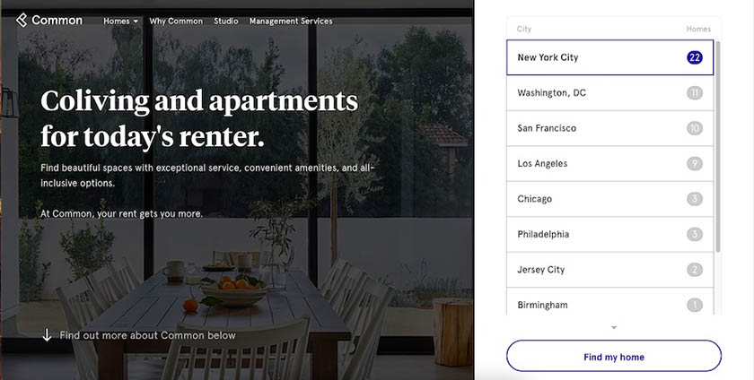
3. Common: Makes Site Navigation a Breeze
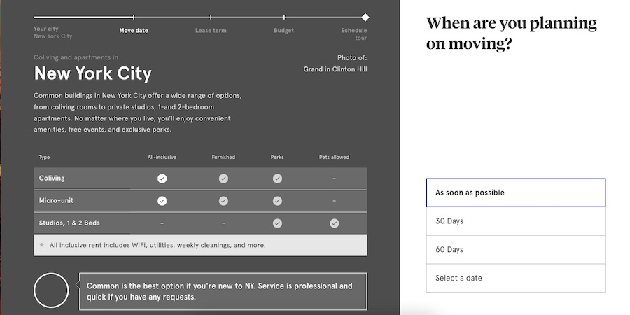
Common earns a spot among the best startup websites for its modern, attention-grabbing quiz on the home page that quickly navigates site visitors to the information they need. Not only is the dynamic quiz an eye-catching design element, but it also leads to a better user experience by accurately anticipating audiences’ intent and putting their needs first and foremost.
Quiz elements are always great for your website—they encourage engagement and guide the user journey. WordPress offers plugins to easily create these elements for free, such as the Quiz and Survey Master Plugin. Alternatively, HubSpot’s free customer relationship management (CRM) tool has a similar online form builder to embed into your site for easy lead generation.
4. Lightyear: Puts Products in the Spotlight
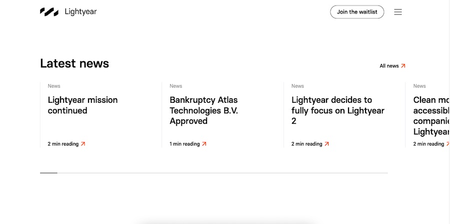
Lightyear’s site starts with a full-screen video that immediately captures attention, which places its main selling point front and center, alongside a clear call to action. It then alternates using whitespace with eye-catching images to divide content into sections as you scroll down the page.
This makes Lightyear’s site clean, professional, and easy to navigate, pulling focus on its products. As your scroll, each section offers options to click links to find out more, which site visitors can navigate and discover organically. You can create a similar site using Squarespace’s Bailard template. Start with a high-quality video on top, then organize your sections based on your customers’ buying journey.
The easiest way to get your startup website online is with an all-in-one site builder like Squarespace or Wix. They offer a wide range of designs and functionalities and intuitive, beginner-friendly editing tools. Learn more and discover why they’re on our list of the best website builders for small businesses.
5. Squadeasy: Dynamic, Animated Visuals
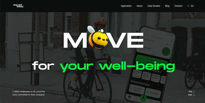
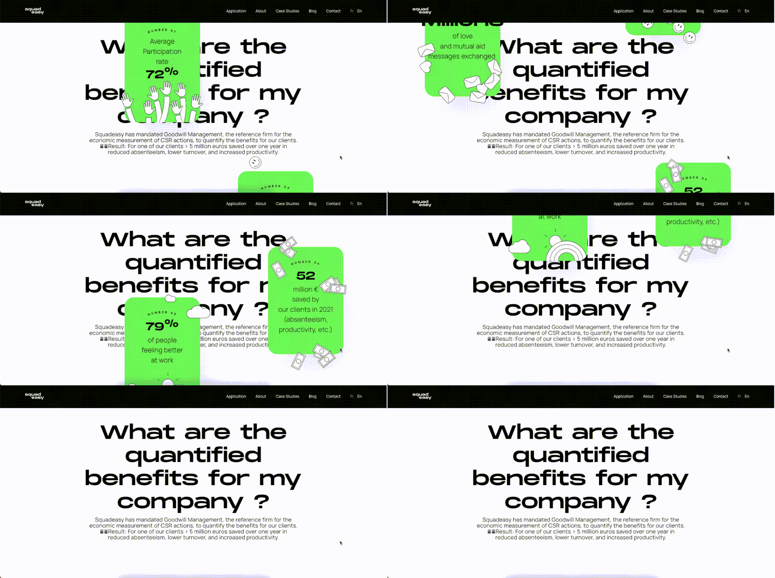
A little movement and animation can do a lot for your website, especially with eye-catching typography and interactive graphics. All of these combined forces are at play in Squadeasy’s website for their health tech app, overall creating a user experience that’s truly unforgettable.
In an age where websites are plentiful, it takes extra effort to stand out. Squadeasy does this well by including all the usual information expected from a startup website, and presenting it in exciting ways by being dynamic and interactive, even down to the movements of your cursor. It’s the best example of utilizing the capabilities of websites to create a lasting impression and boost brand recall.
6. January: Great Use of Pop-ups for Lead Generation
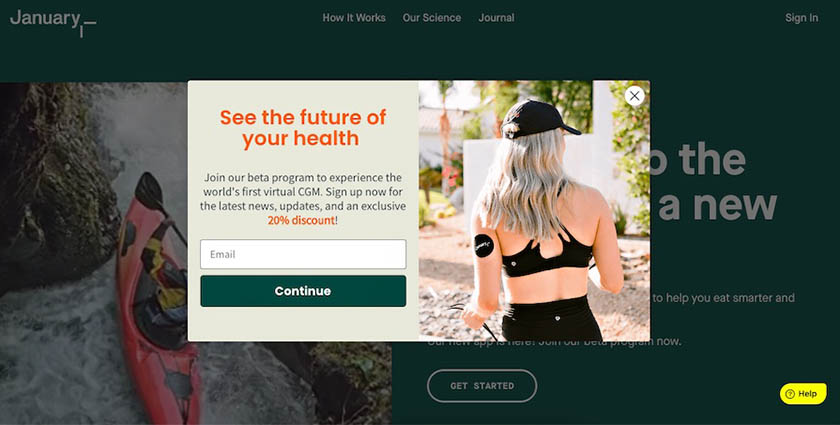
Upon visiting the January homepage, you’re greeted with a pop-up for an enticing 20% discount by inputting your email address. Code-based coupon marketing and first-time purchase discounts are effective in generating leads and building your contact list.
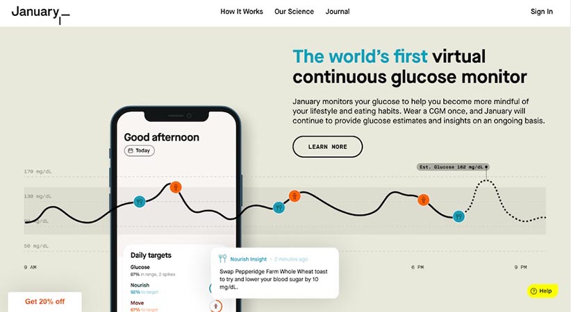
The rest of the website is also visually appealing and informative. Like all the best startup websites, it uses unique, high-quality content, and presents it in interesting ways, through images, videos, charts, and infographics.
The easiest way to recreate this website is to use the Malone or Bogart template on Squarespace. Use a bright color that draws visitors’ attention to specific elements, such as your CTA buttons, and add pop-ups with limited offers to help build contact lists. If you’re using WordPress or Shopify, a pop-up creator like Sumo can help with lead generation.
7. GoHenry: User Reviews for Credibility
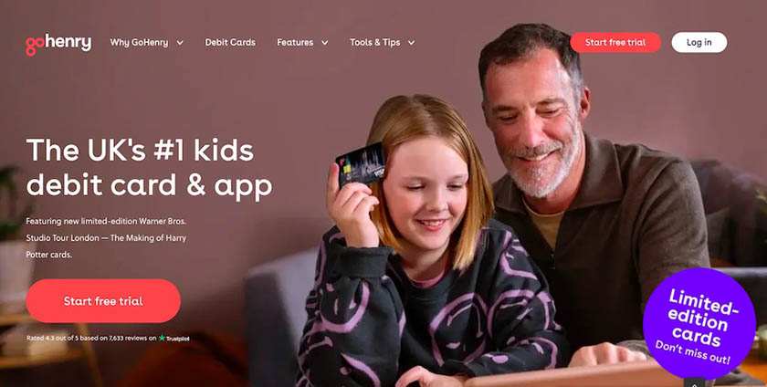
The GoHenry website is unique for catering to two audiences at once: parents and their kids. Their hero image of a father and daughter immediately reflects this, as do the rest of the website’s elements. While the website copy speaks directly to parents (the decision-makers), the visuals are eye-catching and appealing to kids (the intended users).
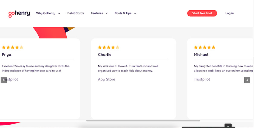
It also stands out by displaying reviews on the website to boost its credibility and ranking, which is especially helpful for fintech (financial tech) companies. Get more strategies to build your brand presence and online visibility by learning to rank higher on Google.
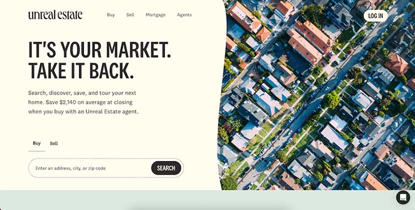
8. Unreal Estate: Strong, Straightforward Call to Action
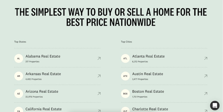
Easy navigation and simple language are cornerstones of any effective startup website, including that of Unreal Estate. Unreal Estate is a platform connecting homebuyers and homesellers, and it does this easily through an orderly (but creative) design layout, as well as clear and simple language that speaks directly to its customers.
Unlike other sites that start by talking about its product, Unreal Estate immediately speaks to its audience using simple, everyday language. It follows this up with an eye-catching and easy-to-navigate startup website design that gives users the most important information first, such as home listings by location. A further scroll down also shows customer testimonials, which put a human face to the brand.
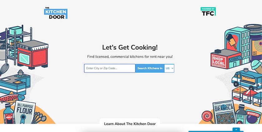
9. The Kitchen Door: User-friendly Search by Location Navigation
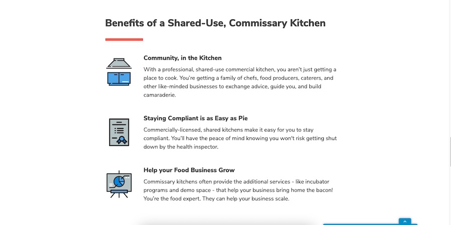
The best feature of The Kitchen Door’s website is the search box in its hero section that lets users search a database of rentable kitchens via ZIP code. The simple, yet colorful hero section is followed by content sections that explain more about their service in neat, single-column text blocks and graphics. Finally, it also features another search box at the very bottom of the page, so users won’t need to scroll back up again.
For startups that center on users’ location, placing a search-by-location element right on top can help generate more leads. You can replicate this type of search easily with an affordable site builder like Wix. You’ll find plugins like the Map & Store Locator plugin in Wix’s app marketplace, which you can add with little more than a click. Find out how easy it is to build a website with Wix, including adding apps.
10. Play.ht: Interactive Product Engagement
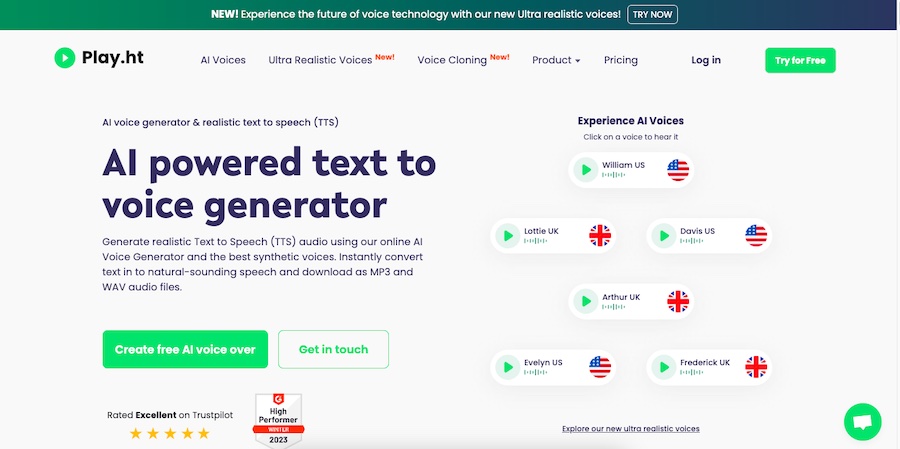
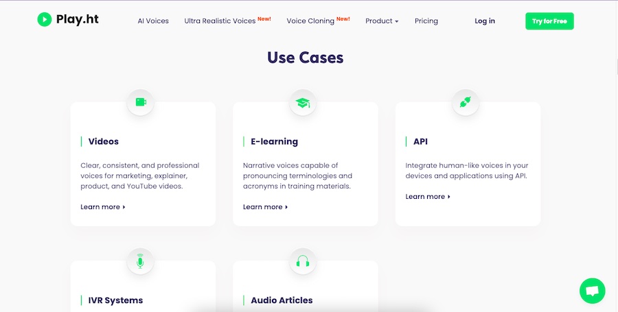
Play.ht encourages engagement from site visitors with its selection of clickable buttons that play samples of their software: an artificial intelligence (AI) text-to-voice generator. It follows these up with call-to-action buttons inviting users to discover more, as well as instructional videos and even more sample recordings. All these elements signal their expertise on all things audio to users, which they back up with user reviews.
Although this is a custom-built website, you can replicate its elements by embedding a limited version of your software. Then, add use cases to illustrate its capabilities and add reviews for credibility. Check out our list of the best small business website examples for inspiration.
Pro tip: Increase your site engagement by adding interactive elements to your page. Wix makes this easy with a large marketplace of third-party apps for everything from calculators to map locators. Learn more in our expert Wix review.
11. Vaayu Tech: Curated Single-page Customer Journey
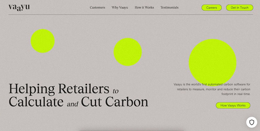
Part of what makes a good startup website is a great user journey. User journeys are usually created through links, buttons, and navigation bars, but sometimes, they can also be as simple as scrolling through a single page. This is exemplified by tech startup Vaayu Tech, which uses a one-page website to tell its entire story.
The concept works because of intentional design and information hierarchy. It starts with the most important information, then supplements it with additional info, like how it works and testimonials, before finishing with a call to action at the bottom of the page. Single-page websites are great for tailoring your users’ journey—see how versatile they can be by checking out our list of the best one-page websites.
12. Consolto: Demo-based Call to Action
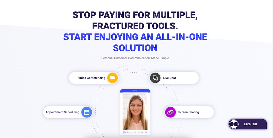
Upon visiting Consolto, you’re immediately greeted with a call to action to demo the video chat service. The homepage demonstrates how the software works and looks, while the rest of the website builds the company’s authority with impactful copy and subtle, effective, responsive elements. It wraps everything up with customer reviews and has a scrolling “Let’s Talk” chatbot that makes it easy to book an appointment with a sales rep.
It’s overall a straightforward but effective strategy for a tech startup website. This type of design can be recreated most efficiently with a cheap website builder like GoDaddy, which includes appointment booking tools and website chatbots in all of its plans (even the free one). Learn more about how to build a GoDaddy website to see how you can make it work.
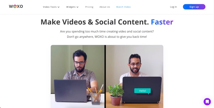
13. Woxo: Great Use of Video Storytelling
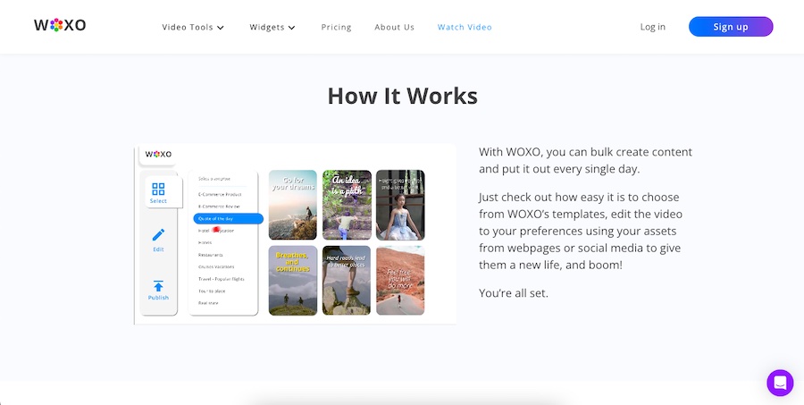
You can’t go wrong with a clean, structured website that combines eye-catching visuals with good use of whitespace like Woxo’s website does. The hero section commands attention with a bold headline, followed by a humorous and relatable video that instantly connects with audiences. The rest of the website follows the same principle, showcasing its product and how it works with simple videos and easy-to-understand language.
Each section builds on itself, offering all the information visitors need. It also uses a clutter-free layout focusing on the most important information. Finally, there’s also a live chat feature for visitors to ask questions, which helps increase conversions.
Pro tip: Worried about how much you’ll have to budget to build a great startup website? Get all the details about small business website costs for DIY site building vs outsourcing to a pro.
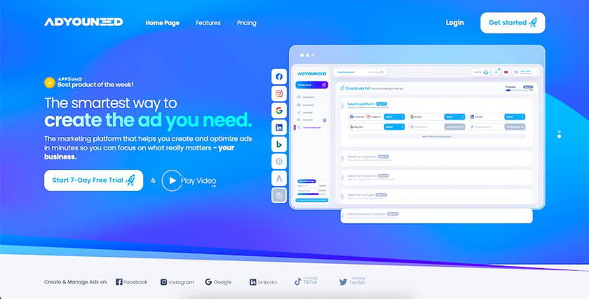
14. AdYouNeed: Animations That Illustrate Services
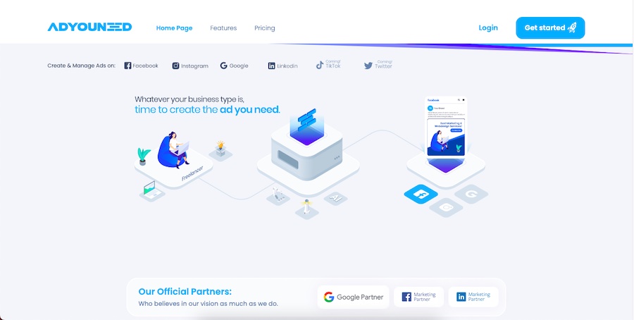
As soon as AdYouNeed’s home page loads, visitors get a clear summary of what the agency can do for them, plus a call to action to start a free trial. Upon scrolling down, the site further stands out by using creative animations to illustrate its services, as well as a unique site layout that uses responsive content blocks.
The startup website is a great instance of using animations and responsive design to turn otherwise complicated information into interesting content. You can get the same responsive mouse-over effects by building a WordPress website using a no-code page builder like Elementor Pro.
15. YouEngage: Good Structure & Scrolling Experience
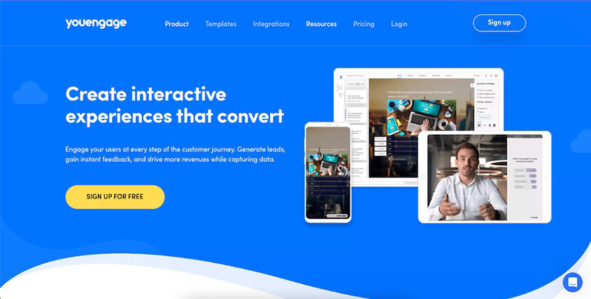
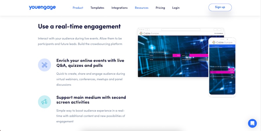
YouEngage’s website begins with a simple explanation of its service and a clear call to action, paired with responsive images that encourage engagement. It also uses a subtle parallax scrolling feature, making the visuals eye-catching. It does an excellent job of information architecture as each section builds upon the last to educate the visitor and strengthen its messaging.
Tips & Resources for Building a Good Startup Website
Having spent some time looking at the design elements and functionality the best startup websites employ, you may be wondering how to make your vision come to life. Below are tips and further resources to help make the website-building process easier, faster, and less expensive.
- Cover all your bases: Take time to explore what makes a good website stand out as well as all of the essential website basics you need to cover.
- The right platform: Choosing a drag-and-drop website builder like Wix or Squarespace offers the best combination of beginner-friendly tools, design freedom, and overall business website functionality. Plus, paid plans come with a free domain and SSL to save you money.
- Lean into the data: Find out more about what makes websites great in our list of website statistics. Then build on your knowledge with web design statistics that showcase how to provide a good user experience to produce sales, word of mouth, brand loyalty, and more.
- High-quality images and graphics: Digital artwork can get expensive, but there are several places to get cheap or even completely free images for websites.
- Website marketing strategies: Building a good startup website doesn’t ensure traffic. So as part of your plan, learn what website marketing strategies you can use to generate awareness and traffic that produces sales, sign-ups, and other conversions.
- Outsource design options: Top digital marketing agencies, like you’ll find on the freelance marketplace Fiverr Pro, have pre-vetted web development experts who can build websites on WordPress, Wix, Shopify, and many other platforms at a low cost. Alternatively, you can get a custom, all-in-one solution for a website, search engine optimization (SEO), email marketing, and social media with an agency like Hibu.
Before you start designing your site, learn how to pick a website color scheme and determine what different types of colors represent. And for even more inspiration, check out our list of the best color palettes for websites.
Frequently Asked Questions (FAQs)
What’s better: WordPress or Squarespace?
Comparing Squarespace vs WordPress isn’t apples to apples. Squarespace is an all-in-one solution, whereas using WordPress requires you to obtain hosting, a domain, SSL, theme, and plugins separately.
Squarespace is better for building a website easily, quickly, and cheaply, and it’s best for beginners. Meanwhile, WordPress is the better choice for startups looking for growth—it offers custom or niche functionality and overall scalability, and is best for those with previous web design experience.
What do you need to build a startup website?
To build a website for a startup, you’ll need to know what type of features and functionality your site needs and find the best platform based on your needs and budget. You’ll also need visuals like a business logo design and images, a plan to structure your site and copy for your web pages. Plus, you’ll need to decide whether you can build it yourself or need to hire a developer or agency.
How much does a WordPress website cost?
At the low end, the cost to build a WordPress website is $130 the first year and $300 a year after that, with all-inclusive plans from web hosting companies like Bluehost. This doesn’t include costs for a premium theme or paid plugins your site may need.
However, the price can climb into the tens of thousands at the high end for developer-built custom WordPress sites with premium themes, plugins, and integrations. Find out more in our article breaking down how much WordPress websites cost.
Bottom Line
Designing a website can be challenging; however, you can find inspiration from the best startup websites above. Then you can easily bring your design vision to life with all-in-one website builders that won’t break the budget, or even with a free website builder like Wix or HubSpot.
