Few things are more exciting for an entrepreneur than launching their brand online—and that includes website design. To help you fulfill your web design vision, we compiled 20 of the best small business website examples for ideas and inspiration. Below, you’ll find examples of small business websites for different businesses, along with the best site builders to use to flesh out your favorite design.
1. Ecommerce Website Example: Vortic Watches
CMS: Shopify
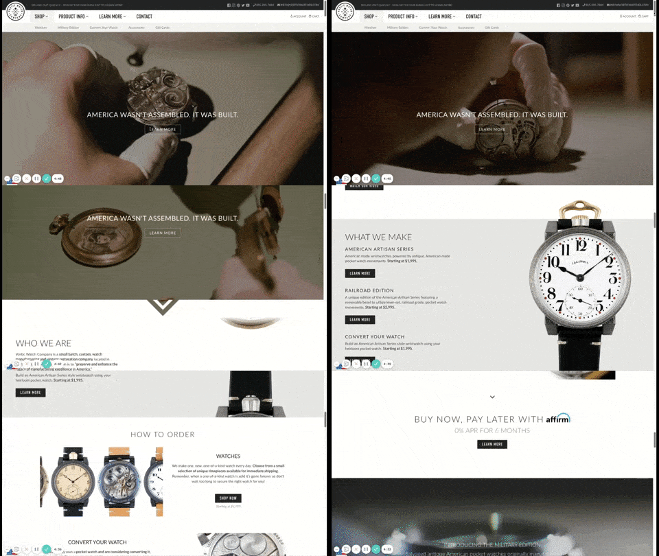
Shopify ecommerce website example (Source: Vortic Watches)
Vortic Watches does a great job of bringing its products to life—even just within its homepage. The company specializes in transforming pocket watches into wristwatches. Effective video use illustrates what it offers, but the creative use of Parallax scrolling sets Vortic apart.
As you scroll the page, a pocket watch is transformed into a wristwatch. This detail demonstrates the brand’s eye for quality. It also highlights the customizability of page builder programs. This site is built on Shopify, one of the most popular website builders for ecommerce.
To learn more about how you can make a store like this one, check out the steps on how to build an online store with Shopify.
2. Photography Portfolio: Galo Delgado
CMS: Wix
Photography portfolio sample website (Source: Galo Delgado)
Photographer Galo Delgado’s portfolio proves simple can be beautiful, but it doesn’t have to be boring. Delgado’s site incorporates motion in the header, and images flip periodically through the gallery. The result is a site that complements Delgado’s photos instead of distracting from them.
Clicking on the themes in the menu, users can browse collections. Or they can click on individual images and view them in a larger format in a lightbox. The result is a site design that, while visually stunning, fades into the background, leaving you to experience Delgado’s art. The photography studio uses a balanced, tiled template to showcase its portfolio on the front page.
Delgado’s site is built on Wix, which has over 800 templates in its library, including portfolio website templates similar to this one. Check out our Wix video tutorial and step-by-step instructions to see how easy it is to build a website with Wix.
3. Cafe: Rise
CMS: Squarespace
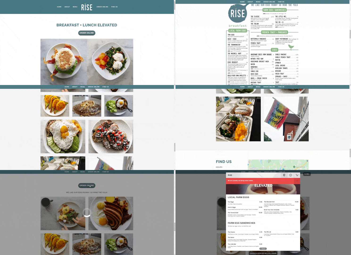
Cafe website example (Source: Rise)
Rise, a Connecticut-based cafe, has a sleek, minimalist website that provides basic information sought by those visiting a cafe’s website. It incorporates scrumptious food photography into its menu, serving as the site’s centerpiece. Directions are placed toward the bottom, followed by a brief section of food reviews from various publications.
Rise’s food takes center stage and makes for a pleasant browsing experience. The top menu transforms into a thin “sticky” menu, meaning navigation is always at the top of the page, which scrolls smoothly through the sections for a browsing experience that looks as delicious as the food.
This simple yet effective small business website design example is powered by Squarespace, a page builder system created to simplify web design. To build a similar site, learn how to build a Squarespace website, then sign up for your 14-day free trial with Squarespace and choose the “Atlantic” template.
4. Architecture Firm: Architecture in Formation
CMS: Squarespace
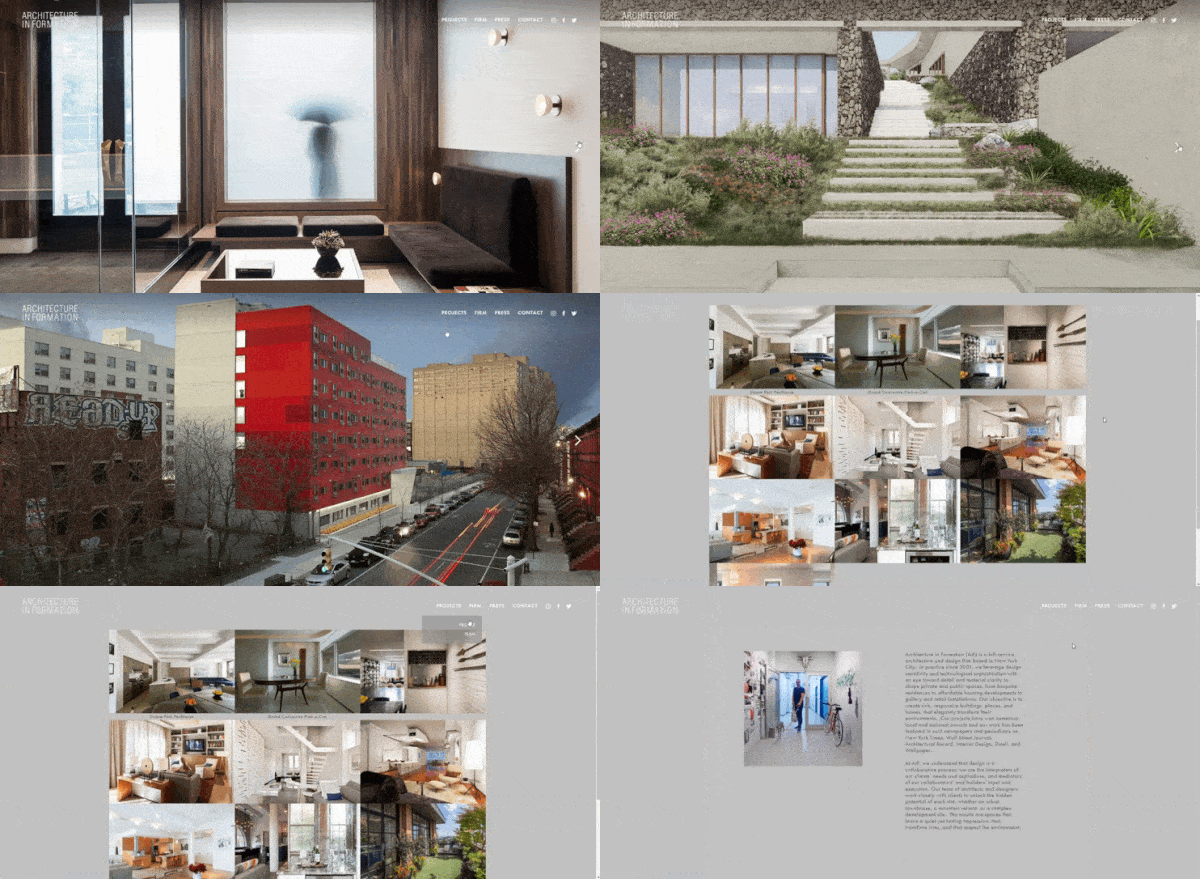
An example of an architectural firm’s website (Source: Architecture in Formation)
For its entry into the website design, Architecture in Formation chose a stacked template evocative of a multi-story building. Modules are layered neatly atop one another, providing an ideal setting for ample professional architectural photographs to sell the company’s services.
Built on Squarespace, Architecture in Formation uses a minimalist landing page that’s just a slideshow of their works. To achieve the same look, use the “Forte” template, a great template foundation for a visual portfolio.
Alternatively, web design beginners wanting to avoid mistakes can take the guesswork out of choosing the right template with an AI site builder like Jimdo. Use its artificial intelligence to create a site based on your business and preferences and then customize it with intuitive settings and sections. Visit Jimdo to get started today.
5. Property Management: Mill City
CMS: WordPress
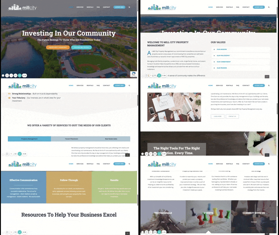
An example of a website with parallax scrolling (Source: Mill City Property Management)
Mill City Property Management, a New England-based property management business, has a simple, clean interface that provides visitors information on two fronts: services the company offers and available rental properties. It’s a good small business website example showing how parallax scrolling gives a site depth and visual interest.
A sticky top menu provides easy navigation, and calls to action (CTAs) encourage site visitors to convert from casual browsers to sales leads. Built on WordPress using the Avada page builder theme, Mill City Property Management’s website demonstrates the capabilities of WordPress in creating a custom site.
6. Startup Business Website Example: KeyNest
CMS: Squarespace
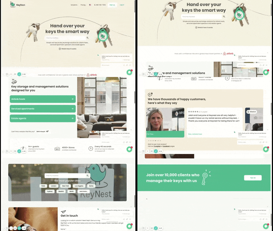
A small business website example with a strong value proposition (Source: KeyNest)
Property rental services startup KeyNest wastes no time stating its unique selling proposition: a simple and secure key exchange system for Airbnb hosts and property rental companies. The site is clean, beautiful, and to the point, leaving visitors to focus on the site’s message of innovative and secure key exchange.
One standout feature is the chatbot that gently encourages visitors to search KeyNest’s knowledge base for answers to common questions. It also provides a direct line of communication to the KeyNest customer service team.
Built on Squarespace, KeyNest shows the power of that page builder platform and the full-featured nature of websites page builders can create and manage. If you’re interested in Squarespace, check out the best free Squarespace templates for business websites.
7. Tree Farm: Treeland Nursery
CMS: WordPress
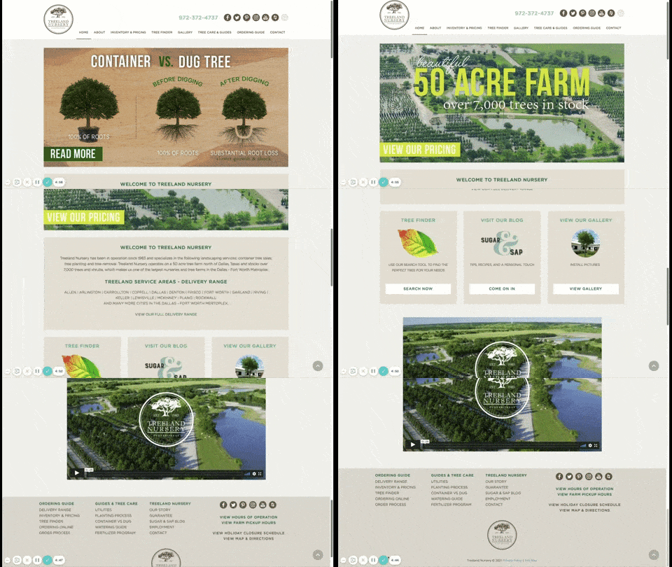
A sample small business website for a tree farm (Source: Treeland Nursery)
Treeland Nursery proves that a small business website does not have to be small. This full-featured site sells trees to the Dallas-Fort Worth area, and it includes all of the information potential customers need to make their arborist decisions.
An About Us page provides background on the company and its personnel, while tree care and how-to guides are showcased on another tab. Suggestions for the perfect species of tree and a blog are just some of the other features of this site, all of which are just a click away in the convenient top menu. Shopping for trees is easy with the inventory and shopping cart features.
The Treeland Nursery site is built on WordPress using the Pinboard theme. To build a WordPress site, get an all-inclusive plan with domain, SSL, business email, and a no-code WordPress page builder through a company like Bluehost. Plans start under $3 a month for the first year.
Check out our list of the best web hosting companies for small businesses. Several have WordPress-ready plans to help you get your brand online more quickly.
8. Online Store Website Example: Izzy Wheels
CMS: Wix
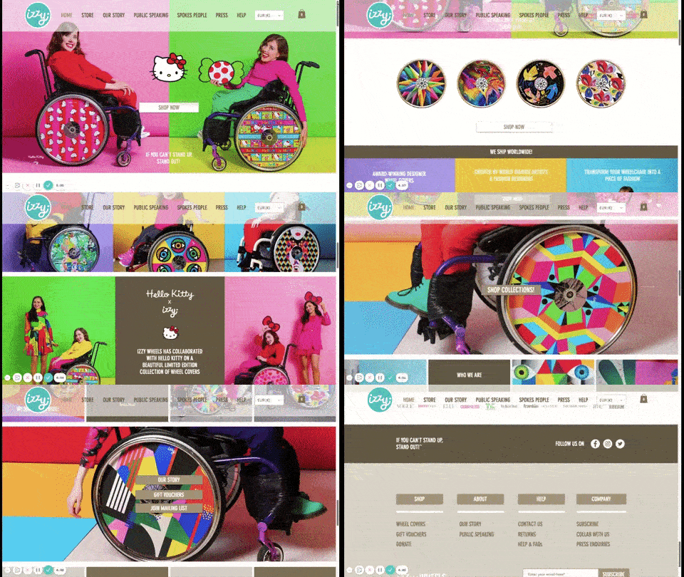
An example of a website built on Wix (Source: Izzy Wheels)
Izzy Wheels shows how a brand can create a fun site visitor experience. The site sells energetic spoke covers for wheelchairs. With bright colors and subtle animations, Izzy Wheels conveys the exuberance and motion its products impart.
This small business website example effectively uses bright colors and captivating photos to capture visitor attention. Its sticky, transparent header lends to user experience, giving visitors easy access to the site’s navigation and other web pages.
For their ecommerce site, Izzy Wheels chose Wix. The ease of use of the back-end ecommerce solution makes Wix an excellent choice for most small businesses. In fact, Wix tops our list of the best website builders for small businesses thanks in part to its robust ecommerce features and website customization you can achieve with its drag-and-drop editor.
9. Hotel & Restaurant: La Zebra
CMS: WordPress with Elementor
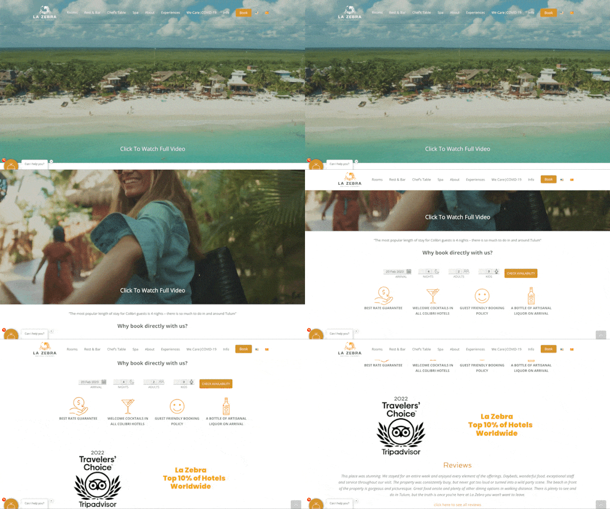
Hospitality industry sample website (Source: La Zebra)
The business website example for boutique hotel La Zebra hotel illustrates how it is possible to include a lot of information in a reader-friendly way. Information is arranged in the navigation bar according to the service a visitor is looking for. Reservations are easily accessible immediately below the header, and the color scheme is warm and inviting.
Despite a large video header, the site loads quickly and presents visitors with a visually stunning series of experiences. Scrolling is smooth and makes effective use of animations and parallax backgrounds.
WordPress is not inherently design-friendly, so La Zebra built the site on WordPress using the Elementor page builder plugin. Elementor is one of the best WordPress website builder themes you can use to simplify building on WordPress. It lessens the learning curve and incorporates drag-and-drop, code-free page building into WordPress.
10. Restaurant: Big Boi
CMS: Wix
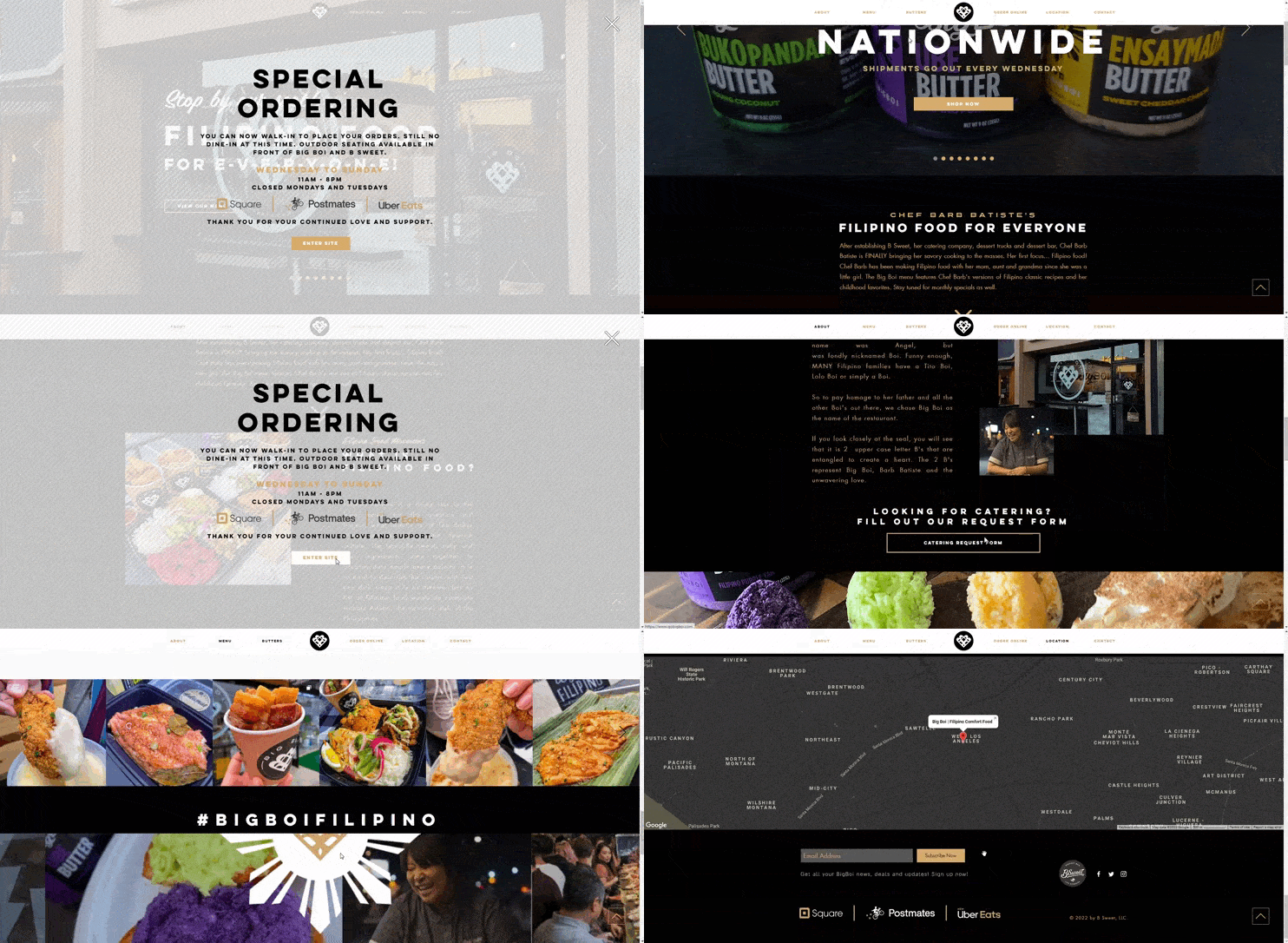
Big Boi’s restaurant website demonstrates the flexibility of Wix. (Source: Big Boi)
Big Boi, a Filipino restaurant in Los Angeles, effectively utilizes Wix page templates to display menus for online ordering. When combined with tiled images of the restaurant’s food, the menus encourage ordering food from the eatery.
Another powerful technique Big Boi employs is using pop-ups to communicate store policies, hours of operation, and delivery information. Pop-ups and splash pages can be effective in helping steer site visitors to specific types of info when they land on a certain page on your website.
Wix makes it easy to add a pop-up by simply adding an element called a “Lightbox” through the Wix Editor. For an ultra-easy way of building a restaurant site like this, check out our list of the best website builders for restaurants.
11. Beauty Services: Sugared + Bronzed
CMS: Shopify
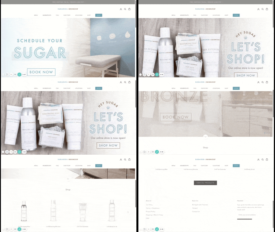
Sugared + Bronzed minimalist service-based website (Source: Sugared + Bronzed)
A Los Angeles-based beauty service business, Sugared + Bronzed offers a clean and minimalist web design. A cool, crisp color scheme sets off its products nicely. Aesthetics aside, it’s packed with features that turn this seemingly simple site into a marketing machine. For example, when you visit the site, a pop-up offers a $10 product discount to join the contact list.
In addition to its online store and membership packages, Sugared + Bronzed includes a booking system. This enables visitors to schedule appointments no matter what time of day they’re visiting your website, ensuring you don’t miss a chance to convert a site visitor.
The site relies on Shopify’s scheduling system for this functionality. Shopify makes it easy to build appointment scheduling into your site. If Shopify is too expensive, consider GoDaddy. It’s more budget-friendly and includes one of the best online booking systems—starting with the free plan. Learn more about GoDaddy in our list of the best free website builders.
12. Web Design Business Website Example: LLT Group
CMS: WordPress
A business website built using a custom WordPress theme (Source: LLT Group)
Web design company LLT Group begins its website with links to client work and a strong call to action. As a web design and branding-focused business, the LLT Group website showcases its WordPress web-building expertise using user experience (UX) and user interface (UI) elements to entice visitors.
Subtle animated effects engage visitors further, inviting them to click through to case studies and a simple contact form to initiate a new project. CTAs are never more than a few inches from the center of the screen, making it easy for a site visitor to become their customer. Built on WordPress using a custom theme, this website example demonstrates the functionality the ever-popular WordPress web content management system (CMS) provides.
13. Online Beauty Products Store: Maapilim
CMS: Wix
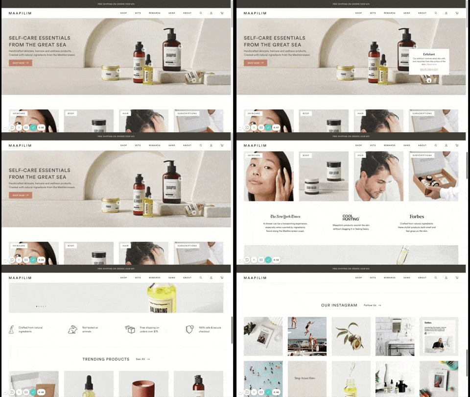
Maapilim’s site for beauty and hair products (Source: Maapilim)
The Maapilim online store is a case study in the power of all-in-one site builders. With an interactive, feature-rich user experience, the beauty and hair products retail website example provides a luxe browsing experience that corresponds to the luxury of its products.
A large, interactive top image-based banner (aka hero) header on the homepage provides basic information with a simple mouse-over of products. Later, a slider image provides an overview of popular product categories for her and for him. The homepage wraps up with an image gallery powered by Instagram, connecting the site back to Maapilim’s 12,000-plus followers.
The site is built on Shopify, using templates and customized themes. For more information about Shopify, learn how to set up a Shopify website easily.
14. Nonprofit Website Example: WoofGang & Co
CMS: WordPress
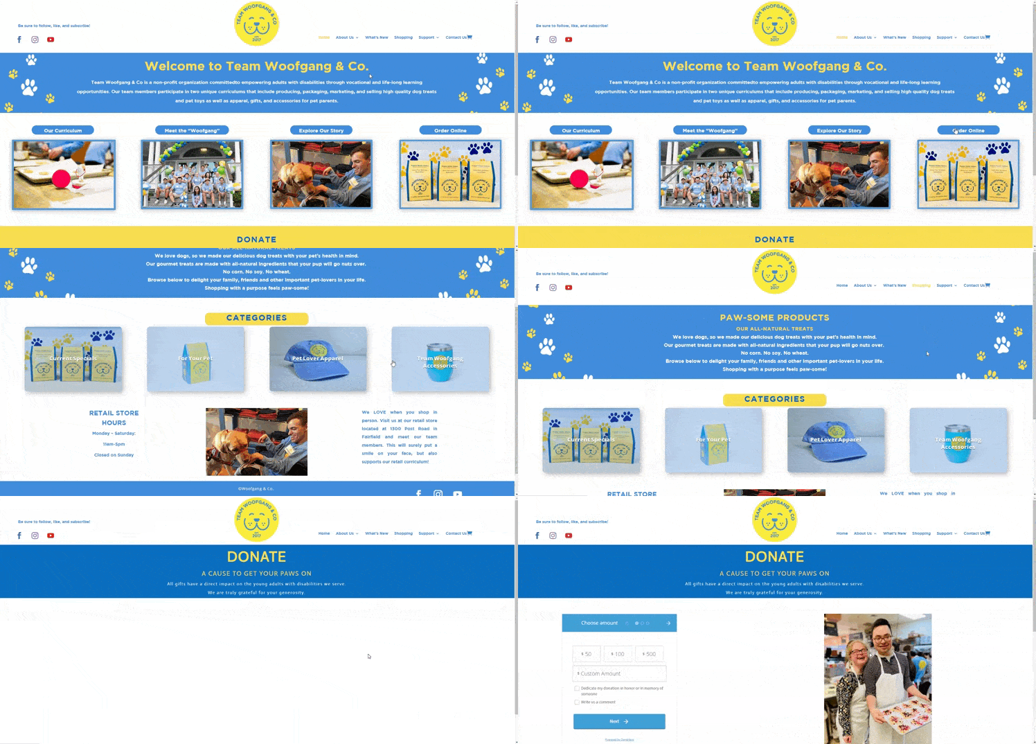
A business website design using vibrant colors and whitespace (Source: WoofGang & Co)
Connecticut-based nonprofit WoofGang & Co hosts a website that serves three purposes: to tell its story, solicit donations, and sell high-quality pet snacks. To accomplish this, WoofGang & Co has created a simple, yet engaging site full of information and images.
Vibrant complementary colors blue and yellow serve as the primary color palette for the site, with ample whitespace to lead users from section to section. Bold calls to action encourage site visitors to convert to a donor or customer.
WoofGang & Co built their site on WordPress, but you can achieve a similar site much more easily using Weebly, one of our favorite choices for ecommerce websites. For a step-by-step guide, read our instructions for how to build a Weebly website.
15. Graphic Design Portfolio Website: Wendy Ju
CMS: Wix
Online portfolio sample website for a graphic designer (Source: Wendy Ju)
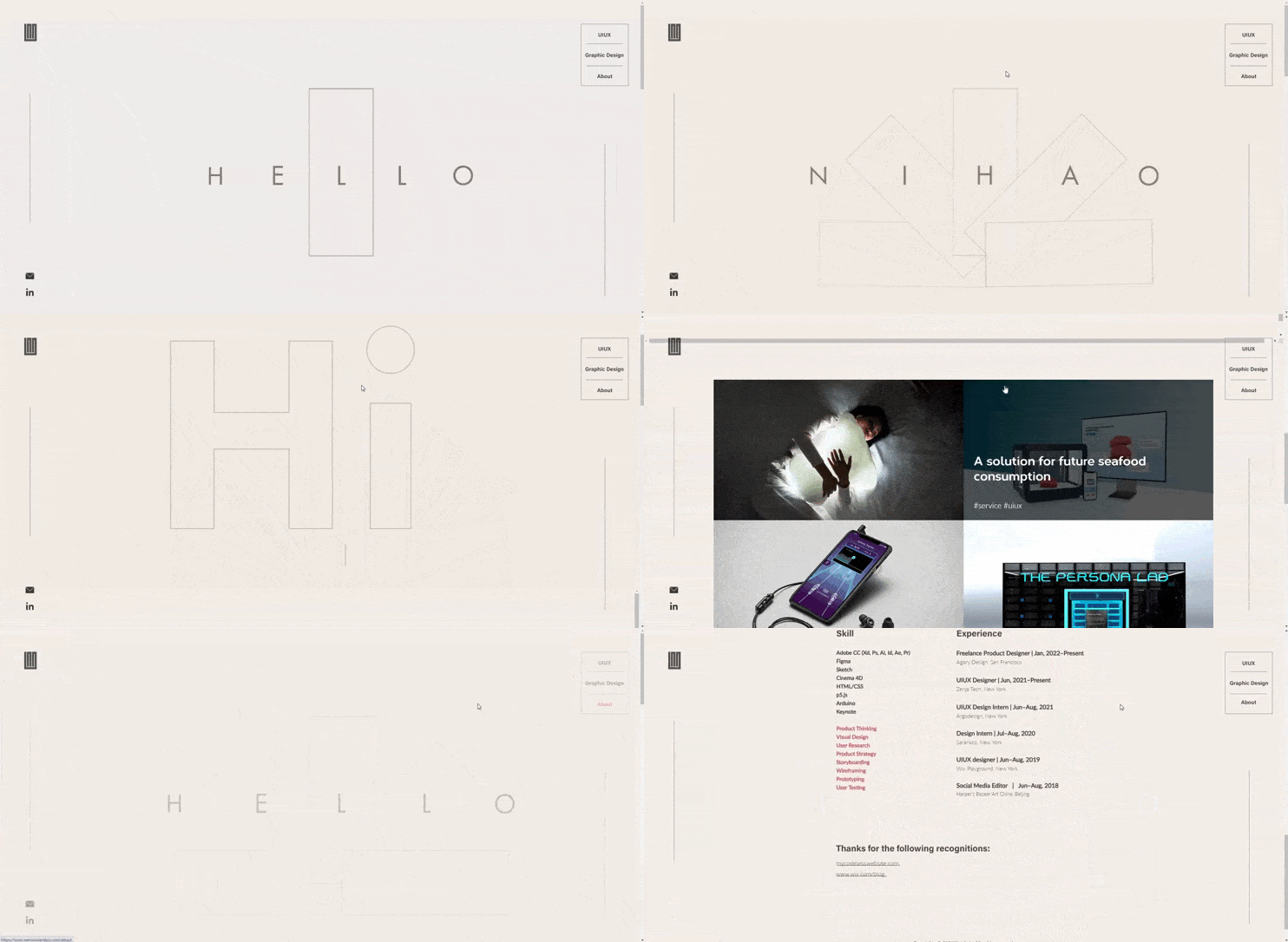
Graphic designer Wendy Ju’s online portfolio is clean and visually stunning. Subtle animations greet the visitor, and an interactive cursor draws attention as you move through the site. It’s a great example of how a small or even one page website can convey a lot of information.
A simple, two-option menu offers you the choice between reading about the New York-based designer or browsing examples of her work. Each example leads to a case study about the project, which provides not only more visual examples of Wendy’s work but also gives you a feel for her style and personality.
For her online portfolio, Wendy chose Wix, using galleries and content blocks to engage with visual elements and animations. Wix’s drag-and-drop editor makes it easy to place images, animated graphics, and videos exactly where you want them on a page for maximum impact. Learn more, including why it made our list of the best drag-and-drop website builders for design freedom.
16. Ecommerce Retail Store: Native Union
CMS: Shopify
Native Union’s online shop specializes in high-end accessories. (Source: Native Union)
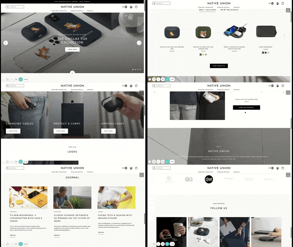
Online retailer Native Union specializes in electronics accessories with a classic, elegant design. For the company’s online store, they chose calming earth tones and crisp lines, which support the brand and echo its products.
The result is an online store website example filled with a plethora of products but free from visual clutter. A simplified navigation bar offers three product categories and an “explore” feature, which leads to more information about the company, its designs, and its mission.
To easily build an ecommerce website with an online store similar to this, go to Shopify and choose the “Narrative” theme. If you’re considering an all-in-one page builder, read our Shopify review before making your final decision.
17. Kid-friendly Business: Play Street Museum
CMS: Squarespace
Play Street Museum Squarespace website example (Source: Play Street Museum)
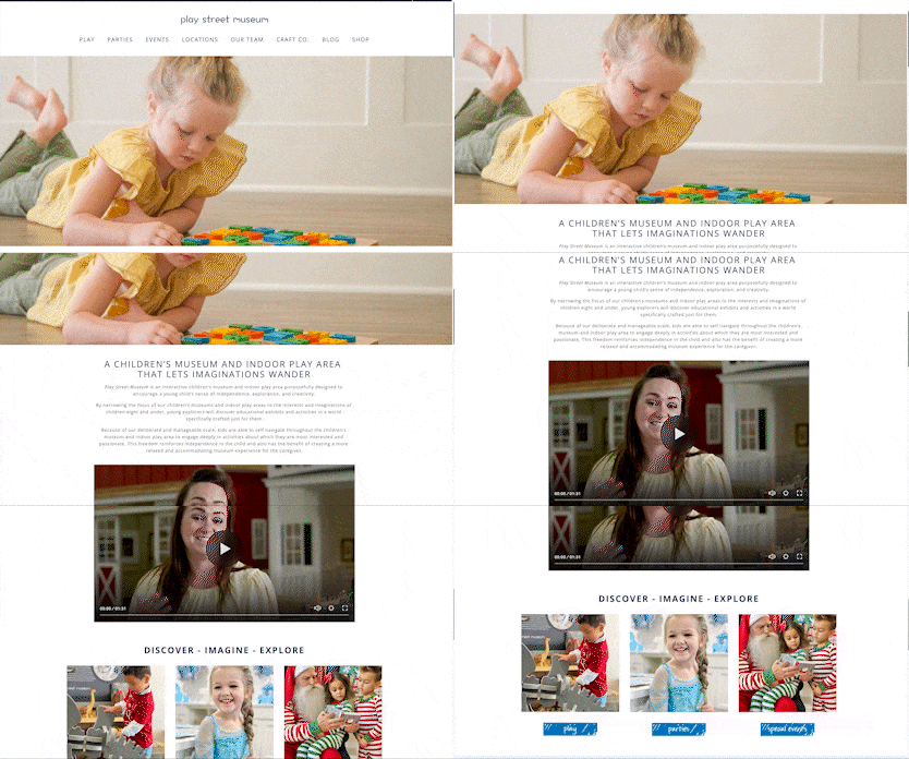
With 19 locations in eight states, Play Street Museum’s website could have quickly become overly complex. However, the children’s entertainment franchise company relies on good design and an easy-to-browse menu to keep its site clean and navigable.
The website features pages for each location with contact forms for party inquiries, hours of operation, and a convenient method for signing the required activity waiver. Children at play capture the company’s value proposition and convey the fun kids will have when they visit a Play Street Museum location in their area.
Built on Squarespace, the layout is simple and familiar, making it easy to navigate around the site and creating a good user experience. Start building your Squarespace website like this one with the Bryler template. Read our expert Squarespace review to learn more.
18. Home Goods: Lola Pate
CMS: Wix
Lola Pate uses sites built with both Wix and Shopify for home goods ecommerce. (Source: Lola Pate)
Home goods brand Lola Pate’s website encapsulates the Bohemian spirit in the website design of the rug and decor sales company using Wix. The animated, overlapping rectangles celebrate Lola Pate’s core products—a line of quality rugs of differing sizes.
The Shop link in the navigation menu showcases the brand’s ingenuity. The company utilizes Shopify for shopping cart content and Wix for everything else, blending the two products to create a custom website solution that covers all the essential website basics.
Wix’s lightbox-style photo gallery serves as Lola Pate’s lookbook to inspire visitors’ creative passions. The Shopify store is clean, clutter-free, and user-friendly. If you’re debating which platform is right for you, head to our Wix vs Shopify comparison for expert guidance.
19. Event Planning: Bellafare
CMS: Squarespace
Event planner website example built with Squarespace (Source: Bellafare)
The polished, lush design of event coordinator Bellafare’s website belies the company’s attention to detail. It’s easy to see trusting a wedding to a company with this close attention to the overall design and visual impact.
Professionally produced photographs and videos draw visitors to the site, inviting them to invest their time watching an event case study or clicking through a gallery. To accomplish this look, Bellafare used Squarespace’s all-in-one page builder to craft a highly customized website that is as individual as each of the weddings the company plans.
20. Travel & Tourism: Arrowhead
CMS: Weebly
A sample travel and tourism business website (Source: Arrowhead)
Boutique Canadian resort Arrowhead entices potential guests with a beautiful overview of its amenities from the continuous scroll homepage. Free of clutter and with ample visuals to keep visitors interested, this site captures the resort’s aesthetic.
The homepage includes a gallery of room images demonstrating the cleanliness of the resort and its website design skills. Arrowhead’s site is built on Weebly, which lacks a native booking system. While booking tools are available through Weebly’s third-party app marketplace, Arrowhead integrates a third-party provider for reservations and bookings instead.
The clean lines and quick loading of Arrowhead’s site highlight why Weebly continues to grow in popularity as a page builder. To see how easy it is, read our how-to on building a website with Weebly.
Frequently Asked Questions (FAQs)
What’s the best way to build a small business website?
The best way to make a small business website is with an all-in-one site builder like Wix or Squarespace. Unlike WordPress, which can be difficult to use and involves a fairly steep learning curve, site builders make it easy for anyone to build their own professional website—even true beginners. Most have plans with everything needed, including a free domain and SSL for website security.
What are the best drag & drop website builders?
The best website builders are Wix, Squarespace, Weebly, and GoDaddy, depending on your needs. Squarespace is best for portfolios and highly visual sites, whereas Wix is best overall, allowing maximum design freedom. Weebly is best for online stores and restaurants, while GoDaddy is best for service-based businesses that want online booking and appointments.
How much does a small business website cost?
The cost of building a small business website depends on whether you build it yourself or hire a web developer. If you make it yourself with a site builder, your only expense may be a paid plan ($12 to $16 per month). You can outsource to a freelancer on Fiverr for around $100, or spend a few to tens of thousands of dollars with a professional web design agency.
Get the complete breakdown of small business website costs for doing it yourself vs outsourcing.
Bottom Line
Looking at small business website design examples is a great way to get ideas and inspiration before designing your website. Before building your website, list the features and functionality you need. Then, choose a CMS that best meets your criteria.
We recommend Wix as the top small business site builder. With over 800 templates and 300 add-ons, Wix is a full-featured page builder with virtually everything you need to build your small business website. Plans start at just $16 per month.
