Have you ever been excited about a new brand, only to visit their website and be greeted with slow loading times, links leading to nowhere, or a messy interface? Today more than ever, having a functional, well-designed website for your business is non-negotiable for your success. Websites are a basic element of digital marketing, and if you’re in the process of building yours, keep reading to learn what makes a good website, plus tips on how to create one.
1. A Good Website Is Set Up for Success With Research & Planning
Great websites don’t happen by accident.
The first step in knowing how to make a good website is always to research and plan beforehand. Intricate planning and research should guide how you create your website, from its content to choosing the best platform and from how it’s navigated to the tone you’ll use in your copies. Here are some tips to help you research and plan your small business website:
Research Your Competitors
You want your website to stand out from your competition, and the only way to do that is to understand what you’re up against. Make a list of your business’ biggest competitors, then do a review of their websites. How is their site structured? How are they appealing to audiences? Keep all these things in mind to use as guidelines when you build your own site.
Say, for example, after scanning your competitors’ sites, you find that none of them offer any appointment-scheduling features. Therefore, you can add some to yours to offer users a better experience. Differentiating your site and making its user experience (UX) better than what your competition offers is a key way to build brand presence online.
Decide What Website Features You Need
An essential part of what makes a good website is that it has complete features and full functionality. When visitors enter your website, they should have everything they need to come away with a good experience. To ensure that nothing is amiss when you build your website, list all the features it needs to have—use your research in the prior step as your guide.
Here are a few essential website elements to include:
- A navigation bar
- A header and footer with company information
- A lead magnet (e.g., an email sign-up form, a downloadable asset, etc.)
- Images of your product or service
- Content about your brand story
For a more comprehensive list of these elements, read our article outlining 19 website basics.
The elements your website will need will differ depending on your business goals, industry, and so on. For example, when creating a restaurant website, your site might include your menu, online ordering form, or your location’s address. If you are a blogger, you probably want to have a gallery featuring recent or essential articles on the main page of your website.
After you’ve listed all your website’s features, organize them by order of importance depending on the journey you want your audience to take on your site. For example, most business websites have images of their product or service on the home page, or you might want to tell users your brand story first.
Apply Your Brand Persona

What does a good website look like? Strong visual branding is a key aspect, like in this example from Bennett Tea.
Your website is one of the pillars of your online brand presence. Therefore, it should also encapsulate everything about your brand, from the tone of your content to picking colors for your website.
When planning your website, think about how you’ll incorporate your brand into its design and content. For a good number of your visitors, your brand’s website is the first encounter they’ll have with your brand, so make sure you leave a good impression.
Pro tip: Need more help choosing your website colors? We’ve listed the 25 best website color palettes for every type of business.
Choose the Right Platform
The website platform you choose is also a key factor that goes into what makes a good website for your business. There are dozens of great small business website builders to choose from, each with its own specialty:
- Wix and Squarespace are well-known for exceptional design features and are two of the best website builders for SEO
- Weebly excels at ecommerce
- DreamHost includes an intuitive, no-code WordPress site builder in its plans
- HubSpot is one of the best blogging platforms
Make sure you carefully evaluate the benefits and disadvantages of each platform according to your business and website goals. The platform you choose should be able to support your site’s growth in the long term.
2. Good Websites Are Search Engine-friendly
Did you know that over a quarter of all online clicks go to the highest-ranking website on search engines? One of the most crucial factors of what makes a great website is its discoverability. If your website isn’t discoverable, it isn’t very effective at furthering your growth, whether your objective is brand awareness or sales.
Here are some tips to ensure your website is optimized for search engines:
Set Up Your Site’s SEO
The most straightforward way to make your website search engine-friendly is with search engine marketing (SEM). SEM is an entire discipline in itself, but its most basic strategy is search engine optimization (SEO).
This involves two general aspects: on-page and off-page optimization. On-page optimization involves making the content and images on your actual pages search-friendly. Off-page optimization addresses technical factors like site speed and ranking factors like backlinks and SEO citations.
Here are some of the most important SEO strategies to cover in your website:
- Keyword optimization: Optimize keywords in web pages by placing them in your main headline, in one or two subheadings, and throughout your site’s content. You can even find the best keywords for your website for free with top keyword research tools like Semrush.
- Image optimization: Optimize images on your website by adding relevant keywords in image alt tags and file names, and by ensuring they are web-size-optimized so they don’t slow your website down. If you don’t have graphic design software, Image Resizer is an online tool you can use to reduce the size of your images for free. And, site builders like Wix automatically optimize your images, saving you time and stress.
- Geotagging: Add your business’ location in your site’s meta tags and your address to local online listings. It also involves embedding your location data in images of your business on your website.
- Get backlinks: The best way to get backlinks from high authority sites is to publish link-worthy, citable content, video, and images. Other strategies include guest posting and link-building campaigns to improve your domain authority with Google.
- Adding schema markup: Schema markups are microdata that help search engines understand your website more accurately, and you can add them to your site’s code or HTML. Semrush has a great schema markup guide for beginners, or you can make it even easier by building a website on Wix, since it adds schema markup automatically.
Make Your Pages Load Fast
One in four users abandon websites that take longer than four seconds to load—which is why an essential factor that goes into what makes a website good is that it loads fast. Beyond that, the bounce rate (the number of site visitors getting on a page of your website and leaving without taking any other action) increases exponentially with each loading second, which can cost you leads and sales.
To keep your loading times low, compress large files and images, clean up your site’s code, and troubleshoot its back-end. You can also build your website on a site builder like Squarespace, which is known for quick page loading speeds.
Optimize for Mobile Devices

Good mobile design, like in this example from Daysie, increases your chances of ranking on Google.
Nearly 54% of all website traffic comes from mobile, which is something Google has also caught on to—its algorithm crawls and indexes websites on mobile first. This means you have a higher chance of ranking on Google if your website is mobile-optimized.
This is why one of the best ways to make a website is to design for mobile screens first, then adjust it for desktops. It also helps if you use a 100% responsive, mobile-optimized, website building platform, like artificial intelligence (AI) website builders Hostinger or Weebly.
Add a FAQs Section or Page
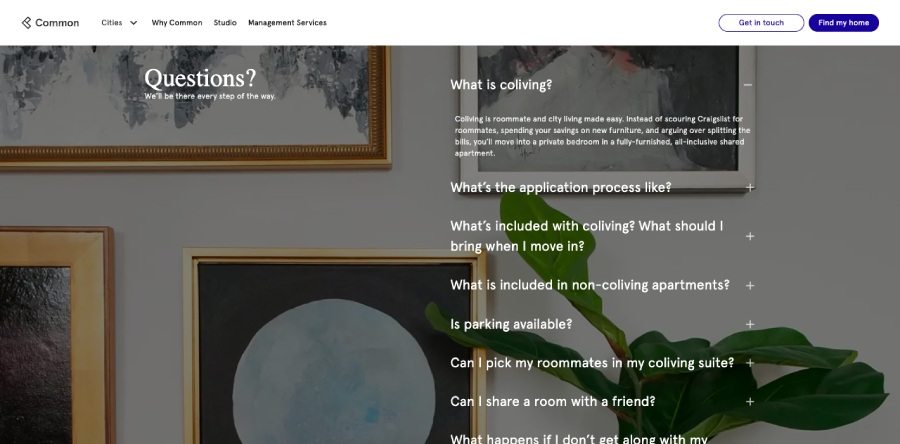
FAQ sections build your site authority and provide a better experience. (Source: Common)
Frequently asked questions (FAQs) are important for two reasons. One, they give your site visitors an easy access place for all their biggest questions about your business, and second, they can help you rank higher on search engines.
Google prioritizes authoritative and high-quality content, and it perceives FAQ sections as an indicator of that. Be sure that your FAQs are genuinely helpful and informative; otherwise, Google may interpret them as fluff and rank your site lower.
Keep Your Website Secure
Cybersecurity is a top priority for any business site in today’s hyper-digital world—especially if you’re handling personal information or payment details of any kind. A simple data breach can cost your business thousands of dollars, not to mention your customers’ trust.
When learning how to create a good website, a must-have is to get an SSL certificate to verify website ownership and protect your data. Many website builders automatically include free SSL, and providers like DreamHost and IONOS have highly advanced security features so you can focus on building your website and business.
Generate a Sitemap
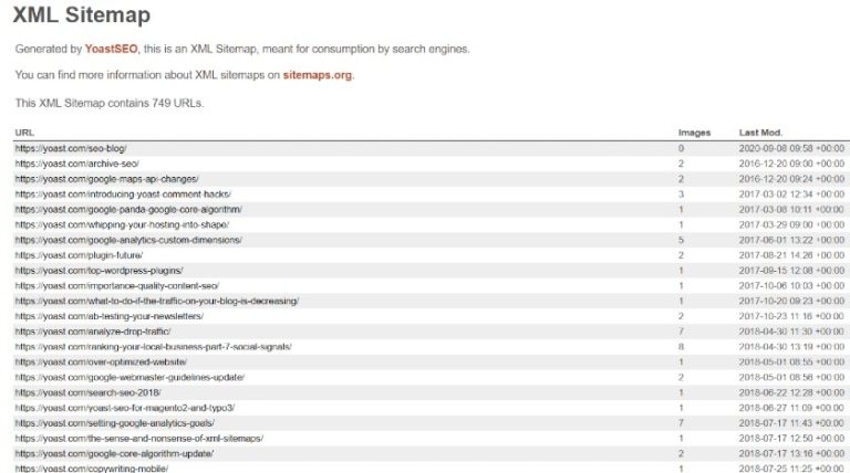
Sample XML sitemap by Yoast
Sitemaps organize your website, making it easier for both search engines and humans to navigate. There are two major types: XML sitemaps for search engines to crawl through your site effectively, and menu-based sitemaps (aka HTML sitemaps), which help users navigate your website via internal links. Both are essential for optimization: the former helps Google determine the value of your content, and the latter enhances user experience.
The good news is that most top site builders automatically generate XML sitemaps and continually update them as you add pages, delete, or move them on your site. You can also manually submit these sitemaps to Google Search Console to request indexing.
3. Great Websites Put Users First
Good user experience (UX) is one of the most vital elements that answers what is a good website. It makes the difference between a casual visitor staying on your site and converting into a customer, or clicking out and choosing your competitor.
Your website should be all about your users—their needs, their preferences, and their overall experience on your site. Here are some tips on how to make your site center around your users:
Add Helpful UX Features
The easiest way to create a good user experience on your site is to add helpful tools that go beyond the basics and give visitors a fulfilling and memorable website experience. Place yourself in your customers’ shoes and think of the experience you want them to have, and then add tools that help create that experience.
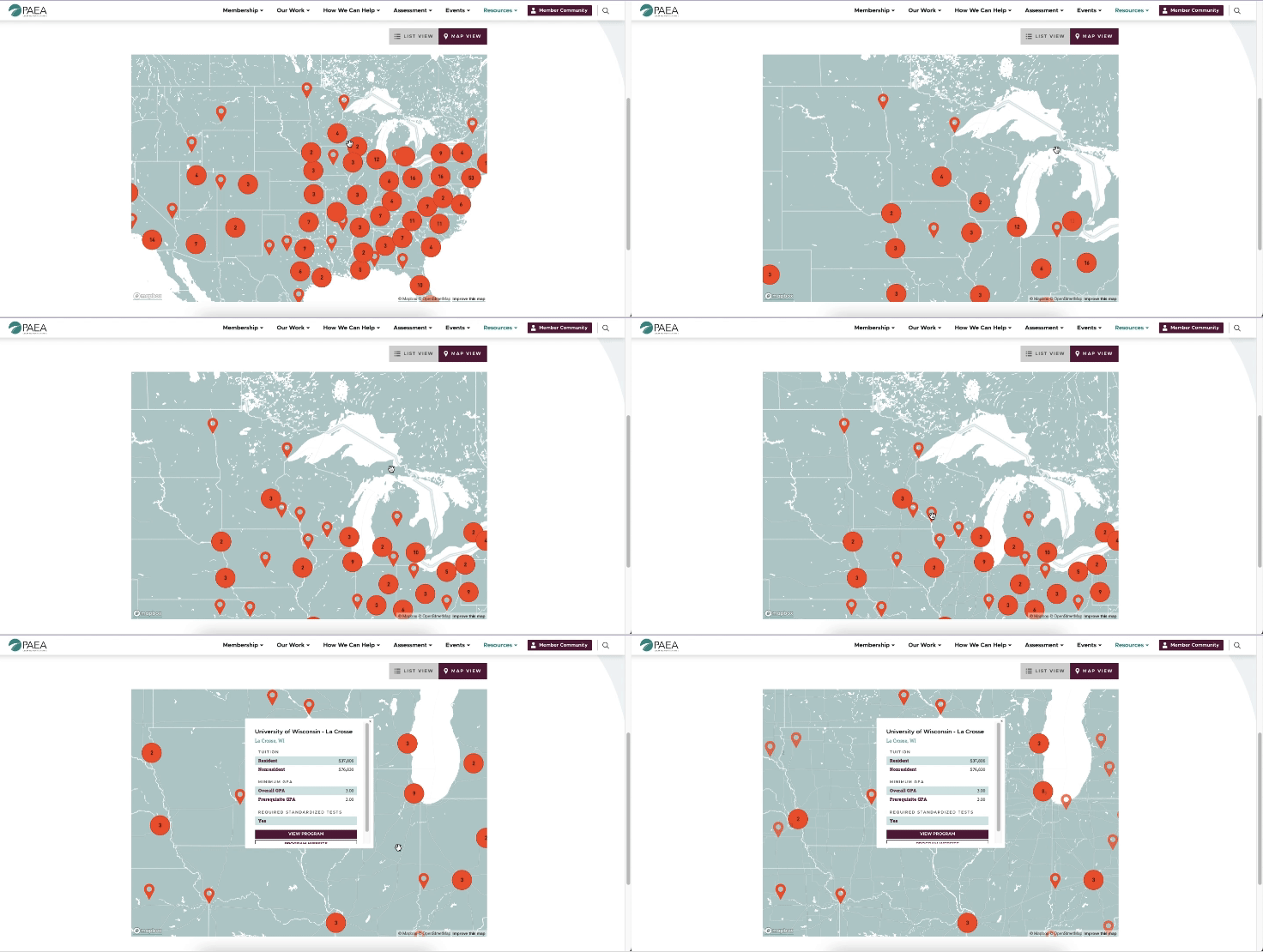
Features like interactive maps can significantly improve your site’s UX. (Source: PAEA)
Examples of helpful UX elements include things like:
- Google map embed to help customers get to your site easily
- Click-to-call buttons to help mobile users get in touch instantly
- Ecommerce chatbots to engage site visitors and answer questions about orders, inventory, and so on
- Loyalty program software to re-engage your customers over and over again
- Appointment-booking tools for site visitors who want to book a demo, sales call, or some other type of appointment
Make Your Website Easy to Navigate
Essential to what makes a good website UX is an interface that’s easy to navigate. Navigation is often the first thing visitors will look for when they enter your website, so you need to be sure that yours are easy to find and use. When planning your site, map out your site’s pages and how visitors will make their way through them.
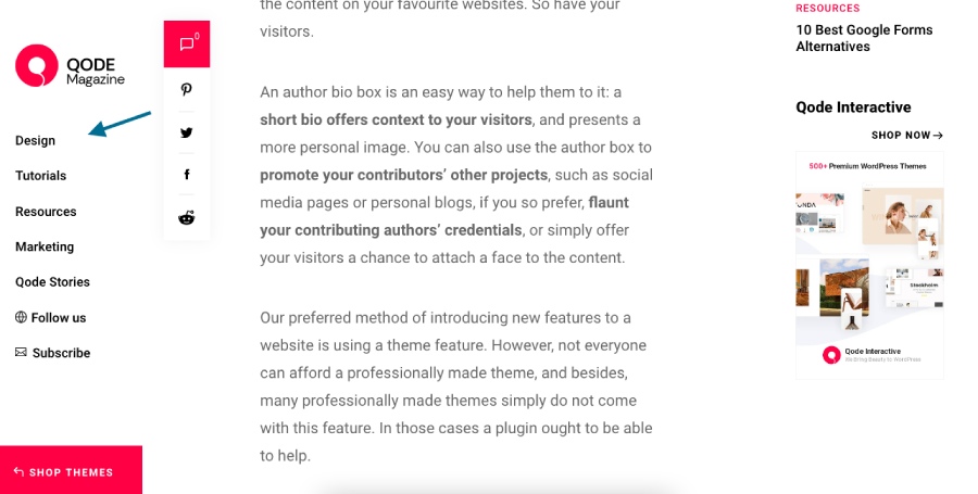
An example of a website with easy navigation (Source: Qode Interactive)
According to web design best practices, it shouldn’t take users more than three clicks to get where they need to—but the faster you can get them there, the better. Finally, make sure you have an easily accessible navigation bar on your home page.
Provide Helpful & Valuable Content

Blogs are a great way to offer valuable content to your audience. (Source: Noissue)
Just as important to creating good UX is having valuable, helpful content. Though your website is integral to your branding, your content shouldn’t just be about how good your product or service is—it’ll only hurt your chances of ranking on search engines and keeping your visitors interested.
To know how to make a good website in terms of valuable content, start by defining your customer personas, then use that data to guide your content. Address your target customers’ pain points, then provide them with useful, helpful, and relevant information.
You can also publish blogs or offer downloadable content like e-books and checklists. Not only is it valuable to your audience, but it’s also a great starting point for building a content marketing strategy.
Use Visual Multimedia
It takes 0.05 seconds for users to make an impression of your website, which means your visual impact has to immediately be good. But beyond that, people are increasingly expecting websites to be interesting and visually stimulating—not just the regular text and images. If you have lots of information to share, share it through visuals and multimedia instead.
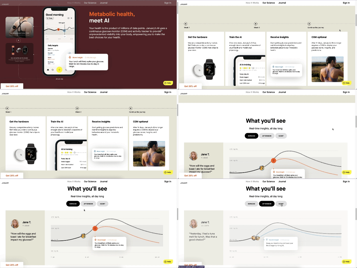
January.ai uses infographics to tell site visitors about its app.
For instance, a demo video can tell loads more about your product than a lengthy article. Or, telling your brand story through an infographic is far more interesting to read than reading plain text.
Visuals are a much easier way for users to digest information (considering that over 50% of our brain is devoted to processing visuals). And, web design stats show that sites with media simply perform better both in views and conversions.
Keep Content Fresh
Part of high-quality content is freshness. For your site to build authority—and rank higher on search engines—your content should always be up to date. This is one of the most helpful tips to make a good website, especially if you publish blogs or other informative content. Make it part of your strategy to update your content regularly to keep your site credible and valuable to your users.
It’s especially important to review and update things like your contact details and hours of operation on a regular basis. To make sure your website’s content stays accurate and relevant, make a list of all your site’s pages and blog posts and establish a review cadence (such as annually for evergreen content or quarterly for high-profile content, like your business hours and contact details).
Pay Attention to Readability
Have you ever visited a website that was cluttered with ads and too many features, or tried to read a blog post that didn’t break things up into bite-sized pieces? UX elements refer to tools and features that your site visitors can access—but readability, or reader experience (RX), is equally important. It’s part of what makes a good website experience and a direct reflection of your brand.
To make your site more readable and offer a good RX:
- Use headings and subheadings to break up major sections of content
- Break up long paragraphs into short, mobile-friendly versions of one to three sentences
- Break up long run-on sentences into smaller ones
- Always leave whitespace and start a new paragraph when introducing a new concept
- Include multimedia for readers who prefer to learn about your brand through videos and imagery
- Use images to break up long text-based sections
Add Accessibility Tools
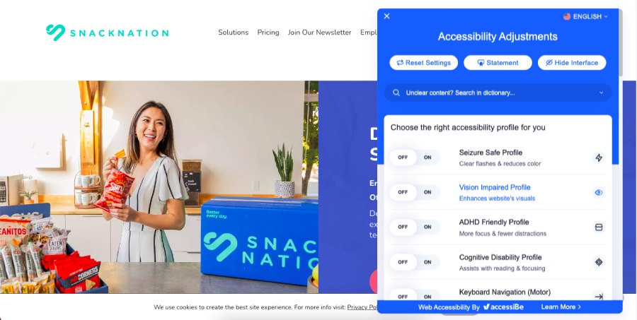
Accessibility features like this one from Snacknation make your website more user-friendly.
Making your website accessible is another key part of UX/RX as far as how to make a good website. It ensures that your site has a good user experience for everyone, including those with disabilities. Some ways to make your website accessible are:
- Using easy-to-read fonts
- Following proper heading hierarchy (to make it easier for text-to-speech converters)
- Adding high color contrast options
- Using alt text and closed captions for your images and videos
You can also use accessibility tools like Accessibe or UserWay to automatically make all these features—and more—available on your site.
4. A Good Website Takes Visitors on a Journey
Half of what makes a good website is that it addresses your users’ immediate needs. But the other half that elevates it into a truly memorable one is that it takes visitors on a journey beyond the essential functions and information. The best professional websites are all about creating an online experience that’s as enjoyable as it is informative.
Here are some tips to use for your own site:
Have Dedicated Landing Pages
When visitors visit your site, your ultimate goal is to convert them into a lead, usually by taking a specific action like signing up for your newsletter or downloading your app. Because these actions are so important, they shouldn’t be hidden somewhere unseen, like on your footer or behind a dozen other pages. Instead, build dedicated landing pages that make it irresistible for visitors to convert.

A dedicated landing page for your call to action (CTA) is more likely to compel users to convert. (Source: Damp Wine)
Landing pages focus solely on getting customers to convert, with no other content or sections on the page. There are many ways to build effective landing pages, from using impactful copy and visuals to simplifying web forms. Find out more examples in our list of the best landing pages.
Use Clear Calls to Action (CTAs)
In the same vein as dedicated landing pages, effective calls to action (CTAs) are also a key factor of what a good website should have. CTAs bridge the gap between a site visitor converting into a lead, and while they aren’t exclusive to landing pages, they should also be clear and accessible, no matter where they are on your site.
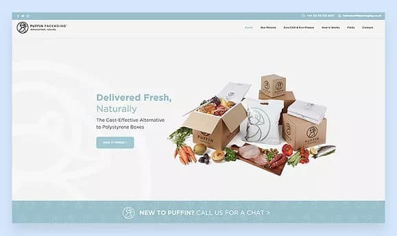
Part of what makes a good website is a clear CTA, like this one from Puffin Packaging (“Call Us For a Chat”).
CTAs can also guide users to other parts of your site, like your “About” page or online store. Making your CTAs clear, compelling (aka what’s in it for the site visitor), and accessible ensures that your site provides a good user journey.
Highlight Positive Reviews
Did you know that 94% of customers are more likely to buy from a business with positive reviews? Prospective customers love seeing reviews from buyers like themselves—they act like personal recommendations for your brand. Highlighting your business’ positive reviews on your website increases your credibility and adds a human touch to your site, creating an overall better user experience.
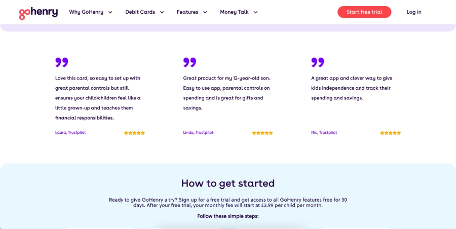
Displaying positive reviews can build trust with your site visitors. (Source: GoHenry)
Also, website content management systems like WordPress, Squarespace, and Shopify have plugins that can integrate Google reviews into your site easily. Additionally, you can also create a press page to post all the favorable mentions you get from the media.
Integrate With Other Platforms & Tools

Have an Instagram feed to show off? Integrate it in your website to lead visitors there. (Source: Popup Grocer)
Reviews aren’t the only plugins you can add to your site to provide a better user journey. There are countless other apps and platforms that can improve your site’s functionality and expand your online presence.
One definite must-have is a social bar linking to your social media profiles. You can also add social share buttons to your blogs, integrate your Instagram feed to your site, or add your site to online business directories to get discovered more easily.
5. The Best Websites Are Maintained & Improved Consistently
Your website isn’t a set-it-and-forget-it type of project. A key part of how to make a good website is ensuring that it’s maintained and improved as your business grows. This is important because the digital space is so dynamic, and what works for your site today may change in a few months.
Here are some ways to get the most out of your website and ensure that it reflects a good standard:
Track Your Website Analytics
The most basic way to evaluate your website is to keep track of its analytics. Most website builders have a dashboard that lets you track essential website metrics, and there are many other tools for checking website traffic free of charge. Google Analytics is the staple for traffic and demographics, while Semrush has robust tools for SEO analysis.
Here are some of the most essential site analytics to track:
- Website traffic: How many users visit your website overall
- Average session duration: How long users stay on your website on average
- Click-through rate: The percentage of how many clicks your site’s clickable elements get
- Conversion rate: How many visitors convert into leads or customers
- Bounce rate: How many visitors leave your site without taking any further actions
When you track your site analytics, use the data you gather to pinpoint areas of improvement. For example, if your blog page isn’t getting any traffic, you might change its layout or optimize its keywords better. By keeping watch of your site analytics, it becomes easy to make informed decisions and site improvements.
Audit Your Site & Improve It
Tracking your site is important, but every once in a while you’ll need to do a more comprehensive audit. Think of it as your site’s regular visit to the clinic, where you can get a full checkup of your site’s health and see if there are any gaping issues to fix or areas to improve on. The three most important areas to audit on your site are its functionality, its design, and its content.
Once you have solid data on your site, use it as a guide to make site improvements and optimization. It’s a good idea to do your audits twice a year or every quarter. Using your own data is the best way to make a website that’s relevant to your customers and your own business goals.
Want tools to help? Here’s our list of the best SEO audit tools for small businesses.
Frequently Asked Questions (FAQs)
The main qualities of a good website include a user-centric design, a good user journey, a search engine-optimized layout and content, and constant maintenance and improvement. When it comes to what to look for in a website, these are the most important elements that indicate its quality. Other elements of good websites are mobile-friendly designs, dedicated landing pages, fresh and authoritative content, and clear calls to action.
You know a website is good if it provides a good user experience and valuable content, loads fast, and effectively converts visitors into leads and customers. Good websites have high website traffic and click-through rates, long session durations, and low bounce rates. They’re also visible on search engine results and have a strong overall online presence.
The key to a successful website is good planning and research along with consistent maintenance and improvement. Planning your website beforehand ensures that you have a good guide for its structure and content and that it caters to your target audience. Meanwhile, maintaining and improving it consistently makes sure that it keeps up with the times and retains its value to your audiences.
Bottom Line
Many factors come into play when talking about what makes a good website. But ultimately, it needs to get the attention of your target audience and convert them into customers. Focus on creating a good user experience through valuable content, solid design and functionality, and impactful visuals and copywriting. These help your website give your visitors what they’re looking for—a fantastic user experience that keeps them coming back for more.